CATEGORY

Offset

RANK


PRODUCTION DETAILS

Quantity

1,000

Page Count

16

Number of Colors

1

Special Techniques

Binding

Dimensions

11.25 × 16.5 × .05

Paper Stock

Newsprint, 35lb


PRODUCTION CREDITS

Production funding

Maryland Institute College of Art's Center for Design Thinking


TAGS

, , , , ,


LINKS

Jessica Karle Heltzel
Aura Seltzer
Linco Printing Inc.

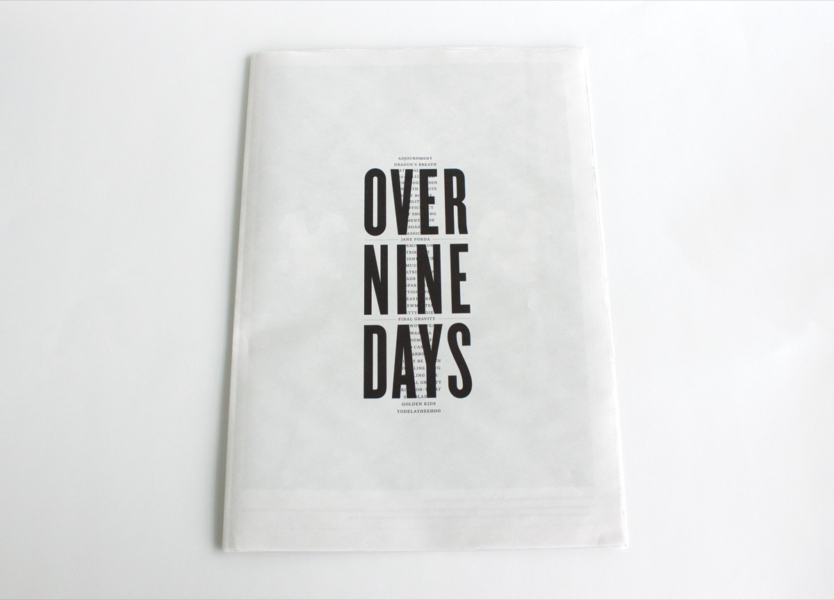
Zine for Self-promotion by Jessica Karle Heltzel and Aura Seltzer


CLIENT

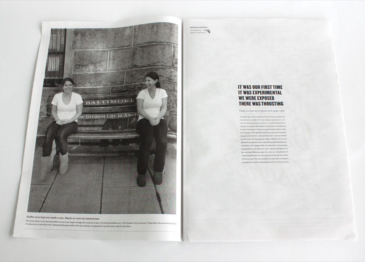
Jessica Karle Heltzel and Aura Seltzer were in their first year at the Maryland Institute College of Art, Graphic Design MFA program, when this project was developed.


BRIEF

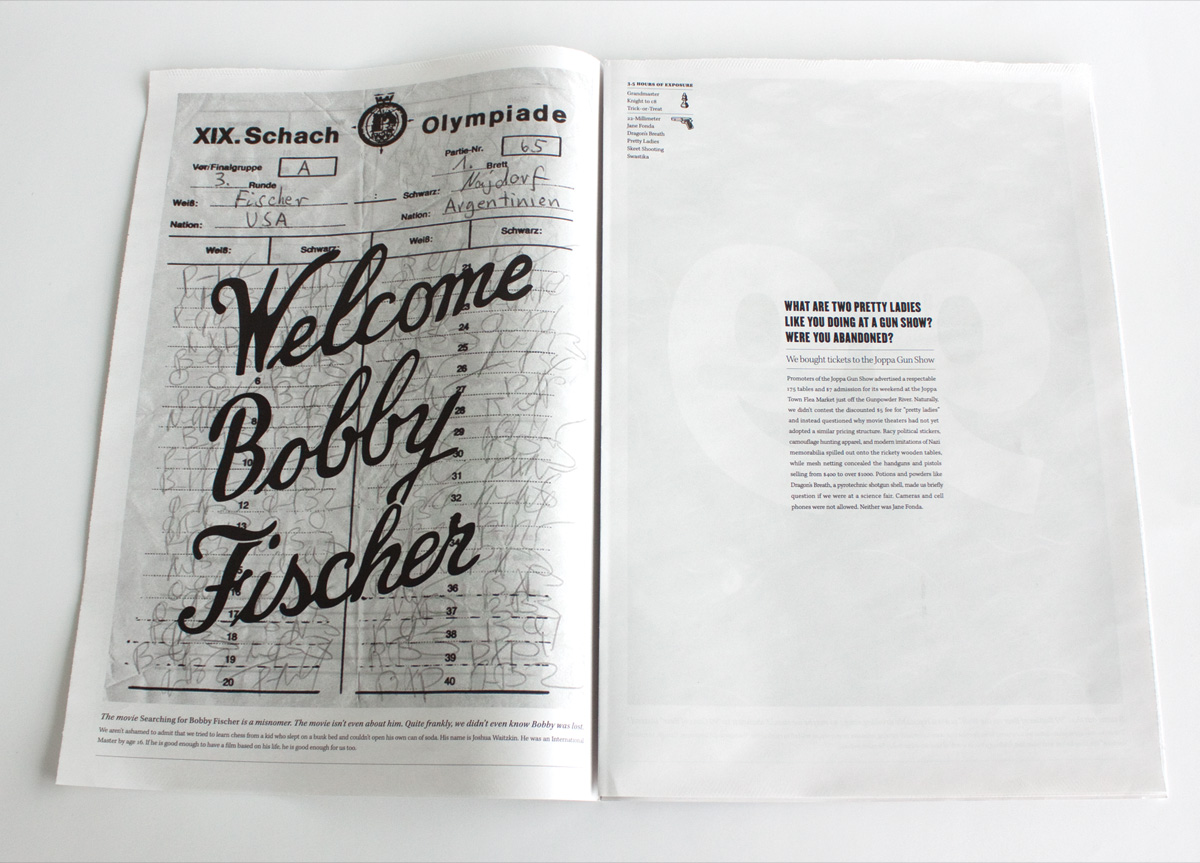
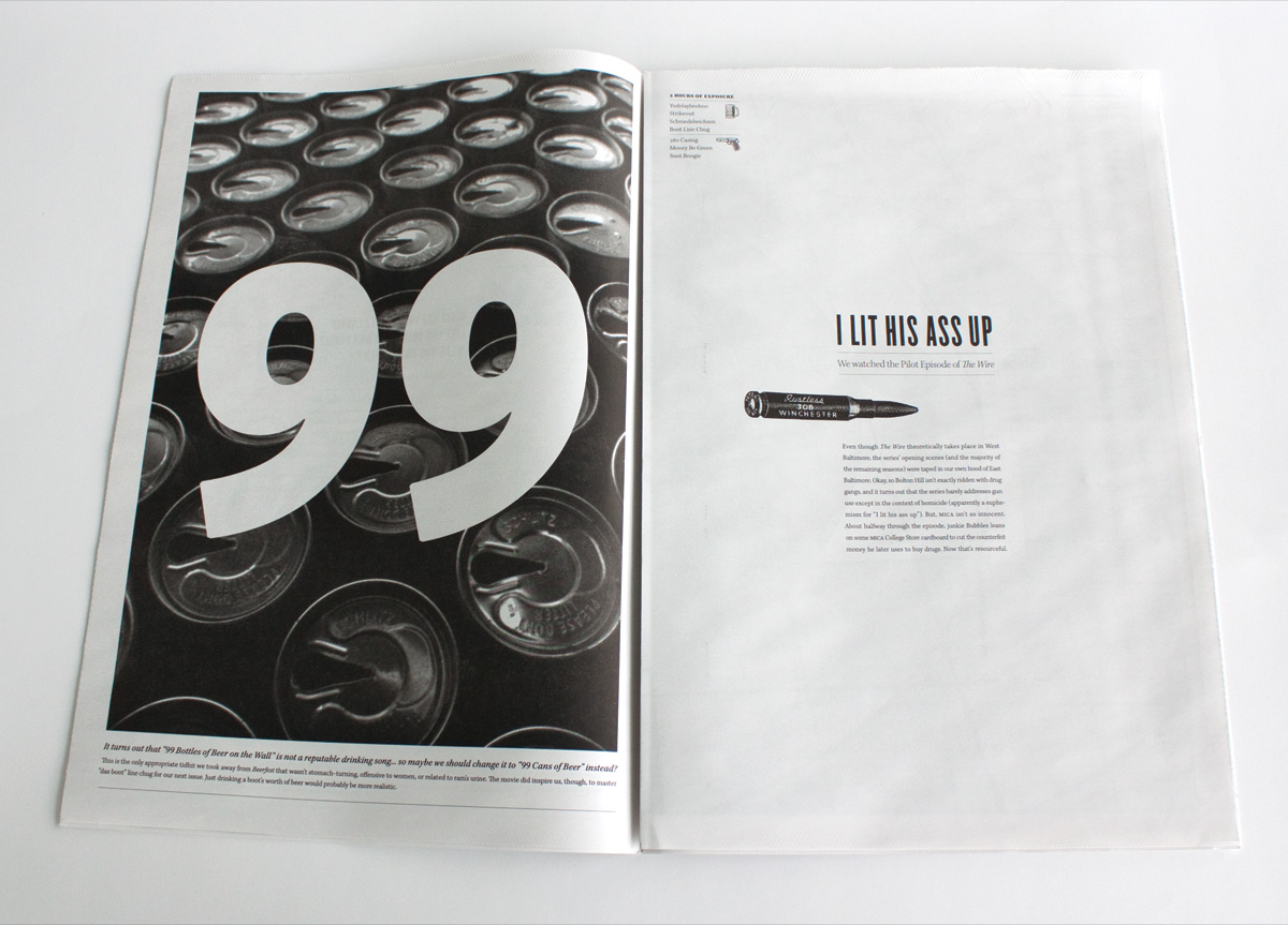
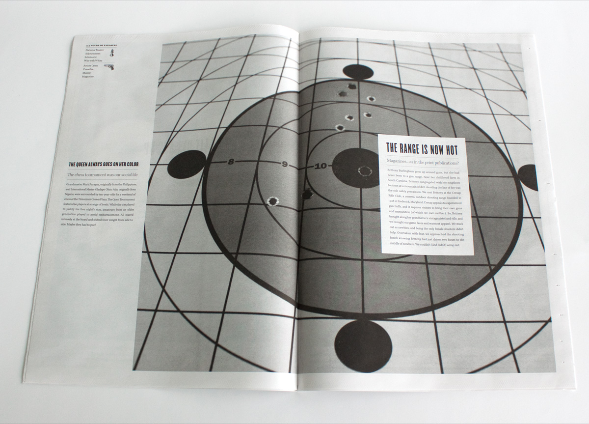
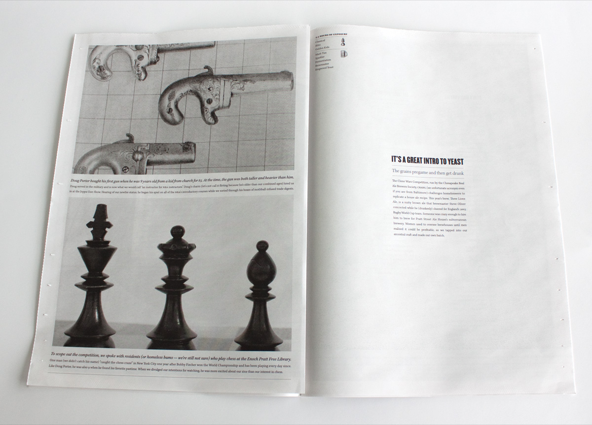
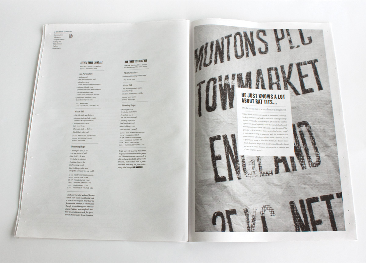
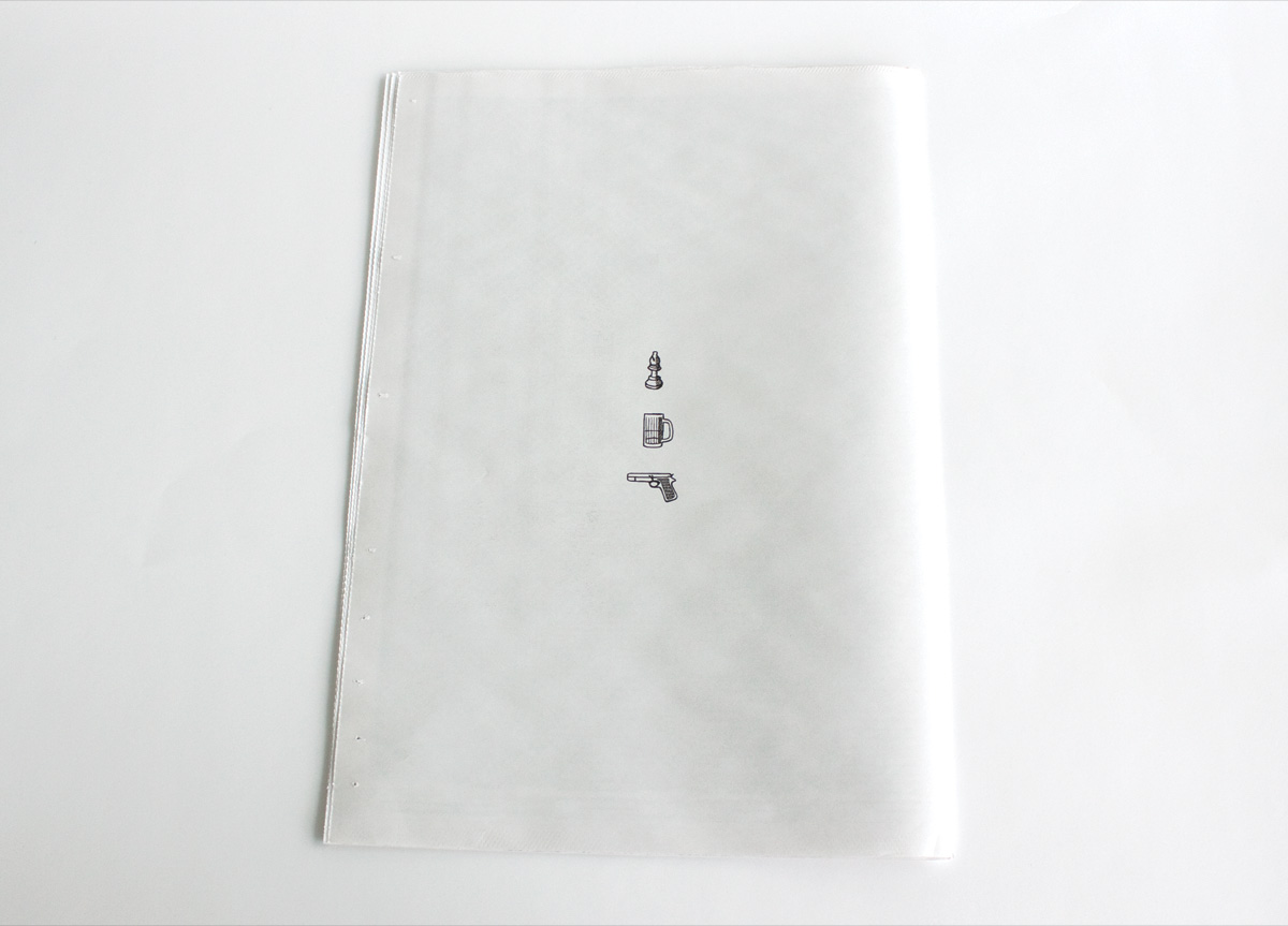
Over nine days, we entered three arenas in which we considered ourselves novices. To embrace the tradition of zines’ focused audiences we also chose topics that are recognized subcultures: chess, beer, and guns. We set out to tell our own experience through the stories of those we met.


APPROACH

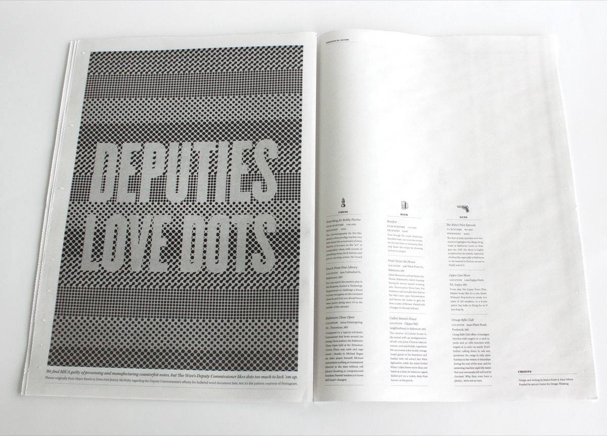
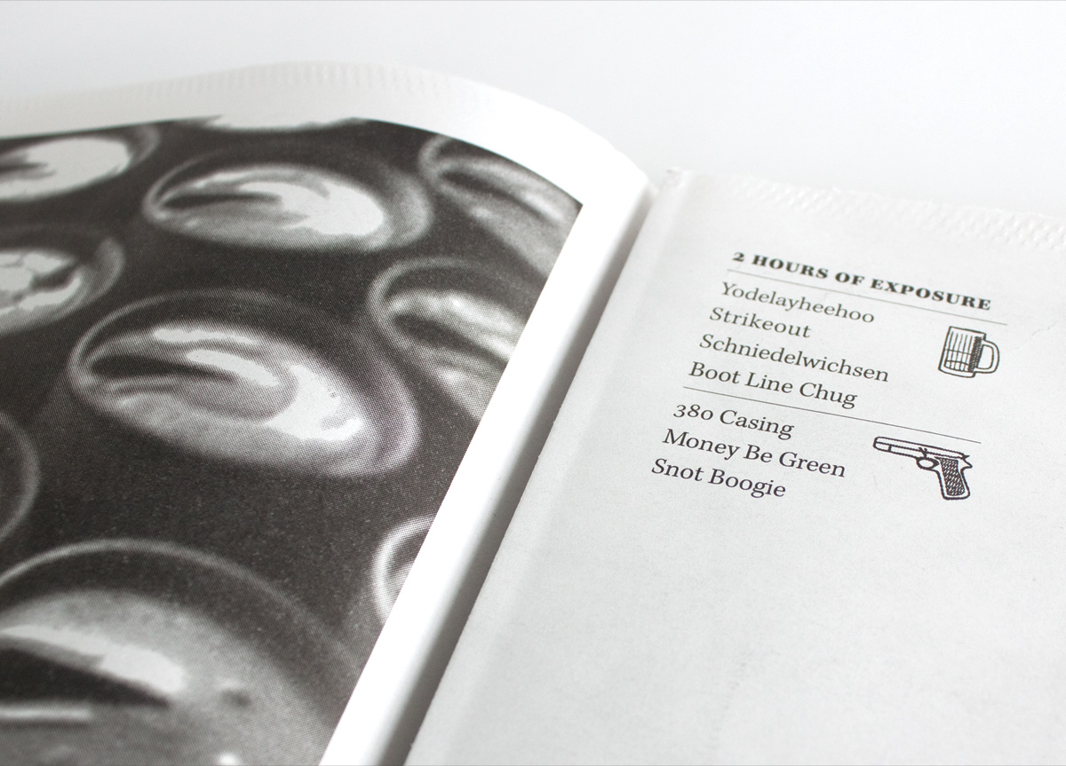
Through the chaotic process, we documented, inquired, interpreted, and experimented―just not always in that order. We studied pop culture references in movies, attended tournaments and competitions, and visited facilities and shows. We engaged with Grandmasters, brewmasters, rangemasters, and others far more experienced than us in the extended Baltimore area. We recorded hours of exposure to each arena and a list of relevant vocabulary. Our zine is a visualization of vernacular with a series of vignettes that reveal how, especially as designers, we grasp for a wider understanding of the world around us.

PRODUCTION LESSONSBy printing on newsprint we were able to produce a large number of copies at a reasonable price. Still, we had to account for low-quality paper, absorbency issues, and a limited color palette of just black and white due to our budget constraints. We chose imagery and icons that would shine in just black ink and were fairly conservative with type size and weight. We chose a middle-weight, whiter paper stock to avoid bleed-through and help make sure that our design’s “white space" was actually perceived as so.

Browse entries