
![]()
![]()
CLIENT
Mikkeller exports craft beer to 40 different countries and is one of the most innovative breweries in the world. It all started when former math and physics teacher Mikkel Borg Bjergsø started experimenting with homebrewing in his kitchen in Copenhagen, Denmark, eight years ago.
BRIEF
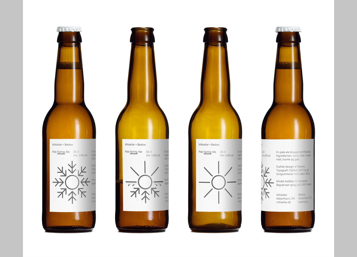
Since 2005 Mikkeller has been experimenting with malt, hop, yeast, and water and have managed to brew beer with notes of flavors like champagne and fried bacon. With this approach they interpreted the four seasons into four progressive beers due to be released during 2012—the first beer will be a Pale Spring Ale.
APPROACH
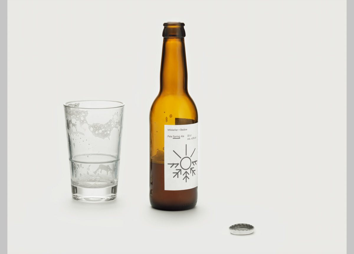
In the same way that the beer interprets the seasons, so does the packaging. With a heat sensitive ink and two simple symbols, we represent the changes between the seasons. The spring beer that introduces 2012 first shows a snowflake for winter, but when the beer is empty or when a warm hand grips the bottle, the heat sensitive color fades away and leaves a sun representing the spring. Just like nature—when the sunbeams melts the snow.


