CLIENT
Henry and Company is an award winning, second-generation specialty print studio.
BRIEF
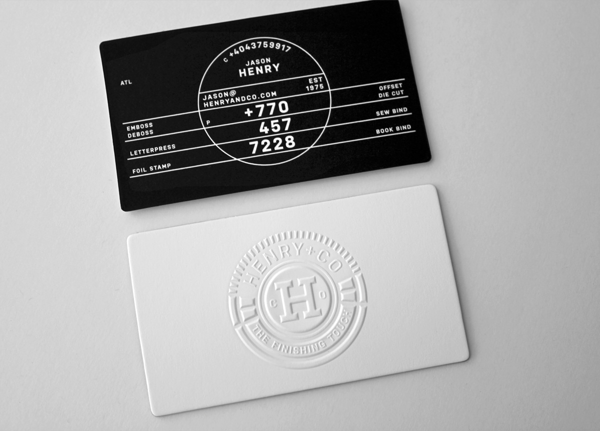
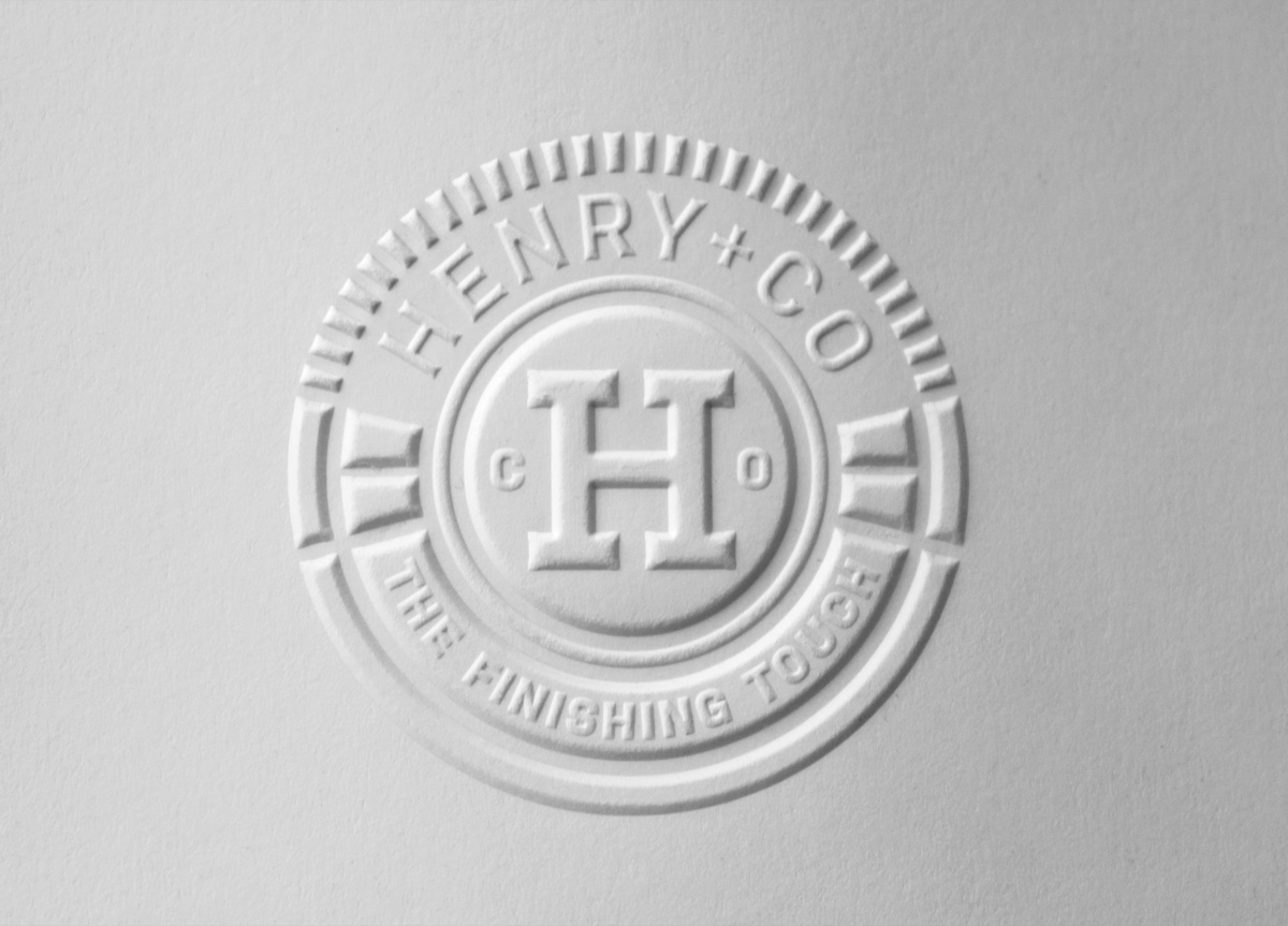
Jason Henry asked Lionel Ferreira to design a fresh look for his specialty print studio. He asked specifically for clean and simple design that would showcase the various print and finishing techniques offered at Henry and Company. He used Gucci as an example.
APPROACH
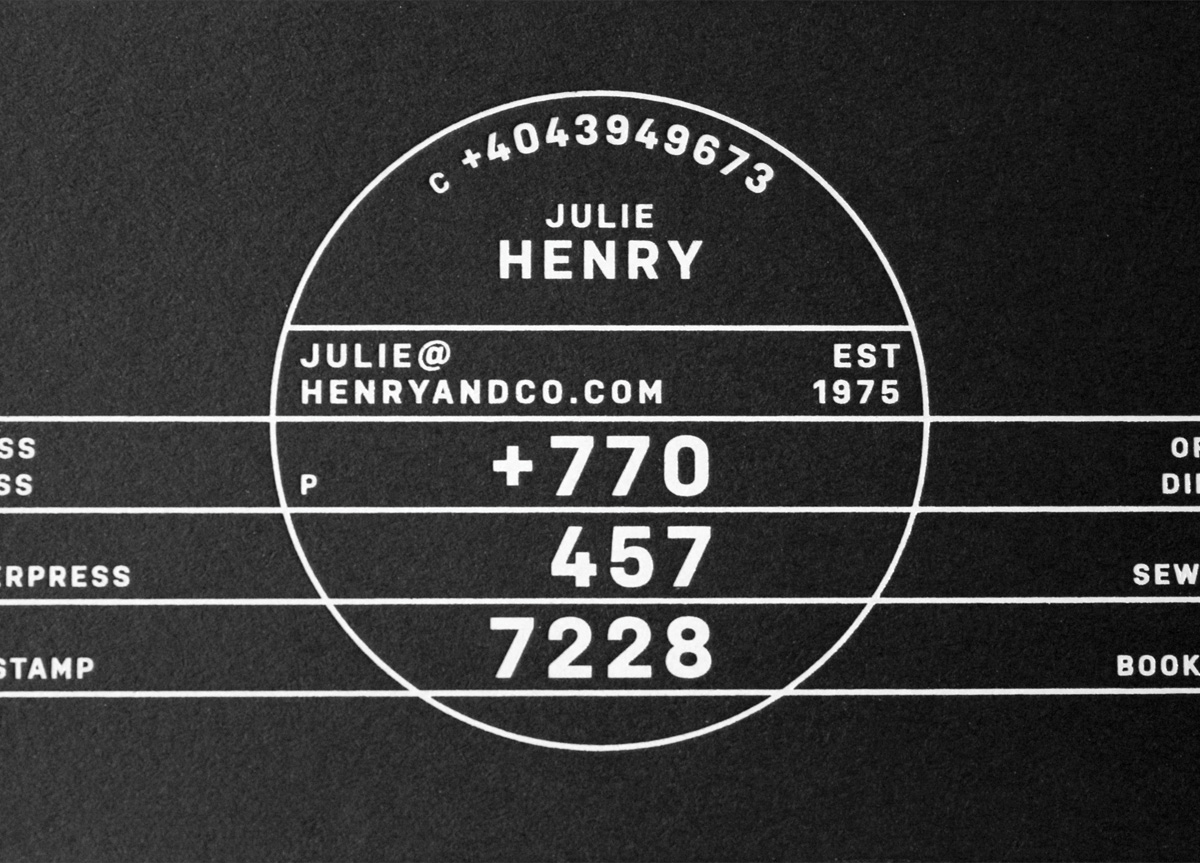
The Henry and Company business card was designed with a twofold objective: to serve as a tiny portfolio while providing contact information, as well as a list of print and finishing capabilities. The idea was to wow the receiver with a clean, simple, and sexy card showcasing great design and precision execution.


