CLIENT
Tangle is a brother-and-sister small property developer. The brother is a Los Angeles, CA-based architect who specializes in small dwellings; the sister is a Seattle, WA-based copywriter. Together they have a sense of adventure and lightness and they are a team of incredibly efficient hard workers.
BRIEF
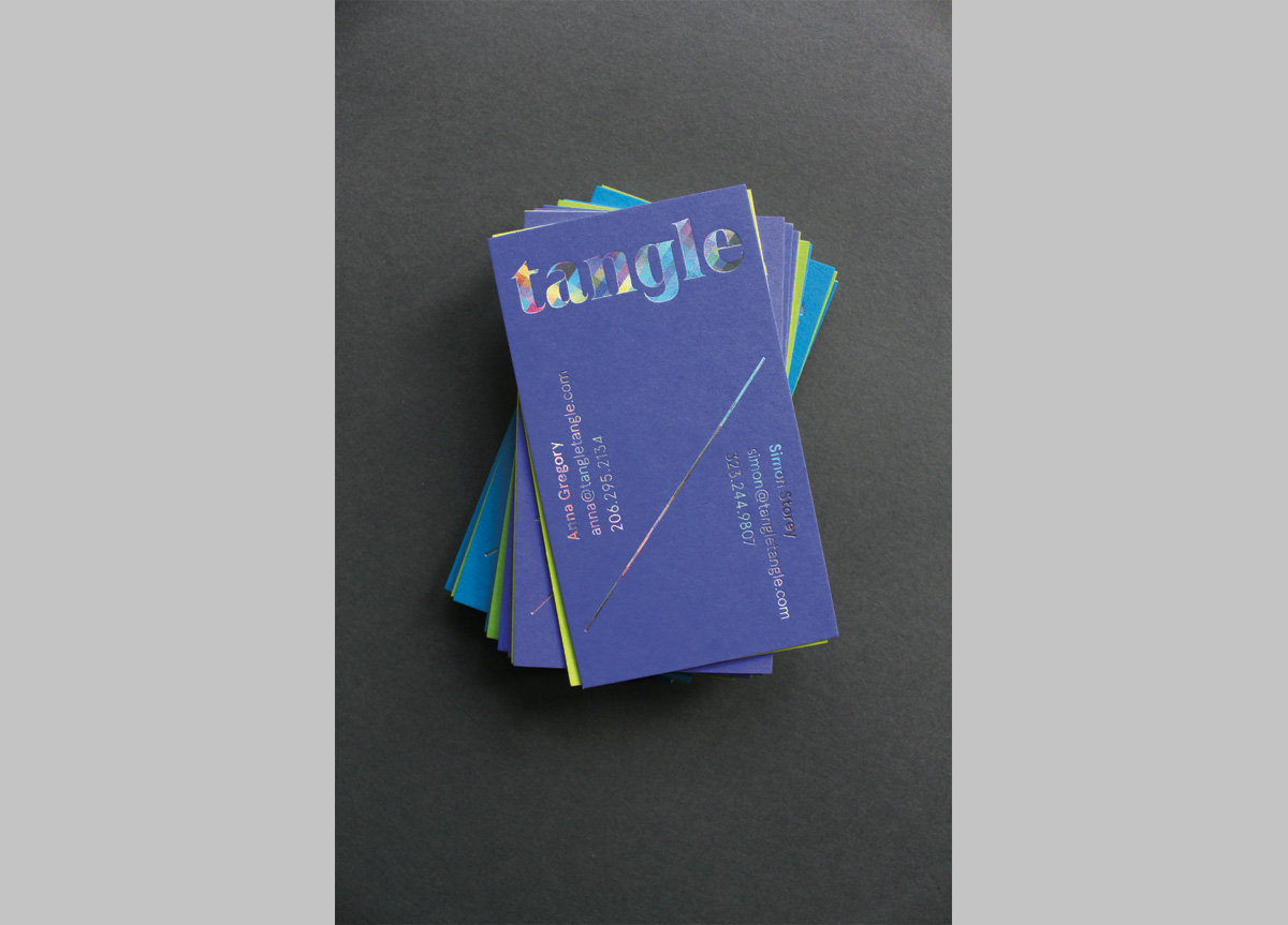
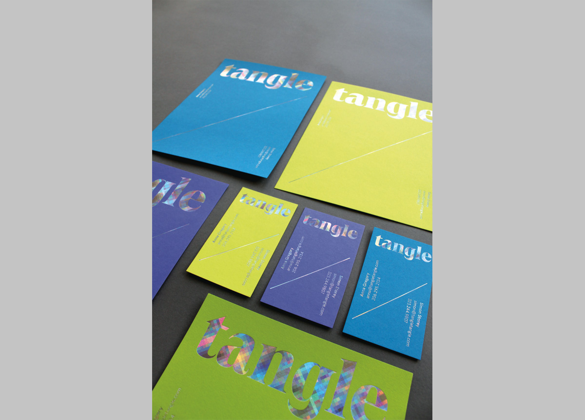
Tangle wanted a logo, shared business cards, and note sheets that were clean, modern, playful, and unexpected. Their audience is, first, themselves; second, bankers and potential backers; and, third, design and development colleagues.
APPROACH
Tangle surprised me by embracing the most ornate type, bright paper, and wild foil proposed—which is in keeping with Tangle’s mission of creating unexpected spaces. A single card serves both partners, with balanced hierarchy between them, where the card flips either way, depending on who’s giving the card. The cards are laminated in pairs of similar colors: blue with violet, yellow with green. The note sheet adapts the slash of the card so that each user can write in the part by their name, thus allowing for interesting compositions in each use.


