CLIENT
Adris Group is an investment company.
BRIEF
Create an annual report that would attract the public attention by portraying the values of Adris Group as a socially responsible company.
APPROACH
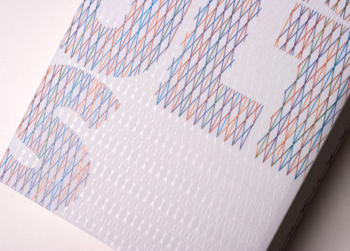
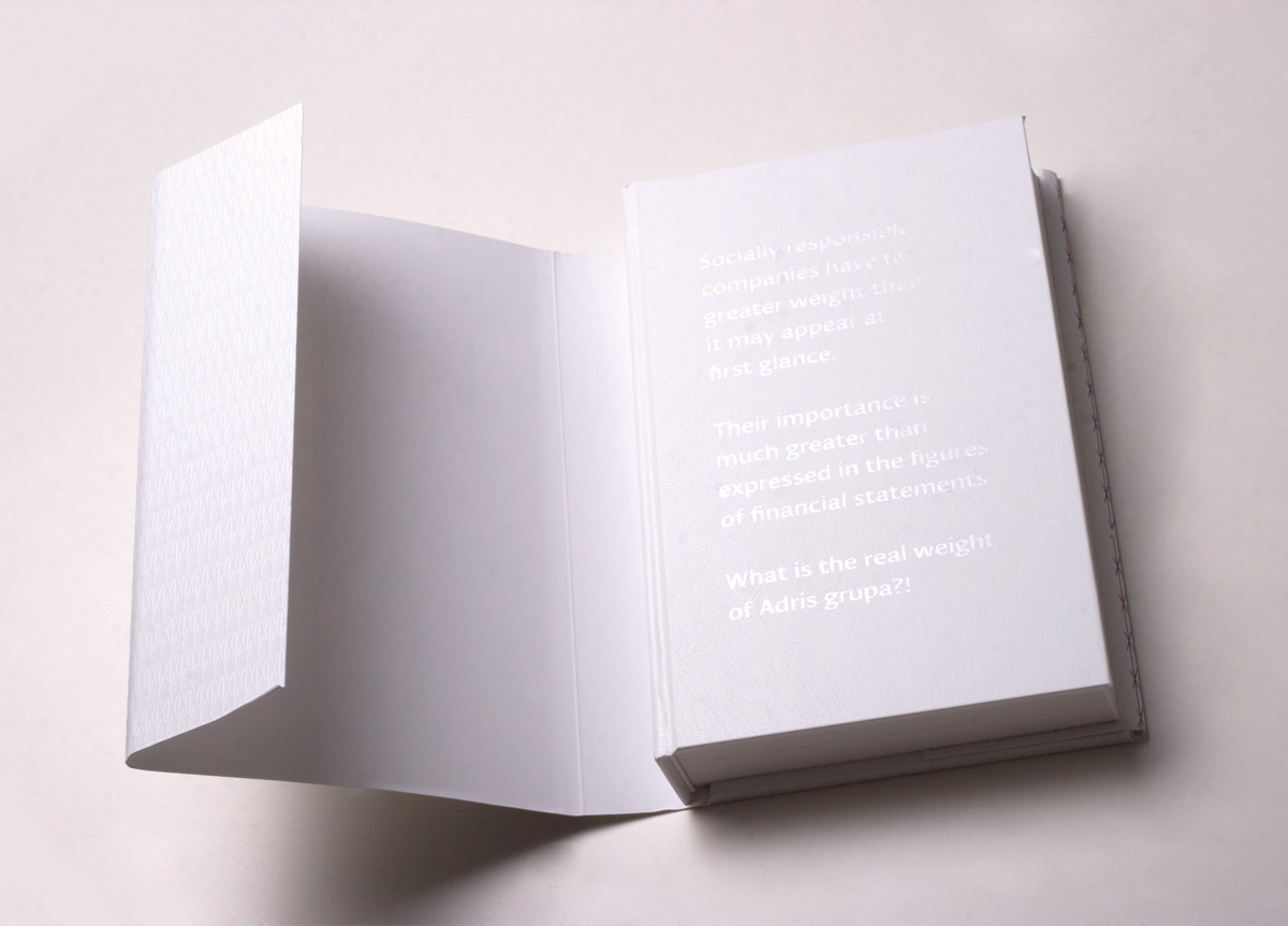
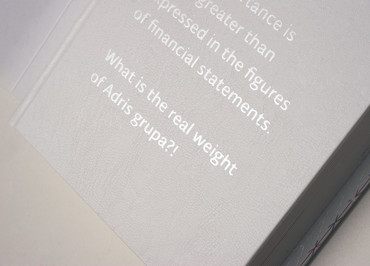
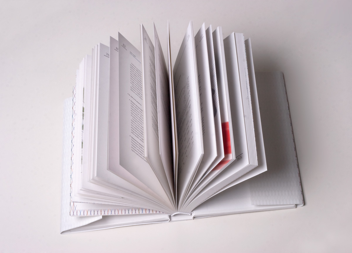
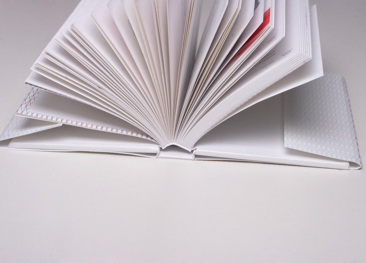
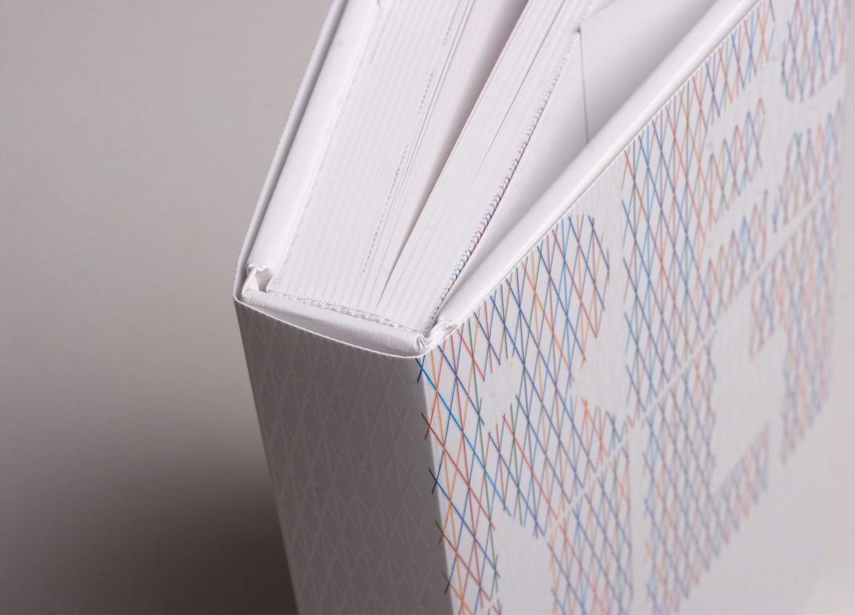
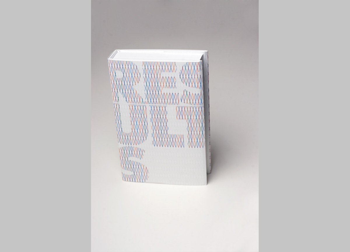
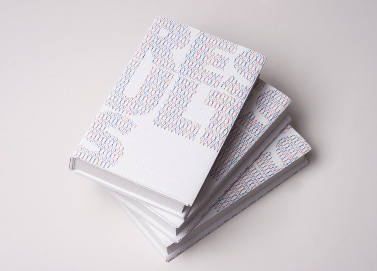
Adris group is a socially responsible company. Its significance and weight are much greater than what is expressed in dull, dry financial statements. That’s why this annual report, titled Results, poses a question: what is the real weight of Adris Group? The unexpected weight of the book invites the reader to consider the true weight of Adris Group. We achieved this by creating a composed cover with thick sheet metal in it. We tested lots of different solutions and we eventually came to one yielding best results.
PRODUCTION LESSONSWe were quite challenged by this project since we had never done something similar before. The cover was composed of various materials including sheet metal and it was very difficult to give it a standard cardboard sheet appearance. We had to put the sheets through a special process which included care for the artificial leather top sheet, since it could be easily torn by the metal inlay. This was a very difficult project but we gained a lot of experience.
Judge's Comments
It was not surprising to discover that this book was designed by Bruketa & Zinic, known for their ingenious “bakeable" annual report—for Podravka, 2006—that I have the pleasure of owning. Although a book fresh out of the oven may be a hard act to follow, this one does not disappoint. The significant weight of it was an immediate signal that this was no or dinary publication. The intricate cover stamping and elegant typography completed the package. — Louise Fili
Heavy. Interesting. Unforgettable. This was the clear winner, the piece that, because of its production, was impossible to forget. In addition to the interesting production, the type was beautifully executed. And it was also the only entry that could be used later as a weapon. — Robynne Raye
This book offers a pleasant surprise. The raised cover invites you to touch and feel the book, treating you to incredibly sound typesetting within. But, when you lift it up, this guy is heavy. It's the first time I've seen physical weight used as a communication element. It's the kind of keepsake book that makes you feel guilty if you ever think of throwing it away. — Mig Reyes
An unexpected design twist doesn't have to be a visual graphic surprise. Well executed simple type throughout did not detract from the books main feature: the weight. This book was what one can only imagine as a production nightmare. Working with heavy metal as the inner hard cover book board material made the simple message clear. — Ben Levitz
