CATEGORY

Offset

RANK


PRODUCTION DETAILS

Quantity

3,000 limited edition

Page Count

96 + Cover

Number of Colors

CMYK + 1

Special Techniques

Binding

Perfect bound

Dimensions

6 × 9


DESIGN CREDITS

Designer and Curator

Scott Massey

Designer

Mark Ho-Kane


PRODUCTION CREDITS

Photography

Brian MacDonald


TAGS

, , , , , , , ,


LINKS

nohawk.com
rrrproject.com
westcanpg.com

Book for RRR Project by Nohawk


CLIENT

The RRR Project is con­cerned with tying togeth­er the left­overs and scraps cre­at­ed by the actions of today and yes­ter­day. Cre­at­ing con­nec­tions between artists of diverse back­grounds, gen­er­a­tions and loca­tions, we are inter­est­ed in telling a uni­fied sto­ry that sums up the world today. 


APPROACH

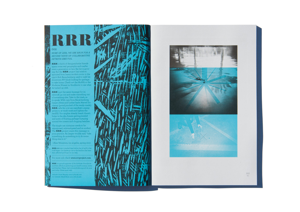
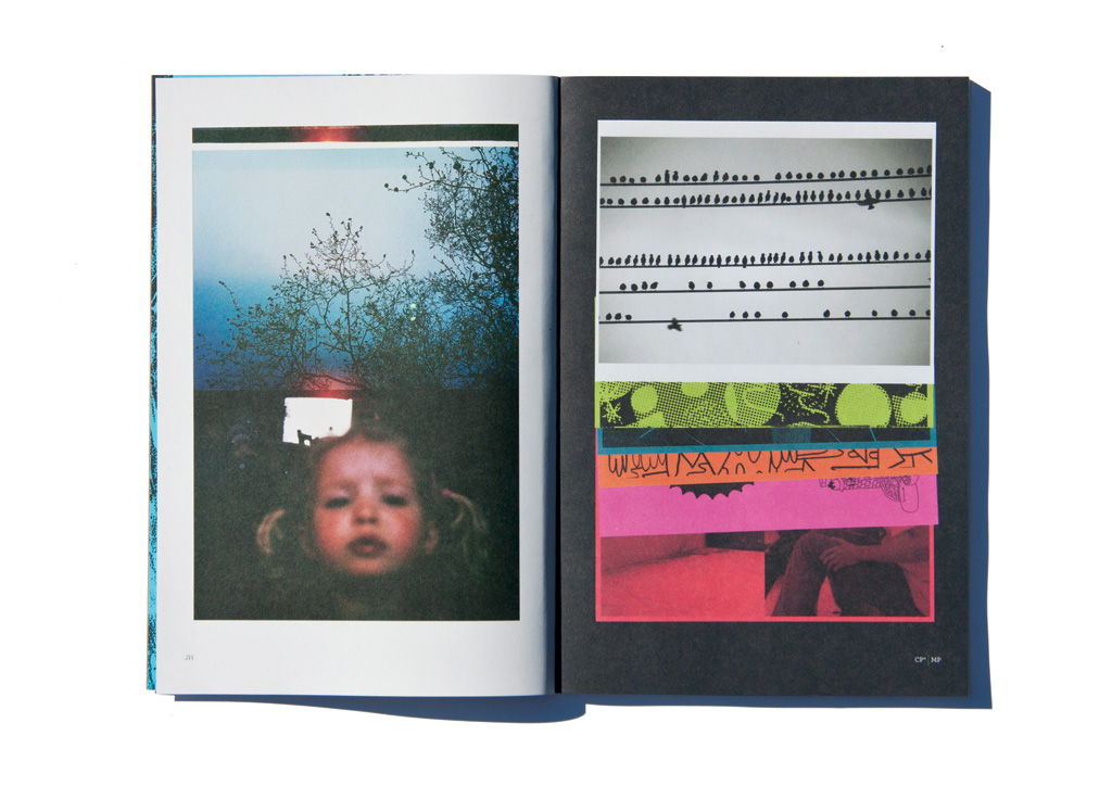
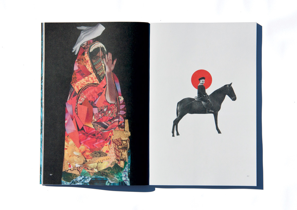
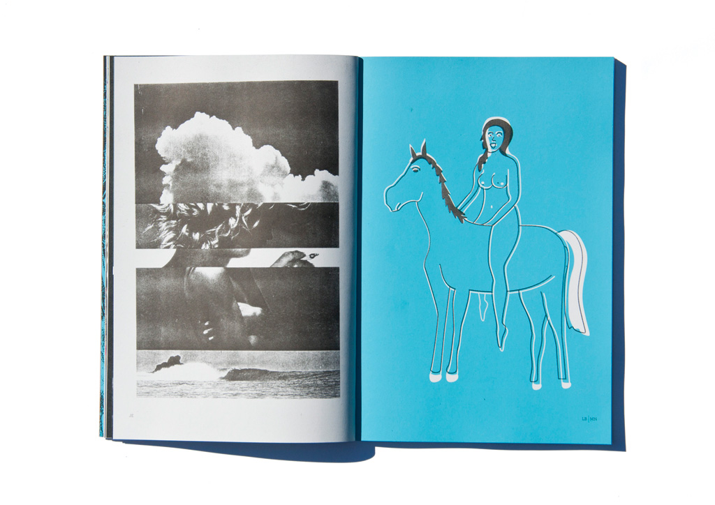
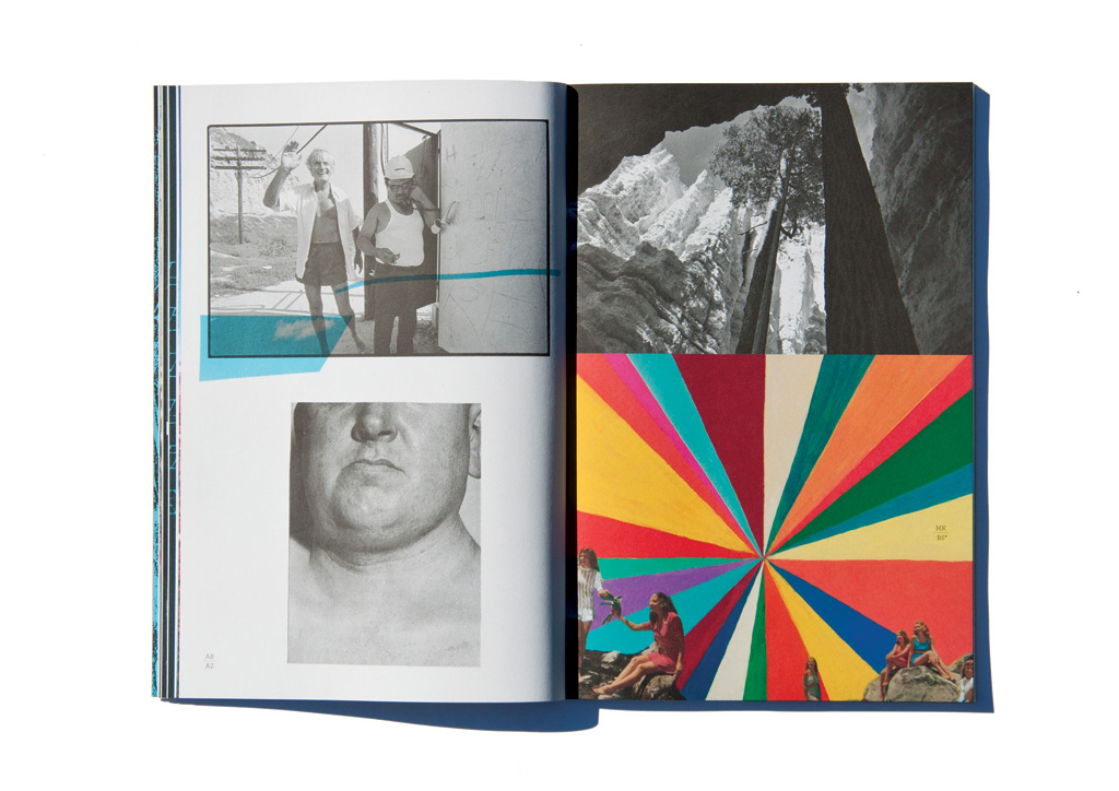
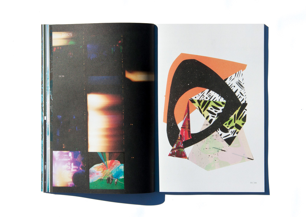
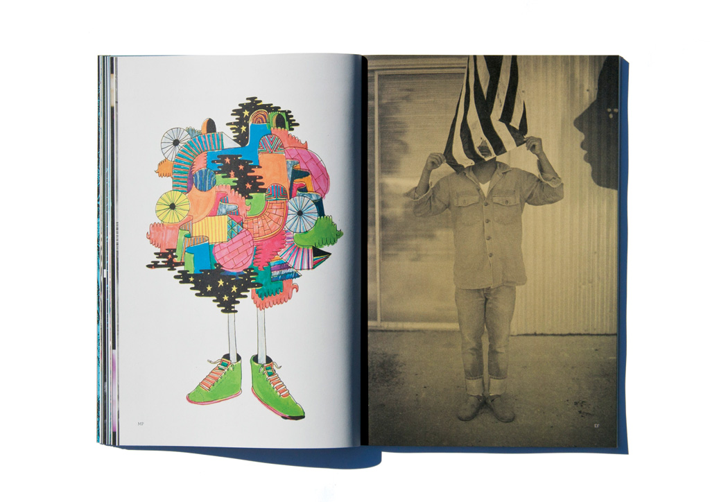
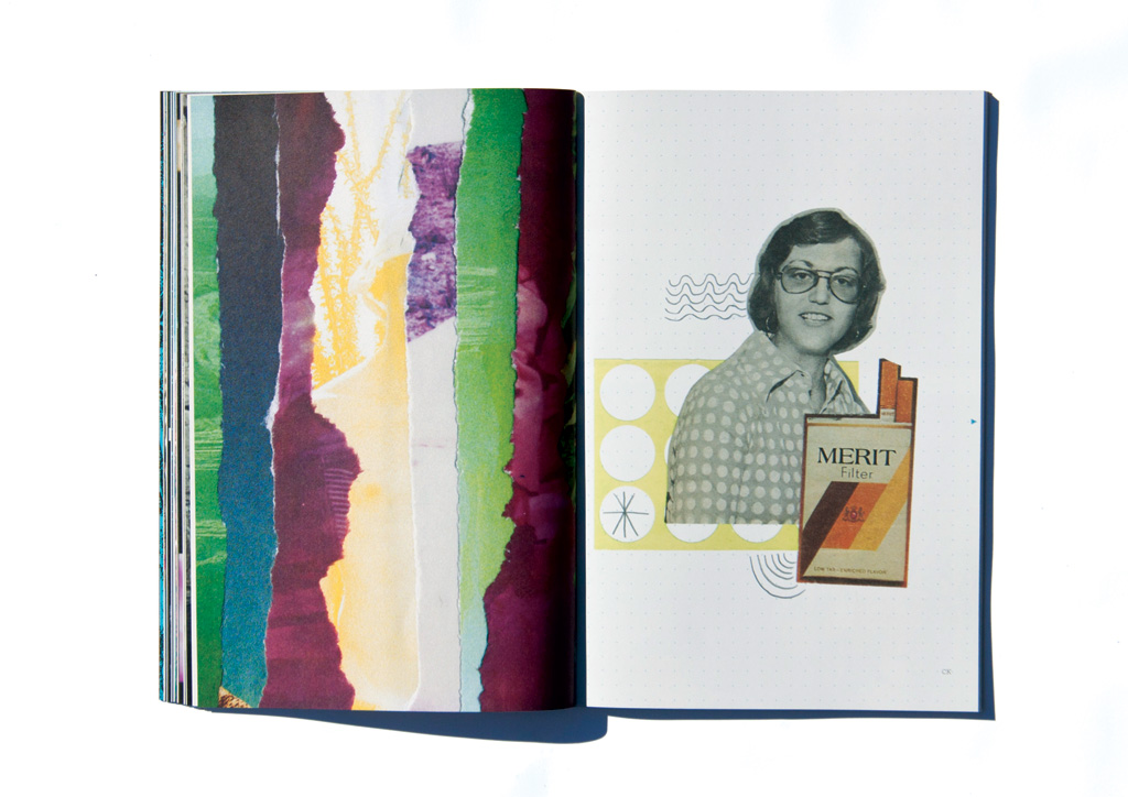
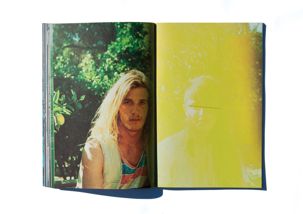
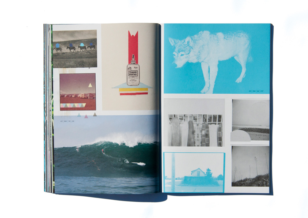
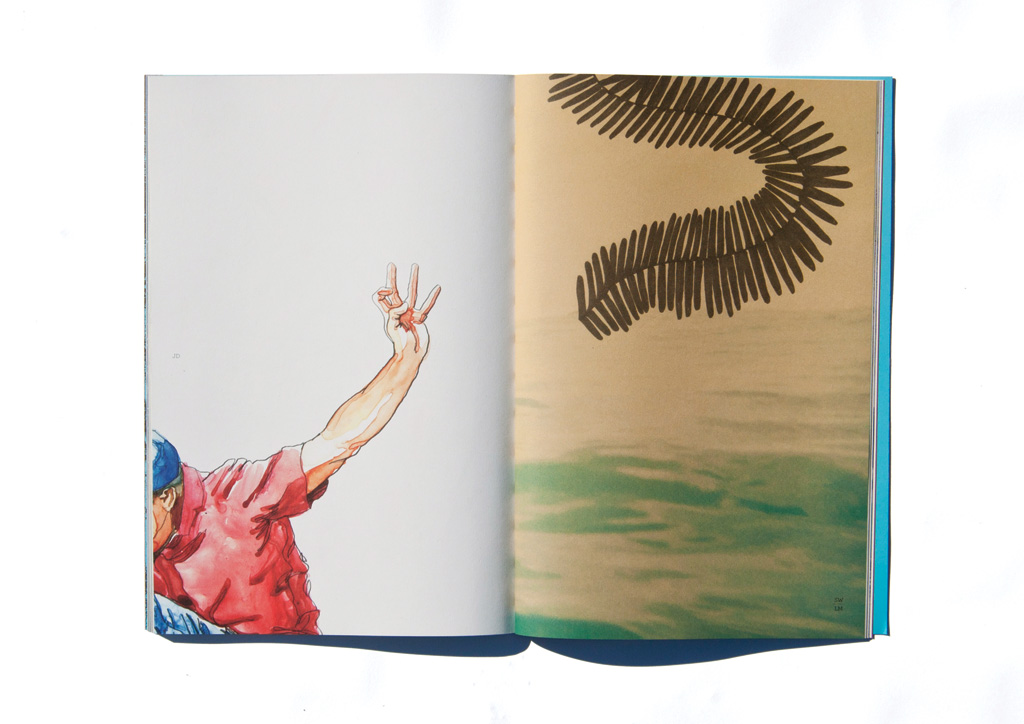
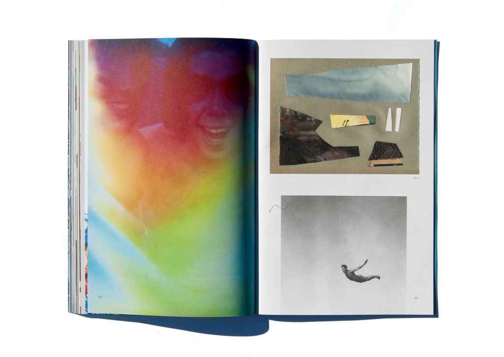
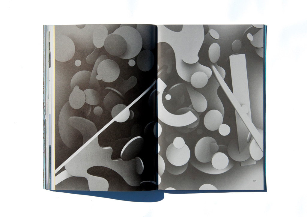
Our sec­ond round of image mak­ing, RRR.002 is a lit­tle more col­lab­o­ra­tive and per­son­al than the first. We invit­ed artists to present work that gave a more inti­mate state­ment about the world today. In an effort to keep our­selves hon­est to the project, we also went around to some of the artists’ stu­dios to learn more about them, see their envi­ron­ments, talk and make new work togeth­er (col­laged bits of their work with ours). Seems like we almost dou­bled the amount of con­trib­u­tors from the last one, span­ning gen­er­a­tions, back­grounds, and geography.

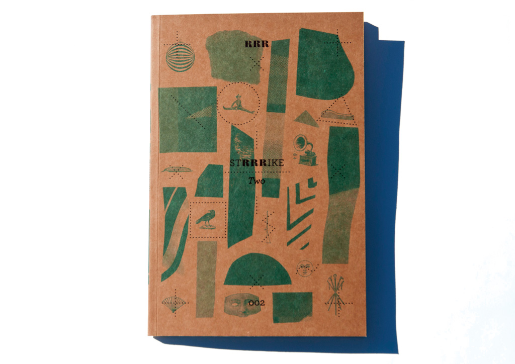
Two lessons were learned in the production phase of RRR.002: always trust your printer and when in doubt hit it hard! We chose a 100% post-consumer recycled chip board for the cover, knowing that it would fit well with our concept and add to the tactile nature of the physical object. Due to the nature of the stock, printed graphics usually must be solid bold shapes. Our cover not only used one layer of blue but also contained halftone dots which would be risky to print twice. To solve this, the team at Westcan decided to hit the blue layer once really hard successfully printing our design.

Browse entries