CATEGORY

Binding

RANK

Judge’s Pick


PRODUCTION DETAILS

Quantity

500

Page Count

216 + Cover

Number of Colors

CMYK + 2

Special Techniques

Cover Spot UV gloss varnish

Binding

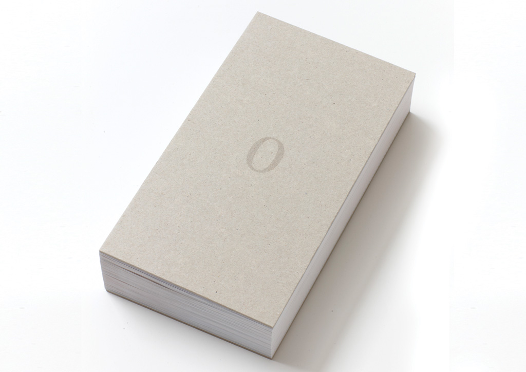
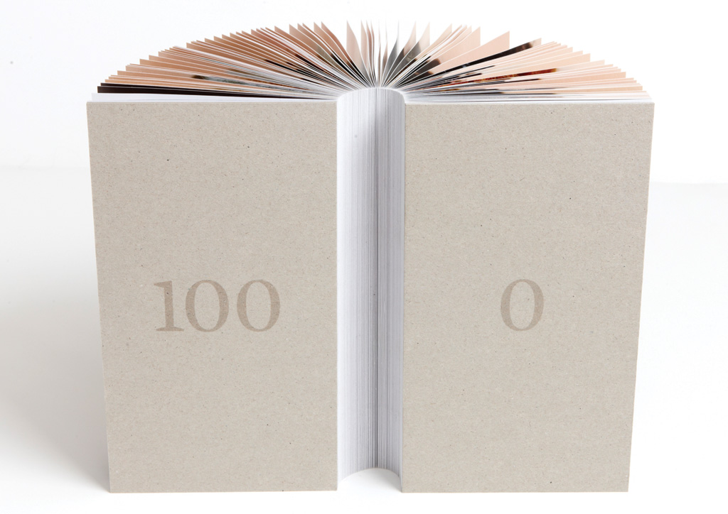
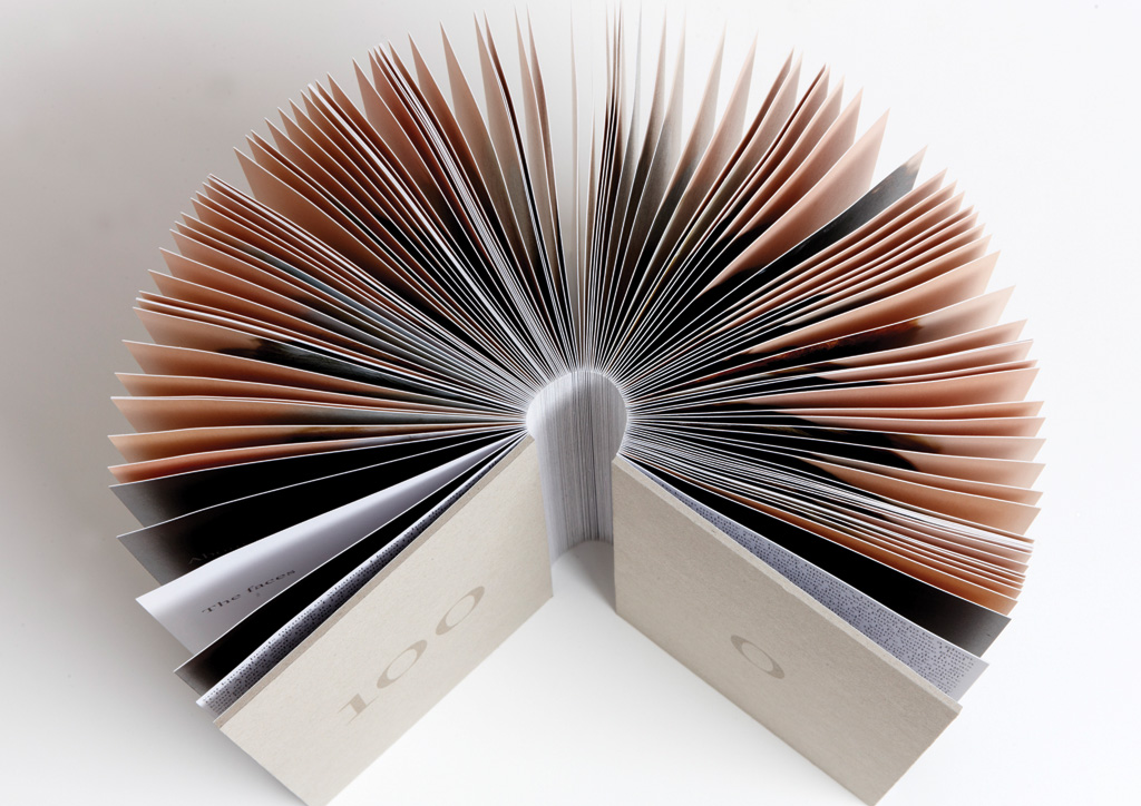
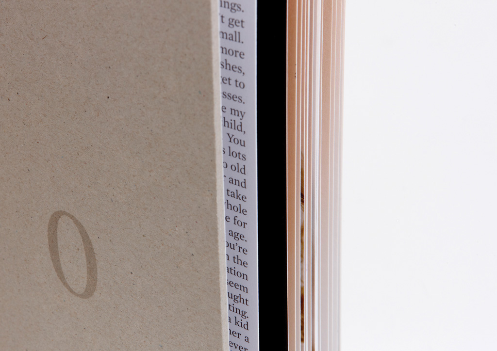
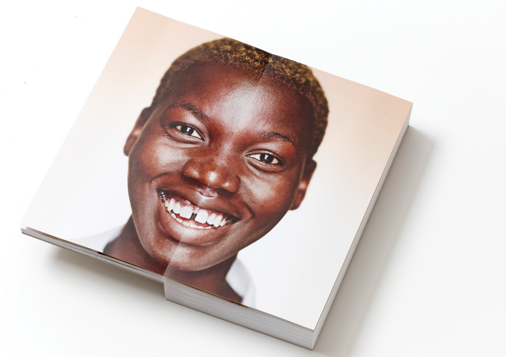
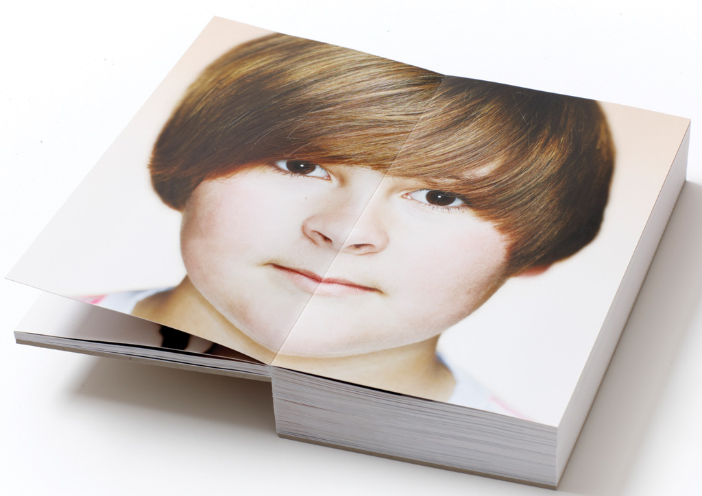
Panoramic bound

Dimensions

Flat 11 × 10
Finished 5.5 × 10 × 2


DESIGN CREDITS

Creative Director

Carey George

Designer

Ryan Booth

Photographer

Sandy Nicholson


PRODUCTION CREDITS

Binder

Specialties Graphic Finishers Ltd.

Retouching, color separations and specialty printing inks

The Gas Company


TAGS

, , , , , , , ,


LINKS

upinc.ca
flashreproductions.com
sandynicholson.com
0to100project.com

Book for 0to100 by Up Inc


CLIENT

0to100 is the result of a col­lab­o­ra­tion between Flash Repro­duc­tions, Up Inc, and Sandy Nicholson.


APPROACH

The peo­ple at the print­ing com­pa­ny Flash Repro­duc­tions, told the peo­ple at a brand­ing agency, Up Inc, about a cool new book­bind­ing tech­nique. Intrigued by the pos­si­bil­i­ties, they enlist­ed well-known pho­tog­ra­ph­er Sandy Nichol­son, and a crit­i­cal mass of oth­er part­ners, for a unique col­lab­o­ra­tion. Look­ing to show­case a new bindery tech­nique that allows full, seam­less dou­ble-page spreads, the part­ners in the project col­lab­o­rat­ed in putting togeth­er the “0 to 100” pho­tog­ra­phy project (an image of a dif­fer­ent per­son to rep­re­sent every year of age, from 0 to 100). This book—one com­po­nent of the project, which also includes an iPad app and website—is a graph­ic and ver­bal nar­ra­tive on aging. An under­stat­ed design, with sim­ple typog­ra­phy and plen­ty of white space, avoids com­pet­ing with the images.

The biggest challenge was finding a paper and glue combination that could be laminated together to eliminate curling of the text/photography pages. We worked closely with the printer and the bindery to experiment with different combinations of sheets and glue, until we found the one that worked best.

Judge’s Comments
I’m not sure I would define it as radical, but it might qualify for xtreme, off the hook, gnarly, or epic. — Charles S. Anderson

We all kept coming back to this piece because of the binding. It is really a wonderfully put together book and the partnership between the printer and photographer was a great match. — Jessica Hische

Simple, elegant, and a pleasure to hold. — Marc English

Browse entries