An image is worth more than a thousand words

That's the header for this spread. I thought the image was so strong and beautiful that it deserved half of the spread. All the spreads in this catalogue have different approaches for text arrangements, I think this one is my favorite.

Click here for a larger image

 
Another buzzer beater

This is a spread for a basketball magazine I did in school. All the spreads have a lot of white space and contrast. I'm a real basketball fan, so I wanted to get one of Jordan's biggest shots, the one against Cleveland in the playoffs, so all true basketball fans will appreciate that detail. Anyhow, I wanted to make the picture more interesting and tie it with the title of the article "The rebirth". The cropped image gives a more dramatic feeling to the spread.

Click here for a larger image

 
A lot of water

Suntory Water Group is one of the largest bottled water providers in the US, among its various products. This is their corporate site. What I like about it is that we had one week to design and build it. I designed a very easy to build site so we could just change images and content. It's square and very tight to make it look like a serious company and by using the "water" texture on top it livens up the page and makes it more interesting.

Click here for a larger image

 
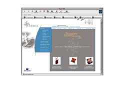
Can we make the buttons look more like buttons?

The website is for the same bankrupt client. This is just the second website I have ever designed, so my inexperience in web design really paid off. The result is a commercial website that didn't look like all the websites you see, the navigation wasn't all the way to the left or at the top, the buttons didn't look like buttons, and boy, did we have a hard time selling it to the client. We designed twenty templates for the client for them to build all the pages, and the day after we delivered everything they didn't have any more money.

Click here for a larger image


Back to the first page of work

Back to Top