Not all of my work is here. This way if you're interested you can contact me, we'll get together and you can see my complete portfolio, in a way this is just a tease. However, my favorite and strongest (I think) projects are in here.  
 
My first winner in a contest

I submitted this logo to the HOW International Design Annual 2000 and I got a merit award in the student category. I'm really proud of it. The logo is for a festival that takes place every year in Mexico City. It's a cultural event with lots of exhibitions, concerts and lectures. So the logo had to convey both cultural and festival qualities.

Click here for a larger image

 
Ready to file for Chapter 11

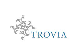
This logo is for an online retail store specializing in expensive stuff. They sold pillows, wallets. You name it, they sold it and for a lot of money. This logo had to represent something unique, precious, expensive, and it had to appeal to both men and women, with the latter being more dominant. So I came up with this abstract pattern. People had good reactions to it, some said it looked like a medallion, that it looked expensive. This is my favorite logo, sadly the company went bankrupt and the logo is just sitting there.

Click here for a larger image

 
Do you want to smell like a real man?

I generally don't do illustrations, because I'm not really good at it, but I just wanted to give it a shot for this school project. We had to create a box and the image for a fragrance for men. I chose to do something really bizarre, I don't think anybody wants to smell like a dragon, but I think it conveys a strong and aggressive image that men may be interested in portraying.

Click here for a larger image

 
Another creepy one

This is another school project. We had to design a label for a bottle of red wine. I wanted to make a wine that would appeal to all the people interested in magic or the unknown. So I looked for illustrations on some books about magic and found two that I liked. I made a collage of these two images, I also incorporated an old manuscript I found, this made it look like there was a spell written on the label. I really like the label and I think if fits my target audience (which I made up).

Click here for a larger image

 
Combining elements

I created this typeface for my thesis project. The concept behind it is taking some elements from the Hebrew alphabet and applying them to the Latin alphabet. I did a lot of research on the Hebrew alphabet so I could decide which elements from this alphabet to use. I wanted the result to be a very dynamic typeface. The name of this typeface is Tirkovet, it means combination in Hebrew

Click here for a larger image

 
Just with one stroke

The challenge with this typeface was creating each character with only one continuous line. That's why in some characters there's a line that goes from one side to the other. I think it has a very interesting texture, with very solid forms son you can identify each character easily. The name of this typeface is Stress.

Click here for a larger image


There's another page with work

Back to Top