
About this Year’s Identity
As is usual for our BNConf identities where we like to mix and match a number of ideas that are specific to the location of our host city, Amsterdam has proven to be quite difficult. Because there are so many references to draw from, ideas to expand on, and visual idioms to embrace. In the end we chose three-slash-four elements to build this Amsterdam-specific identity.
Adopting the ××× visual device used throughout Amsterdam as part of the City’s official identity and a key design element of its coat of arms is borderline cliché and an expected design solution but we love ×’s and we weren’t going to deny ourselves the pleasure of using them as long as we made sure to offer a new take on it. From the very beginning we settled on this as the main identity element.
A very small sampling of the use of the three vertically-stacked St. Andrew's Crosses in the coat of arms, City of Amsterdam identity, and more.
Another element is the distinctive Canal Ring structure at the heart of Amsterdam where each canal — Singel, Herengracht, Keizersgracht, and Prinsengracht — grow in diamater as they span away from the center. We love ×’s at UCllc but we have room in our heart for concentric circles just as well.
The Canal Ring of Amsterdam as concentric circles.
The third element… well, how could you avoid this?
“I amsterdam” letters at the back of the Rijksmuseum on Museumplein. Photo by Kevin Gessner.
No, we are not talking about the photogenic letters but about what’s behind them: the Rijksmuseum, home to over 8,000 objects that “tell the story of 800 years of Dutch art and history, from the Middle Ages to Mondrian.” Apart from its significance as a museum, the Rijksmuseum has an amazing digital collection that not only showcases some of the masterpieces that people travel the world over to see in person but makes them available for download. In HIGH resolution. For anyone to use as they please. No strings attached. All images have been placed in the public domain. Few other museums — let alone cities or whole cultures — have such a generous collection available for use so it was a source we simply had to take advantage of somehow.
Vermeer, van Gogh, Rembrandt. Just a few of the artists and works available digitally in the Rijksmuseum.
The last, fourth-ish element are the bicycles of Amsterdam. We say it’s an -ish element because you could build a whole design language on bicycles in Amsterdam alone but we just used it as a small nod to that aspect of the city.
Bicyclists in Amsterdam go zoom-zoom. Photos by Sadettin Canbay, FaceMePLS, and Jackie.lck.
So how do these things come together?
The three ×’s are used as the starting point for a grid of 9-by-9 individual ×'s or 3-by-3 Amsterdam ×××’s. At first we laid out the ×’s all at the same size but that looked bland so with the idea of the concentric circles we let the ×’s become smaller or bigger as they radiated from the center.
A 3-by-3 grid of 3 ×’s with concentric scaling (×’s can get bigger or smaller as they move away from the center).
The concentric circle element also has a role in the animation of the grid, staying in constant motion, radiating off the center.
The grid’s consistent motion.
From the 9-by-9 grid, each with its own radiating animation, we started carving away ×’s to create “BNCONF”. The first step was simply to come to a consistent set of letters. At first we even thought that these were going to be the final letters for the logo, but something was missing.
The "thicks" of the letters are 3 ×'s bringing it full circle to the St. Andrew's Crosses.
The letters above weren’t the most dynamic and it started to look more like embroidery than anything else. This is where the nod to Amsterdam’s bicycles comes in: we gave the letters a slight tilt, like a person leaning forward on a bike, to give them more motion and break away from the squared look we had above.
Like Amsterdam's cyclists, our letters are ready to go zoom-zoom.
All this amounts to the final BNCONF logo:
Whenever it appears on screen it will always be in motion.
We added a simple frame at the end to include “AMSTERDAM” in the lock-up and a small “20” / “16” on the corners.
Final lock-up for web use.
In static applications we are thinking there will be a light (above) and bold (below) version of the logo and any other letters we make by reversing the size of the × at the center.
Bold version.
And there are a few configurations we can use.
One kind of lock-up.
And another.
The logo is animated on the website through a single SVG file and CSS animation, so it will scale across any browser and keep the load time to a minimum (to make up for the XL background images!). The different configurations also allow it to work in the responsive layout of the site (which is best seen on a desktop with the browser window quite wide).
Since the logo on the website has a fully transparent “background” that’s where the Rijksmuseum images come into play, seeping through the ×’s and the transparent navigation (that has a built-in background on rollover for, you know, readability). We like the notion of these images as the backgrounds representing the Brand Nieuwe Conference coming into a city and culture with such a rich tradition in art and history and contributing something new to it, even if it’s just for a fleeting couple of days. A complete list of the images we used is below the end of the explanation.
The identity will use Grilli Type’s Sectra which is a beautiful serif with hard corners that reminded us of the more strict turns the canals take when seen on a map and Font Bureau’s Titling Gothic Wide because it’s not a geometric sans.
That’s all we have at the moment and now it’s time to figure out how this translates into the rest of the materials.
Full view and details of images used in the background
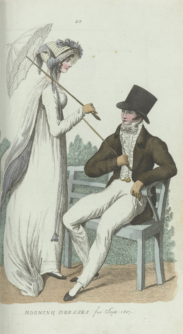
Elegantia, or magazine of fashion, luxury and taste for women, in September 1807, No. 20: Morning dresses for Sept. 1807, anonymous, Evert Maaskamp, 180
Engraving, colored by hand, h 223mm × 123mm b
Rijksmuseum link
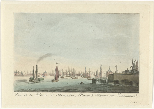
View of the port of Amsterdam, Roelof van der Meulen, Evert Maaskamp, 1816 - 1833
Etching and aquatint, brush in color, h 137mm × 196mm b
Rijksmuseum link
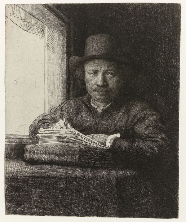
Self-portrait of Rembrandt etching by a window, Rembrandt Harmensz. van Rijn, 1648
Etching and drypoint on Japanese paper, h 160mm × 130mm b
Rijksmuseum link
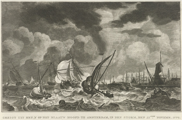
Storm on the IJ to the Blue Head Amsterdam, 1776, Noah van der Meer (II), Hendrik Kobell, 1778
Etching, h 192mm × 291mm b
Rijksmuseum link
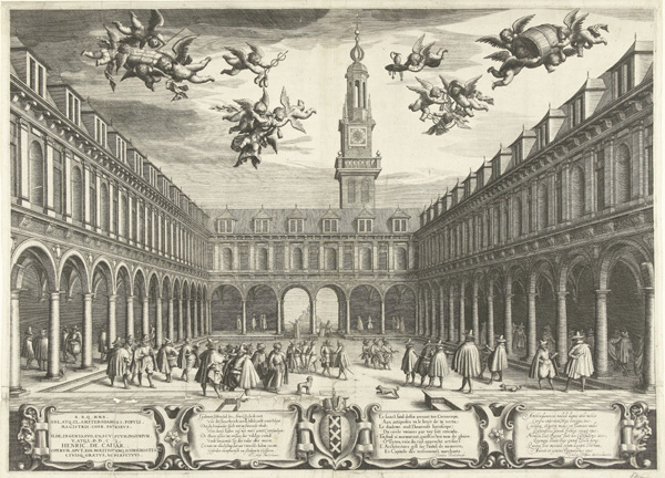
The Amsterdam Stock Exchange, 1609 Boëtius Adamsz. Bolswert, Pieter Cornelisz Hooft, Theodore Rodenburgh, 1609
Etching and engraving, h 432mm × 601mm b
Rijksmuseum link
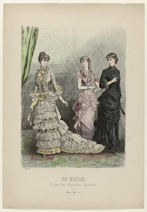
The Bazar, 1882, Nr. 16, Pl. 511, anonymous, brothers Belinfante, 1882
Wood engraving, colored by hand, h 382mm × 270mm b
Rijksmuseum link
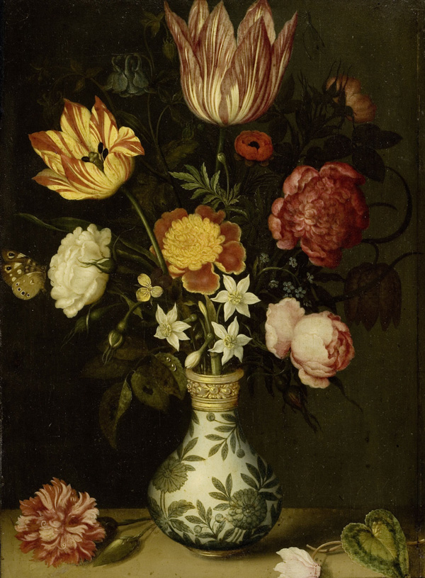
Still Life with Flowers in a Wan-Li Vase, Ambrosius Bosschaert, 1619
Oil on copper, H 31cm × W 22,5cm
Rijksmuseum link
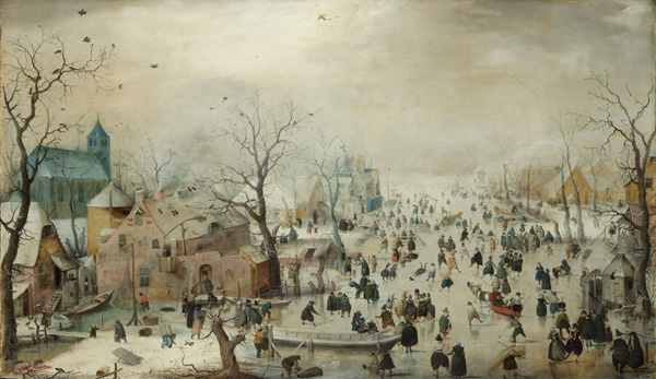
Winter Landscape with Skaters Hendrick Avercamp, ca. 1608
Oil on panel, h 77,3cm × b 131,9cm
Rijksmuseum link
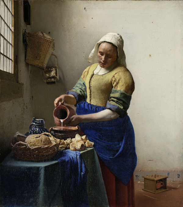
The Milkmaid, Johannes Vermeer, c. 1660
Rijksmuseum link
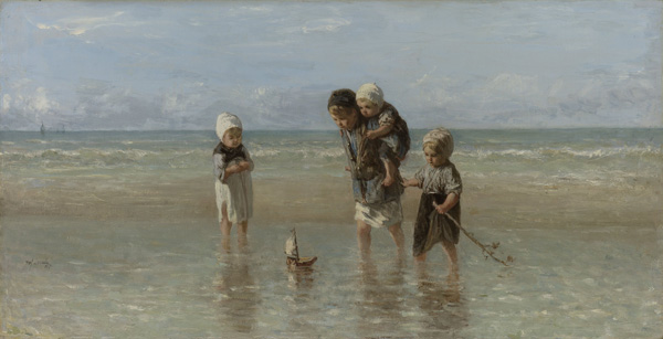
Children of the Sea, Jozef Israels, 1872
oil on canvas, h 48,5cm × 93,5cm b
Rijksmuseum link
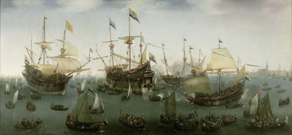
The return to Amsterdam of the Second Expedition to the East Indies, Hendrik Cornelisz. Vroom, 1599
Oil on canvas, H × W 102,3cm 218,4cm
Rijksmuseum link
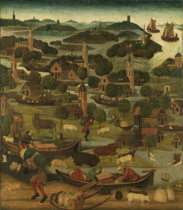
St. Elizabeth Flood, Master of the Holy Elisabeth panels, anonymous, ca. 1490 - ca. 1495
Oil on panel, H × W 127,5cm 110,5cm. Catalogue entry
Rijksmuseum link
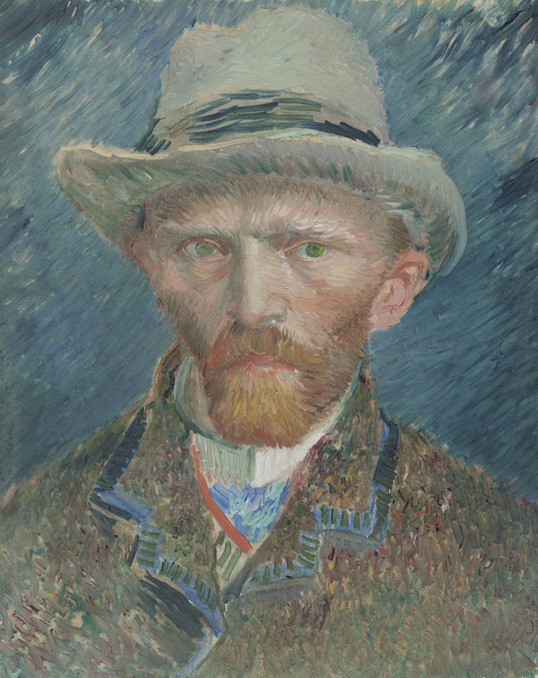
Self-portrait, Vincent van Gogh, 1887
Painting, h 42cm × w 34cm × d 8cm
Rijksmuseum link
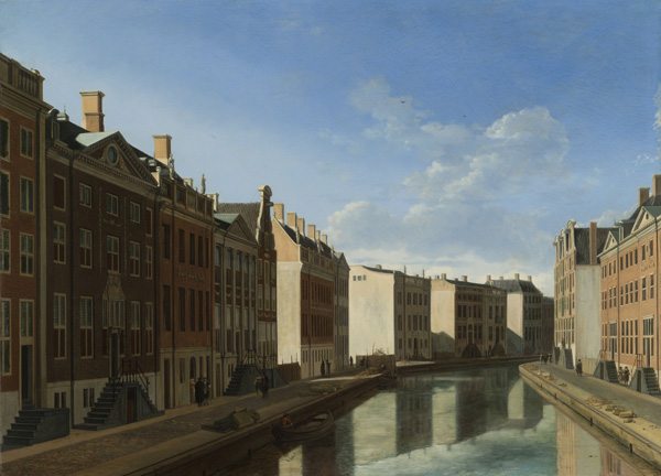
View of the Golden Bend in the Herengracht, Gerrit Adriaensz. Berckheyde, 1671 - 1672
Oil on panel, 42.5 cm H × W 57,9cm
Rijksmuseum link
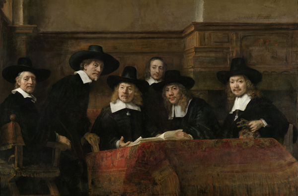
The Sampling Officials of the Amsterdam Drapers' Guild, known as 'The Syndics', Rembrandt Harmensz. van Rijn, 1662
Oil on canvas, h 191.5cm × w 279cm
Rijksmuseum link
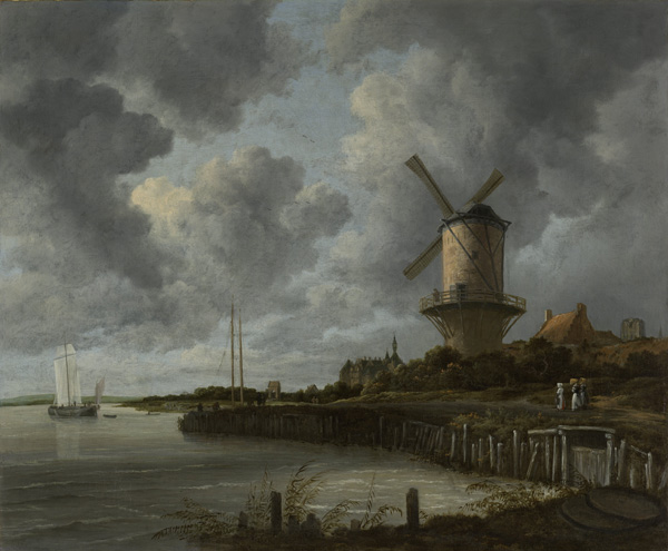
The Mill at Wijk bij Duurstede, Jacob Isaacksz. van Ruisdael, ca. 1668 - ca. 1670
Oil on canvas, H 83cm × W 101cm
Rijksmuseum link
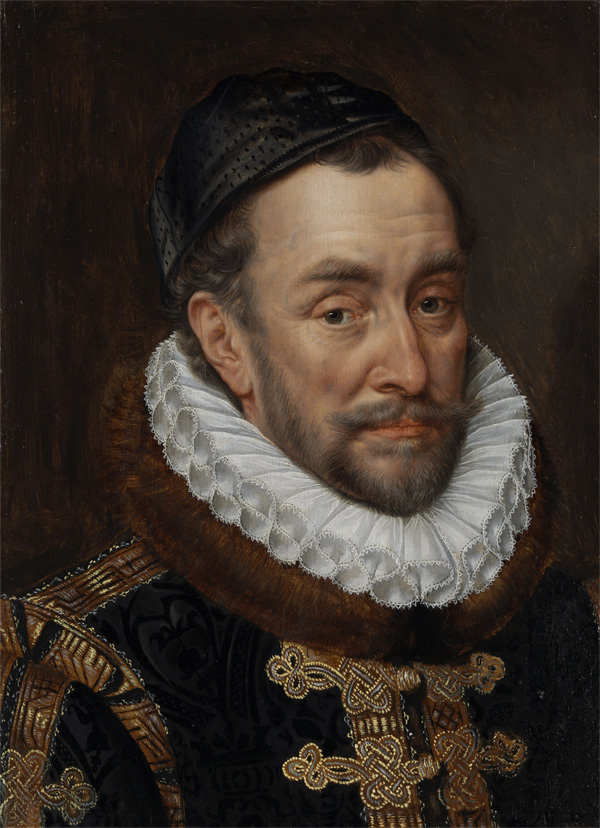
William I, Prince of Oranje, Adriaen Thomasz. Key, c. 1579
Oil on panel, h 48cm × w 35cm
Rijksmuseum link