About the Identity
Our last two conference identities — for Amsterdam and Nashville — were chock-full of references, which is an approach we love to take. This year, however, there is only a single point of reference: The Cloud Gate by Anish Kapoor at Millennium Park, the public space that is also home to Harris Theater, where the conference will take place.
Cloud Gate, or “The Bean”, is undeniably joyful and a crowd-pleasing piece of public art. Its size and shape are key elements to its popularity but it’s the reflections that capture people’s attention and imagination. The way it distorts the perfectly horizontal and vertical grids of buildings and streets around it and the tiles underneath provides such a simple, visual pleasure and that’s what we wanted to mimic in this year’s identity.
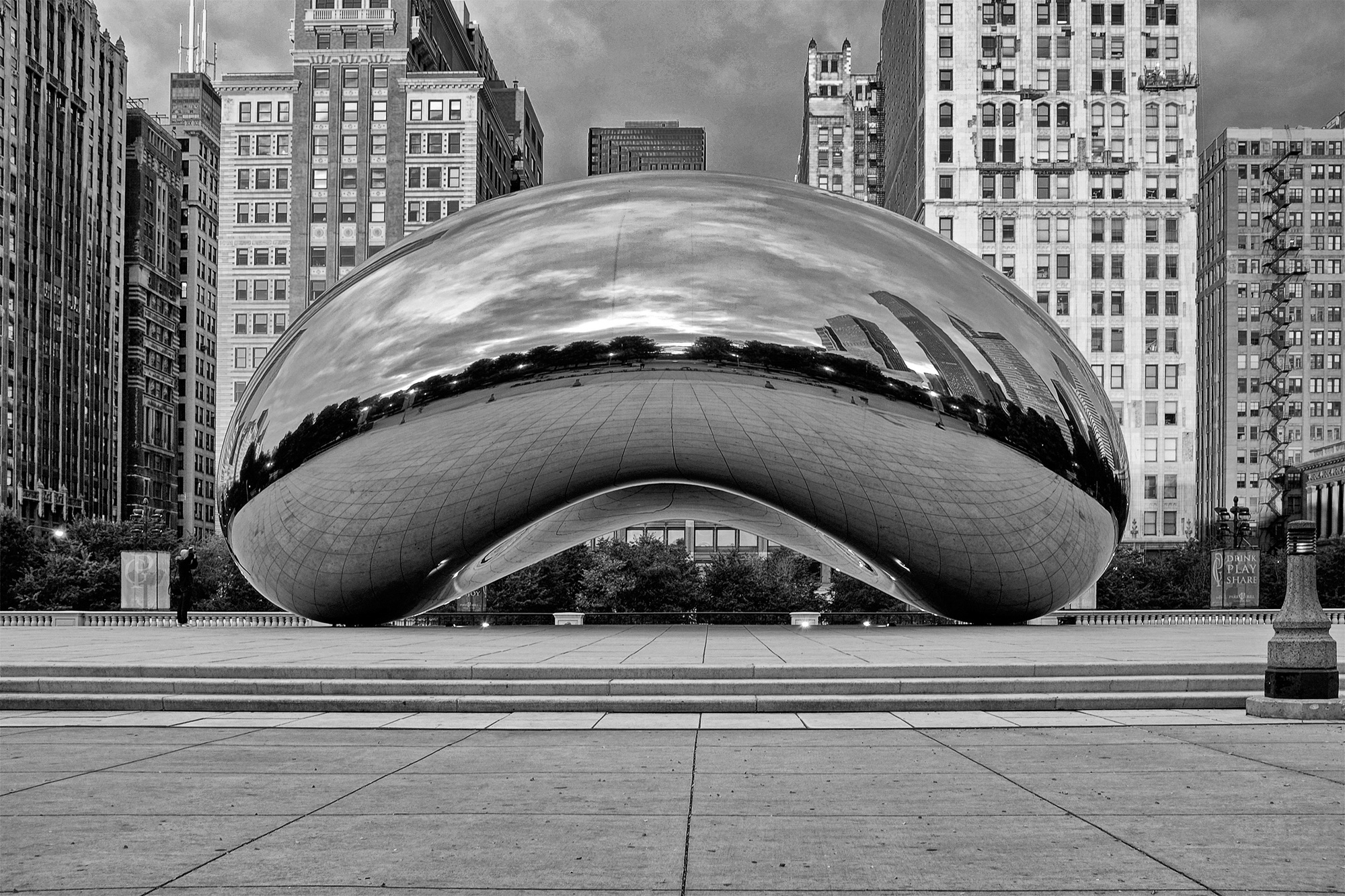 The Cloud Gate by Anish Kapoor in Millennium Park. Photo by Timothy Neesam.
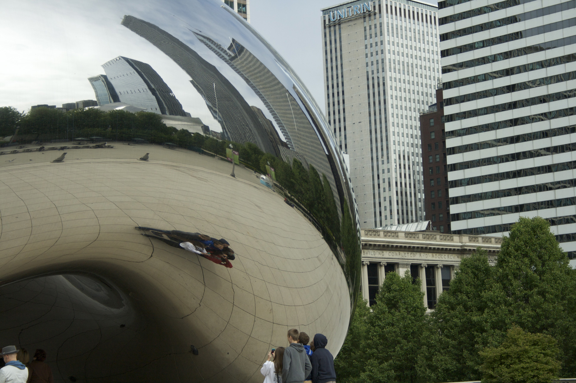
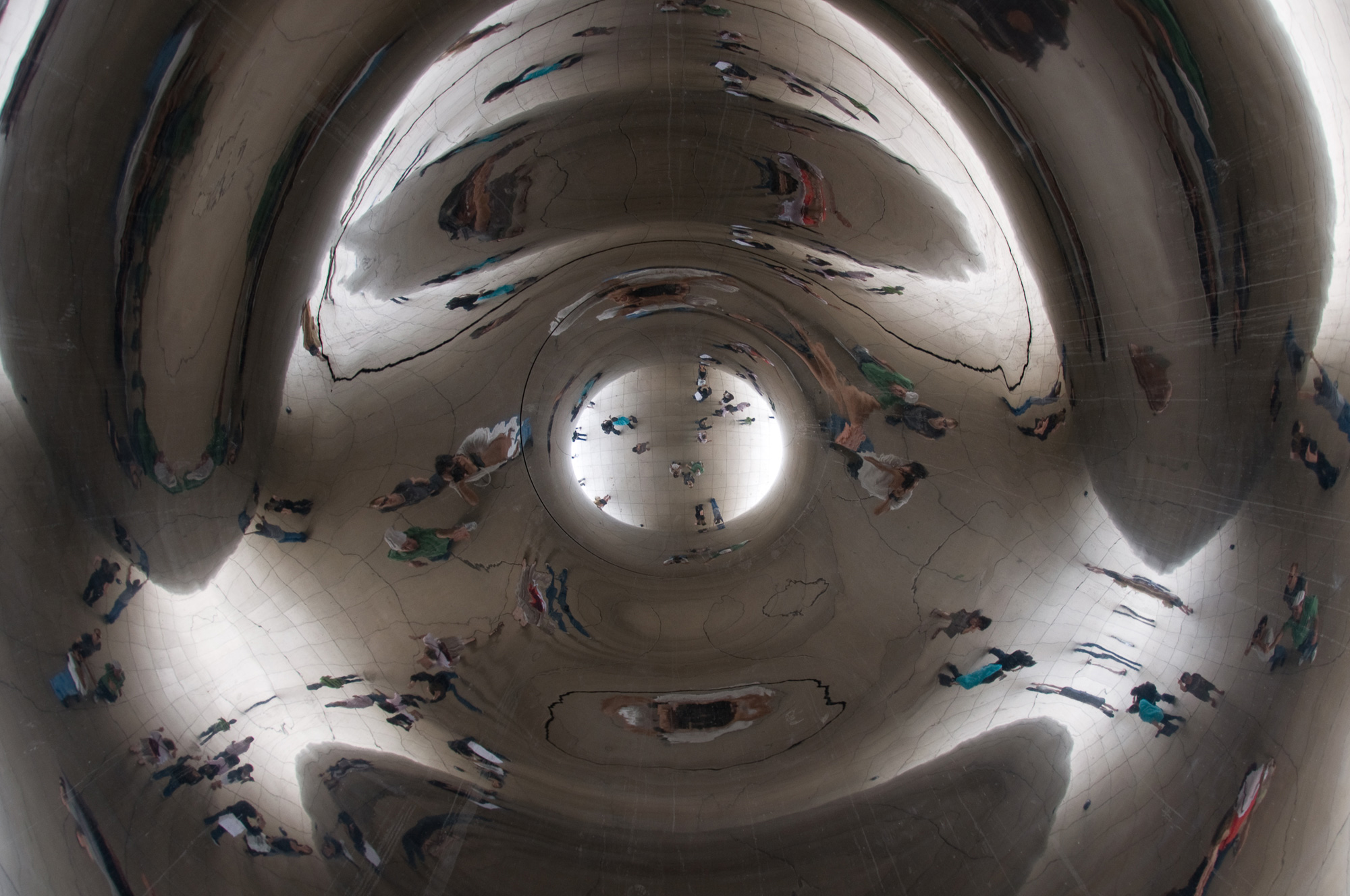
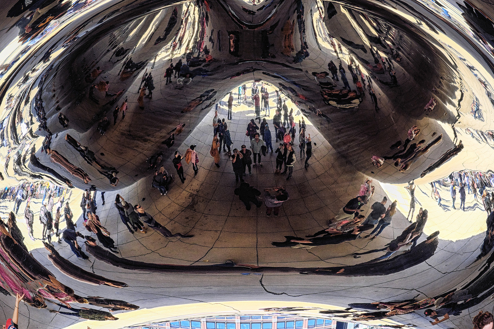
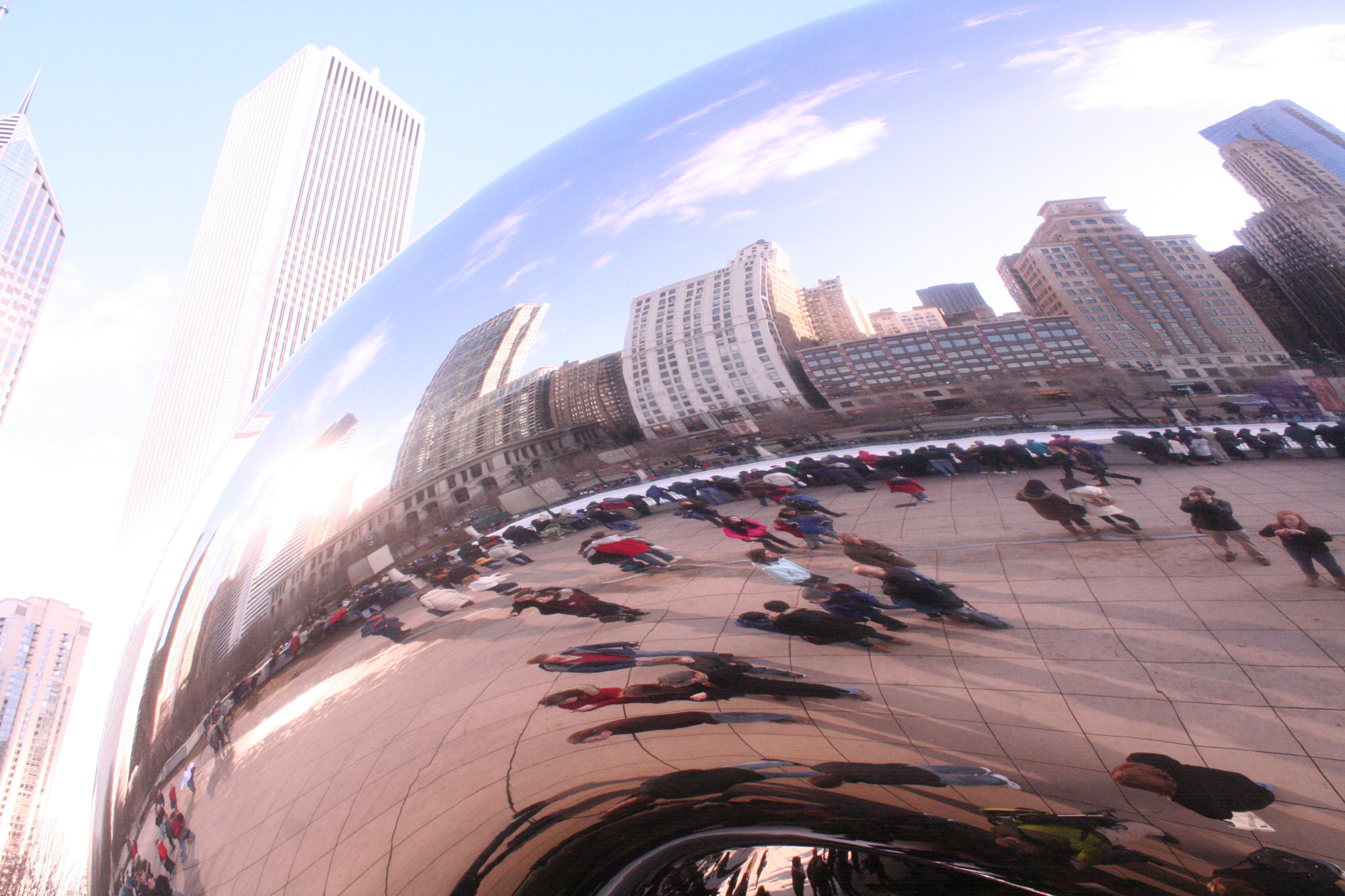 Cloud Gate distortions. Photos by (left to right, top to bottom) Niklas Hellerstedt, Alejandro Mallea, Tomošius, and Christopher Schmidt.
Maybe the “there is only a single point of reference” statement earlier isn’t exactly true… there are at least three more things that informed our decisions but that’s mostly because we don’t like doing things just because and there should be some connection between the context and the work. The primary display typeface selected is Torque, from our Event Sponsor Type Supply, which, apart from being bad to the bone, echoes the grid layout of Chicago’s streets WHILE also echoing the angular streets — Clybourn, Milwaukee, Grand, Ogden, South Archer — that break the grid through the 45-degree cuts found throughout the typeface.
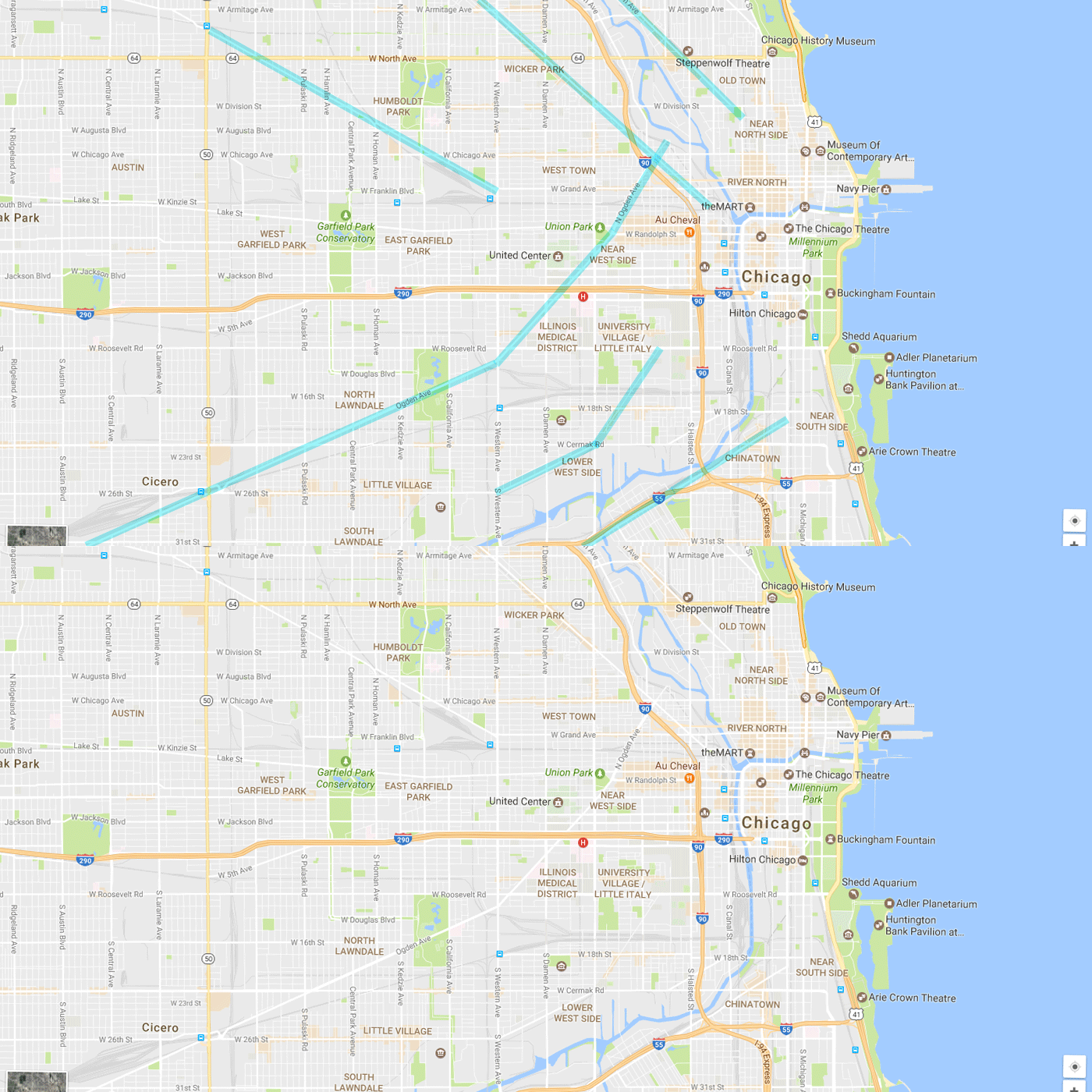 The angled streets that break Chicago’s strict grid.
 Torque by Type Supply. Its 45-degree angles echo the streets above.
The main reason we picked Torque, though, is because its tight 0-, 45-, and 90-degree-angle lines would distort beautifully and be evident that something was happening to the letters.
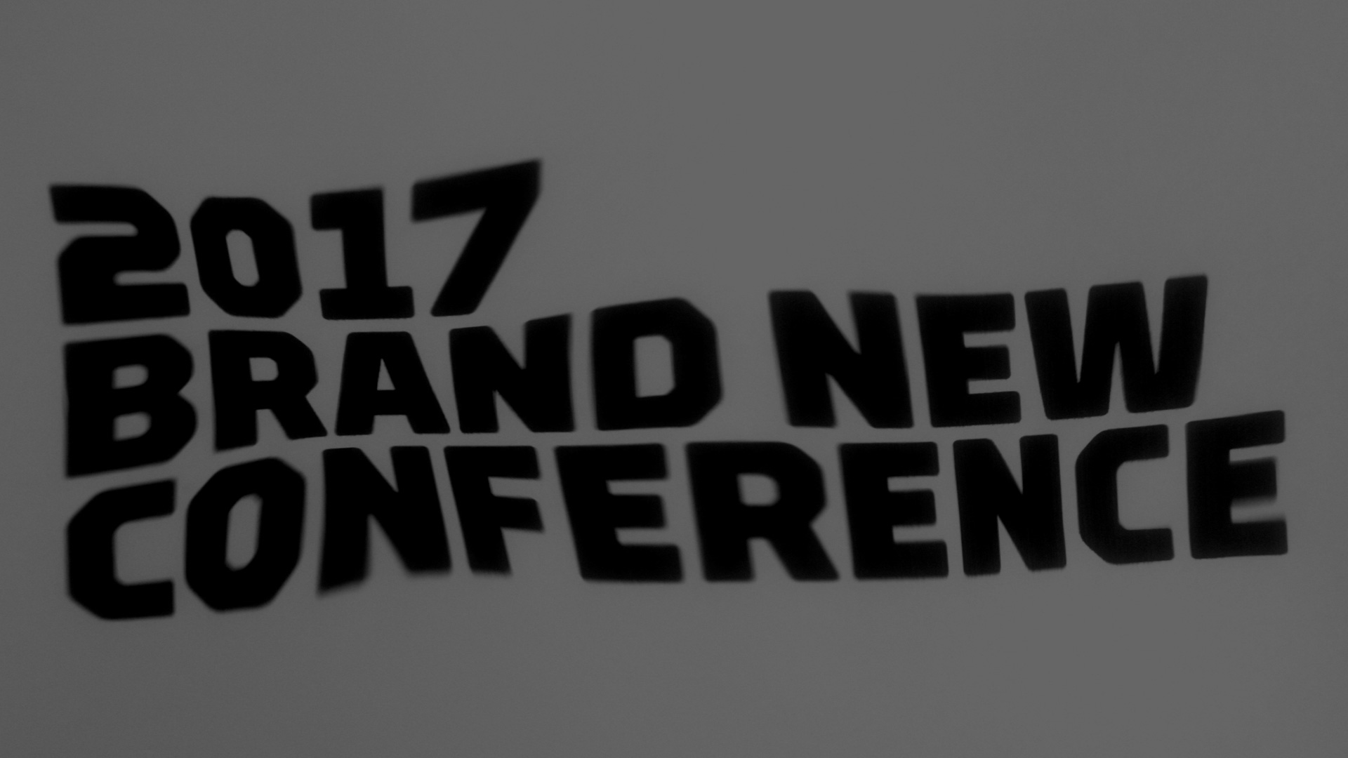 Wordmark distortion.
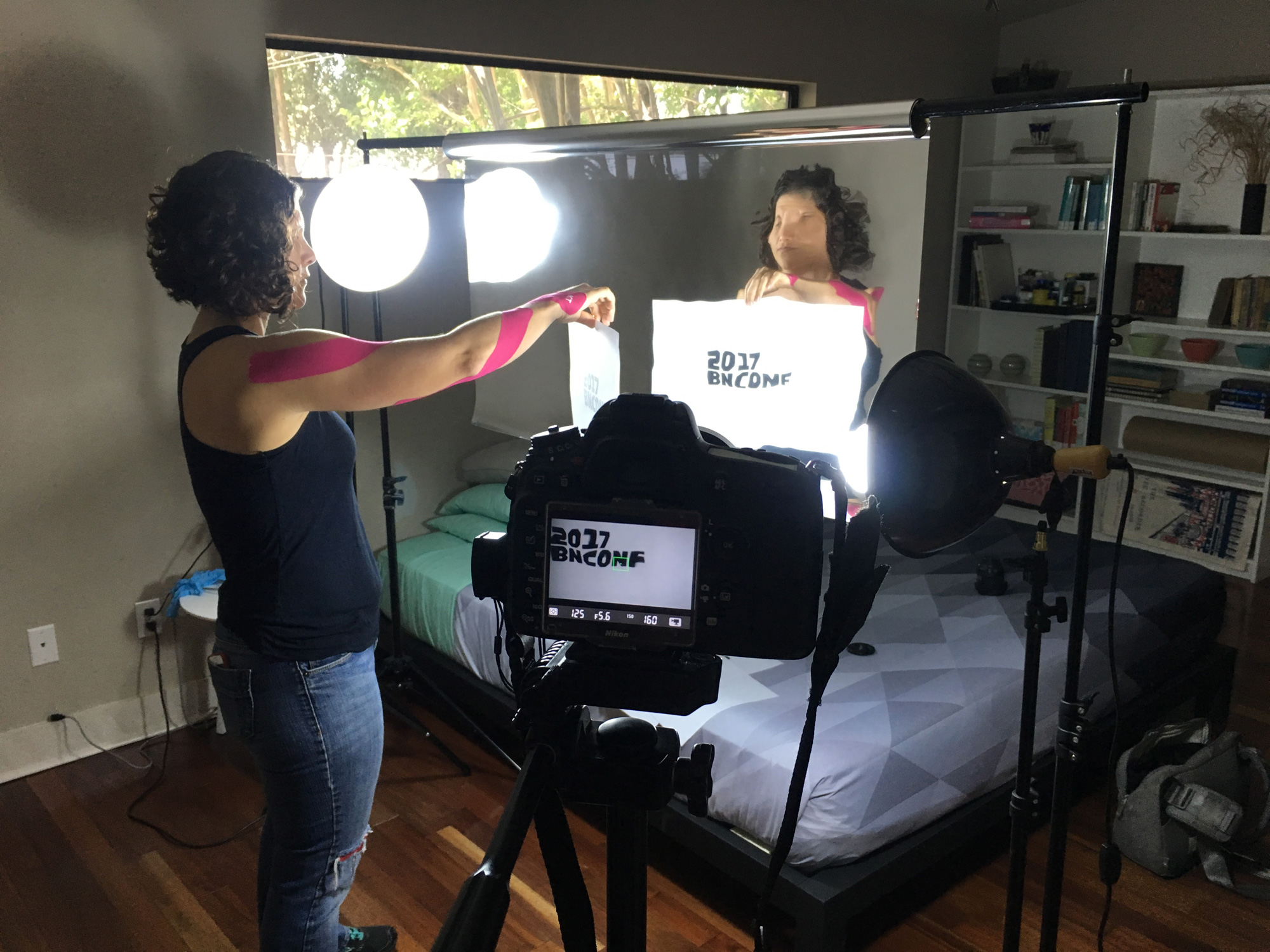 Behind the scenes because no, we did not just use the Liquify filter in Photoshop.
Our first attempt at generating the distortion was heavily analog, recording a printed 11 × 17 piece of paper reflected against a roll of Mylar. The result is quite cool and we loved the effect:
Some of the “footage” of the distorted logo.Unfortunately, after recording, cleaning up, and editing a 1-minute loop of these distorted wordmarks we started to feel that the effect wasn’t right and that it looked more like type being underwater… instead of reflecting against a giant, static sculpture.
The 1-minute loop we edited and were *this* close to using. As mentioned, it’s a cool, groovy effect, but it didn’t capture what we envisioned.Enter StudioTBT, who have done some great motion work, including some for other conferences like TypeCon. Based on our effort so far and an explanation of the concept, they were able to do a much more convincing execution through Cinema 4D that kept the stretchy, distortion-y aesthetic we were able to capture but, by being in a 3D environment, it allowed to pan the typography on the object, something we couldn’t do in our analog approach.
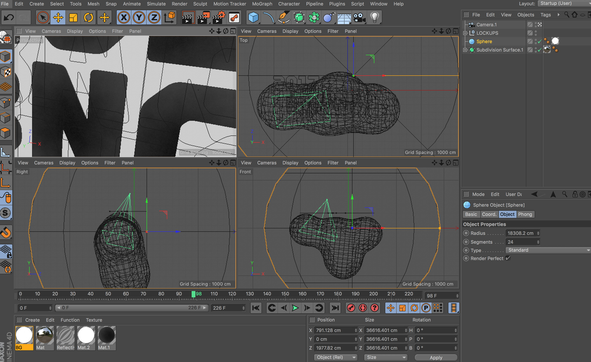
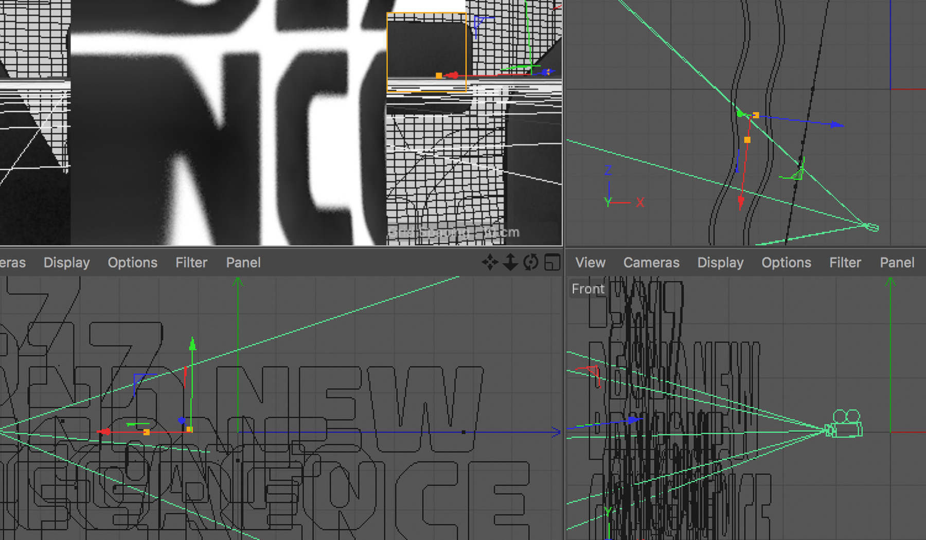
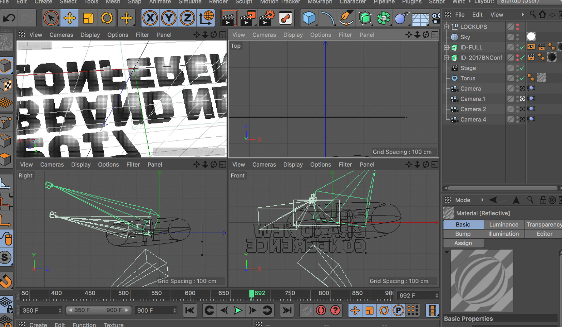
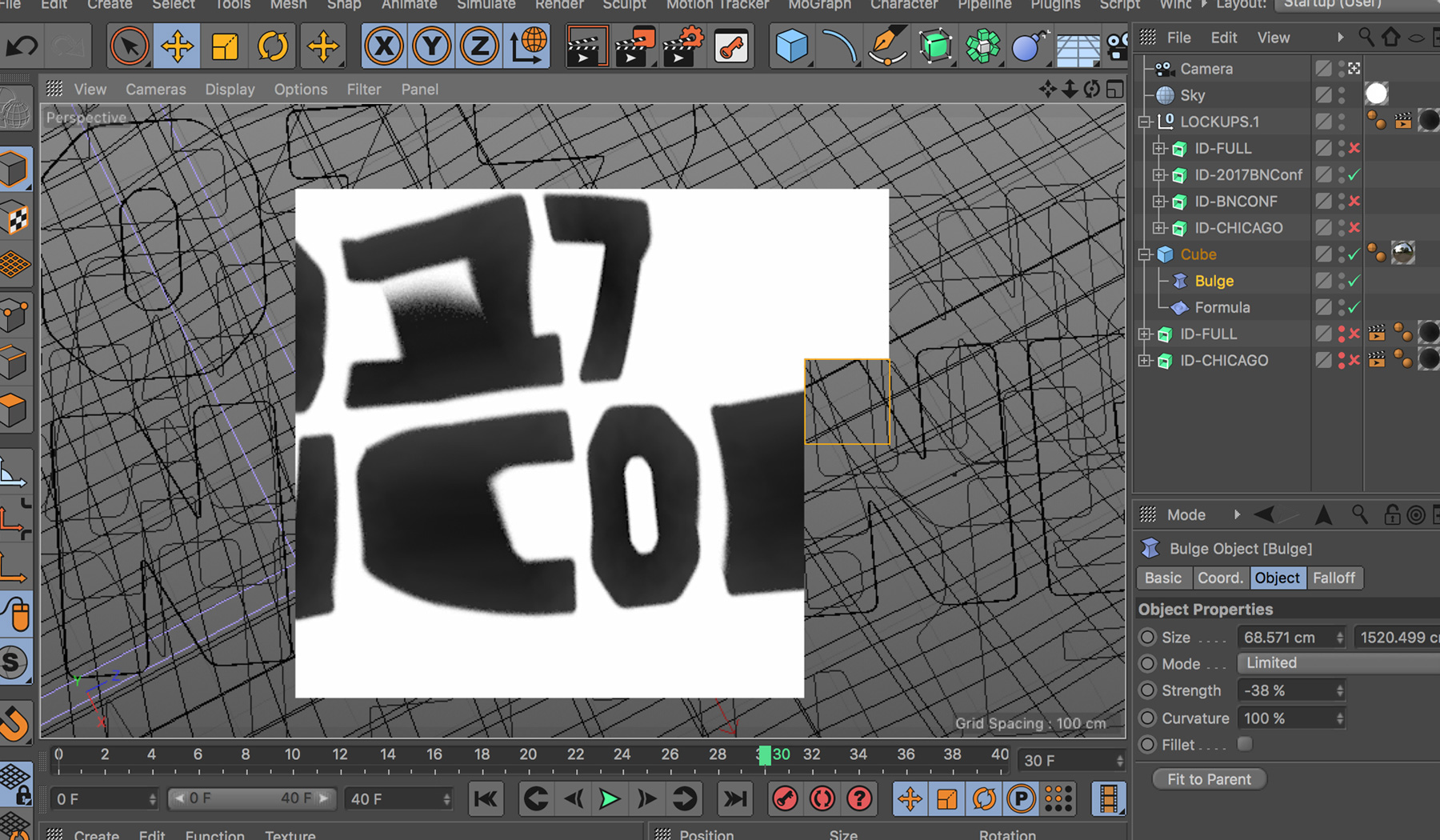
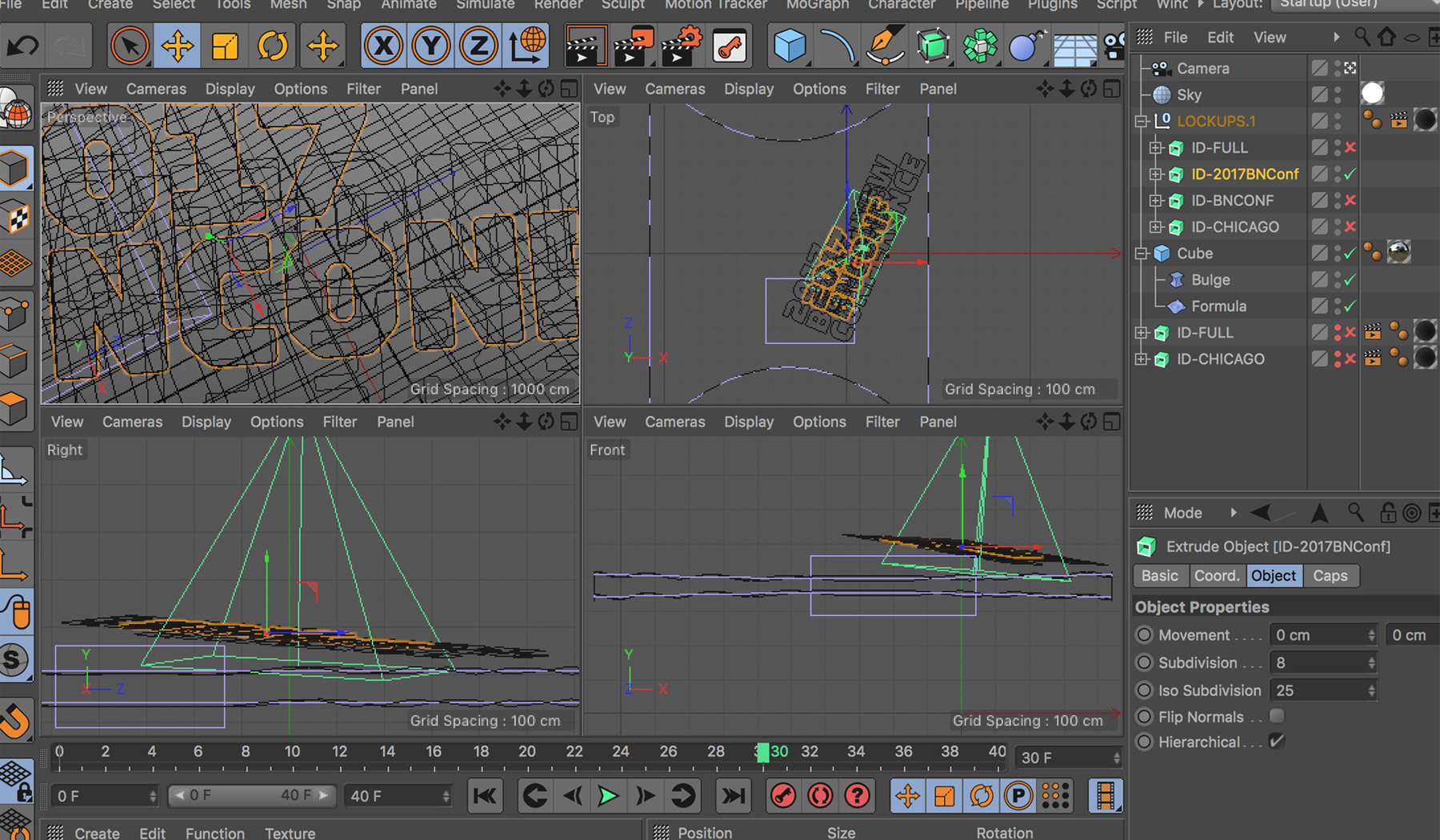 Behind the scenes in Cinema 4D.
After some editing of the super-time-consuming renders, the final 1-minute loop looks like this:
The final, computer-generated loop. We tried! The only real way to have pulled it off fully analog would have been to build a replica Cloud Gate, get some dollies and rigs, rent a warehouse, and hire a whole crew that included James Cameron to maybe get the same effect.StudioTBT will be helping us with the motion work for the graphics during the event, in specific giving each speaker the same groovy treatments.
To complement the distorted typography we drew from Chicago’s own flag in two ways: First, choosing blue as our only accent color but taking some liberties with the actual hue as the baby blue was not providing enough contrast; and, second, creating an asbtract version of the stars that adorn it to form a subtle pattern.
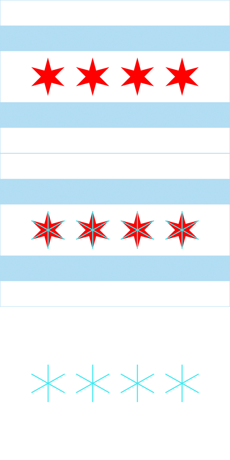 Abstracting the stars of the Chicago flag.
 Star pattern.
The pattern is not completely gratuitous either: There are exactly 168 stars used whenever the pattern appears. Why 168? We’re glad you asked: The Cloud Gate is built from 168 stainless steel plates that have been welded together. On this website, whenever it’s seen at full width, there are 168 stars — they start disappearing as the browser shrinks but in print applications we will always use the 168 stars. And the very last point of reference is a curved element that, you guessed it, is just like the belly of the bean… er, Cloud Gate.
 A curve that follows the bottom silhouette of the Cloud Gate.
The secondary typeface is Styrene, from Event Sponsor Commercial Type, that has some elongated strokes that match the squareness of Torque and it has plenty of personality of its own.
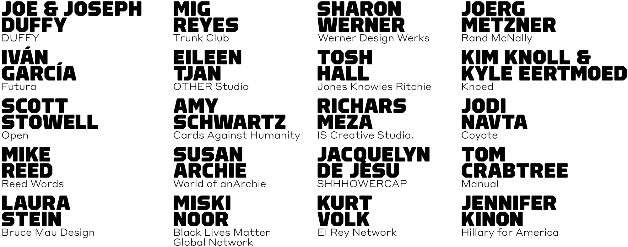 Speaker List
As usual, we have a sense of how these ingredients might get applied but there are still a lot of explorations to be made and we’ll see how distorted things get in final application.


