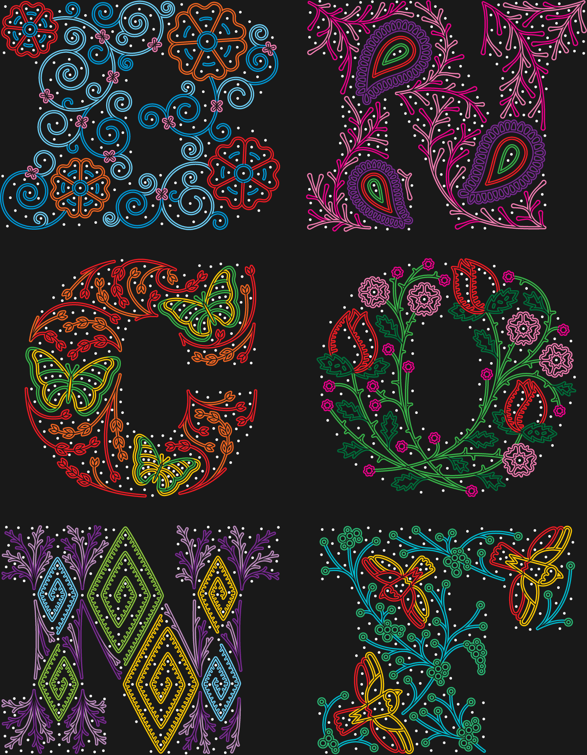
About this Year’s Identity
Coming to Nashville we knew the logo had to do one thing: reference the city’s music culture. How we would do that we had no idea but, luckily, there are no shortage of references and we opted for the epic suits worn by country singers clad in festive motifs and glittery rhinestones as the driving force behind our logo. We also didn’t ignore the obvious: Hatch Show Print and their woodtype typographic exploits that have helped promote and build the visual expression of Nashville’s music scene.
The heavily-embroidered and rhinestone-covered suit approach can be traced back to Nudie Cohn (né Nuta Kotlyarenko) whose Los Angeles, CA-based shop Nudie’s Rodeo Tailors was responsible for creating suits for classic country, blues, and folk singers like Hank Williams and Porter Wayne Wagoner as well as mainstream performers like Elton John and Cher. One of his employees was Manuel — who will be on stage at the conference on Thursday — who later established his own shop in L.A. and was commissioned by the celebrities he first met at Nudie Cohn's shop that grew to include the likes of Dolly Parton, John Wayne, Johnny Cash, Neil Young, John Travolta, and even, sigh, Kid Rock, many of whom performed extensively in Nashville. In the late 1980s Manuel moved to Nashville where his style and craftsmanship continued to influence the visual culture of the local music scene.
These suits by Nudie and Manuel — and other designers operating within this signature style — feature elaborate designs of nature with floral and botanical motifs punctuated by birds, butterflies, and bigger flowers. While these elements would be enough to make the suits special, they are turned up to eleven with the addition of flashy rhinestones that literally make the suits sparkle. How could we not latch on to this visual feast?
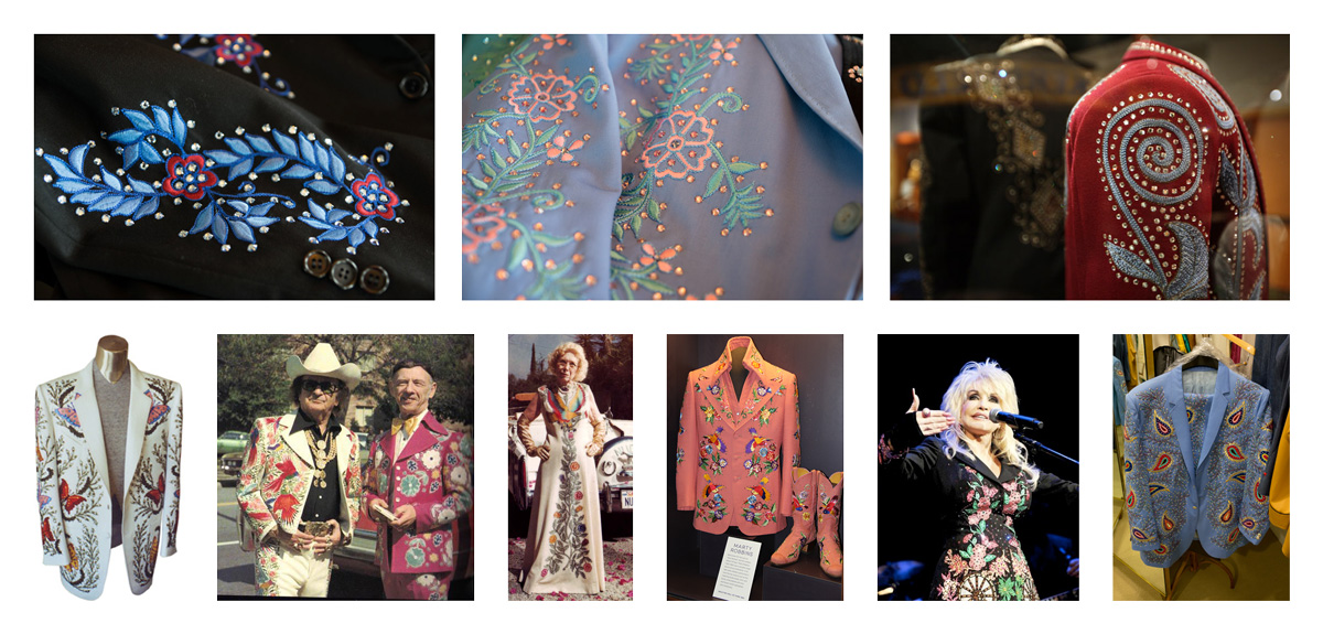
A sample of the iconic suits associated with the country music scene, some of them on display at the Country Music Hall of Fame and Museum in Nashville.
Established in 1875 in Nashville, Hatch Show Print became the celebrated producer of woodtype music posters we know today during the 1920s through the 1950s when it produced hundreds of posters from its location right behind the Ryman Auditorium, one of the most classic music venues in town. Their woodtype aesthetic has been imitated countlessly but they are still the best, even today as their shop keeps pumping out posters for musicians, comedians, and other performers. We did not want to imitate the stacked woodtype aesthetic because that’s too easy and not necessarily original but we couldn’t ignore it completely — explained how so in the next paragraph.
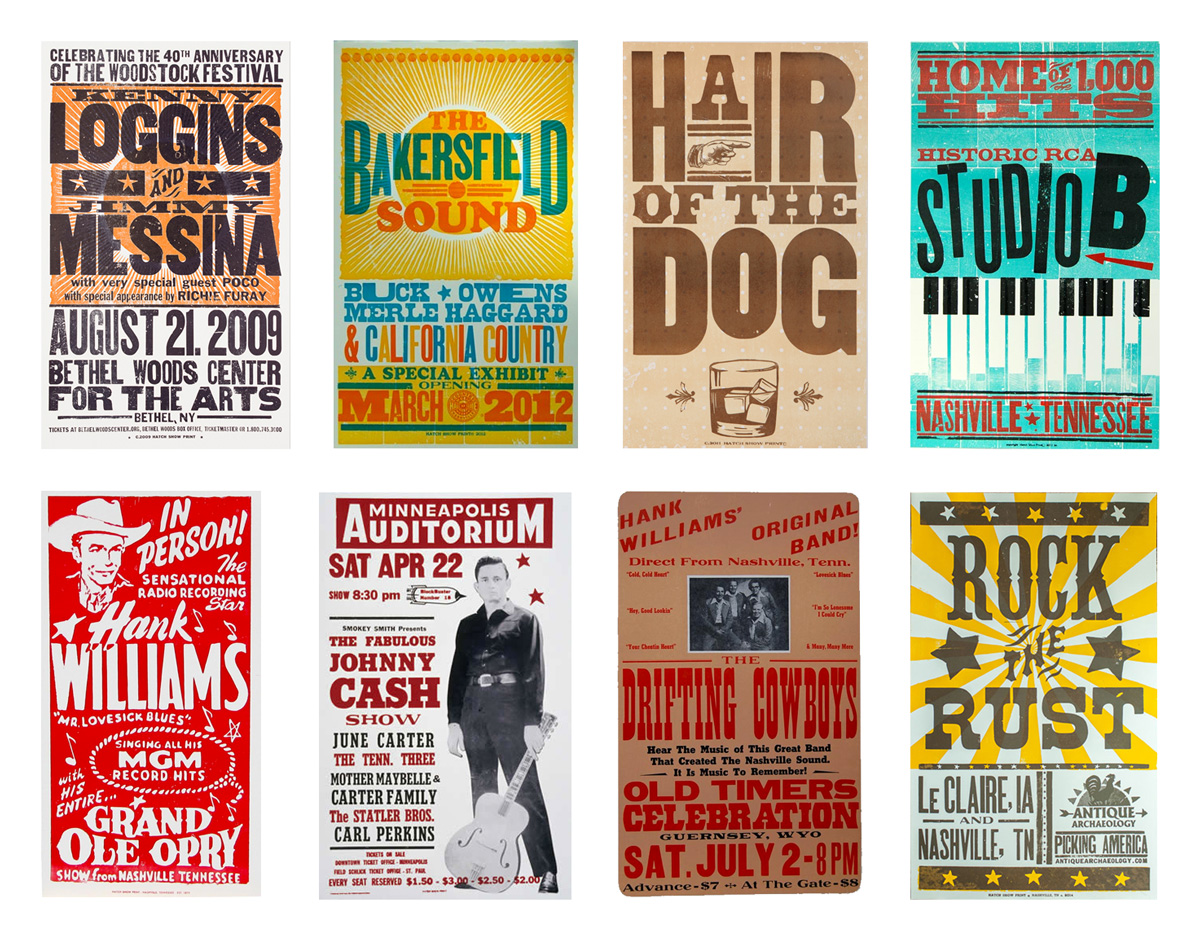
A sample of classic and contemporary posters from Hatch Show Print.
Our concept for the logo was taking our now well-recognized "BNCONF" shorthand name and treating each letter like a suit to be adorned. We needed big, chunky letters to be able to fit in more decoration and that’s where the woodtype element comes in. After thorough vetting of various black-weighted fonts we found our hero in Behemoth — designed by Dave West and digitized by Martin Wenzel — from House Industries’ Photo-Lettering typesetting service (and available for rent from Fontstand). Behemoth has a large volume and some beautiful, curvaceous details that give it plenty of personality.
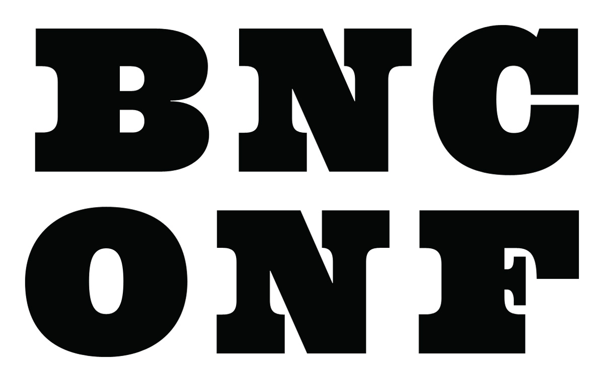
BNCONF typeset in House Industries’ Behemoth — our “suits” before decorating.
We didn’t — and, really, couldn’t, out of lack of talent in that aesthetic — just transfer the fabric designs into digital versions so we decided to use the suits as reference points to create similar patterns and motifs but executed in a very twenty-first-century, Adobe Illustrator style that we could actually execute. Which sounded easier in our head before we actually tried to do it.
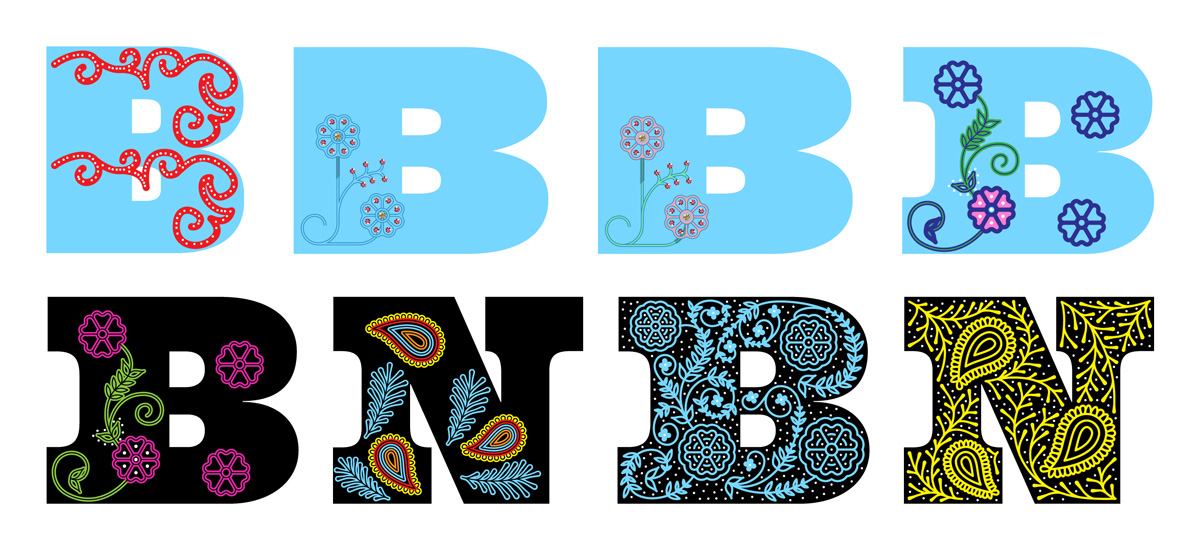
Very early attempts at pulling this off (top row) and slowly evolving into something convincing (bottom row, right).
After nailing down the “B” and the “N” (although we later replaced the “B” seen above) we started tailoring each letter with its motifs and “rhinestones” (simple, white dots). Some elements are very much direct representations, like the paisleys, while others are personal interpretations, like the birds and butterflies. Crafting these took an unexpectedly long amount of time and whether we nailed the illustration style or not is up for debate but what we DO know we did is that all those bezier points are all perfectly in place. If you Command-Y our file you might get bezier jealousy.
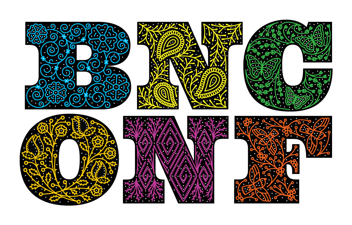
The first step was generating a single color, single thickness design for each letter.
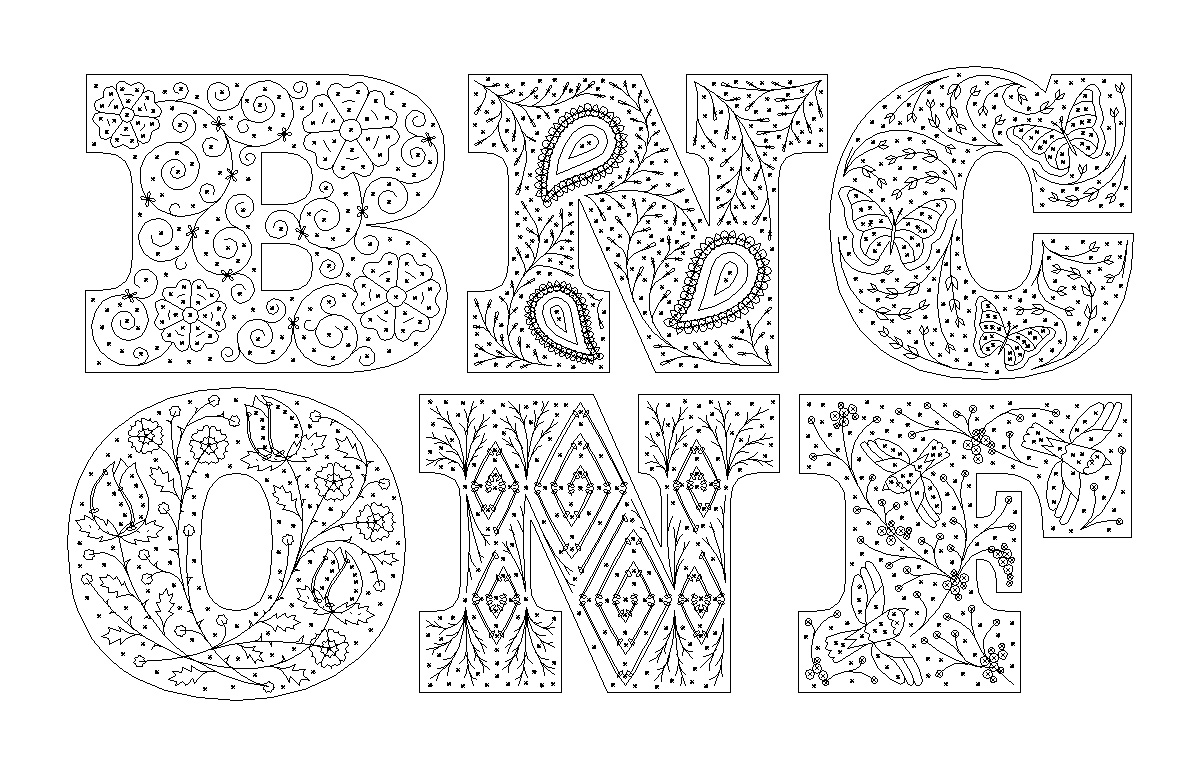
(Seriously, check out those beziers with Command-Y!)
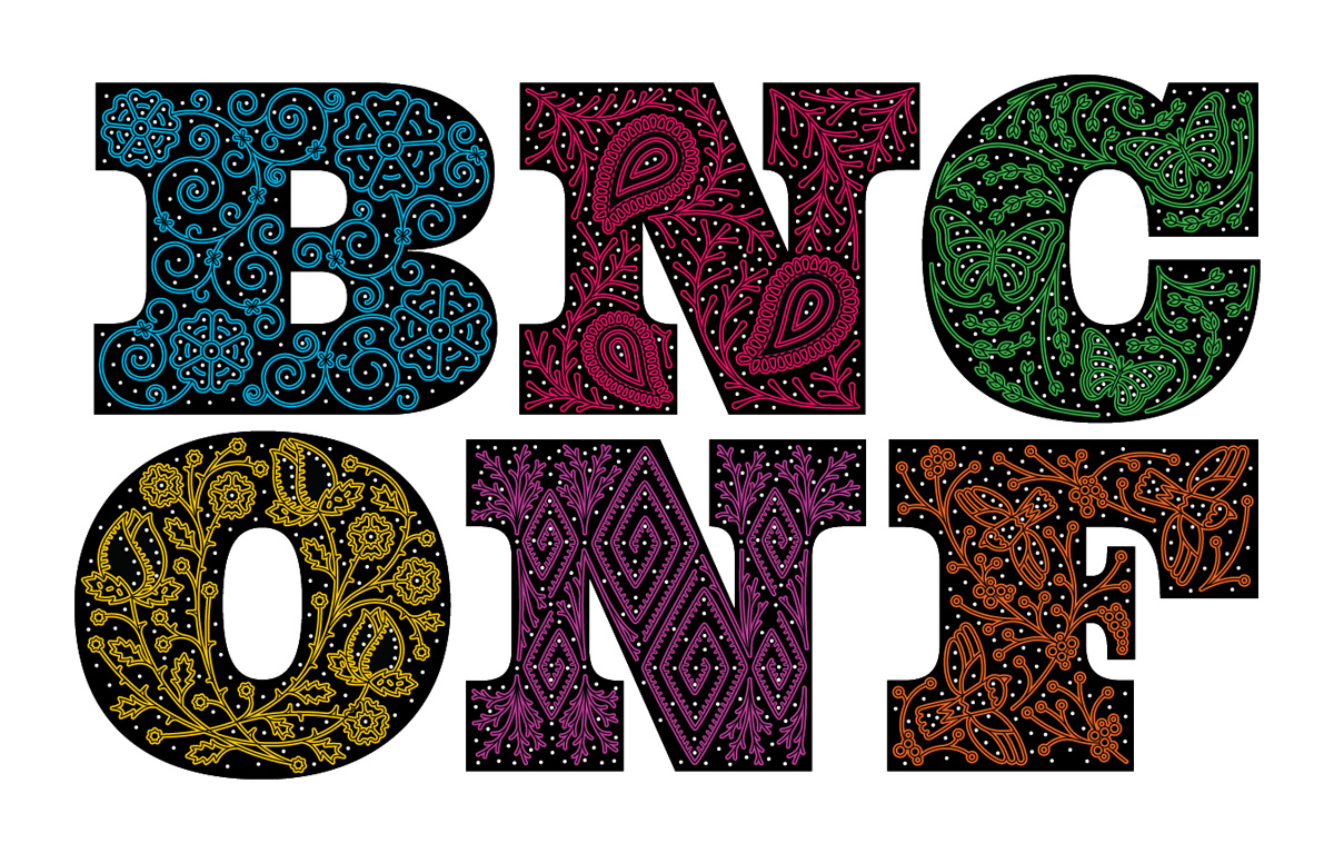
Then we added an inline to make it feel embroidered as if a black thread was running through the designs.
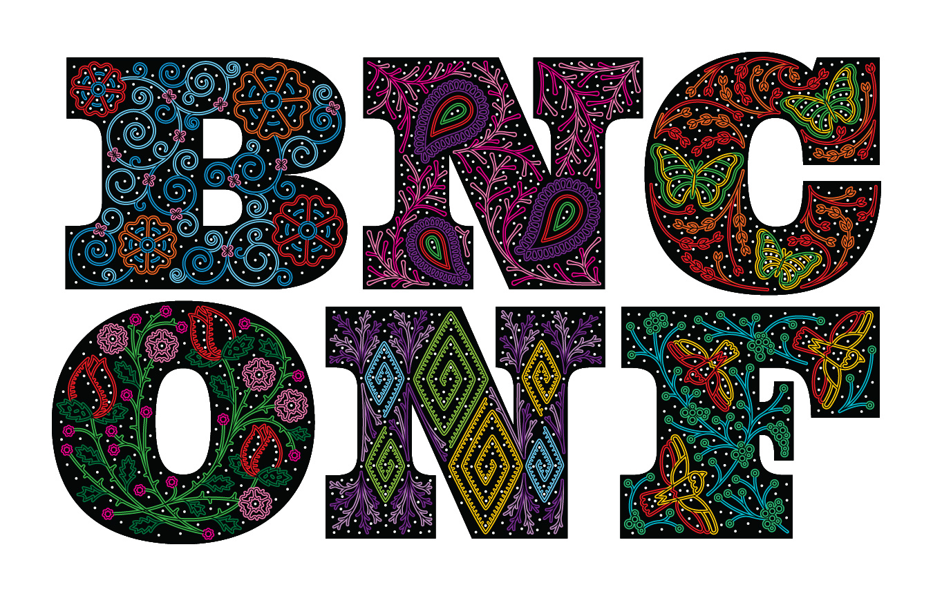
Finally, we colored it real pretty-like.
The logo is meant to be used at large sizes so that the inline doesn’t get all fuzzy and smooshed. What you see on the home page is the ideal, minimal size. What you see on this page and all other inner pages is a version without the inline that reduces pretty well.

Smaller version, without inline.

And in black and white.
We are not exactly sure yet — as is usually the case — how this extends to the rest of the materials but between Behemoth, the lively color palette, the complementary use of Hoefler & Co’s Knockout, and the graphic motifs we’ve put together, we are pretty excited to find out. The last visual we will leave you with are the letters without the, well, letters which we imagine in our heads to be like a singer stepping out on stage with his or her black suit before the lights go on and everything is dark except for the colors and rhinestones on their suit.
