About the identity
This year’s identity follows up slightly on the approach of last year’s in which a few trends in identity design were exploited to create the Megatron of trends in a very graphic execution. For this iteration of the conference identity we latched on to one of the funnier trends in logo design in the last couple of years, best summed up in this Tumblr: Your Logo is Not Hardcore.
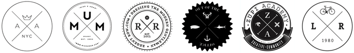
A few samples of Your Logo is Not Hardcore.
Part of what makes these logos indeed “not hardcore" is that, despite the use of what is supposed to be some kind of anarchic “X”, the rest of the typography and graphics are too pretty and stylish and family friendly. So we went in the complete opposite direction: awkward, ugly, hard to read, and aiming to please no one. Hardcore? Maybe still not. But it works as an experiment in bursting the trend and seeing what comes out of it.

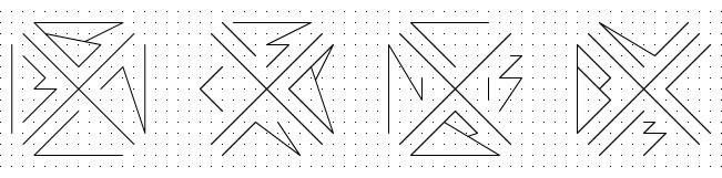
The four versions of our logo, with the “B”, “N”, “C”, and “13” characters changing places clockwise.
Over the years we have played with using the full name of the conference or just using BNC, or BNC2012 as last year, and adopting BNConf as the Twitter handle. Probably not the best approach for brand consistency but perhaps next year, our fifth, we’ll settle on one acronym/shorthand. This year, to make the name fit in the quadrants within the “X” we went with BNC13 (where “13” is its own unit). We first designed each letter in a minimal, Caesars Palace-esque style that we then forced all of its vector points to fit within a square grid inside a triangle, nicely and not nicely.
The basic letterforms and its vector points. The logo on the grid. The triangle borders.
In application we decided the logo should reveal its grid to give it some kind of foundation. We’ve been using pixel-based lines, backgrounds and decorations on our blogs since 2002, and whenever the redesign of the Brand New blog actually happens it will be the end of its pixel-based backgrounds, so we went with some lo-fi pixels as a background to add to the un-sophisticated logo.
The logos on the pixel grid.
Because we can’t leave well-enough alone, then we thought it would be fun — or funny (or downright annoying) — to animate the logo in a jerky sort of way, where the vectors can only move from pixel to pixel on the grid, snapping clumsily.
We started simple with The Twitch. All four logos have a Twitch version.
Then we got more daring with The Drain where each character appears and is then sucked into the center of the “X”. All four logos have a Drain version.
The Swipe features all four logos with the characters swithing places in a swipe-style animation. As simple as this looks, it’s a 180-frame animation that took 12 hours to build. Best way to spend business hours? Heck yeah.


All of the speakers also got their own animated monogram.
We will probably work on a few more animations to use on the day of the event. In the meantime this will do.
To punctuate the identity and to celebrate is clunky, default-ish, style what better font than Helvetica? It’s not actually a rhetoric question: We used Christian Schwartz’s Neue Haas Grotesk which is the only usable version of the entity known as “Helvetica”. Only two point sizes are used throughout the site: 14 and 28.
We have some ideas on how to bring this to non-digital life for the conference program and other goodies that will hopefully also be unexpected. Good or bad.
Presenting Sponsors
Event Sponsors
After-Party Sponsors
Local Sponsor
In-kind Sponsor