CLIENT
A micro financing company that provides various kinds of financial services to individuals running small businesses.
BRIEF
Research, positioning, naming, and brand development of a new concept in micro financing.
APPROACH
I began with deep research into the field of micro finance, examining names and mission statements of other similar organizations prior to any actual design work. This fine research led to the development of a variety of names before the selection of Pennyfund.
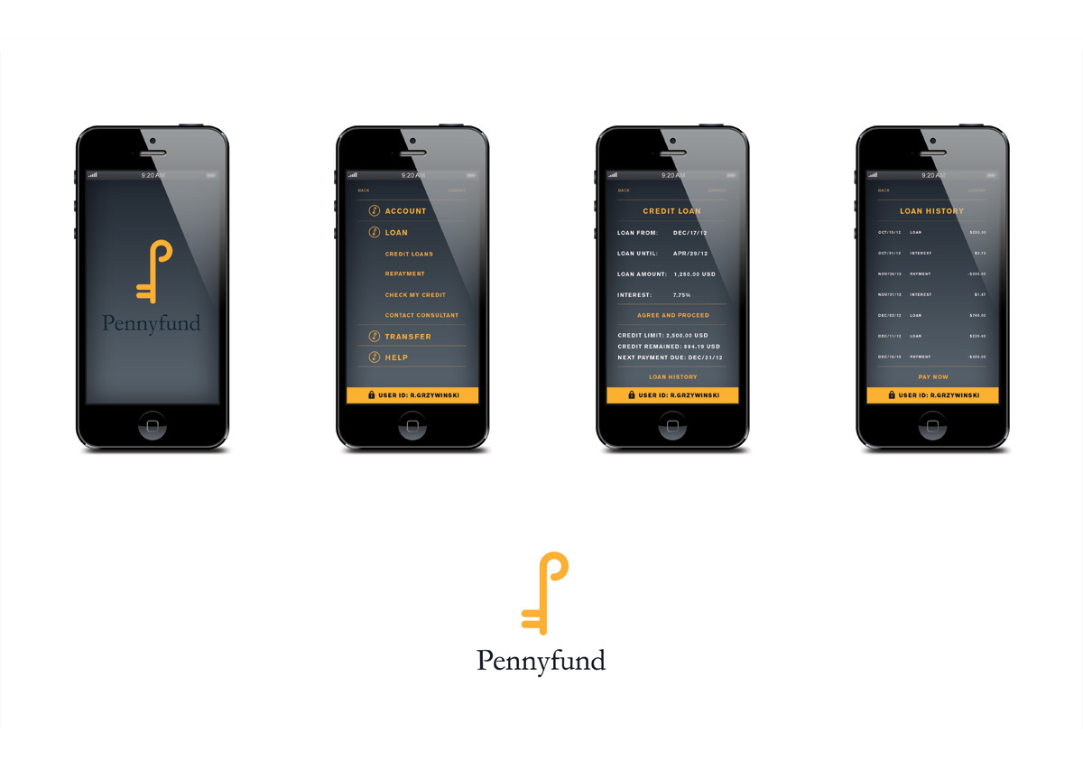
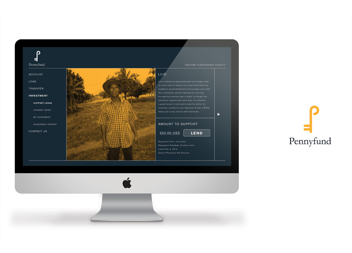
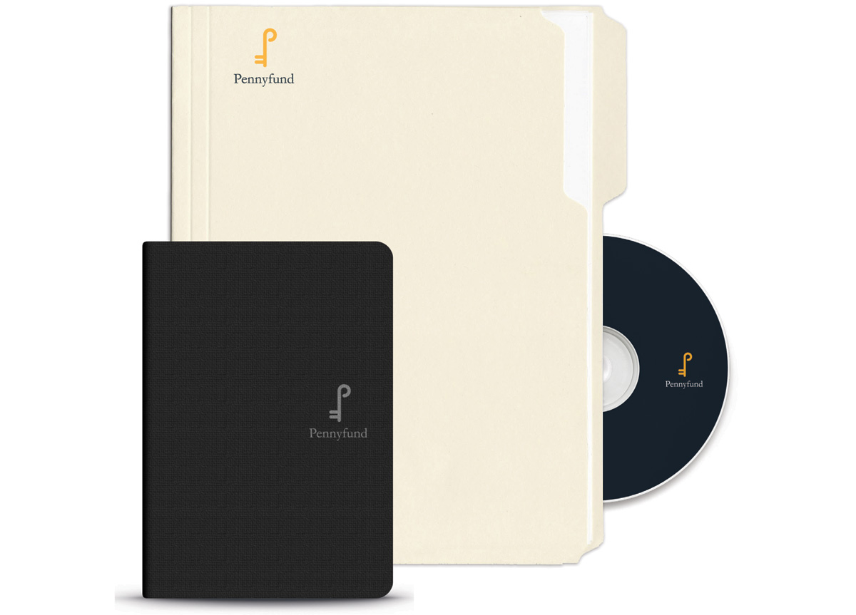
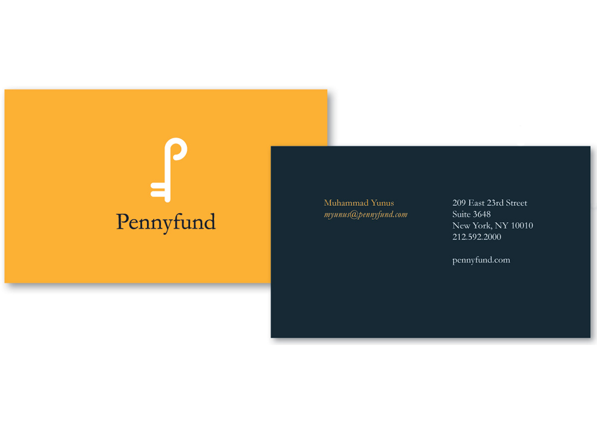
The mark is a wonderful play on the letters P and F ultimately forming the shape of a key. A powerful symbol conveyed with restraint and simple elegance, along with the Pennyfund wordmark, set in the classic Garamond type family gives the overall feeling of trust and strength without being overpowering. It is a brand system that has depth and longevity. The support materials, stationery system, mobile app, and website carry the brand identity, typography, and color system into new mediums and forms without losing any of its strength and integrity. Pennyfund is a fine piece of concept, design, and applications with very high professional standards. — Eric Baker, Professor at School of Visual Arts
