CLIENT
A family-oriented Italian restaurant in St. Louis, MO, owned by three-time James Beard nominee Gerard Craft. Pastaria has an accessible but unconventional menu that appeals to kids, adults, and culinary enthusiasts alike.
BRIEF
Create a complete visual identity for Pastaria, including the logo. Gerard’s passion and dynamic understanding of St. Louis’s changing culinary landscape meant that Pastaria’s shape was still evolving, making the project an interesting challenge. Partway through our work, Eater magazine named Pastaria one of the most anticipated restaurants of 2012 in the country. So the pressure was on to create something bold and memorable that lived up to that excitement.
APPROACH
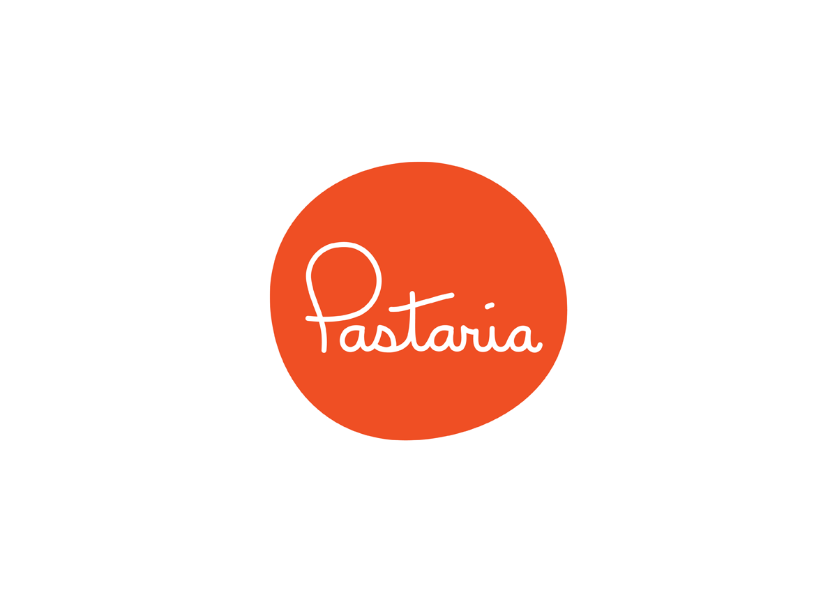
The logo needed to be a little playful, a little handcrafted, but polished—just like Pastaria. The logo’s red dot was inspired, simply, by pasta sauce. Its slightly irregular shape calls back to its origins as a splatter (rather than a circle). The pasta-like typeface was hand-drawn by one of our designers. It’s a logo that immediately communicates the warmth and openness of Pastaria’s atmosphere.


