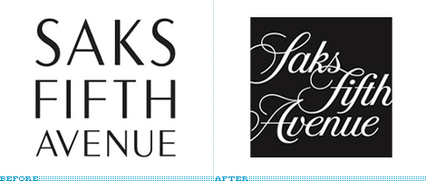
Many companies dream of an organic, adaptable and changing identity to avoid looking static, stoic and stale. Most companies, too, flail at the thought of managing a constantly fluctuating identity, commonly opting for one logo lockup… two, if they are feeling saucy. MTV has made a living out of changing logo looks faster than Madonna, and VH1 has adopted a similar mentality; Fossil may have one official logo, but its look is as diverse as the retro look can be milked; and companies like GE, Motorola and BASF find comfort in extensive color palettes to render their logo in. These are few and far in between and the exception rather than the rule. Saks Fifth Avenue’s embrace of a changing identity — changeable in 100 googol ways no less — designed by Pentagram (Michael Bierut, to be specific) is a feat all the more impressive considering the stagnant state of retail identity, specially in this category (Nordstrom, Bloomingdale’s, etc.).
Continue reading this entry
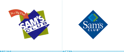
Following in the recent footsteps of sister-store Walmart, Sam’s Club is attempting to go after a higher income customer.
Continue reading this entry
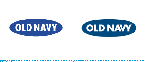
I’m not sure exactly when this happened, but Old Navy has a new mark. No press releases, no launch events, no announcements. I actually couldn’t find anything anywhere, although I didn’t try calling anyone. Old Navy simply updated their mark. They have refined the oval and changed the typography. Nice.
Continue reading this entryPrevious Page |
(Total Number of Pages in Retailers: 4)


