

![]()
Note: The original logo shown above is the original. The new one has been tweaked a little, but I don’t have a clear image of it to show.
The big news of the day has, undeniably, been Starbucks. The free coffee for 30 minutes sure helped. But also, it’s been a news item in the making since the 1990s when Starbucks started its insurmountable growth that would eventually come to compromise and cripple its original modus operandi of small, personable and unique. Or, less ominously, the news has been brewing (sorry!) since January of this year, when Howard Schultz took the reigns back as CEO — after an eight year respite from running the coffee empire he set ablaze in 1987 when he bought Starbucks — in order to resuscitate the unimaginably flailing brand. And, today, surrounding the unveiling of a new coffee bean, the Pike Place Roast, Starbucks unleashed an unprecedented wave of brand nostalgia by deploying the original Starbucks logo on the masses, starting with a sad replica of the original store, in New York’s Bryant Park.
Continue reading this entry
![]()
The once-textile-manufacturer turned-ski-manufacturer Rossignol — which was purchased by Quicksilver in 2005 and looks like it’s now being sold — has now evolved from a snowsport brand to become a “Mountain Lifestyle Brand.” This shift is reinforced by their current rebranding, replacing a forgettable, gradient-enabled and beveled “R” with a return to their original and energetic script “R.” The new one-color solution is graphically much stronger and contrasts well with the revised DIN-inspired typography. From their release:
Continue reading this entry![]()
Sunglass Hut International, a purveyor of fashionable sunglasses and eyewear, is in the midst of rolling out a new brand identity to its 1,500 retail stores located in malls and other high-density retail areas around the globe. The new identity, developed by everyone’s favorite, Wolff Olins and retail specialist FRCH Cincinnati, has already been unveiled in Europe, and is only now just starting to make its public debut here in the United States, replacing an interim identity plaguing some applications, like the web site. The result has been a confusing image for an iconic sunglass retailer — one that is not nearly as distinctive as the one that it replaces.
Continue reading this entry![]()
To continue with our supermarket streak (three in a row, booyah!) at Brand New I would like to offer a, well, brand new entrant into the category. Fresh & Easy Neighborhood Market (yes, that’s the official full name) is a new chain of supermarkets opening in the West Coast of the United States, with 30 stores planned to open in the states of Arizona, California and Nevada by the end of 2007. The new venture is headed by UK-based Tesco, one of the world’s largest retailers (“the world’s third-largest retailer, behind Wal-Mart of the United States and Carrefour of France” according to Wikipedia). Launching the store and its associated 1,500-plus SKUs, Tesco worked with three agencies to complete the project, U.S.-based marketing / communications / anythingelse firm Deutsch Inc., U.K.-based and independently-owned branding agency Pemberton & Whitefoord (P&W), and U.K.-based and retail-specialized design and fabrication company Schorleaf. (The invoices from all three combined could probably buy you three or four of those islands near Dubai).
Continue reading this entry![]()
If you can’t tell the difference between the two logos above, that’s because there isn’t. Pathmark is a 40-year-old supermarket chain with 140+ stores in the states of New Jersey, New York, Pennsylvania and Delaware and is currently the 31st out of the top 75 supermarkets in the nation according to Supermarket News and, earlier this year, it launched a 55,400-square-foot protoype store in Kinnelon, New Jersey to capitalize on its new branding and merchandising initiative, “Go Fresh, Go Local”. So while the logo has stayed the same, the real changes have happened inside.
Continue reading this entry![]()
As part of a R110 million (US$16 million+) rebranding effort by Pick n Pay — a 40-year-old supermarket chain in South Africa, and one of its largest retail groups — that includes converting 450 stores and 1,200 product lines within a 24 month period, the store is taking the opportunity to update with a new logo that does away with its dated-looking use of slab serifs to embrace the ever-so-modern san serif.
Continue reading this entry
Toys R Us, Inc. finally trimmed a thread of frivolous grammatical imposition from their logo. The company’s new legal name is Toys R Us…(no quotation marks around the backwards R). The star has been stuffed into the engorged R in order to make a tight and simple(r) wordmark which is less patriotic, more bulbous and more fun.
Continue reading this entry![]()
Shopko, a department store chain with approximately 135 stores throughout the Midwest, Mountain and Pacific Northwest regions of the United States, recently shed its very masculine image in favor of one that softens perceptions about the retailer and appeals to its primary customer base — women (much like the Sears campaign of yesteryear). Shopko provides “quality name-brand merchandise, great values, pharmacy and optical services” — which at quick glance is not what the old identity communicated.
Continue reading this entry![]()
A year ago, almost to the date, I wrote a heartfelt and disparaging review of the redesign of the Payless Shoesource identity on Speak Up — Brand New’s “mom” as I like to call it. Since the launch of this blog, the most requested logo review and/or tip has been for Payless. More than a dozen times. I always point our readers to the link above and explain that we try to keep our reviews as current as possible and prefer not to discuss older work. Until now I had refrained on bringing up Payless again, but the recurring requests are perhaps an indication (or is it vindication?) of my original feelings… That the old Payless identity, in all of its Cooper Black glory, had too much equity that could have been evolved instead of being replaced by an unnervingly meaningless icon and subjectively boring typography.
Continue reading this entry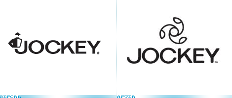
Jockey, the folks that invented men’s briefs in the 1930s have undergone a rebranding. What has traditionally been seen as a men’s underwear company (they didn’t start selling women’s undergarments until 1982) is now going gender-neutral. Their old logo was an actual horse jockey complete with cap although the name jockey was a reference to jock-strap which was the inspiration for their breakthrough underwear design.
Continue reading this entryPrevious Page | Next Page
(Total Number of Pages in Retailers: 4)


