
I will preempt this post by saying that this may or may not be an official long-term change for HP. There has been no press release and no change on their main web site, but the use of this reworked logo has been making enough appearances to consider it a low-key rollout. I first saw the logo on a TV ad for HP’s Touchscreen PC — and I would recommend watching the ad as it is pretty awesome — and then it has been popping up in print ads in a variety of mainstream magazines, including Wired, where the logo shown above comes from. The evolution looks interesting, I definitely like the removal of the holding shape which has always, to me at least, made it look more like the logo for a dishwasher. I also like how the circle now “masks” the italic hp letters, it gives the sense of there being more beyond what you are looking at. The shading doesn’t look great in the image above, but it’s a nice subtle execution, as opposed to the clunker two posts down. A nice, punchy evolution.
Update: A clean version of the new logo has kindly found its way into my inbox. Refresh your browser to see it.
Giant Food and Stop & Shop, two sister companies that represent a pair of the nation’s largest regional supermarkets have shed its previous identities for a bowl of fruit — or a plant — or, um, a multi-colored flower thingy. In any case, gone is the Giant-on-your-side G and the stop lights.
Continue reading this entry
This coming October will be the inaugural season of a new venture from the International Ice Hockey Federation: The Champions Hockey League, that will see the best Hockey teams from Europe battle it out. The simple, yet elegant press release offers the following explanation on the logo: “The most prominent part of the trade mark has the shape of a hockey puck, where two hockey stick blades meet. In the middle of the puck, the rink’s centre ice area is shown — with the centre circle and the centre line — depicted.” If they’ve already put so many things in the logo what stopped them from throwing in a Zamboni, goals, and referee? IIHF President added “It’s simple, it gives you an immediate association to what you want to communicate and it conveys a touch of class.” You heard it here first people… gradients, bevels and glows are the new class. Sarcasm aside, the new logo feels oddly non-European and maybe a tad too American, or a tad too Second Life, there is no sense of restraint or focus, and the typography is downright clunky. Feels like being hit in the teeth with a puck.
Thanks to Andras Sudy and Ivan Philipov for the tip.
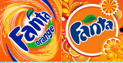
Quick Note: The opening image above is not exactly a before/after of logos, more of a visual language before/after.
I have always had a soft spot for orange sodas, there is something about the combination of magic syrup, orange and bubbles that is just fun. In Mexico the undisputed taste champion (at least in my personal tests) was Orange Crush and I guess the funky glass bottle it came in had something to do with the experience. A close second was Fanta. So, yes, that was an odd segue to bring us to the subject at hand, but I really wanted to link to the Orange Crush bottle. With more than 70 flavors (including mind-benders like Banana Fermented Milk, Mellon Vanilla and Mint Raspberry) in 180 markets around the world, Fanta, from the Coca-Cola family of products, will be implementing a new identity designed by San Francisco-based Office.
Continue reading this entry
If staying at an Econolodge is too highbrow for you, perhaps one of the 2,000-plus locations of Super 8 Worldwide (formerly just Super 8 Motel) would satisfy. Because I believe everything I read in Wikipedia, I now know this is “the world’s largest budget hotel chain,” which is a testament to the ubiquity of these motels as you drive through any and all states in the U.S., and how well it has blended into the background since its inception in 1973. The new logo was introduced back in April of this year but has slowly begun to be displayed in about twenty of the properties, including a recent unveiling at the first Super 8 to grace the landscape of Aberdeen, South Dakota. As with any hotel rebranding, this one is meant to signal a change in the amenities and services offered by the chain — there is a press release to tell you all about it.
Continue reading this entry
A leader in the production and distribution of gas-based domestic appliances, Emegé (pronounced, roughly, eh-meh-heh) is a 75-year-old, family-owned corporation based in Argentina, slowly growing into the international market. With six logos logos since its inception and the latest update in 2003, Emegé has released a contemporary new identity designed by Buenos Aires-based Brea, García Barra y asoc..
Continue reading this entry
Let me preface by noting that I’m not Canadian. I have never lived in Canada. I’ve never seen a commercial with a pair of talking beavers named Frank and Gordon hocking telecommunications products and services. Nor have I seen a lot of the previous Bell Canada logos out there in my daily world. And the first instances of the new logo I saw were images of their teaser campaign with its ample negative space and stark typographic compositions — just the right kind of light-handed touch to peak the curiosity of the graphic designer in me.
Continue reading this entry
If 100 yards feels like too many or being subjected to the whims of nature is not your thing, then indoor football might just be what you need, and there is a new league waiting to fulfill your full-field-length passes: The Indoor Football League (IFL). Created from a merger of two existing leagues, United Indoor Football and (the awesomely named) Intense Football League, IFL will bring together the teams from each league for next year’s season.
Continue reading this entryNext Page
(Total Number of Pages in August 2008: 2)


