

With title apologies to R.E.M..
Yes, you are correct, there is not much new to this logo, and it’s quite likely that you didn’t even notice the change if you happen to be a DIRECTV subscriber. But I find this to be an excellent example of how much identity design has changed and how ubiquitous 3Dimensionalization has become that, now, 3D logos are being revisited and getting redrawn to be more shiny, voluptuous and realistic. One of my favorite designers, typographers and letterers is Jim Parkinson, who, among other talents, has made an art form of redrawing logos that needed more cohesiveness or kick-assedness — i.e. 01, 02, 03, 04 — through a detailed exercise of typographic perfection and nuance. The work of Joe Fino also comes to mind, as someone that can refine letterforms to reveal uniqueness. These, and other designers, are the masters of the nip and tuck. This new iteration of DIRECTV represents the new form of identity nip and tuck: Less about typographic or icon refinement, and more about highlight and shadow enhancement. While it’s easy and expected to cringe at this as a gut reaction, it may be time to accept that this is the new standard, and someone might as well do it right. The old DIRECTV logo was crudely Photoshop’d, and is more reminiscent of early, beveled web graphics. The new one is much more intentional, purposeful and rationalized in the effect, plus it’s probably done with the more powerful and scalable mesh and gradient tools in Illustrator. So I may not find conceptual beauty in these glossy logos, but I can acknowledge when something is better crafted and judge it within the context of current day identity work. The new logo has been redrawn by Capacity.
Continue reading this entry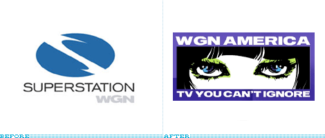
As far as importance, relevance, influence or dissemination goes, the recently renamed WGN America does not rank highly — but as far as bringing the pain, it furiously competes for the top spot. Over the weekend, without much festivities or press releasing, the Chicago-based channel formerly known as Superstation WGN relaunched as WGN America. I haven’t watched WGN since Michael Jordan retired, as they used to broadcast a bunch of the Bulls games, and until this morning I thought their logo was still this simple little thing, which was quite respectable, as opposed to the warped “S” they had until last week. Lee Abrams, chief innovation officer of WGN America’s parent company Tribune Broadcasting Company, stated the following craziness: “[the new brand would] look and sound… like nothing else out there.” Lucky for us, indeed nothing much out there looks like this — except, as pointed out in the article, the Movie Channel’s oldoldold logo, or the thousands of Patrick Nagel’s illustrations. The logo was designed in-house as we learn from this scary sentence in the MediaWeek link above: “In an earlier memo, Abrams said that he had sent WGN’s creative director ‘a few Pink Floyd albums’ after she had turned in some uninspired art/voiceovers.” And there you have it… television branding for the twentyfirst century. Makes you wish they had just lowercased everything and made it roundy.
Thanks to coudal.com for mentioning the change in their Fresh Signals yesterday.
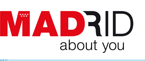
This is almost two months old, but it’s something I meant to post when it came out and somehow forgot to. The Community of Madrid, which is one of the 17 autonomous communities of Spain, unveiled a new logo that they will use to promote Madrid-based businesses in other countries, complementing the launch of a network of offices around the world that will support the international endeavors of these businesses. The Community of Madrid already has a logo, a red square with the seven stars of Madrid’s flag, which some people argued would have been enough instead of having to make a new one — specially a new one with such an odd message.
Continue reading this entry

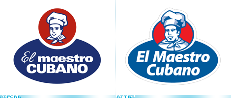
Grupo Bimbo, one of the largest food corporations in the world based in Mexico City with a strong presence in Latin America, and famous for its delicious snacks and ubiquitous bread, has been making headway into the baked goods market in the South American country of Uruguay by purchasing El Maestro Cubano (“The Cuban Craftsman” could be a proper translation in meaning), a leader in that category. The new, revitalized logo has been executed by Uruguay-based Kabala, who had previously done packaging for Bimbo and are now heading the design of the packaging. The brief was as simple as it gets: Make the logo fresh and relevant, stick with the same elements. With the complicated discussions around vaguely disclosed strategies we read on press releases, it is rather nice to just be able to look at a no nonsense graphic execution. The old logo was charming and the typography most likely the result of an original sign painting outside of the first store — I’m just romanticizing here, I don’t know the story of the logo — while the new one fits perfectly in today’s world of consumer good packaging and icons. The typography — set in Myriad Pro Black Italic (I never would have guessed) — is clean and friendly, and pretty much the same can be said about the baker. The elements are well integrated and the colors more in tune with the flagship brand of Bimbo. A very hearty update for this purveyor of (what I’m sure are) delicious treats.
Continue reading this entry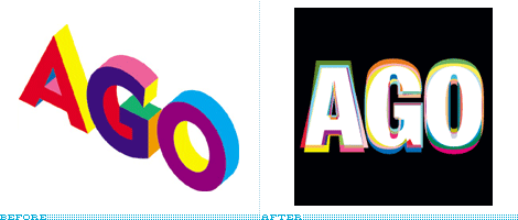
The Art Gallery of Ontario (or, “the AGO” to friends) has been undergoing a revitalization since 2002 that will culminate in a Frank Gehry-designed building and thousands of new works of art sometime in the Fall of 2008, when the AGO reopens its doors, which have been closed since October of last year. In the meantime, and gearing up for the momentous event, the AGO unveiled last week a new logo designed by Bruce Mau Design, who also designed the previous iteration of the logo in 1997.
Continue reading this entry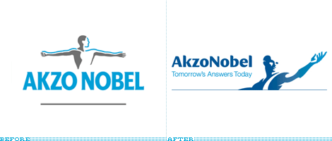
With title apologies to Erasure.
Amsterdam-based AkzoNobel, a powerhouse in the global production and distribution of decorative paints, performance coatings, and specialty chemicals, unveiled a new identity this past April, following the acquisition of ICI, one of the largest chemical producers in the world — the ICI name and logo will slowly fade away as they are not part of the rebranding. The original logo was designed by Wally Olins in 1988 through his namesake Wolff Olins, and the outstretched man was inspired by a Greek bas relief sculpture hosted at the Ashmolean Museum in Oxford chosen “as both a scientific and an artistic symbol, reflecting the values it wanted to express — those of striving and achievement.” The new identity was also designed by Wally Olins, now through his new company, Saffron. The old logo was clunky at best, even if metaphorically strong, so the redesigned male of unidentified race or political inclinations is a welcome evolution to the concept — although it seems more fitting for a healthcare organization than a decorative paints producer, but I am willing to take the leap of faith. The accompanying typography is enjoyable and foregoes the all-lowercase trend, proving that it’s possible to appear accessible and friendly while maintaining a corporate demeanor. There is a wealth of references about the AkzoNobel brand, so please enjoy at your own pace: An overview and brief history of the identity, Brand Center, showing well edited brand movies, and a press release.
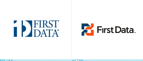
Unfortunately I have nothing to reference or go by for this redesign. (According to this blog post, it’s feasible that Chicago-based VSA Partners did the work — given that First Data has been a client of them since 2001, and the logo is indeed VSA-ish, I would jump on board and agree.) Fortunately, it’s great enough on its own that we can talk about it. First Data is one of those complex companies that make things behind the scenes work flawlessly through mind-bending systems, fancy computers and, surely, some type of mathematical equations. Or, in their words, “First Data processes transaction data of all kinds, harnesses the power of that data, and delivers innovations in secure infrastructure, intelligence and insight for its customers.” What it boils down to is technology, data, and getting it from one place to another — the new logo manages to convey all this and more. The interlocked “F” and “d” signal connectivity and interaction, while the hard-angled shapes convey that this is a technologically astute company that — instead of softening its image like the rest of the rounded identities (xerox, docomo, kodak) — isn’t afraid to communicate that it’s authoritative and hard-nosed. The old logo was a heartwarming play on visuals and language, but felt decidedly vintage. If there is one major complaint I have about the new logo is the annihilation of the dot over the “i.” Sure, it solves the boinking of it against the “F” but I just find this continued practice of de-dotting to be wrong. Nonetheless, In contrast to the remarkable new modern-day monogram introduced by First Data, it’s a small quibble. First Data could transfer my data any day of the week.
Thanks to Joe Szczepaniak and Rachid Molinary for the tip.
Next Page(Total Number of Pages in May 2008: 2)


