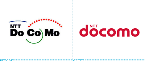

After establishing a Corporate Branding Division last year, Japan’s 53-million-customer NTT DoCoMo is undergoing a major re-branding that will be rolled out July 1st — the cornerstone of which is their new logo. DoCoMo’s company name, previously divided in three syllables and now united as one word, comes from the word dokomo, meaning “everywhere”, and is an abbreviation of the phrase, “Do Communications Over the Mobile Network.”
Continue reading this entry
It is quite likely that you’ve never heard of Cholie’s. I hadn’t. It’s not a national pizza franchise. Nor regional. It’s not a famous local joint that people travel to. It’s not even its hometown’s most famous pie. Cholie’s is a small chain in Chicago, with three locations, aptly named Cholie’s, Cholie’s #2 and Cholie’s #3. Its logo is not even a logo per se, it’s whatever the sign painter can muster using the name, and a pizza with a slice coming off. So why in the world would we be reviewing it?
Continue reading this entry
— “666” has to be in the logo.
— A brand name has to be developed. (Think “Zoloft”, “Viagra” or “Crestor.”)
— Must use “Red”. (Satan owns this color. Sorry “Target” and “Coke.”)
— Spend no more than 30 minutes on it. (Have work to do.)
— Approach it like a corporate client.
— No cliches. (Think “Devil Horns” and “Trident.”)
So, Von, you would show the devil just two options?

Guest Editorial by Kosal Sen
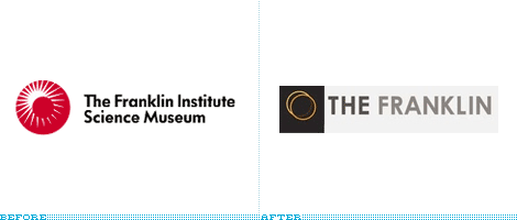
The Franklin Institute Science Museum in Philadelphia is a popular tourist attraction that’s within walking distance from the Philadelphia Museum of Art. It’s a funhouse of exploratory hands-on science. Kids can chase each other inside a giant walk-in human heart, gaze in awe at the IMAX screen, or sit and enjoy the planetarium sky. Though the permanent exhibits are meant for kids on field trips, adults are no less fascinated by the traveling exhibits that take place there, such as The Titanic, Gunther von Hagens’ Body Worlds, and King Tut. Through the years The Franklin Institute has maintained its well-respected, non-profit reputation by balancing educational material and fun without being too commercial or juvenile.
Continue reading this entry

MeadWestvaco, a global supplier of paper products, packaging and chemicals (and subsequently a resource used by many designers… for the paper, not the chemicals) on March 24th unveiled a new brand that shortens the company moniker to “MWV,” introduces a new ribbon element that is animated in a cheesy Flash presentation on the corporate website (more on this later), and incorporates the presumptuous tagline “How brands take shape.”
Continue reading this entry
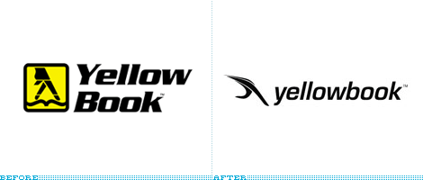
Welcome to, as I found out this morning, the complicated world of Yellow Pages, Yellow Books and Walking Fingers. Like “Xerox” or “Kleenex”, “Yellow Pages” has come to signify the market for those bulky telephone directories that magically appear at your doorstep when you least expect it. Yellow pages have existed since the late 19th century and now comprise a global network of directories published by different phone companies or local entities, and even specialty yellow pages developed for specific neighborhoods and target audiences. The Walking Fingers logo, the “Let Your Fingers Do The Walking” slogan, and Yellow Pages name were first introduced in 1961 by AT&T, and the subsidiary regional operating companies that made up the Bell System, but the logo was never trademarked by AT&T and, actually, AT&T happily allowed others to use the logo — this, of course, was rosy when AT&T was a monopoly and you didn’t have Verizon, or SBC bombarding you with yellow bricks.
Continue reading this entryPrevious Page |
(Total Number of Pages in May 2008: 2)


