
Opinion BY Armin
Hertz Loses its Shadow
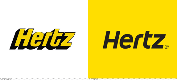
With 8,100 locations in 147 countries and approximately 30 million reservations annually, Hertz is one of the world’s largest rental car services. It’s also the most yellow. Since early this year, Hertz has slowly been introducing a new logo first brought in February from a customer survey. With the logo now on Hertz’s web site and the cover of the 2008 annual report I would have expected a little more fanfare or at least more information, but there is none unfortunately.
Continue reading this entry

DATE: Oct.05.2009 POSTED BY: Armin
 CATEGORY: Transportation
  COMMENTS:

TAGS:

Opinion BY Armin
New Train Connexion for Melbourne

Ten years ago, Connex, a subsidiary of the French corporation Veolia Environnement, was awarded by the State Government of Victoria a contract to operate the suburban rail lines in Melbourne, Victoria. Over the years, as a combination of lack of government support and mismanagement by Connex, the train service has been anything but stellar and has been widely criticized by its riders. This past June, the State Government of Victoria stripped Connex’s contract and, starting in November of this year, the responsibilities will fall to Metro Trains Melbourne (MTM), Metro to the public, an enterprise formed my majority owner MTR Corporation — based in Hong Kong and operating that city’s train lines — and two minority Australian owners, John Holland Group and United Group Rail. The announcement earlier this month came with a look at the new identity.
Continue reading this entry

DATE: Sep.23.2009 POSTED BY: Armin
 CATEGORY: Transportation
  COMMENTS:

TAGS:

Opinion BY Armin
Streamlined Transportation
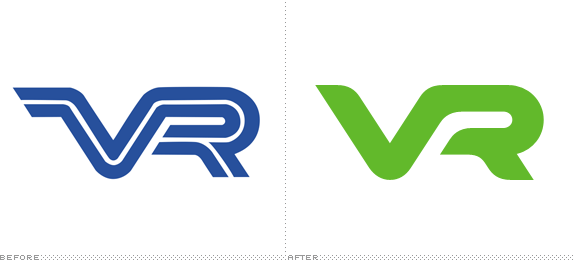
With roots as far back as 1860 and owned by the Finnish State, VR Group is a “logistics company that provides rail transport and supplementary road transport services.” Basically, if you or your cargo want to get somewhere in Finland you will most likely find yourself or it on a VR train. Looking to tout its environmental focus and approach or, in their words, “to stress the eco-friendly nature of rail services” VR has updated its identity to, not surprisingly, be green and have introduced a streamlined VR monogram. The move to green is one more example of the de-blueization of corporate identity and its propagation globally. The new monogram is a really great upgrade and evolution from the previous one, giving VR a contemporary look without feeling futuristic. All the curves and widths have been nicely considered and executed, which is a must for such a simple logo.

DATE: Aug.12.2009 POSTED BY: Armin
 CATEGORY: Transportation
  COMMENTS:

TAGS:

BY Armin
Swooshing Shipping
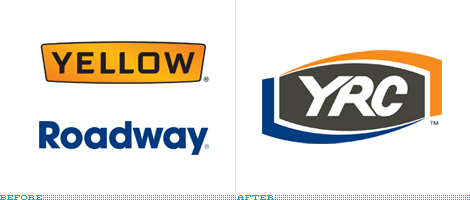
In 2003, Yellow Corporation, owners of the ubiquitous Yellow trucks, purchased Roadway Express, becoming one of the largest transportation, shipping and logistics companies in the U.S. — and changed its name to Yellow Roadway Corporation, later YRC Worldwide. This past January, YRC Worldwide introduced the new public-facing brand that will replace the Yellow and Roadway brands. Simply: YRC. The yellow and blue swooshes are meant to carry the brand equity from the two previous logos. The new lettering is meant to carry the pain suffered by those three poor letters that have been tortured to contort into impossible and atrocious forms. There is no saving grace for this logo, it’s all the wrong moves in all the wrong places, with disparate elements jumbled together. As our tipster noted, the logo was designed by SHR Perceptual Management; I couldn’t confirm, so if this information is different I’ll he happy to change it.
Thanks to Jason Roberts for the tip.

DATE: Feb.06.2009 POSTED BY: Armin
 CATEGORY: Transportation
  COMMENTS:

TAGS:

BY Armin
MapQuest: From Here to Groovy
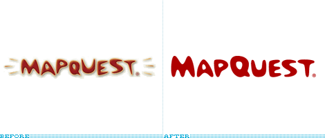
Before Google Maps became the de facto on-line mapping destination, MapQuest was the biggest player in town, or at least the most commonly referenced in the late 1990s and early 2000s — Yahoo! Maps was a contender, but in terms of a cool Web 1.0 name and functionality, MapQuest was it. This past August 26, MapQuest launched a Beta version of a redesign of the service, including the de-bevelization of its logo — here is a quick overlay and comparison of the logos. This is as close as it gets to a miracle in twenty-first-century identity design. What’s great is that, underneath a decade of bevels was a pretty decent, fun logo with a hint of both Jetsons and Bowl-a-Rama, which is more than can be said for many logos. The new logo may not be the epitome of logo design, but it sure is perfect for its context and as an evolution of its web legacy. It’s too bad about all the rest of the AOL flotsam and jetsam that destroys the MapQuest page; no matter what improvements have been or not been made to the map… one minute spent there is one minute more than necessary.
Thanks to Mark Husson for the tip.

DATE: Sep.07.2008 POSTED BY: Armin
 CATEGORY: Transportation
  COMMENTS:

TAGS:

BY John Feldhouse
The Not-so-greener Port

The Port of Seattle is a major hub for international trade, transportation and travel in the northwest United States. Established in 1911, the port has quickly grown, becoming the 7th busiest US seaport in 2007. From its roots until now, the port has always thought of itself as progressive. The port envisions itself as one of the �cleanest, greenest, most energy-efficient port[s] in the nation.� Visually the port has attempted to align itself with its twentieth-century mission of being the cleanest, greenest port.
Continue reading this entry

DATE: Apr.11.2008 POSTED BY: John Feldhouse
 CATEGORY: Transportation
  COMMENTS:

TAGS:

BY Armin
Dubai’s Global Globe
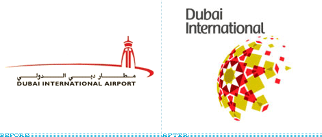
In November of 2007 — sorry we are late on this one — His Highness [sic] Sheikh Mohammed bin Rashid Al Maktoum, Ruler of Dubai [sic], unveiled the new identities for Dubai’s airports, the existing Dubai International Airport (shown above) and the future Al Maktoum International Airport which will be many times larger than its counterpart and be part of Dubai World Central. (Can you imagine George W. Bush, Ruler of the United States, unveiling a rebranding for JFK or Dulles? Ha!). The sphere object is downright beautiful and feels unique to Dubai as a pinnacle of progress, excess and exuberance. It feels expensive, global and forward-looking, everything that Dubai seems to embody. Unfortuntely the same can’t be said for the typography which feels like the ugly cousin of Dax (it of UPS logo fame) and is oddly positioned from the logo — but it’s small enough to be inconsequential to the graphic. Both airports are architecturally branded under a Dubai Airports logo which is equally nice. Overall, this is a great execution for a city that wouldn’t take anything less.

DATE: Jan.27.2008 POSTED BY: Armin
 CATEGORY: Transportation
  COMMENTS:

TAGS:

BY bryony
Putting the E in Enterprise
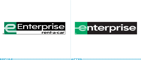
The new logo, the seventh since the company’s inception, was designed internally by Enterprise, with assistance from Monigle Associates of Denver. “Our existing mark has excellent consumer awareness, but at the same time we know we need to reflect changing times and tastes,” said Steve Smith, Enterprise�s vice president of marketing communications. “This evolution of our logo respects the strong equity and heritage of the Enterprise brand, while at the same time giving it a cleaner, bolder, more contemporary look. The ‘Enterprise’ name is also 20 percent larger in this new treatment, providing greater visibility and consumer recognition. That’s especially important as we continue to open branches in more visible locations.”
Continue reading this entry

DATE: Dec.18.2006 POSTED BY: (Display Name not set)
 CATEGORY: Transportation
  COMMENTS:

TAGS:


