A B-Side BY Armin
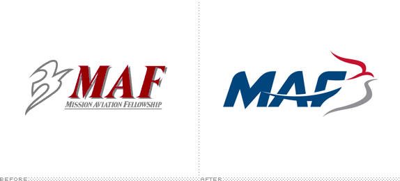
Mission Aviation Fellowship

With origins as far back as 1943, Mission Aviation Fellowship (MAF) “serves people who deal with challenges due to isolation in regions such as Africa, Asia, Eurasia, and Latin America by providing aviation, communications, and learning technology services.” Its mission is to share “the love of Jesus Christ through aviation and technology so that isolated people may be physically and spiritually transformed” and that “all people have access to both the Gospel and the resources that advance God’s Kingdom.” MAF introduced a new logo earlier this month. Part of the release states: “The dove — part of MAF-US’s logos since the 1970s — was maintained in the new design and represents the Christian faith, aviation, and MAF history.” No design credit given.
Thanks to Phil Laver for the tip.

DATE: Aug.27.2012 POSTED BY: Armin
 CATEGORY: Religion The B-Side
  COMMENTS:

TAGS: animal, italic, sans serif,

A B-Side BY Armin
Telenav

Established in 1999, Telenav provides custom wireless location-based services for both consumers in the form of apps and as features for partners like wireless carriers, automobile manufacturers and original equipment manufacturers (OEMs), app developers, advertisers and agencies. Earlier this year, Telenav introduced a new logo. No press release, no design credit.
Thanks to Myles Dordick for the tip.

DATE: Aug.23.2012 POSTED BY: Armin
 CATEGORY: Technology The B-Side
  COMMENTS:

TAGS: sans serif, yellow,

A B-Side BY Armin
Visit Indy

Formerly known as Indianapolis Convention & Visitors Association, the newly renamed Visit Indy is the organization devoted to promoting the city. A new logo, designed by local firm The Lodge was introduced last week. From a news story: “The logo uses several Indy-centric images including an ‘I’ in the word Indy that is supposed to symbolize Monument Circle and a large oval shape coming off the tail of the ‘y’ in Indy symbolizing the Indianapolis Motor Speedway and Indy 500.” A bigger and more gradient-y view of the logo below (or after the jump).
Continue reading this entry

DATE: Aug.21.2012 POSTED BY: Armin
 CATEGORY: Destinations The B-Side
  COMMENTS:

TAGS: script,

A B-Side BY Armin
Madison Public Library

An agency of the City of Madison, WI, the Madison Public Library has nine branches across the city with 2.3 million visitors and 4.75 million checkouts a year — its main branch is currently under renovation. Earlier this month, they introduced a new logo, designed by local firm Cricket Design Works. Image of the unveiling below (or after the jump).
Continue reading this entry

DATE: Aug.20.2012 POSTED BY: Armin
 CATEGORY: Culture The B-Side
  COMMENTS:


A B-Side BY Armin
Piedmont Healthcare

Founded in 1905, Piedmont Hospital is one of the most important in Atlanta, GA with over 3,000 employees and more than 1,000 physicians across five facilities. A new logo, tagline, and advertising campaign were launched in July. Press release here. No design credit given. A couple of videos with the new logo below (or after the jump).
Continue reading this entry

DATE: Aug.17.2012 POSTED BY: Armin
 CATEGORY: Health The B-Side
  COMMENTS:


A B-Side BY Armin
Rosetta Stone

Established in 1992, Rosetta Stone provides “cutting-edge interactive technology that is changing the way the world learns languages. The company’s proprietary learning techniques—acclaimed for their power to unlock the natural language-learning ability in everyone—are used by schools, businesses, government organizations and millions of individuals around the world.” A revised logo was introduced recently, designed by Pappas Group.

DATE: Aug.15.2012 POSTED BY: Armin
 CATEGORY: Technology The B-Side
  COMMENTS:

TAGS: 3d, gradient, sans serif,

A B-Side BY Armin
Iplay

Established in as Oberon Media, Iplay, which takes its new corporate name from its consumer online portal, is an interactive games marketplace and a “multi-platform casual games company” providing distribution of interactive game entertainment for such�partners�as Microsoft, Yahoo and AT&T. The new logo, designed by Berkeley, CA-based Thermostat represents “[Content], curation and�connectivity with an orbiting group of letter Is that expresses�connectivity.�We use the RGB color spectrum graphically to represent all digital media�content and curation by how the shapes overlap and form a new shape of a play�button in the center.” A few application images below (or after the jump).
Continue reading this entry

DATE: Aug.13.2012 POSTED BY: Armin
 CATEGORY: Technology The B-Side
  COMMENTS:


A B-Side BY Armin
2013 MLB All-Star Game

Scheduled for July 16, 2013, the New York Mets will host the 2013 MLB All-Star Game. The logo for the game was released this past Tuesday. Press release here. Breakdown of the story by Chris Creamer here. Detail view of the logo below (or after the jump).
Continue reading this entry

DATE: Aug.10.2012 POSTED BY: Armin
 CATEGORY: Sports The B-Side
  COMMENTS:


A B-Side BY Armin
British Film Institute

Established in 1933, the British Film Institute (BFI), as its name implies, is dedicated to all that is good and holy about British film. Back in 2006 we reported on BFI’s new flexible-ish identity by johnson banks, which I liked quite a bit and in our early years of Brand New was one of the first heated comment threads. A new, dumbed-down version of the logo has been designed by London-based Dewynters.

DATE: Aug.08.2012 POSTED BY: Armin
 CATEGORY: Culture The B-Side
  COMMENTS:

TAGS: gradient, overlay, slab serif,

A B-Side BY Armin
HGTV Canada

Launched in 1997, HGTV (short for Home & Garden Television) is a Canadian (and American) channel that is described by itself as “the hottest address for the most compelling and entertaining stories about the connections people have with the places they call home.” Hottest. Yeah! Basically you just watch it to see if you paid too much for your house or if you are the only tool (as in dumbass not the physical thing in a shed or box) that gets screwed (no pun intended) by their contractors. The Canadian version redesigned its logo in July to match the American version and also introduced a new on-air graphics package designed by Toronto-based Tendril. On-air video below (or after the jump). For an in-depth look at the typography see this Fonts In Use post.
Continue reading this entry

DATE: Aug.07.2012 POSTED BY: Armin
 CATEGORY: Entertainment The B-Side
  COMMENTS:

TAGS: canada, on-air, television,


