
A B-Side BY Armin
Brooklyn Public Library

About: (Est. 1896) “As an independent system, separate from the New York City and Queens libraries, Brooklyn Public Library serves the borough’s 2.5 million residents, offering thousands of public programs, millions of books and use of more than 1,100 free Internet-accessible computers.”
Design by: Eight and a Half.
Ed.’s Notes: I’m not usually the correct-English-police but there is something odd about the library using the slang-ish abbreviation of the borough. It’s far more readable at smaller sizes, that’s for sure.
Relevant links: BPL blog post with historical logos.
Select quote: “Gone is the sad little black box that for so long meekly defined our presence in the digital realm. There’s something invigorating about the facelift that comes with rebranding — it seems to signify a fresh start, a new direction.”
Thanks to Ricardo Cordoba for the tip.

DATE: Jan.15.2013 POSTED BY: Armin
 CATEGORY: Culture The B-Side
  COMMENTS:

TAGS: bold, brooklyn, library, sans serif,

A B-Side BY Armin
Fandor

About: (Est. 2011) “Fandor is the leading on-demand independent film service, expanding the audience for independent films and offering an innovative new distribution platform that shares revenue with filmmakers. Fandor’s rich editorial environment and active community of film fans makes it easy and rewarding to discover movies from its handpicked library of independent and international films.
Design by: Surface Under Fire.
Ed.’s Notes: If the Playboy bunny and the Penguin penguin had a baby this would be it. Bigger view below (or after the jump).
Relevant links: N/A.
Continue reading this entry

DATE: Jan.14.2013 POSTED BY: Armin
 CATEGORY: Entertainment The B-Side
  COMMENTS:

TAGS: mascot, sans serif, uppercase,

A B-Side BY Armin
Government of Saskatchewan

About: “Saskatchewan became a province of Canada on September 1, 1905. Located between Alberta to the west and Manitoba to the east, its boundaries extend from the US border along the 49th parallel to the border with the Northwest Territories along the 60th parallel. Saskatchewan covers 6.5% of Canada, an area of 651,036 square kilometres. Of this, 591,670 square kilometres are land and 59,366 square kilometres are covered by water.” [Way more…].
Design by: Brace yourselves, “The newer logo was developed and tweaked by a number of agencies and organizations over the years, including Regina’s H.J. Linnen and the Phoenix Group, and government agency Enterprise Saskatchewan. The most recent adjustments were made by Saskatoon-based Kinetic design agency.”
Ed.’s Notes: This logo has sparked a controversy because (A) people seem to really really like the wheat sheaf icon; (B) it’s not just a new logo, but it’s a third logo that is used along with a seal and the wheat sheaf icon and there is a bunch of rules about which one is used where; and (C ) “The New Democrats are criticizing the provincial government’s new logo because it uses the Saskatchewan Party’s green-and-yellow colour scheme,” calling it sneaky and inappropriate. I’ll simplify things for all ya’ll Saskatchewans: the logo sucks, that’s why it’s controversial.
Relevant links: Design Edge story. CBC story. Huffington Post story.
Thanks to Aylwin Lo for first tip.

DATE: Jan.11.2013 POSTED BY: Armin
 CATEGORY: Politics The B-Side
  COMMENTS:

TAGS: canada, controversy,

A B-Side BY Armin
The Biggest Loser

About: (Est. 2004) “The Biggest Loser is a reality television show which first started in the U.S. in 2004. The show centers on overweight contestants attempting to lose the most weight to fight for a cash prize. There are different variations of The Biggest Loser around the world. Each country has made its own adaptation to the show; however, the contestants always have the same goal: to lose the highest percentage of weight (or most weight) to become the Biggest Loser.” (Source: Wikipedia).
Design by: N/A.
Ed.’s Notes: Very important logo redesign we are talking about here. Bigger view of the logo below (or after the jump).
Relevant links: N/A.
Continue reading this entry

DATE: Jan.10.2013 POSTED BY: Armin
 CATEGORY: Entertainment The B-Side
  COMMENTS:


A B-Side BY Armin
Food Network

About: (Est. 1993) “Food Network is a unique lifestyle network, website and magazine that connects viewers to the power and joy of food. The network strives to be viewers’ best friend in food and is committed to leading by teaching, inspiring and empowering through its talent and expertise. Food Network is distributed to more than 100 million U.S. households and averages more than 9.9 million unique web users monthly.”
Design by: N/A.
Ed.’s Notes: Pretty terrible evolution.
Relevant links: Food Network blog post.

DATE: Jan.09.2013 POSTED BY: Armin
 CATEGORY: Entertainment The B-Side
  COMMENTS:


A B-Side BY Armin
Florida Lottery
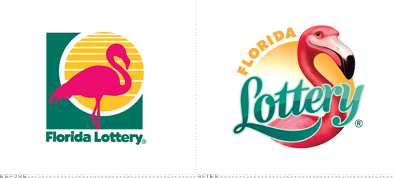
About: (Est. 1988) “Over the past quarter century, the Florida Lottery has paid more than $37.7 billion in prizes to winners, enjoyed a mutually-beneficial relationship with more than 13,000 retailers and generated more than $24 billion for education.”
Design by: FutureBrand.
Ed.’s Notes: Bigger view of the new logo below (or after the jump).
Relevant links: 25th Anniversary mention.
Excerpt from provided description by Futurebrand:“Supported by insights gathered from extensive research, we put special focus on developing the mark’s keystone element—an engaging, expressive flamingo. Deemed fun, friendly and Floridian by players, retailers and community members alike, the new character is a manifestation of everything the Lottery can and does represent.”
Continue reading this entry

DATE: Jan.08.2013 POSTED BY: Armin
 CATEGORY: Entertainment The B-Side
  COMMENTS:

TAGS: animal, illustration, mascot, script,

A B-Side BY Armin
Seattle Reign FC

About: (Est. 2012) “Seattle Reign FC is one of eight clubs that will compete in the National Women’s Soccer League (NWSL) beginning in the Spring of 2013.”
Design by: N/A.
Ed.’s Notes: Detail view of the logo and (a nicer) alternate version below (or after the jump).
Relevant links: SB Nation story.
Continue reading this entry

DATE: Jan.07.2013 POSTED BY: Armin
 CATEGORY: Sports The B-Side
  COMMENTS:


A B-Side BY Armin
LOV/CON

About: (Est. 2012) LOV/CON is a conference about love, passion and relationships. […] Caroline and Daniel Pieracci had the idea to put on LOV/CON as a fun way to celebrate their marriage with their friends and family. It quickly outgrew itself, and became a little love movement.”
Design by: Johannes Widmer.
Ed.’s Notes: I love this logo. That is all.
Relevant links: N/A.

DATE: Dec.21.2012 POSTED BY: Armin
 CATEGORY: Culture The B-Side
  COMMENTS:


A B-Side BY Armin
Air Canada Rouge

About: (Est. 2012) Rouge is “Air Canada’s new leisure airline with stylishly affordable service to holiday spots in Europe and the Caribbean. Benefit from Air Canada’s extensive network for smooth connections to flights departing daily from Toronto and Montreal. Service begins July 1, 2013. It’s time to go more. “
Design by: N/A.
Ed.’s Notes: Wow. That is bad. I would excuse how bad it was if at least they would have actually taken the time to hand-letter it instead of just using a font — or if they did hand-letter it (because I really have no idea what font that is, I’m just assuming) then they should have made different letterforms for the repeating characters in “Rouge” and “go more”. Terrible. Livery and logo-on-balloons images below (or after the jump).
Relevant links: Meet Air Canada Rouge.
Select quote: “Air Canada rouge embodies the best of Air Canada including reliability, trustworthiness, top safety standards and a name and iconic brand that represents ‘Canada. The name was tested in major Canadian cities. Canadians said the name and colors spoke to the color Canada is known for: red, a color they link to warmth, fun and excitement. Air Canada rouge also represents Canada’s two official languages.”
Continue reading this entry

DATE: Dec.20.2012 POSTED BY: Armin
 CATEGORY: Aviation The B-Side
  COMMENTS:

TAGS: canada, hand-drawn, livery, red,

A B-Side BY Armin
PONCHO

About: (Est. 1963) “PONCHO (Patrons of Northwest Civic, Cultural and Charitable Organizations) is a 501(c)(3) non-profit organization dedicated to enriching the quality of life in the Puget Sound through increasing resources and community support for the arts. PONCHO acts as a catalyst for change in the arts sector by leveraging relationships with arts, philanthropic and education communities to build our civic and cultural life. PONCHO has provided over $35 million in support for 200+ arts organizations.”
Design by: The Garrigan Lyman Group.
Ed.’s Notes: Personally I would have started with changing the name or acronym.
Relevant links: N/A.

DATE: Dec.19.2012 POSTED BY: Armin
 CATEGORY: Non-Profit The B-Side
  COMMENTS:

TAGS: overlay, sans serif,


