
A B-Side BY Armin
MailChimp
About: (Est. 2001) “MailChimp supports more than 3 million subscribers worldwide, sending 5 billion messages per month. MailChimp is designed for the do-it-yourself power user — someone looking for all of the power of an enterprise application, but built for anyone to use.”
Design by: Jessica Hische.
Ed.’s Notes: Fantastic evolution that maintains the character of the original with enhanced performance. Bigger view below (or after the jump) and be sure to check the link below to get insight into all the subtle changes made.
Relevant links: Jessica Hische case study.
Select quote: “Overall the weight was lightened, the vector drawing improved, and letterforms were revised for legibility, especially at small sizes. The end result is something new and fresh, more refined but just as playful.”
Continue reading this entry

DATE: Jun.20.2013 POSTED BY: Armin
 CATEGORY: The B-Side Technology
  COMMENTS:


A B-Side BY Armin
Emma
About: (Est. 2003) “Emma is a web-based email marketing service helping more than 40,000 customers manage their online communication efforts. With sophisticated design, easy-to-use features and stellar customer support, it’s the easiest way to create, send and track stylish email newsletters and campaigns.”
Design by: In-house (Chris Korbey, Creative Director).
Ed.’s Notes: Sexy librarian, anyone? Logo variations below (or after the jump).
Relevant links: Emma blog.
Provided quote: “The new logo is simpler, more modern and more flexible, but the real story is in the wordmark. Emma is dedicated to great design — even within the tight parameters of HTML for email. One of email’s biggest restrictions is a limited choice of typefaces. Web fonts don’t work with email, so you’re beholden to system fonts. With that in mind, we created the new wordmark from Georgia Bold Italic, which every Emma user has access to. The letterforms were customized to marry with the new Emma face, but the logo pays homage to our customers.”
Continue reading this entry

DATE: May.21.2013 POSTED BY: Armin
 CATEGORY: Technology The B-Side
  COMMENTS:


Opinion BY Armin
Facebook’s Radically New “f” Logo

I will spare you my usual introductory paragraph this morning since you all know what Facebook is and what it does and get right to the point. Last month, without much fanfare, Facebook introduced a revised version of its “f Logo” which is meant to be used to promote an organization’s or person’s presence on Facebook. It’s ubiquitous — yet I had never realized there was, officially, a lighter blue line at the bottom of it. Along with the new “f Logo” also comes an official brand page and a revised set of icons for all the different services/pages found throughout the Facebook universe. Obviously this is not the most earth-shattering change in the history of logo changes but it’s my duty to report on it, since, like, a billion people use Facebook.
Continue reading this entry

DATE: May.01.2013 POSTED BY: Armin
 CATEGORY: Technology
  COMMENTS:


A B-Side BY Armin
Apple Worldwide Developers Conference 2013
About: (Est. 1983) “The Apple Worldwide Developers Conference, commonly abbreviated WWDC, is a conference held annually in California by Apple Inc. The conference is primarily used by Apple to showcase its new software and technologies for developers, as well as offering hands-on labs and feedback sessions.” (Source: Wikipedia)
Design by: N/A.
Ed.’s Notes: They sure have been on an app-icon-shape kick lately. It’s better than last year’s, but that’s not saying much. Bigger view of the logo below (or after the jump).
Relevant links: N/A.
Continue reading this entry

DATE: Apr.29.2013 POSTED BY: Armin
 CATEGORY: Technology The B-Side
  COMMENTS:


Opinion BY Armin
April Fools: Google Chrome’s Broken Image Icon Heals Broken Hearts
First used in 1994 with the beta release of Netscape, the “broken image” icon has become a staple of web browsing. In this Quora question, Netscape’s original UI designer gives credit to Marsh Chamberlin of DataGlyph for creating the first, literally-iconic rendition of a shattered frame containing a sphere, pyramid, and cube. Since then, some browsers have used variations of the theme while others, like Safari, have gone with their own idea like a question mark for Apple’s own browser. Until earlier this year, Google’s Chrome browser had been using its own take on the original but one thing we know is that you can’t contain Google to the status quo. A new broken image icon has started appearing across users’ Chrome browser this year and since we’ve covered Google’s favicon, not once but twice, I thought it would be relevant to cover this minor yet significant change.
Continue reading this entry

DATE: Apr.01.2013 POSTED BY: Armin
 CATEGORY: Technology
  COMMENTS:

TAGS: flexible identity, google, pixelated,

A B-Side BY Armin
Acxiom
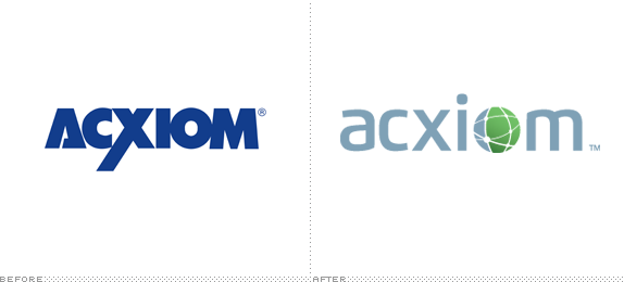
About: (Est. 1969) “Acxiom is an enterprise data, analytics and software as a service company that uniquely fuses trust, experience and scale to fuel data-driven results. For over 40 years, Acxiom has been an innovator in harnessing the most important sources and uses of data to strengthen connections between people, businesses and their partners. Utilizing a channel and media neutral approach, we leverage cutting-edge, data-oriented products and services to maximize customer value. Every week, Acxiom powers more than a trillion transactions that enable better living for people and better results for our 7,000+ global clients.”
Design by: N/A.
Ed.’s Notes: It’s nice to see that boring, corporate logos can still be done nowadays. Bigger view of the logo and some applications below (or after the jump).
Relevant links: N/A.
Select quote: “The rebrand is an expression of our new powerful reality and reflects our strategy of connecting people, business and their partners. We are ramping up investment in product innovation, and have recently launched two products,” said Jefferies. “We want to make 1:1 marketing at scale, with privacy best practices, a reality.” - Wyatt Jefferies (spokesperson)
Continue reading this entry

DATE: Mar.26.2013 POSTED BY: Armin
 CATEGORY: Technology The B-Side
  COMMENTS:

TAGS: globe, lowercase, sans serif,

A B-Side BY Armin
Conax
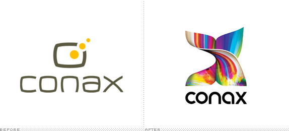
About: (Est. 1986) “Conax protects content for over 350 pay-TV operators, representing 125 million consumers in 85 countries around the globe. Our latest content protection platform, Conax Contego, built on 25 years of pioneering security expertise, is the most secure on the market today. Conax Contego provides secure content delivery and digital rights management across broadcast, broadband or OTT on the devices of your choice, wherever and whenever you need it. Headquartered in Norway, Conax has offices in 14 locations, including 24/7 global support operations based in India. Conax is part of Telenor Group, one of the world’s largest mobile operators.”
Design by: Pajama.
Ed.’s Notes: It’s like a Richard Serra sculpture and video mapping performance all in one! A few more applications and video of the animated logo below (or after the jump).
Relevant links: Pajama case study.
Select quote: “The company had last invested in its branding in 2002. The appointment of a new CEO in 2012 led to a decision to address a rather dated identity which no longer fitted the global company Conax had become. We advised that the identity could not be refreshed without brand strategy.
The creative brief grew out of the strategy we helped Conax articulate. The big idea for the brand, ‘Sustaining Magic,’ encapsulates the crucial role of conditional access in safeguarding valuable TV content. This idea is supported by values rooted in the Conax culture and useful for future growth: Curiosity, Integrity and Agility.”
Continue reading this entry

DATE: Mar.15.2013 POSTED BY: Armin
 CATEGORY: Technology The B-Side
  COMMENTS:

TAGS: 3d, lowercase, sans serif, texture,

Opinion BY Armin
Mozilla to Mobile OSes: Fox You.
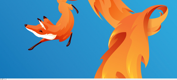
Launched last month, Firefox OS is a new operating system developed by Mozilla specifically for use in mobile devices. Like its popular (free and open source) browser, Firefox, this OS “brings the freedom and unbounded innovation of the open Web to mobile users everywhere” as Gary Kovacs, CEO, Mozilla announced. Firefox OS is entering a very tough market where Apple’s iOS and Google’s Android have a stronghold on the market so it’s up to Mozilla’s do-good vibe and geek-cred to gain ground on the iOS’ chastity-belt-approach and Android’s super-deploying powers to become a contender. So far 17 mobile operators around the world have committed to Firefox OS and upcoming smartphones built specifically for it will launch later this year. To help Firefox OS build a broader consumer brand of its own Mozilla worked with Wolff Olins to “unleash the Fox”.
Continue reading this entry

DATE: Mar.11.2013 POSTED BY: Armin
 CATEGORY: Technology
  COMMENTS:

TAGS: animation, illustration, mascot, wolff olins,

A B-Side BY Armin
EVS
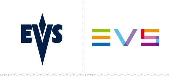
About: (Est. 1994) “EVS provides its customers with reliable and innovative technology to enable the production of live, enriched video programming, allowing them to work more efficiently and boost their revenue streams. Its industry-leading broadcast and media production systems are used by broadcasters, production companies, post-production facilities, film studios, content owners and archive libraries around the globe. It spans four key markets — Sports, Entertainment, News and Media. The company is headquartered in Belgium and has offices in Europe, the Middle East, Asia Pacific, and North and Latin America. Approximately 475 EVS professionals from 20 offices are selling its branded products in over 100 countries, and provide customer support globally.”
Design by: N/A.
Ed.’s Notes: Not terribly exciting but way better than the previous vampire logo. Bigger view and needlessly long video below (or after the jump).
Relevant links: Semi press release.
Continue reading this entry

DATE: Feb.26.2013 POSTED BY: Armin
 CATEGORY: Technology The B-Side
  COMMENTS:


A B-Side BY Armin
Vine

About: (Est. 2013) “Vine is a mobile app by Twitter that hosts short video clips for sharing through the user’s Twitter feed. Clips have a maximum length of six seconds. It debuted on 24 January 2013 as a free iOS app on the iPhone and iPod Touch. ” (Source: Wikipedia)
Design by: N/A.
Ed.’s Notes: Undecided if I love it or hate it. There is something attractive about it but there is something very unresolved about the script approach. Bigger view of the logo and app icon below (or after the jump).
Relevant links: N/A.
Continue reading this entry

DATE: Feb.01.2013 POSTED BY: Armin
 CATEGORY: Technology The B-Side
  COMMENTS:

TAGS: script,


