
BY Armin
HP Called, it Wants its Logo Back
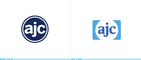
In August of 2008 we reported on HP (Hewlett-Packard) shedding its rectangle for a simple circle shape. I am happy to report that we now know HP’s rectangle was found by AJC, the online edition of the Atlanta Journal-Constitution. Apparently, the AJC can’t seem to figure out an original logo, as the old one was reminiscent of another bastion of online news, the A.V. Club, and while I’m not one to typically say “this logo reminds of…” I think it’s worth pointing out here because this logo could be something unique: The lowercase “ajc” letters provide a great set of letterforms to work with and it’s a shame that all they can do is select something from the Font menu and put it in a generic holding shape.
Thanks to Junghoon Park for the tip.

DATE: Feb.09.2009 POSTED BY: Armin
 CATEGORY: Media
  COMMENTS:

TAGS:

BY Armin
Brand New: Best & Worst 2008
As the year comes to a close and the list tradition bears on, I thought a Best & Worst selection from the 2008 archives of Brand New would be entertaining. These are my best and worst and they don’t represent the comments on each of the original posts, whether positive or negative. Other than the first item in each category (my favorite and my least favorite) the selections are in no particular order. I’ll take this opportunity too, to thank everyone that visits Brand New — every single month of 2008 our readership increases — and for all of you that send us tips, we would literally not have the great content we have if it weren’t for your contributions. Posting will be light for the next two weeks. Enjoy your Holidays and have a happy new year.
Continue reading this entry

DATE: Dec.22.2008 POSTED BY: Armin
 CATEGORY: Media
  COMMENTS:

TAGS:

BY Armin
Headline News Logo Speaks!
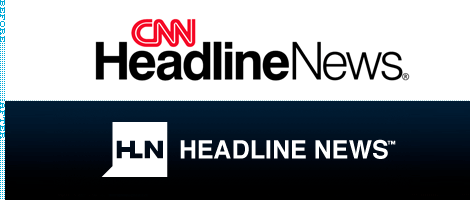
Many changes happened across the CNN network this week, most notably the replacement of the on-screen ticker at the bottom of the TV with the “flipper.” The other notable change is the redesign of the CNN Headlines News logo, which has dropped the CNN and moved away from the overarching use of lowercase sans serif and red. As far as speech bubble logos go, this is perhaps one of the nicest and most appropriate. It feels contemporary and hardcore, just like the channel itself. At first I was taken aback by the HL ligature, but it’s actually quite smart as it creates a better acronym than just HN and reminds people that “headline” is one word. You can never have enough grammar and spelling lessons in the world. This is a nice move to give Headline News its own look and feel that doesn’t rely so much on its parent identity.
Thanks to Geoffrey Sorensen for the tip.

DATE: Dec.17.2008 POSTED BY: Armin
 CATEGORY: Media
  COMMENTS:

TAGS:

BY Christian Palino
Spinning Wheels
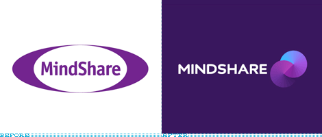
Mindshare, the media company formed by the 1997 merger of the media departments of JWT and Ogilvy & Mather, has rebranded as part of a global restructuring at WPP. This re-engineering of the brand involves a complete remake of the identity, save the retention of the color purple. Even the name itself has seen a shift in the reduction of the letter “S.” The redesign was developed in partnership with Moving Brands, who explain that “The symbol has been created to reflect the structure and form of Mindshare’s business. It shows two forms coming together to create a new, strong form reflecting Mindshare’s partnerships with clients, suppliers and other agencies.” You can read a bit more about the rebrand on Mindshare’s web site.
Continue reading this entry

DATE: Oct.08.2008 POSTED BY: Christian Palino
 CATEGORY: Media
  COMMENTS:

TAGS:

BY Armin
E-nvigorating Radio and TV in España

Corporation RTVE (Radio Televisión Española, Spanish Radio Television) is the organization in charge of Spain’s public radio and television; running eight TV channels, six radio stations and an internet portal. Over the weekend RTVE unveiled a new identity for their corporation as well as a cohesive family of brands for their TV, radio and internet properties.
Continue reading this entry

DATE: Jun.11.2008 POSTED BY: Armin
 CATEGORY: Media
  COMMENTS:

TAGS:

BY Armin
White News

Euronews, a 15-year-old news channel with an unconventional approach — i.e., their “No Comment” segment features news clips presented without segues or comments, it just rolls — launched a new identity last week. Designed by Paris-based advertising agency FFL, the new logo is a white circle paired with the awful choice of either ITC Bauhaus or its rich version, Chalet 1970 — elements indicative of transparency and simplicity in the delivery of news that Euronews strives for, or, in their words, “The new euronews signature epitomises the fundamental values of the channel: honesty, integrity, neutrality, transparency in the broadcasting of information and,in particular, respect for the viewer who is looking for information over spectacle.” This page has a nice collection of brand statements and positioning about the channel and the new logo as well. I have never watched Euronews, so I will have to go by what I’ve read so far, and it feels like the positioning and the logo are on par with each other and, above all, signal confidence. I really don’t like the typeface choice at all because it is trying too hard to be different, and because it does not reflect the goal of simplicity, and the white circle could be a little pretentious, but it fits the quirky attitude of the channel.
Thanks to Ranwa Hakim for the tip.

DATE: Jun.09.2008 POSTED BY: Armin
 CATEGORY: Media
  COMMENTS:

TAGS:

BY Joe Marianek
Loud in New York City

A new identity, designed by Open, has been launched for WNYC (93.9 FM, AM 820), the regional provisioner of NPR & PRI news broadcasting and arbiter of exquisitie cultural infotainment. The station is recognized for its nationally syndicated programs hosted by namesakes such as Brian Lehrer and signature shows such as Studio 360 with Kurt Andersen. For non-New Yorkers, live and archived shows can be accessed at wnyc.org.
Continue reading this entry

DATE: Apr.21.2008 POSTED BY: J. Marianek
 CATEGORY: Media
  COMMENTS:

TAGS:

BY Armin
The Biggest Collection of Dots in the World

There is nothing more exciting for global conglomerates than having a “Biggest [blank] Company in the World!” catchphrase, and the latest addition to this lofty echelon of behemoths is Thomson Reuters, the biggest business media company in the world, that resulted from the purchase of Reuters by the Thomson Corporation, a deal worth billions of dollars and stock fluctuations. Yesterday, the new company unveiled its new identity, designed by Interbrand.
Continue reading this entry

DATE: Apr.18.2008 POSTED BY: Armin
 CATEGORY: Media
  COMMENTS:

TAGS:

BY Christian Palino
Gimme Shelter

PhotoShelter, a “provider of archiving, e-commerce solutions and sales opportunities to the world’s fastest growing community of independent photographers,” founded in 2005, recently exited its Beta stage and has entered the busy, online stock photo marketplace with the intent of bringing back more control to the photographers whom they work with.
Continue reading this entry

DATE: Apr.16.2008 POSTED BY: Christian Palino
 CATEGORY: Media
  COMMENTS:

TAGS:

BY Armin
The Roaring Mouse
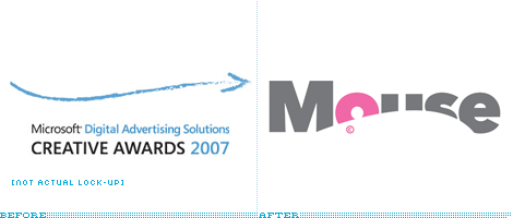
If you’ve never heard of the [deep breath] Microsoft Digital Advertising Solutions Creative Awards it may most likely be because — if you reside in the U.S. like yours truly — it’s a European competition, or because it’s only two years-old, or, possibly, because its six-word-long name is downright forgettable, if not obnoxious — or maybe, by default, you just stop reading anything after the word “Microsoft”. Also, the criteria for entering is somewhat limiting: Advertising that appeared only in a Microsoft-run web site like MSN or XBOX Live. The one uptick to these awards is that the first-prize winners in each category get automatically entered into the Cannes Cyber Lions competition — a big deal if there ever was one. Seeing that a coveted “Lion” award was the ultimate bait, Brand Guardians and johnson banks (who are the firm responsible for the playful identity), focused on fauna-influenced naming and arrived at “Mouse” as a better, catchier and more memorable name for these awards.
Continue reading this entry

DATE: Feb.14.2008 POSTED BY: Armin
 CATEGORY: Media
  COMMENTS:

TAGS:


