
A B-Side BY Armin
Deutsche Welle

On the air since 1953, Deutsche Welle is Germany’s international broadcaster, “its work around the globe is based on German federal law and is financed from tax revenue.” It has a staff of about 1,500 people across the world. A new logo was introduced last week. Release here.
Thanks to Ivan Filipov for the tip.

DATE: Feb.10.2012 POSTED BY: Armin
 CATEGORY: Media The B-Side
  COMMENTS:

TAGS: blue, monogram, Sans Serif,

A B-Side BY Armin
Transcontinental

Transcontinental is a marketing activation company founded in 1976. According to their website, they are the “Largest printer in Canada. One of Canada’s leading providers of Web solutions and marketing communications. Canada’s leading consumer magazine publisher.” In addition to the new mark, the trademark changed to “TC. Transcontinental”. The new identity was done by Montréal’s brand strategy consulting firm Cohesion Strategies and creative shop Bleublancrouge. From the press release: “The new brand better reflects the company’s comprehensive and integrated marketing communications offering, including print, media, digital, interactive and mobile.” Some applications below (or after the jump).
Continue reading this entry

DATE: Feb.01.2012 POSTED BY: Armin
 CATEGORY: Media The B-Side
  COMMENTS:

TAGS: Bleublancrouge, Cohesion Strategies, dot, lowercase, Sans Serif, small caps,

A B-Side BY Armin
Women at NBCU
Launched in 2008, Women at NBCU is an “ad sales, marketing and research initiative [that] creates custom solutions for advertisers to connect with female consumers via NBCUniversal’s wide portfolio.” Logo designed by Wolff Olins. A few more images at Wolff Olins designer Mike Abbink’s website.
Thanks to Marc Nijborg for the tip.

DATE: Sep.09.2011 POSTED BY: Armin
 CATEGORY: Media The B-Side
  COMMENTS:

TAGS: condensed, monogram, wolff olins,

Opinion BY Armin
Smile, you are on the Yellow Pages
PagesJaunes (Yellow Pages) is, as you may have guessed, the Yellow Pages business directory in France. Owned by PagesJaunes Groupe, one of the largest advertising placement and managing companies in the world representing over 770,000 advertisers, PagesJaunes boasts 1 million printed directories across the country, 78 million hits per month on its website, and 4 million downloads of its mobile application. So: Big. Earlier this month PagesJaunes introduced a new identity designed by Publicis Royalties. Press release for our French readers here.
Continue reading this entry

DATE: Apr.21.2011 POSTED BY: Armin
 CATEGORY: Media
  COMMENTS:


A B-Side BY lauren
City Grid Media

Owner of local-scene sites like Citysearch, Insider Pages, and Urbanspoon, CityGrid Media is “an online media company that connects web and mobile publishers with local advertising organizations.” Its identity has been designed by La Visual. A photo of the stationery is available after the jump.
Continue reading this entry

DATE: Mar.23.2011 POSTED BY: Armin
 CATEGORY: Media The B-Side
  COMMENTS:

TAGS:

Opinion BY Armin
Is that an Accent in your Gradient, or are you just Happy to see me?
Established in 1966 as Grupo Editorial Expansión (Editorial Group Expansión), this Mexican media organization launched its first eponymous magazine, Expansión, in 1968, which has been in circulation, covering business news, for 42 years. Since then, it has introduced 18 more magazine into the Mexican market, including American imports like Travel + Leisure, InStyle, and Elle, along with more local and upscale fare. It also counts with an online presence in the form of a CNN business portal called CNNExpansión and a few other entertainment and lifestyle sites. In 2005 Group Editorial Expansión was acquired by none other than the grandaddy of media organizations, TimeWarner. At the end of June, Grupo Editorial Expansión dropped “Editorial” from its name — to Grupo Expansión — and introduced a new logo created by Ideograma, an identity firm located in Cuernavaca, just a few miles outside Mexico City.
Continue reading this entry

DATE: Jul.20.2010 POSTED BY: Armin
 CATEGORY: Media
  COMMENTS:

TAGS: grupo expansion, ideograma, mexico, monogram,

Opinion BY Armin
A River Runs Through It
Operating 20 television networks, 82 radio stations, and 8,000 outdoor advertising spaces, Astral Media is one of Canada’s largest media corporations, employing 2,800 employees across the country. Originally started in 1961 as a photo concession service within a store, it dabbled in various fields, from film and TV production to videocassette duplication, before growing into the conglomerate it is today that “plays a central role in community life across the country by offering diverse, rich and vibrant programming that meets the tastes and needs of consumers and advertisers.” Last week, Astral Media announced it would change its public name to, simply, Astral and introduced a new identity and advertising campaign by Toronto-based Juniper Park.
Continue reading this entry

DATE: Jun.01.2010 POSTED BY: Armin
 CATEGORY: Media
  COMMENTS:

TAGS: advertising, astral, canada, icon, juniper park,

Opinion BY Armin
Play that Funky Music Y Boy
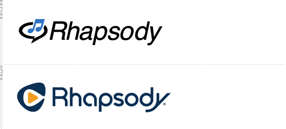
At the turn of the century, the internet held the promise of content “streaming,” a splashing waterfall of always-on music and video, but bandwidths weren’t then what they are now, and the whole experience of streaming anything was slow and painful. One of the frontrunners though was Rhapsody in 2001, owned by Listen.com at the time, which provided over 30,000 legally-owned tracks. Two years later, Rhapsody was acquired by RealNetworks, where Rhapsody’s catalog and subscribers continued to grow. This month, with close to 10 million tracks, Rhapsody became an independent company and to break free from the RealNetworks branding, created a new logo.
Continue reading this entry

DATE: Apr.21.2010 POSTED BY: Armin
 CATEGORY: Media
  COMMENTS:


Opinion BY Armin
New Butterfly not so Fly
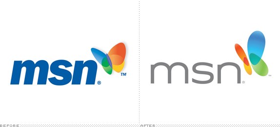
It’s a rhetorical question since I am assuming thousands of people do but, seriously, does someone use msn.com anymore? With so many cooler and more efficient ways to access the online world, MSN has for a long time felt caught in 1999, both aesthetically and technologically, heck even philosophically. I’ll admit that I really like the MSN butterfly from the beginning when it was introduced in 2000 and in TV ads it had a lovely animation. But in the twenty-first century I don’t recall ever visiting MSN willingly. Not that that’s about change anytime soon but at least if I do, the new scenery won’t be as dreadful as it used to be, at least in the design of the web site. The new logo, well, that’s another story….
Continue reading this entry

DATE: Nov.05.2009 POSTED BY: Armin
 CATEGORY: Media
  COMMENTS:

TAGS:

BY Armin
Pitchfork, All Grown Up
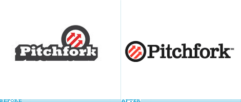
It’s hard to believe that fourteen years have already passed since Chicago-based Pitchfork launched — launching along with it, hundreds of careers of independent musicians in this span. Like other successful and fledgling online ventures that started as whims of young folks who saw a hole in the internet market years ago, Pitchfork has matured and grown up to be serious business and its new logo, introduced this week, reflects this evolution. While both old and new logos are perfectly respectable and ad hoc, the new one is definitely more “corporate”, now with the arrowed pitchfork as its own icon that, with its audience, is as recognizable as the nike swoosh. The typography is also more normal, going from a heavy slab serif to a more conventional Clarendonesque typeface. Nonetheless, the logo retains the equity of the original and, like any other product, it’s the content that matters, and Pitchfork continues to deliver in that regard. That blue graffiti top-left corner of the old web site will surely be missed though.
Thanks to Steve Spillman for first tip.

DATE: Mar.12.2009 POSTED BY: Armin
 CATEGORY: Media
  COMMENTS:

TAGS:


