
BY Joe Marianek
Sweet Substance

If you live outside of New York City, you may only be nostalgically familiar with this frozen dessert retailer by way of mentions on Sex and the City and The Apprentice. And if you’re from the 1990s, Tasti is the rumored unaccredited culprit on the “Yogurt” episode of Seinfeld. To the uninitiated, this dairy based treat is “Not frozen yogurt, because it doesn’t contain yogurt. Not ice cream, because it contains less fat,” according to Tasti faqs. So let’s just call it substance.
Continue reading this entry

DATE: Jun.19.2008 POSTED BY: J. Marianek
 CATEGORY: Food
  COMMENTS:

TAGS:

BY Armin
Pizza Hunt
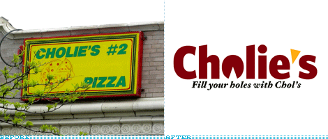
It is quite likely that you’ve never heard of Cholie’s. I hadn’t. It’s not a national pizza franchise. Nor regional. It’s not a famous local joint that people travel to. It’s not even its hometown’s most famous pie. Cholie’s is a small chain in Chicago, with three locations, aptly named Cholie’s, Cholie’s #2 and Cholie’s #3. Its logo is not even a logo per se, it’s whatever the sign painter can muster using the name, and a pizza with a slice coming off. So why in the world would we be reviewing it?
Continue reading this entry

DATE: May.11.2008 POSTED BY: Armin
 CATEGORY: Food
  COMMENTS:

TAGS:

BY Armin
Donatos, Quaint no More
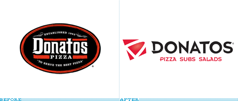
Compared to Pizza Hut or Domino’s, Donatos is by far not a big retail chain, but the 45-year-old pizza place that started with (as the web site proudly states) $1,300 does have a good following in its hometown of Ohio, as well as franchises in Alabama, Ohio, Indianapolis, Orlando, North and South Carolina. On February it officially launched its new identity and campaign, but the identity has been in the works since 2006 undertaken by Interbrand’s Design Forum — somebody needs an update of their own if you know what I mean. The new logo and a prototype store were tested in a 1975-square-foot prototype in a western suburb of Columbus in 2006, and here you can see some nice shots of the updated interiors and exteriors. Having never been to a Donatos I can’t vouch for the old restaurants, but the new ones look like what a fast food chain should look like in the twenty-first century and, unfortunately, that’s exactly the same thing I can say about the new logo. The old one may have been overly traditional, but the new one is far too technologically advanced to trigger images and cravings of yummy pizza. Donatos claim to fame is its Edge to Edge® pizza, which is then cut in squares, so I guess that’s where the D-in-a-skewed-box comes from, but I’m not sure where the crazy wordmark comes from with those poor deformed letterforms — and poor “S”s they always get it the worst. The update, as usual, makes sense, the execution, also, does not.

DATE: Mar.03.2008 POSTED BY: Armin
 CATEGORY: Food
  COMMENTS:

TAGS:

BY John Feldhouse
Lifesavers’ Negative Becomes a Positive

When I was growing up, there was nothing better than getting some candy for being good. Sugar of any sort could silence me for hours. One of my favorite candies was Lifesavers — especially the green and red flavors. As I was walking down the candy aisle the other day, I noticed the entire Lifesavers family got a nice new logo and package update.
Continue reading this entry

DATE: Jan.13.2008 POSTED BY: John Feldhouse
 CATEGORY: Food
  COMMENTS:

TAGS:

BY Armin
20 Degrees of Separation

Of all the juicyjuicetastic drinks out there, I can only recognize Snapple. Even as I write this I couldn’t name off the top of my head other brands of juice drinks promising “100% Natural!”. But I know Snapple. When I want something more than water but less than soda, I go for an iced-tea lemon snapple or whatever other thing they might have — they all taste the same, except the red- or pink-colored ones, those taste like pomade. And I can spot a Snapple in a deli fridge among all the other finely-designed, colorfully-labeled bottles: I can do a quick scan for that weird sun that shows up in the iced teas, or the checkered or otherwise patterned cap, or, of course, the angled logo — but, unfortunately, it looks like all those recognizable traits and quick identifiers (for me at least) will soon be gone. In their place, a very slick look will replace this idiosyncratic brand, blurring the distinction between it and all those other nondescript bottles. Sigh.
Continue reading this entry

DATE: Dec.20.2007 POSTED BY: Armin
 CATEGORY: Food
  COMMENTS:

TAGS:

BY Ryan Hembree
A Fresh Identity Tue Impress
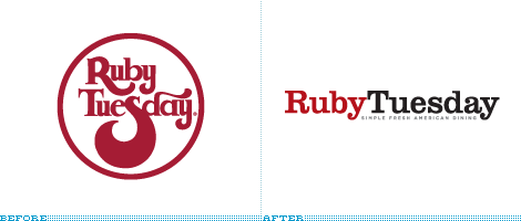
Ruby Tuesday, the international restaurant chain known for its casual dining menu and impressive salad bar, has been implementing a new, “fresh” (a word emphasized over and over) identity over the past several months to coincide with an update of the brand’s interior. Gone are black- and white- checkered tablecloths and the hodge-podge of sports memorabilia that adorned the walls and were reminiscent of Applebee’s or TGI Friday’s In their place is a more upscale and elegant look and feel.
Continue reading this entry

DATE: Nov.12.2007 POSTED BY: (Display Name not set)
 CATEGORY: Food
  COMMENTS:

TAGS:

BY John Feldhouse
Applebee’s Gets A Spokesapple

There are a million restaurants out there, and of those millions thousands are national franchises. Of these, unfortunately, there aren’t too many that really stand out — they all seem to blend together for some reason. Chili’s, T.G.I. Friday’s, Ruby Tuesdays (yes, they have a new logo too, to be reviewed here soon), and, the cause of this post, Appleebee’s, are only a few of them. They all have roughly the same vast menu, same average price, and same lackluster service. Most of these places are so cookie-cutter from the decor to the menu, it’s hard to differentiate between them. Close your eyes at any of them and take a sample of the food and you wouldn’t be able to tell the difference. But this is the exact thing Applebee’s hopes to fix. Applebee’s goal is to make a “special place for people to come together.”
Continue reading this entry

DATE: Nov.05.2007 POSTED BY: John Feldhouse
 CATEGORY: Food
  COMMENTS:

TAGS:

BY JonSel
The Real Thing. Really.

….bzzz….snap….crackle…awheeeeeeyoooooo…distortion….static…fade in…. Excuse me while I break into your regularly scheduled programming of corporate identity changes to focus on another aspect of Brand™: packaging. I’ve worked in both the corporate identity and packaging fields for over 10 years now. If I could sum up my general feeling on mass-market packaging (in the United States), I’d say it sucks. At some point, there are only so many variations one can do on ribbons, splashes, swooshes, dimensional type and fake water droplets. When small percentage points of market share can mean hundreds of millions of dollars, you can kind of understand. Kind of. So it thrills me to no end when someone of stature refuses to do it anymore.
I present the New Old Coke.
Continue reading this entry

DATE: Jun.28.2007 POSTED BY: Jonathan Selikoff
 CATEGORY: Food
  COMMENTS:

TAGS:

BY Armin
Sandwich’s Up, Dude
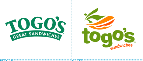
I love me a good sandwich. Whether it’s from Subway, Quizno’s, Jimmy John’s (probably some of the best), or the unnamed deli down the corner I appreciate the art of a good, balanced sandwich. Togo’s however, was never on my lunch considerations. One, because it was always next to a Dunkin’ Donuts and/or Baskin Robbins — making perfect sense since they are all part of Dunkin’ Brands food chain — second, because I could never figure out how to pronounce the name (silly excuse, I know), and third, the logo always seemed like a cheap, fast foodish hole desperately trying to look healthy, in that Whole Foods logo kind of way. One day, in Chicago, with little time for lunch and a Togo’s on the opposite corner from my previous office it was the only choice. Boy, was I surprised: They make a good sandwich. Good amount of turkey, cheese, greens and just enough Mayo oozing from the sides. Clearly I wasn’t aware of their founding principles, “freshly prepared, generously portioned, made to order sandwiches.” Nor did I know that Togo’s was a California-bred sandwich shop — with their previous logo, my best bet would have been New Jersey-bred, no offense. With their new logo, Togo’s is claiming its sea-side origins and laid back attitude by embracing a surfing dude, ripping some waves on what I would think is a surfboard/salami sub and a quirkily-set wordmark. All of which I, well, hate. But at least I know what Togo’s is about now and what to expect. And that can’t be that bad. Like their sandwiches.
Thanks to Daniel Khamsing for the tip.

DATE: May.23.2007 POSTED BY: Armin
 CATEGORY: Food
  COMMENTS:

TAGS:

BY Armin
Dreary Queen
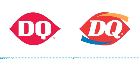
More than once the “If it ain’t broke, don’t fix it” adage applies to the logos we review on this site. But I think this one takes the crown for the least broken with the worst fixin’. Dairy Queen’s ellipse is one of the most highly recognizable marks, it is (was) unique, memorable and impactful. Despite this equity, Dairy Queen considered it was time to change and make the wrong moves in all the wrong places — from the press release: “The traditional logo is the foundation for the new one, a more symmetrical ellipse enhanced with gold and blue curved swishes signifying food and treats. The DQ lettering also has been updated to a font that is more current, adding greater personality.” The new mark has melted into a generic cacophony of unrelated forms (swishes! Italics! Bold!) and colors… Actually, in that respect, the new mark is the equivalent of Dairy Queen’s famous Blizzard treats: A jumbly mess.

DATE: Mar.23.2007 POSTED BY: Armin
 CATEGORY: Food
  COMMENTS:

TAGS:


