
A B-Side BY Armin
Yogurtland
First opened in 2006 and headquartered in Anaheim, CA, Yogurtland is one of the many players in the self-serve frozen yogurt category and counts with about 100 locations in the U.S. and Japan. The new logo has been spotted as early as 2009, and it has just recently been updated on their website. A Flickr set of one of the locations with the new design can be seen here.
Thanks to Jeffrey Toye for the tip.

DATE: Feb.02.2011 POSTED BY: Armin
 CATEGORY: Food The B-Side
  COMMENTS:


A B-Side BY Armin
Findus
Established in the early 1940s, Findus — name comes from Fruit Industries apparently — is a Swedish producer and distributor of frozen food products for consumer retail and wholesale foodservices. It operates in other European markets like France, the UK, and the in the Nordic countries, as well as in Thailand. The new identity was designed by Stockholm-based Pond. Press release in Swedish here. And, yes, the logo is supposed to be a flag.
Thanks to Simon Wennberg for the tip.

DATE: Feb.01.2011 POSTED BY: Armin
 CATEGORY: Food The B-Side
  COMMENTS:

TAGS: italic, red, sans serif, sweden,

Opinion BY Joe Marianek
Papaya King: Regally Good
Since 1932, Papaya King has delivered sweet/savory subsistence in New York City. Somehow, after 68 years, the brand has resisted gentrification. While it feels like this institution has been franchised onto every block, in reality there are only several official locations which are in ferocious competition with other namesake brands who all aim to corner the hot dog culinary category including Gray’s Papaya and Nathan’s, (not to mention street vendors or the Shake Shack.) In this update, designer Joe Guzman at Skaggs Design has embraced the existing vernacular of “organized chaos” and built a system to deliver a consistent experience on packaging, signage, and online.
Continue reading this entry

DATE: Oct.04.2010 POSTED BY: J. Marianek
 CATEGORY: Food
  COMMENTS:

TAGS: display font, mascot, New York, sans serif, signage, skaggs design,

Opinion BY Armin
The Country’s Blandest Yogurt?

I never thought the day would come but, these days, I would much rather have a tart frozen yogurt sprinkled with blackberries and coconut shavings than a creamy chocolate ice cream sprinkled with chocolate chips. Years ago, it was fat over fat-free. Perhaps the boom of the “froyo” craze, fueled by Pinkberry, of the mid-2000s had something to do with it, which has positioned this treat as a cool, groovy, healthy swirl to consume. Not even remotely associated with the upheaval of the froyo is TCBY (The Country’s Best Yogurt), the forefather of consumer frozen yogurt that opened its first store in 1981 and now has over 900 franchise locations, approximately 400 of those outside the United States. I remember the TCBY in a mall in Mexico, it was full of hippie foods and it couldn’t shake the old school health attitude if its granola depended on it. In the last ten years in the US, I don’t recall, once, seeing a TCBY outpost. Surely, I have, but it has receded into the background against its contemporary, colorful rivals. In June, TCBY announced plans to change all this, introducing a new store design and identity created by Salt Lake City, UT-based Struck/Axiom.
Continue reading this entry

DATE: Jul.27.2010 POSTED BY: Armin
 CATEGORY: Food
  COMMENTS:

TAGS: store, struck/axiom, tcby,

Opinion BY Armin
Midnight in the Garden of Type and Image
Before moving to a 20-acre lot in 2006, Johnson’s Backyard Garden (JBG) was literally just a garden for, well, the Johnsons, Beth and Brenton in Austin, TX. Today JBG is a 70-acre certified organic farm that functions through a Community Supported Agriculture (CSA) program, meaning that members buy a “share” in JBG’s crop and in return they get delicious boxes every week of whatever the hard-working people have harvested. JBG counts with over 1,000 members making it the biggest CSA farm in Texas. Earlier this year, JBG started using a new logo created by fellow Austinite Ryan Rhodes who happened to end up living in the Johnsons’ old house.
Continue reading this entry

DATE: Jul.06.2010 POSTED BY: Armin
 CATEGORY: Food
  COMMENTS:

TAGS: ryan rhodes, typography, wood,

Opinion BY Armin
Hebrew National, Now More National
I don’t consume enough sausages to know which one is the leading brand in the market, probably Kraft makes some rendition of the mystery cylinder meat, I really wouldn’t know. But if you asked me to name one sausage brand I would instantly think of Hebrew National. Not because I know what it tastes like, but because it has a cool name, a cool slogan — “We answer to a higher authority” — and it feels like it plays by its own rules, defying mainstream consumption with a kosher product and, again, what would seemingly be a very limiting name. Originally established in 1905 on the Lower East Side in New York City, Hebrew National catered to the city’s growing Jewish immigrant population, going through various changes over the last hundred years, most recently as part of ConAgra Foods. Beyond a good name and story, the product isn’t bad at all, according to some experts: Last year New York magazine asked über restaurateur Danny Meyer (and two other New York power chefs) to rate supermarket hot dogs — described as a “meatier hot dog” Hebrew National took the top spot. But enough hot dog talk…
Continue reading this entry

DATE: May.20.2010 POSTED BY: Armin
 CATEGORY: Food
  COMMENTS:

TAGS: hebrew national, packaging, wordmark,

Opinion BY Armin
Follow-up: Miracle Whip, Rewhipped
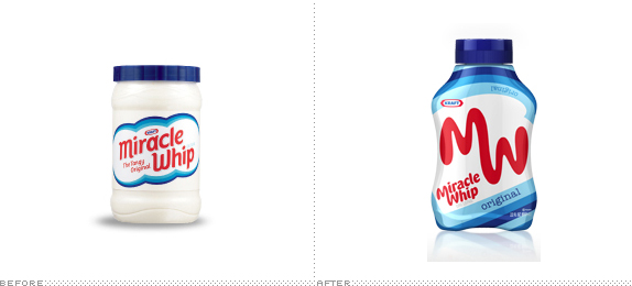
It feels as if this happened yesterday, but almost a year ago, we reported on the redesign of the mayo-alternative, Miracle Whip, and its repositioning as the coolest spread in town. That deliciously retro design is now gone, in the blink of an eye, and in return we get a more gooey rendition of the name and something that resembles more what they had before the change last year. Despite the quick switcharoo, it’s nice to see that they still aimed for a certain simplicity and the new packaging is as minimal as you will find on the shelves; it’s actually quite striking with that big MW. Still, I doubt this will win over Mr. Colbert.
Continue reading this entry

DATE: May.19.2010 POSTED BY: Armin
 CATEGORY: Food
  COMMENTS:

TAGS: miracle whip, packaging, redux,

Opinion BY Armin
New Seattle’s Best: Best-er or Worse?
Seattle’s Best Coffee began roasting in 1970 in what was yet to be the northwestern cornerstone of U.S. coffee culture, Seattle. The company has expanded to a modest and respectable 500 stores across twenty states and being the official coffee shop at Borders bookstores, giving it an additional 500 or so outposts. It is also the second largest coffee roaster in the U.S. behind Starbucks, who ironically (or not), owns Seattle’s Best, purchased in 2003 by the giant. Today, Seattle’s Best is announcing a major push in its distribution: By partnering with other retailers like Burger King, Subway and AMC Entertainment (one of the largest movie theater chains in the U.S.), to add Seattle’s Best coffee to their menus, bumping its distribution by about 30,000 points of sale. Additionally, Seattle’s Best will be dispensing coffee via vending machines, although I’m not clear how or where. Along with this announcement, a radically new logo has been introduced, designed by Seattle ad agency Creature.
Continue reading this entry

DATE: May.12.2010 POSTED BY: Armin
 CATEGORY: Food
  COMMENTS:

TAGS:

Opinion BY Armin
April Fools: Dunkie Drinks Dunkin’s Coffee
With nearly 9,000 stores worldwide, more than 6,000 of them in the United States alone, serving 2.5 million donuts and 2 million cups of coffee to more than 3 million customers per day, Dunkin’ Donuts is undeniably one of the most prominent guilty pleasures in the world. I favor Starbucks coffee and de-favor eating donuts altogether (despite their awesome deliciousness) so I’m in a minority that doesn’t frequent Dunkin’ Donuts — a minority that has become even smaller since 2002, when a steaming cup of coffee was added to the Dunkin’ Donuts logo to muscle back into consumers’ consciousness that coffee wasn’t just available from Starbucks or McDonald’s. And, apparently, that change paid off as Dunkin’ Donuts is celebrating its 60th anniversary (it was founded in 1950) with a new identity that not only removes the coffee cup but also reaches back to its vintage roots for inspiration.
Continue reading this entry

DATE: Apr.01.2010 POSTED BY: Armin
 CATEGORY: Food
  COMMENTS:

TAGS:

Guest Opinion from Chris Weiss posted BY Brand New
Better Bread. Better Subs. Better Logo?
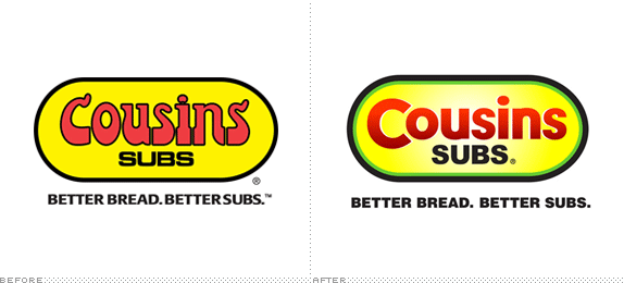
Milwaukee-based Cousins Subs was established in 1972 when two cousins, originally from Atlantic City, introduced the Midwest to the Eastern-style subs they had enjoyed back home. From the beginning, the pair were committed to delivering quality sandwiches made with the best ingredients available. Of the company’s 150 locations, 128 of them are located in the state of Wisconsin. Having grown up in Milwaukee, it has always been one of my favorite sub shops. In my opinion, the ingredients and the bread really are better than the competition’s — the logo is another story.
Continue reading this entry

DATE: Feb.01.2010 POSTED BY: Brand New
 CATEGORY: Food
  COMMENTS:

TAGS:


