
Opinion BY Armin
Guy Fieri Invades Times Square
Opened this month, Guy’s American Kitchen and Bar is a 16,000-square-foot restaurant in Times Square that sits 500 people and features three separate bars. As the name implies, the joint is owned by Food Network superstar (and national annoyance) Guy Fieri, co-owner of various other restaurants and one of the most popular hosts and personalities of the aforementioned food channel. There is no credit for the identity or interiors and this is for a stand-alone restaurant so it breaks a little bit with my publishing criteria but the project is worth a look.
Continue reading this entry

DATE: Sep.20.2012 POSTED BY: Armin
 CATEGORY: Food
  COMMENTS:

TAGS: food, New York, restaurant,

A B-Side BY Armin
People’s Harvest
Recently launched, People’s Harvest is a supplier of local produce in Petaluma, CA, helping local institutions like schools or hospitals provide fresh and local produce. It’s not a big company or anything, but it has the most adorable tractor logo ever. Identity designed by CDA. Identity applications here and logo detail below (or after the jump).
Continue reading this entry

DATE: Feb.27.2012 POSTED BY: Armin
 CATEGORY: Food The B-Side
  COMMENTS:

TAGS: custom, farm, Sans Serif,

A B-Side BY Armin
Texas Farm Bureau
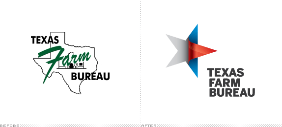
Established in 1933, the Texas Farm Bureau is a member-controlled and financed organization that provides “a voice for farmers, ranchers, rural citizens and everyone interested in preserving and protecting this way of life” and one of its main functions is grassroots policy development. The new logo has been designed by Interbrand. More images here. Press release here. As far as updates go, this is one of the most remarkable, simply because of how un-designed the old one was.
Thanks to James I. Bowie for the tip.

DATE: Jan.05.2012 POSTED BY: Armin
 CATEGORY: Food The B-Side
  COMMENTS:

TAGS: gradient, interbrand, texas,

A B-Side BY Armin
Golden Boy Foods
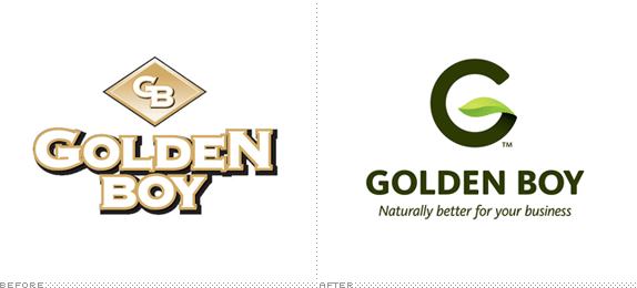
Established in 1979, Golden Boy Foods is a manufacturer of private label foods like peanut butter, trail mixes, snacking nuts, and more. The new identity was designed by TAXI Vancouver. Some applications below (or after the jump).
Continue reading this entry

DATE: Dec.01.2011 POSTED BY: Armin
 CATEGORY: Food The B-Side
  COMMENTS:

TAGS: gradient, green, private label, Sans Serif, taxi,

A B-Side BY Armin
Del Taco
First opened in 1964, Del Taco is a fast food chain of Mexican-ish offerings, with 525 restaurants in 17 states. With the launch of a few prototype stores, a new logo is being introduced. Both designed by Tesser. Press release here.
Thanks to Abe Vizcarra for the tip.

DATE: Oct.25.2011 POSTED BY: Armin
 CATEGORY: Food The B-Side
  COMMENTS:


The B-Side BY cole
Hiro Sake
Hiro Sake is a new high-end imported brand that attempts to differentiate itself from other spirits by “expressing its cultural authenticity with a contemporary style.” The direction of the logotype was influenced by traditional Japanese calligraphy. You can read more and see the bottle here.

DATE: Jul.20.2011 POSTED BY: Cole Baldwin
 CATEGORY: Food The B-Side
  COMMENTS:

TAGS: calligraphy, packaging,

A B-Side BY cole
49th Parallel
49th Parallel Coffee Roasters has recently had an identity upgrade in what looks like an attempt to be taken seriously as a coffee provider. A bit more here.
Thanks to Harry Olson for the tip.

DATE: Jul.13.2011 POSTED BY: Cole Baldwin
 CATEGORY: Food The B-Side
  COMMENTS:

TAGS: coffee, logo, sans serif, slab serif,

A B-Side BY Armin
Sheffield Food

Sheffield Food is a new initiative in Sheffield, UK to “support quality, artisan producers and food from across Sheffield’s seven hills.” The logo has been designed by local firm DED Associates. A lovely shot of some little flags below (or after the jump) and more background information at DED’s site here.
Continue reading this entry

DATE: Jul.08.2011 POSTED BY: Armin
 CATEGORY: Food The B-Side
  COMMENTS:

TAGS: ded associates, icon, sans serif, serif, uk,

Opinion BY Armin
If this Chicken’s a Kickin’ don’t Come a Cluckin’
With the first location opened in 1997, The Kickin’ Chicken is a full service, full bar, full menu restaurant featuring chicken wings, tenders, wraps, sandwiches and burgers. (Hungry and thirsty yet?). The Kickin’ Chicken now has seven locations in North and South Carolina and is revving up their franchising business so they needed an overhaul to their identity to attract franchisers. The new look has been designed by Charleston, SC-based Fuzzco.
Continue reading this entry

DATE: Jul.08.2011 POSTED BY: Armin
 CATEGORY: Food
  COMMENTS:

TAGS: animal, fuzzco, icon set, mascot, sans serif,

Opinion BY Armin
A Monster Deal

Launched this year in Melbourne, Australia, MunchaCruncha is a mobile application that will allow restaurants and other food venues to broadcast meal deals giving users the opportunity to scope out said deals via food type, location, or price and then, from the magic of their own phone, coordinate with friends to get together or just let them know about the deal. The next Foursquare it might be not, or at least not until it launches with the SXSW nerdcore. The most earth shattering or game changing idea it is not either. And the biggest, most influential app it isn’t. (Sorry, not sure why I’m forming sentences like Yoda). But it has a monster as a logo and, OMG, we could use a logo with a monster in it around here. The MunchaCruncha identity has been designed by Lucas Melbourne.
Continue reading this entry

DATE: Mar.22.2011 POSTED BY: Armin
 CATEGORY: Food
  COMMENTS:

TAGS:


