
BY Armin
Financial Services, Period

Fiserv, the largest provider of technology, logistics and information management for the financial services industry has recently updated its 25-year-old logo which, rather painfully, demonstrated its 1984 roots. Designed by Landor, the new wordmark is an excellent corporate design: It is simple, confident and has just enough quirks to make it unique and ownable. The condensed sans serif is a great way of creating a compact wordmark that has as much punch as an icon. The period at the end is my favorite part, it clearly states “the line ends here, we are the best.” In contrast, my least favorite part is the missing dot over the “i.” I have never liked that move. An “i” needs its period, otherwise it’s just a stick, and in this particular case, it looks like the dot was transplanted to the end, so as much as I like the period, it feels like the “i” had to sacrifice its own. Nonetheless, this is a simple, strong corporate design and major bonus points for ditching the industry-issued color blue in favor of orange.
Thanks to Jarrod Wubbels for the tip.

DATE: Feb.27.2009 POSTED BY: Armin
 CATEGORY: Finance
  COMMENTS:

TAGS:

BY Armin
Tu Banco es mi Banco

I was going around a few web sites yesterday and I stopped by Tony Spaeth’s Identity Works where I spotted this beauty. It looks like it was completed and launched back in September, so it’s not completely fresh, at least not just in its date. Ixe Grupo Financiero, established in Mexico in 1996, is one of the strongest financial groups around at the moment (or so I am told, and so I understand) perhaps because of their corporate and high income audience, and they have opened El Banco Deuno. It translates very roughly as “One’s (own) Bank.” And it is targeted to the burgeoning middle income class, which until a few years ago was not as prosperous as what is known as middle income class in the US or Europe. Point being: El Banco Deuno is a friendly, accessible and modern bank with strong roots in Mexico. The identity has been designed by Saffron and it is quite fantastic.
Continue reading this entry

DATE: Jan.23.2009 POSTED BY: Armin
 CATEGORY: Finance
  COMMENTS:

TAGS:

BY Armin
This Little Piggy Went to the Bank

Early in October, the 150-year-old Bank of New Zealand unveiled a new identity as wall as a name change to BNZ, which is apparently how people refer to it, but I wouldn’t really know, I’ll defer to our NZ readers. The change, as is clear from the before and after logos, is meant to take the bank from the perception of a stodgy, traditional bank to that of a friendlier more contemporary one.
Continue reading this entry

DATE: Nov.12.2008 POSTED BY: Armin
 CATEGORY: Finance
  COMMENTS:

TAGS:

BY Armin
Global is as Global does
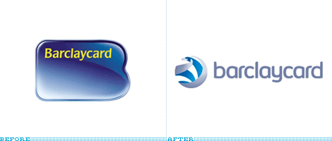
Owned by financial services firm Barclays, Barclaycard is one of the largest credit card providers in Europe and India. And it recently unveiled a new identity designed by The Brand Union that is as much about moving the service provider forward as it is about mimicking what other brands have already done: Kodak, Xerox, AT&T, Ericsson, blah, blah, blah.
Continue reading this entry

DATE: Oct.03.2008 POSTED BY: Armin
 CATEGORY: Finance
  COMMENTS:

TAGS:

BY Armin
Mad About This
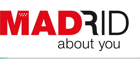
This is almost two months old, but it’s something I meant to post when it came out and somehow forgot to. The Community of Madrid, which is one of the 17 autonomous communities of Spain, unveiled a new logo that they will use to promote Madrid-based businesses in other countries, complementing the launch of a network of offices around the world that will support the international endeavors of these businesses. The Community of Madrid already has a logo, a red square with the seven stars of Madrid’s flag, which some people argued would have been enough instead of having to make a new one — specially a new one with such an odd message.
Continue reading this entry

DATE: May.27.2008 POSTED BY: Armin
 CATEGORY: Finance
  COMMENTS:

TAGS:

BY Armin
On the Seventh Day, while God Rested, the Devil Invented the Swoosh

I have to begin by apologizing for the tiny logos you see above and for the more-than-usual lack of information. Since this identity launch is not official yet, there is little to no information, much less supporting graphics. But an update this… hellish, deserves special advance screening. According to this page, buried deep somewhere in the capitalone.com server, the new look (which you can delight yourself in while visiting that URL) will take place in late February, while, one of our tipsters informed me that the logo had been released internally since last summer. Regardless of when this will be official, it will not be a second too soon to bask in Swooshiness 3.0 — yes, it’s on a revival course. The old logo was nothing to admire, with its extended italic sans, and flimsy, subscript, italic serif [you can see a detail of it in this pop-up] but at least it didn’t have a swoosh. As I write this, I am actually glad there is no press release about the new logo, as I can’t imagine it being anything less than infuriating. Nothing, in the year 2008, can justify the use of a swoosh. Much less a swoosh with gradients and bevels. Even less for one of the major financial players in the U.S. — next time you check to see what’s in your wallet, really, check that you don’t have this in it. Perhaps we’ve been living in purgatory since 2000 and Xerox just opened the gates to hell — and hell looks like the Capital One logo.

DATE: Jan.30.2008 POSTED BY: Armin
 CATEGORY: Finance
  COMMENTS:

TAGS:

BY John Feldhouse
Goodbye, Beautiful; Hello, Weird Name

It is a sad day in the world of identity design: A day in which we say goodbye to the beautiful, and now defunct, Bank of New York logo and usher in the new Bank of New York Mellon logo. On July 2, 2007, Mellon Bank offically merged with The Bank of New York and on October 1, 2007, the Bank of New York Mellon launched its global brand program — one all the more challenging as both banks have storied histories that include great identities with great legacy.
Continue reading this entry

DATE: Oct.25.2007 POSTED BY: John Feldhouse
 CATEGORY: Finance
  COMMENTS:

TAGS:

BY Brand New
Unum Goes Human, Sort of

Guest Editorial by Ryan Hembree
In April, Unum, a leading employee benefits provider in the United States and the United Kingdom, unveiled a new identity in an attempt to better communicate the company’s core competencies and focus. Formerly UnumProvident, the company’s new logo, designed by The Gate Worldwide, is visually superior to the old — while at one time the highly patriotic logo probably appealed to companies based largely in the United States who desired to “buy all things American” (and who doesn’t love the logo’s ode to “Ole’ Glory’s” stars and stripes?), the company’s products and services have expanded well beyond the borders of this country and into Europe. And in today’s geo-political climate, looking “American” might be considered a liability and unpopular with an international audience.
Continue reading this entry

DATE: Jun.21.2007 POSTED BY: Brand New
 CATEGORY: Finance
  COMMENTS:

TAGS:

BY John Feldhouse
Ditech Ditches the Swoosh

Ditech, the infamous mortgage loan company, ditched the awful swoosh-mouse-cursor-Optima logo and upgraded to a clean sans-serif look. Along with the new logo, designed by L.A.-based Ground Zero, comes a new campaign slogan, “People are smart.” The irony is I can’t quite figure out what the new logo represents. Or maybe I’m not their kind of people.
Continue reading this entry

DATE: May.31.2007 POSTED BY: John Feldhouse
 CATEGORY: Finance
  COMMENTS:

TAGS:

BY Armin
Two Thirds Off, At Least

I have always been disgustingly fascinated by the name “Fifth Third Bank”. Specially since I had no idea where it came from. I wondered, how stupid can a bank be that divides anything into two times more than it mathematically could? Having never had to satisfy that curiosity until today — since I bank at Pentagram-designed banks only — I finally learned that the name comes from the merger of Fifth National Bank and Third National Bank almost one hundred years ago, in 1908, forming Fifth Third Bank. In the same vein, the old logo has consistently struck me as both repelling and fascinating, with its ultra thickness, italicism and super curves. Luckily, with a redesign by Cincinnati-based branding agency Deskey,�I have now come to peace with my paradoxical feelings: I just find it repelling, nothing else.
Continue reading this entry

DATE: May.28.2007 POSTED BY: Armin
 CATEGORY: Finance
  COMMENTS:

TAGS:


