


Online
- FPO (For Print Only) / Celebrating the reality that print is not dead by showcasing the most compelling printed projects.
- Art of the Menu / Cataloguing the underrated creativity of menus from around the world.
- Quipsologies / Chronicling the most curious, creative, and notable projects, stories, and events of the graphic design industry on a daily basis.
- Speak Up (2002 – 2009) / Discussing, and looking for, what is relevant in, and the relevance of, graphic design. Archives Only.
- Word It (2003 – 2010) / Encouraging creative diversity in the community through monthly, one-word challenges. Archives Only.
- Brand New Classroom (2010 – 2011) / Providing a space for critique and opinions on student identity work. Archives Only.
Publishing
- The 2010 Brand New Awards / 2011, self-published.
- Flaunt: Designing effective, compelling and memorable portfolios of creative work / 2010, self-published.
Events & Judged Competitions
- Brand New Conference / A one-day event on the development of corporate and brand identity projects by some of today’s most active and influential practitioners from around the world.
- Brand New Awards / Celebrating the best identity work produced around the world.
- FPO Awards / Celebrating the best print work from around the world.
Writing
- Graphic Design, Referenced: A Visual Guide to the Language, Applications, and History of Graphic Design / 2009, Rockport.
- Women of Design: Influence and Inspiration from the Original Trailblazers to the New Groundbreakers / 2008, HOW Books.
- The Word It Book: Speak Up Presents a Gallery of Interpreted Words / 2007, HOW Books.
Graphic Design
- Department of Design / Designing corporate and brand identities and full development of printed and digital matter for clients.

Opinion BY Armin
Current Lets its Bold Flag Fly
![]()
Launched in 2005 by former Vice President Al Gore (before An Inconvenient Truth fame) and entrepreneur Joel Hyatt, Current TV was originally a pretty drastic model of programming, featuring user-generated “pods” reflecting a broad range of topics and opinions that lasted anywhere from 3 to 10 minutes. You could tune in at any time of day and just jump right in into whatever was going on and not have to worry about following typically scheduled programming. This was the same year YouTube launched and before it went as big as it is now, so the concept was fairly ahead of the curve. Current gathered some initial attention but then it just kind of disappeared as the novelty wore off and despite hiring former MTV Networks’ President Mark Rosenthal, toying with the idea of going public, and transitioning into 30- and 60-minute programming Current felt anything but. Enter Keith Olbermann, the love-him-or-hate-him, ex-ESPN anchor turned political commentator. In February Current announced that Olbermann would be taking his show, Countdown With Keith Olbermann, from MSNBC to their cable channel starting June 20. Reminiscent of when Howard Stern announced he would be leaving the broader air waves for SiriusXM, Olbermann’s move to Current gave it instant relevance. Last week, Current quietly introduced a new look, launched the website for Olbermann’s show, Countdown, and over the Summer will be implementing the new look. The identity has been designed by Wolff Olins with motion assistance by Ghava, the on-air look is by loyalkaspar, and web design by Code and Theory.
Continue reading this entry

DATE: May.31.2011 POSTED BY: ArminCATEGORY: Entertainment COMMENTS:

TAGS: animation, current, on-air, television, wolff olins,

Opinion BY Armin
Funny Smile
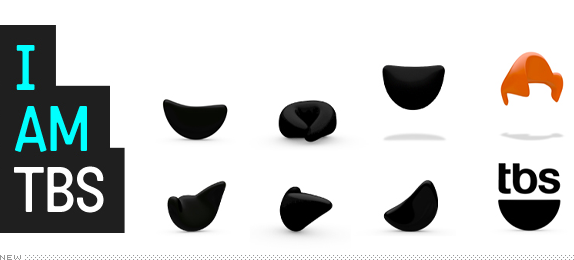
Known mostly for its solid roster of sitcom reruns and old-ish comedy movies TBS has grown into a cable television force to contend with: It’s home to Conan, it has attracted original programming from powerhouse entertainer Tyler Perry, and, well, you will find Groundhog Day showing just at the right time when your brain needs some Bill Murray. Since 2004 TBS has been using its “smile” logo and this month it has introduced a complete new on-air look, designed by Los Angeles-based Ferroconcrete, that revitalizes the channel, bringing the smile literally to life.
Continue reading this entry
DATE: May.27.2011POSTED BY: ArminCATEGORY: Entertainment COMMENTS:
A B-Side BY Armin
Azteca 7
![]()
Launched in 1983 TV Azteca is the second largest television network in Mexico with two main channels Azteca 13 and Azteca 7, with the latter being the “funner” channel, mainly by carrying The Simpsons. This past February, Azteca 7 launched a new logo and look. A few color variations and speech bubble configurations are shown here.
Thanks to José Héctor Gálvez for the tip.
DATE: May.25.2011POSTED BY: ArminCATEGORY: Entertainment The B-Side COMMENTS:
TAGS: mexico, speech bubble, television,
Opinion BY Armin
Kick-ass Heraldry
![]()
This will be a very short introductory paragraph because I don’t have a lot of information about the subject at hand and because said subject is not the typical organization we cover on Brand New. Here is what you need to know: Gamer.ru is a Russian gaming portal focused on Role-Playing Games (RPG). Think Dungeons & Dragons evolved for the twenty-first century generation. A new identity for the site and company has been designed by Erohnovich Roma with 3D rendering by Stanislav Linus.
Continue reading this entry
DATE: May.09.2011POSTED BY: ArminCATEGORY: Entertainment COMMENTS:
TAGS:
Opinion BY Armin
Animal Stripes
![]()
Established in 1899 in Seattle, WA, Woodland Park Zoo — previously the private park of Guy C. Phinney, a wealthy lumber mill owner and real estate developer — currently sits on 92 acres and features more than 1,090 individual animals representing nearly 300 species. The zoo is well known for advancing animal exhibits to be more naturalistic and closer to each animal’s habitats. This month Woodland Park Zoo, with the launch of a new capital campaign that aims to raise $80 million, introduced a new identity and theme — “More Wonder. More Wild.” — created by Phinney Bischoff Design House. I wonder if they got the job because they have the same name as the zoo’s original founder? (Kidding).
Continue reading this entry
DATE: Apr.18.2011POSTED BY: ArminCATEGORY: Entertainment COMMENTS:
TAGS: gill sans, sans serif, seattle, zoo,
A B-Side BY Armin
Root Sports
![]()
Root Sports, a subsidiary of DirecTV Sports, is the new name that will take over three regional sports channels in Seattle (formerly FSN Northwest), Denver (formerly FSN Rocky Mountain), and Pittsburgh (formerly FSN Pittsburgh). Troika has designed the identity and on-air package. All work can be seen at their website.
DATE: Apr.06.2011POSTED BY: ArminCATEGORY: Entertainment The B-Side COMMENTS:
TAGS: animation, italic, sans serif, sports, troika,
Opinion BY Armin
Meet Morph
![]()
Part of Discovery Communications’ menagerie of TV properties, launched in 1999 as Discovery Science, renamed Science Channel in 2003, this little corner of cable universe, featuring, as you might have guessed, science-y programming is reinventing itself a third time: simply as SCIENCE. All uppercase, please. Facing stiff competition from the more popular Syfy, SCIENCE certainly needed some kind of boost to make it more relevant and while new programming like Ricky Gervais’ An Idiot Abroad or reruns of cult classics like Firefly are helping, this new identity certainly demands attention — specially its new logo, nicknamed Morph. The new identity will be implemented on air starting June 8.
Continue reading this entry
DATE: Apr.06.2011POSTED BY: ArminCATEGORY: Entertainment COMMENTS:
TAGS: animation, discovery communications, orange, sans serif, science,
Opinion BY Armin
Tyra Rocks some Fierce Lettering
![]()
One of the most unexpected figures in modern-day business and content creation is ex-supermodel — supermodel emeritus? or once a supermodel always a supermodel? — Tyra Banks, as evidenced primarily through the success of 16 seasons and 20 international editions of America’s Next Top Model and her own talk show, The Tyra Banks Show, that aired for five years. Both of these shows were produced by her own company, Bankable. To cement her business savvy (and gain some additional attention), Banks has enrolled in the Harvard Business School’s Executive Education Owner/President Management Program (OPM) which has her attending (and sleeping at) Harvard for one three-week period for the next three years. Her latest venture, in partnership with Demand Media, is typeF, “a revolutionary fashion and beauty website that listens to what women want and gives them the answers they are looking for, when and where they want it.” Banks rang the bell of at the New York Stock Exchange this past Tuesday and launched typeF.
Continue reading this entry
DATE: Mar.18.2011POSTED BY: ArminCATEGORY: Entertainment COMMENTS:
TAGS: illustration, monogram, orange, tyra banks,
Opinion BY Armin
The Logo Less Traveled
![]()
One of my guilty pleasures is watching Man Vs. Food, where host Adam Richman travels the U.S. to find the most local of local restaurants that also happen to serve either the biggest, the spiciest, the sweetest, or a combination thereof of any number of restaurant staples from tacos to burgers to chicken wings. He sweats and suffers. It’s a useless show, but it’s a heck of fun. That’s about the only thing (perhaps some Anthony Bourdain too) I’ve ever watched on the Travel Channel, but that’s more a reflection of my viewing habits than the channel’s fault, which has a great range of original programming. Launched in 1987, the Travel Channel has gone through many owners, including Discovery Communications until 2010 when it was bought by Scripps Networks Interactive. Starting in January a new logo for the channel had been popping up in some promos and now it’s officially on the website. No word yet on who designed it, tip welcome.
Continue reading this entry
DATE: Mar.14.2011POSTED BY: ArminCATEGORY: Entertainment COMMENTS:
TAGS: blue, sans serif, television, travel channel,
Opinion BY Armin
Walk of Maple Leaf Fame
![]()
Incised on the sidewalks of King and Simcoe Streets in downtown Toronto, 131 stars currently make up Canada’s Walk of Fame, which celebrates Canadians who “have excelled in music, sport, film, television, as well as the literary, visual, performing arts, science and innovation.” Some of its inaugural inductees in 1998 included singer Bryan Adamas and actors Christopher Plummer and John Candy. Since then entertainers like Kiefer Sutherland, Alex Trebek, Leslie Nielsen, and Shania Twain have joined the streets with sports figures like Mario Lemieux to round up the stars. This week, the Walk of Fame introduced a new identity designed by TAXI.
Continue reading this entry
DATE: Mar.03.2011POSTED BY: ArminCATEGORY: Entertainment COMMENTS:
TAGS: canada, icon, maple leaf, red, serif,


Books about logo design, the designers that create them and the meaning of branding.
