Tex-Mex
Maudie’s
Austin, TX
Designed by Pentagram.
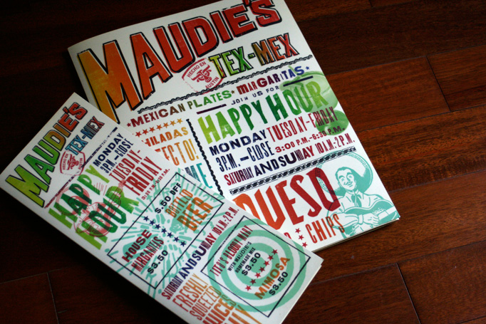
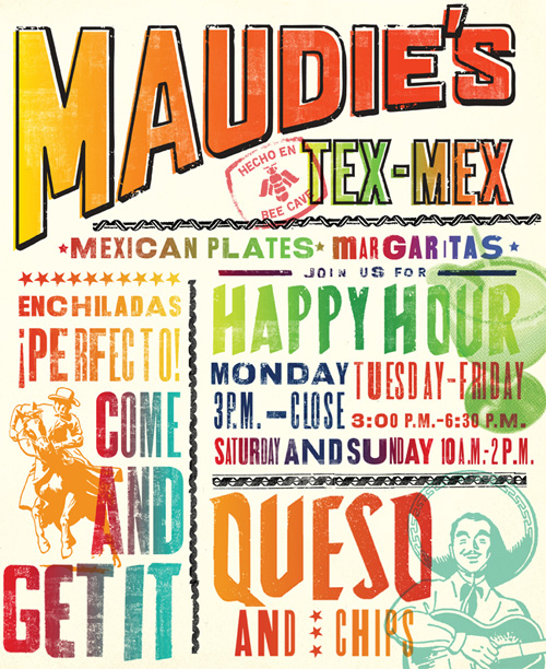
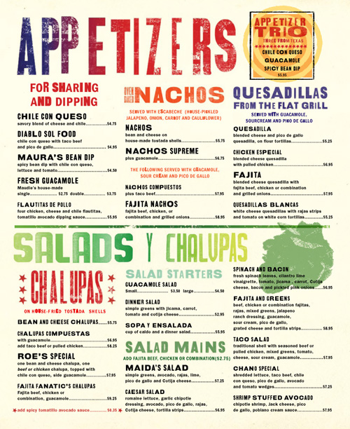
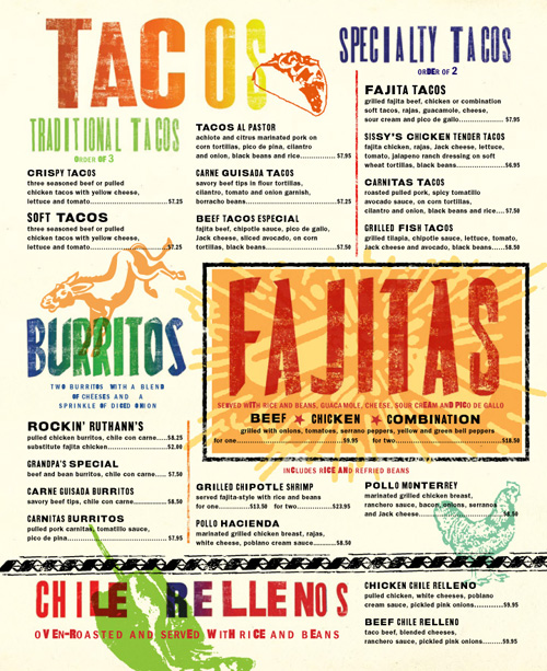
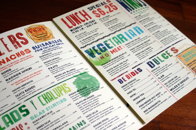
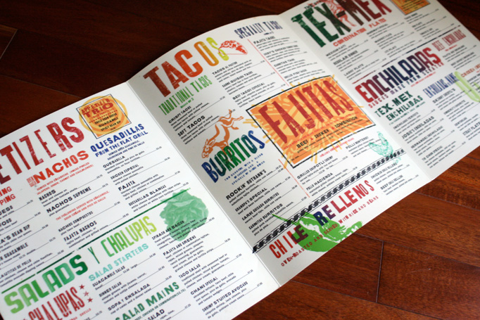
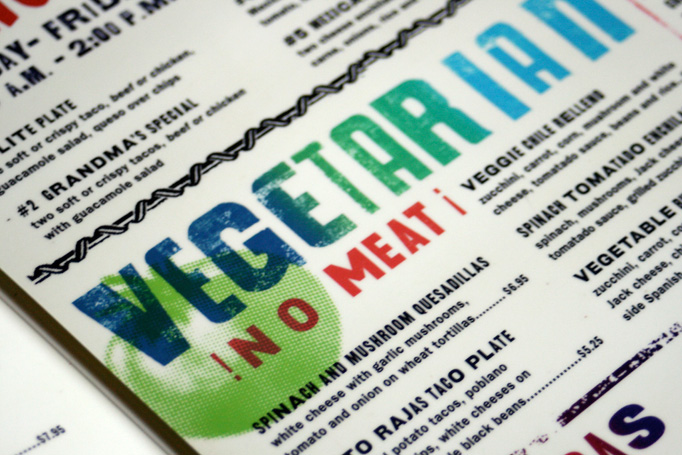
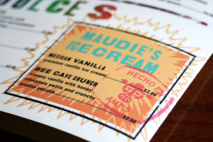
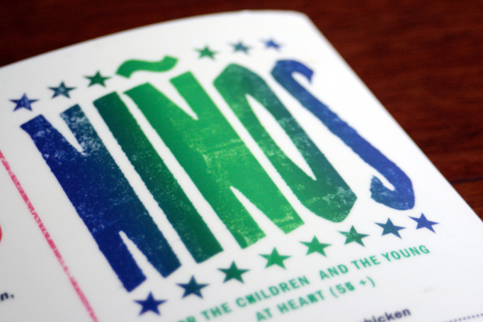
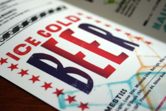
Just like Tex-Mex is Mexican cuisine multiplied times kitsch — the over-cheesing, the over-lettucing, the over-margaritas’ing — the design of the Maudie’s menu by Pentagram partner DJ Stout is Mexican kitsch multiplied times a dozen different fonts and silkscreen-split-fountain effects. In other words: It’s awesome.
Visit Maudie’s.
Posted
By Armin on 08.03.2011

Kyle Valentic’s comment is:
I think this menu really captures the essence of Austin - colorful, creative and influenced by Mexican culture. I'm always a sucker for letterpress type too. LOVE the new blog. Keep up the excellent work.
on 08.09.2011 at 02:13 AM
Tim’s comment is:
Beautiful. Beautiful on print, and could really be lovely online too.
on 08.09.2011 at 06:43 AM
????? ???’s comment is:
Sorry for the huge review, but I'm really loving the new Zune, and hope this, as well as the excellent reviews some other people have written, will help you decide if it's the right choice for you.
on 08.14.2011 at 12:57 AM
Patrick’s comment is:
I like the look of this design, I love the color and typography. As an object it is lively and visually exciting. I think that we should also, when admiring design, consider the functionality of the object in use, which in this case is pretty limited (I've actually eaten there several times since it was introduced). Are we doing our job as designers if the product we make doesn't work? I also began to wonder how original this look was after seeing the Estaban poster in the lower right of this page - http://arts-rec.com/artsdept/ballroom-marfa/
on 08.14.2011 at 11:31 AM
michelle’s comment is:
Well done! Using many colors and fonts with background images is challenging, but it looks great. Was there a lot of time involved getting it to look just right?
on 08.16.2011 at 01:06 PM
Dalia Vasallo’s comment is:
Is that a joke?
on 08.17.2011 at 11:10 AM
Renee’s comment is:
Re: Patrick's comment - I made that Esteban poster, and you're right, it's not an "original" look. It's an homage to old Mexican lucha libre posters. I tried to channel that honesty and energy by limiting myself similarly -- cutting my own illustrations, using only non-digitized wood type and stealing some of those unique hand-cut letters from the lucha posters themselves.
And split fountains are always fun =)
on 09.02.2011 at 04:17 PM

Click Thumbnails Below for Bigger View of the menu
Main
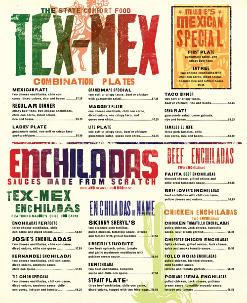
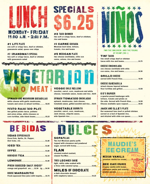
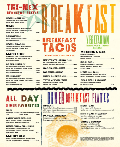
Drinks
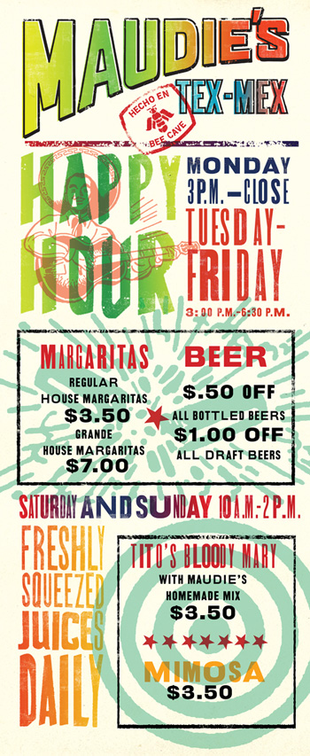
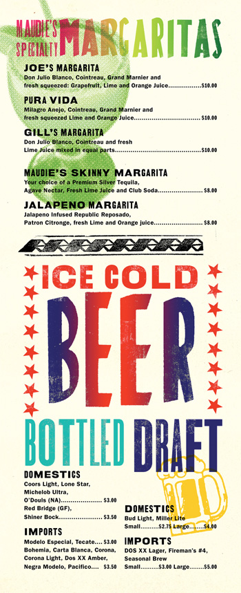
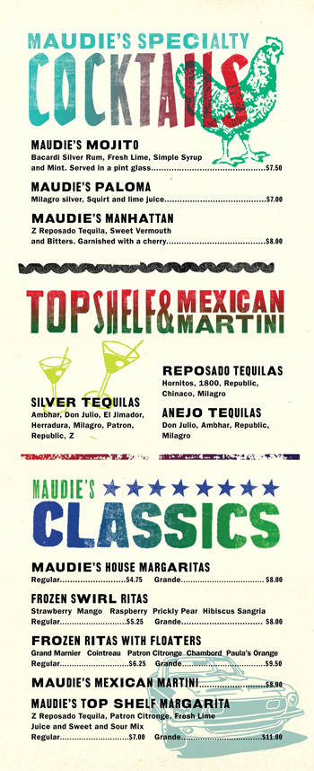
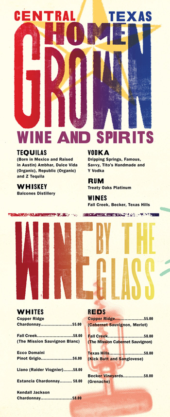
Note: Prices and items may differ in current menu from those shown here.

About
Art of the Menu, is a division of UnderConsideration, cataloguing the underrated creativity of menus from around the world.
Art of the Menu uses Typekit to render Proxima Nova by Mark Simonson and Adelle by Type Together.
Art of the Menu is run with Six Apart’s MovableType 6.8.8
All comments, ideas and thoughts on Art of the Menu are property of their authors; reproduction without the author’s or Art of the Menu’s permission is strictly prohibited
Twitter @ucllc
Thanks to our advertisers
About UnderConsideration
UnderConsideration is a graphic design firm generating its own projects, initiatives, and content while taking on limited client work. Run by Bryony Gomez-Palacio and Armin Vit in Bloomington, IN. More…
blogs we publish
Brand New / Displaying opinions and focusing solely on corporate and brand identity work.
Art of the Menu / Cataloguing the underrated creativity of menus from around the world.
Quipsologies / Chronicling the most curious, creative, and notable projects, stories, and events of the graphic design industry on a daily basis.
products we sell
Flaunt: Designing effective, compelling and memorable portfolios of creative work.
Brand New Conference videos / Individual, downloadable videos of every presentation since 2010.
Prints / A variety of posters, the majority from our AIforGA series.
Other / Various one-off products.
events we organize
Brand New Conference / A two-day event on corporate and brand identity with some of today's most active and influential practitioners from around the world.
Brand Nieuwe Conference / Ditto but in Amsterdam.
Austin Initiative for Graphic Awesomeness / A speaker series in Austin, TX, featuring some of the graphic design industry's most awesome people.
also
Favorite Things we've Made / In our capacity as graphic designers.
Projects we've Concluded / Long- and short-lived efforts.
UCllc News / Updates on what's going at the corporate level of UnderConsideration.


