Announcement
Best of 2014
UnderConsideration
Here are our favorite twelve menus shown on Art of the Menu this year. We will be back with our regular programming on January 5, 2015. No other posts will be published until then.
Posted
By Armin on 12.23.2014
No. 12
Design
Thoughts
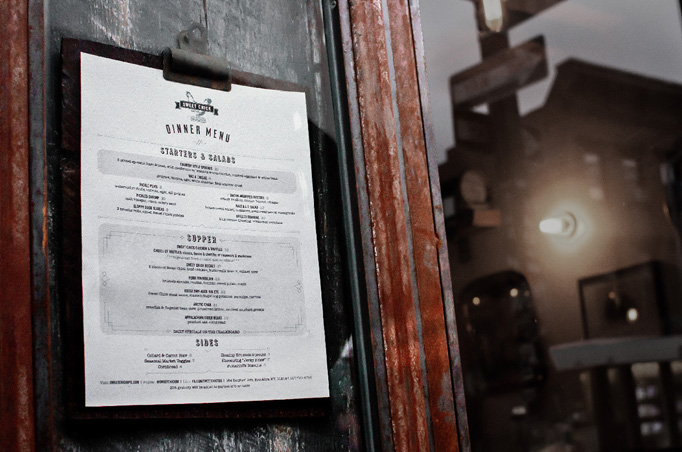
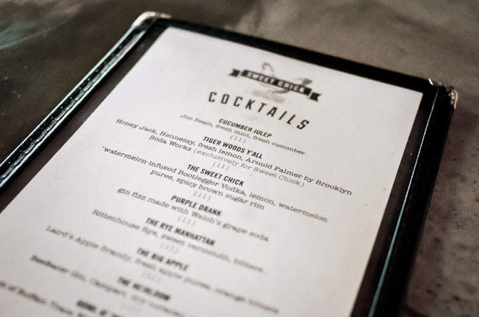
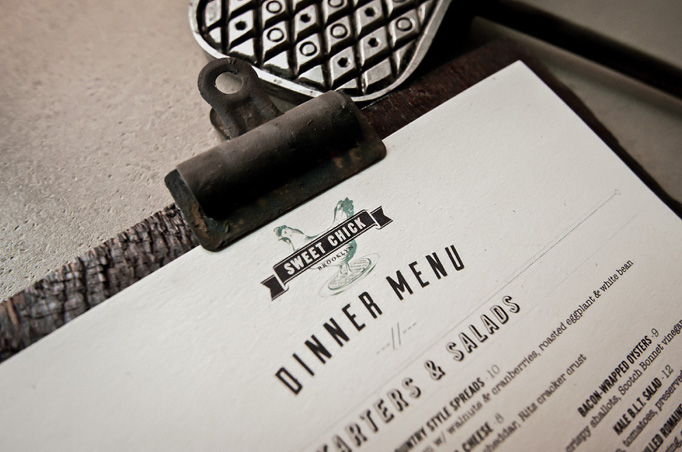
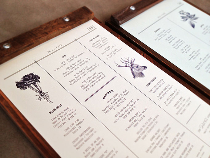
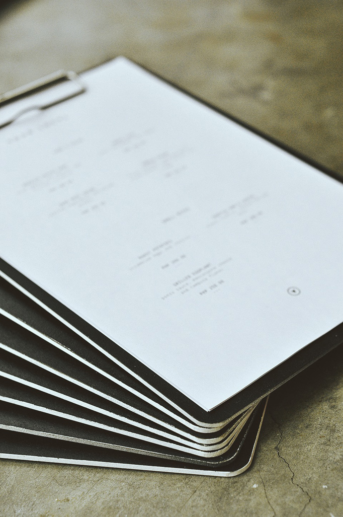
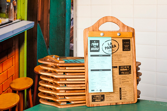
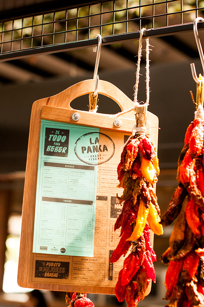
There was a lot of clipboards used in menus this year — as evidenced in this list — so the good ones have to have something unique like this rugged wood finish and nearly decaying metal clip.
No. 11
Design
Thoughts
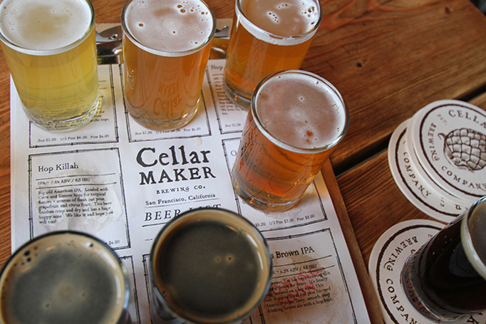
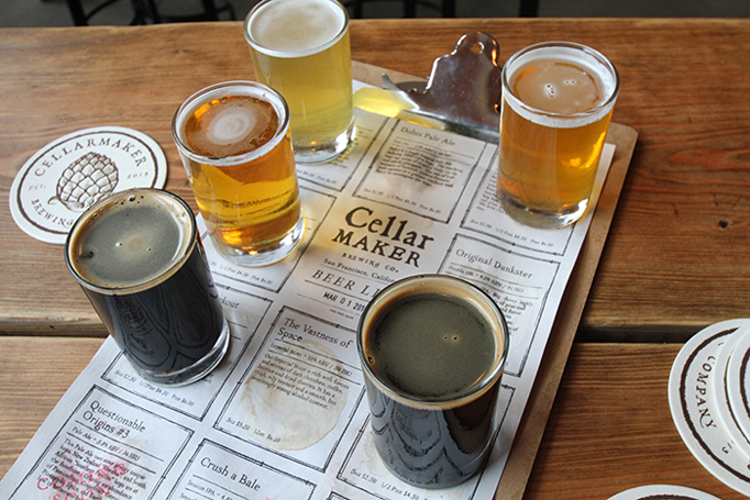
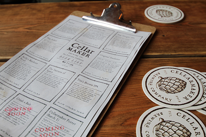
Half menu, half beer flight identifier, this disposable menu features some oddly appealing distressed serif typography that fits well with the “cellar” name.
No. 10
Design
Thoughts
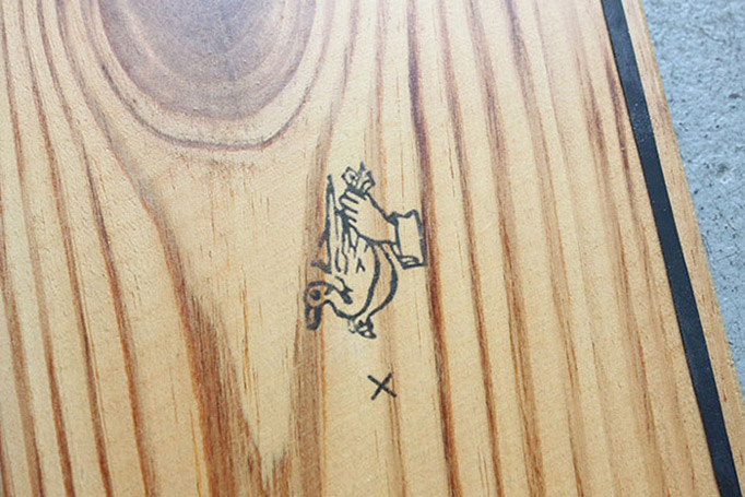
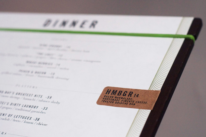
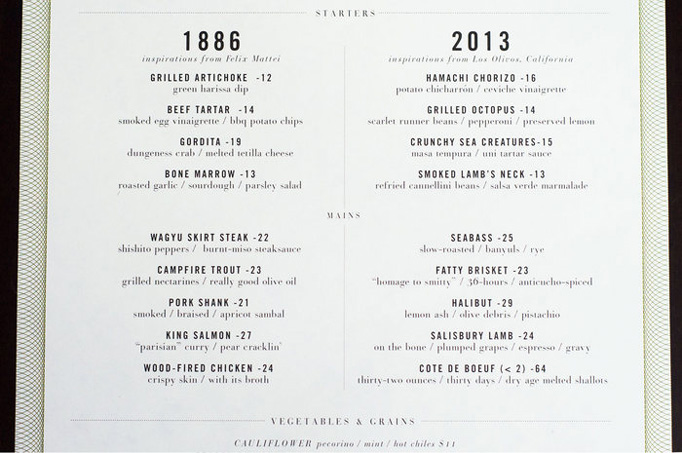
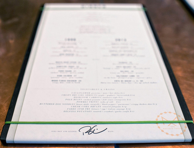
Another repeating model we saw this year was a menu held with a rubber band or string against a hard surface and these smooth plank holders and black rubber band are a great example, specially with the various icons on the back.
No. 9
Design
Thoughts
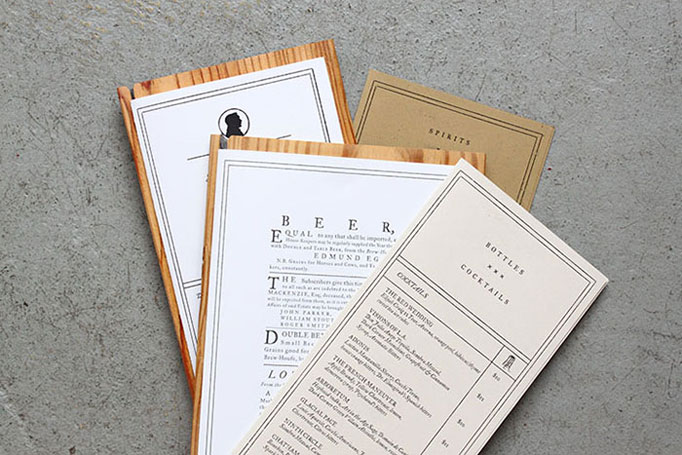
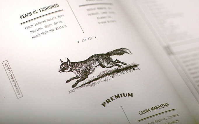
Vintage illustrations, great typography, and more ambitious materials make this a great combo of food and drink menus.
No. 8
Design
Thoughts
Much more straightforward than any of the previous selections, this one shows you don’t need too many accoutrements to produce an easily digestible and attractive menu.
No. 7
Design
Thoughts
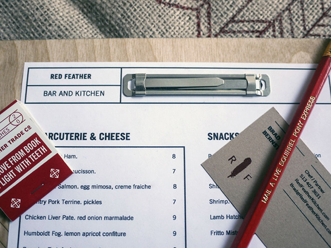
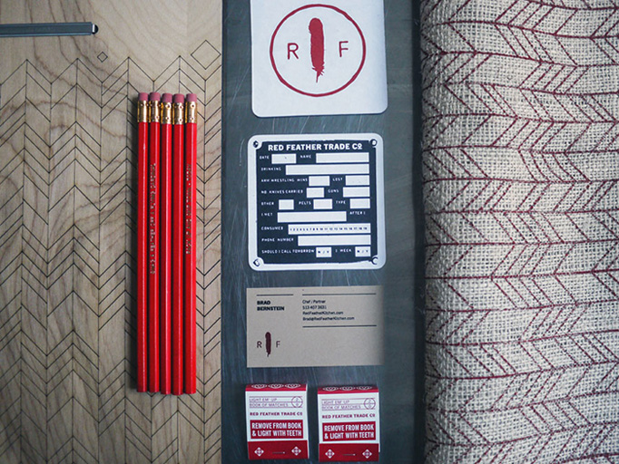
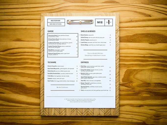
Combining plank and office clip holder, this menu stands out for its custom pattern on the wood, alluding to the Red Feather name.
No. 6
Design
Thoughts
You guessed it. More planks. This one stands out for its rounded corners, beautiful typography, spare layouts, and great production for the full suite of materials.
No. 5
Design
Thoughts
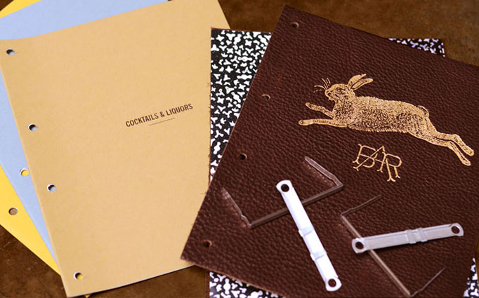
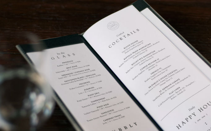
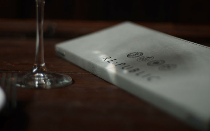
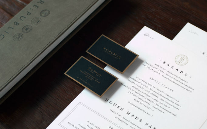
Simply outstanding typography and a more traditional leather-bound menu.
No. 4
Design
Thoughts
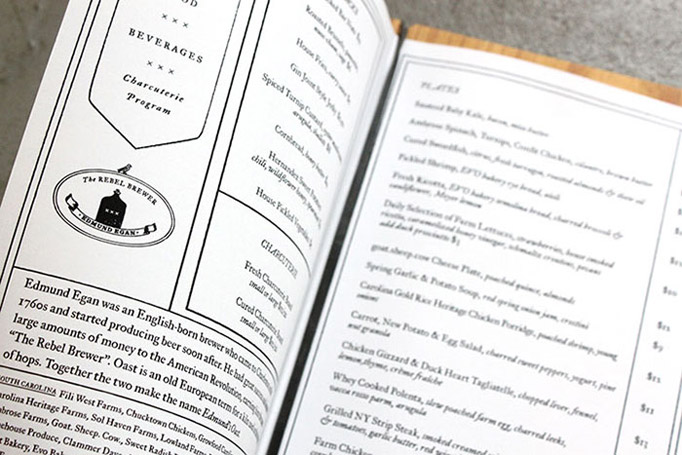
Great choice of materials, textures, and typography give this menu surprising sparks.
No. 3
Design
Thoughts
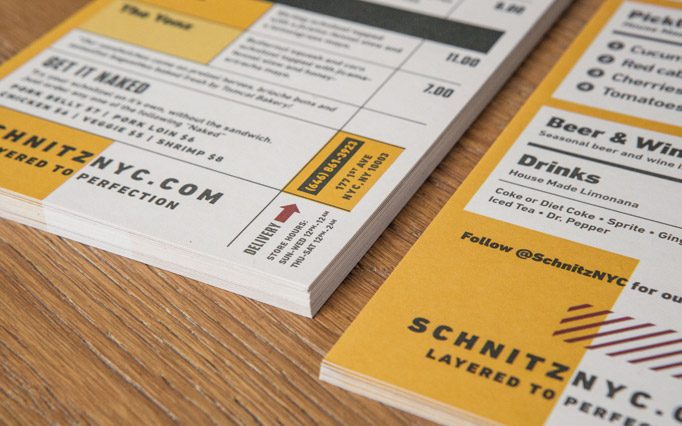
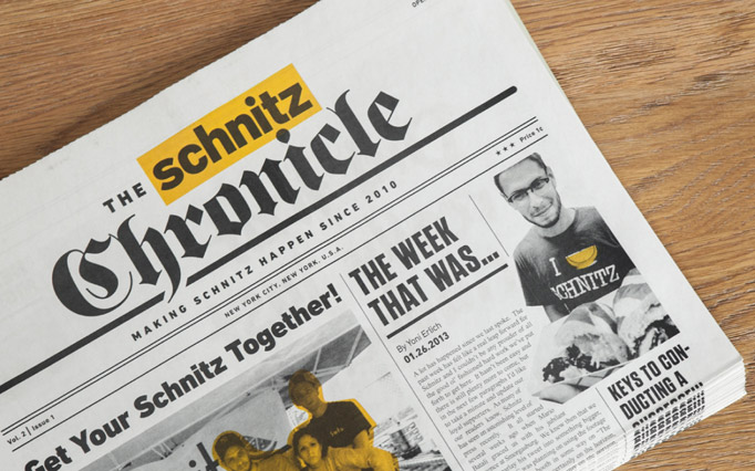
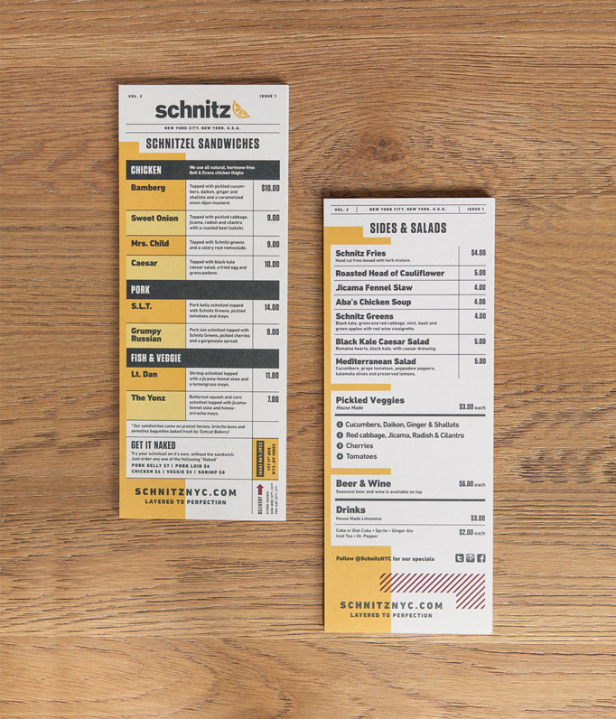
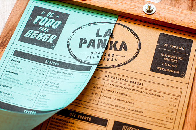
Exploiting the lowbrow typography of tiny restaurants and street food vendors, this menu has a great typographic vibe and the layered drink and food sheets add nice depth.
No. 2
Design
Thoughts
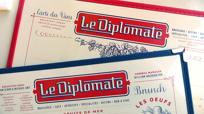
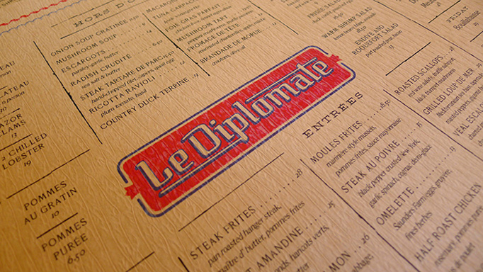
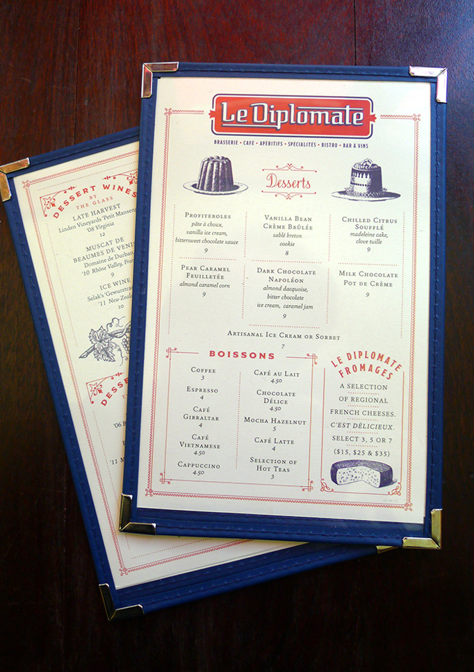
No plank, clip, or rubber band on this one. Instead it has some of those typical and rudimentary plastic sleeves with the cheesy gold corners but this selection fits the perfectly calibrated typography, illustrations, and Francophile color palette.
No. 1
Design
Thoughts
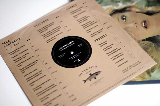
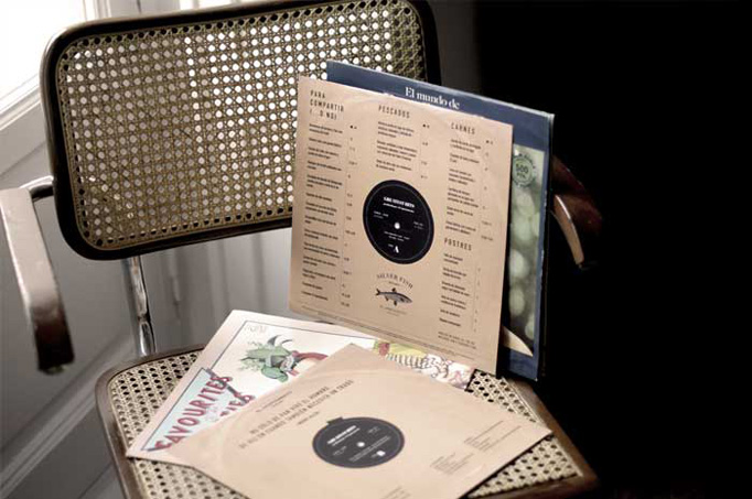
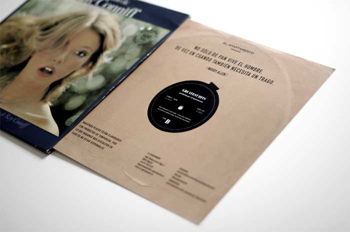
By far the most original menu on this list — I wish the typography would have been a little bit more interesting somehow — this one uses actual vinyl albums and covers, presenting the menu in the sleeve. Just a great, surprising idea that really challenges expectations.
About
Art of the Menu, is a division of UnderConsideration, cataloguing the underrated creativity of menus from around the world.
Art of the Menu uses Typekit to render Proxima Nova by Mark Simonson and Adelle by Type Together.
Art of the Menu is run with Six Apart’s MovableType 6.8.8
All comments, ideas and thoughts on Art of the Menu are property of their authors; reproduction without the author’s or Art of the Menu’s permission is strictly prohibited
Twitter @ucllc
Thanks to our advertisers
About UnderConsideration
UnderConsideration is a graphic design firm generating its own projects, initiatives, and content while taking on limited client work. Run by Bryony Gomez-Palacio and Armin Vit in Bloomington, IN. More…
blogs we publish
Brand New / Displaying opinions and focusing solely on corporate and brand identity work.
Art of the Menu / Cataloguing the underrated creativity of menus from around the world.
Quipsologies / Chronicling the most curious, creative, and notable projects, stories, and events of the graphic design industry on a daily basis.
products we sell
Flaunt: Designing effective, compelling and memorable portfolios of creative work.
Brand New Conference videos / Individual, downloadable videos of every presentation since 2010.
Prints / A variety of posters, the majority from our AIforGA series.
Other / Various one-off products.
events we organize
Brand New Conference / A two-day event on corporate and brand identity with some of today's most active and influential practitioners from around the world.
Brand Nieuwe Conference / Ditto but in Amsterdam.
Austin Initiative for Graphic Awesomeness / A speaker series in Austin, TX, featuring some of the graphic design industry's most awesome people.
also
Favorite Things we've Made / In our capacity as graphic designers.
Projects we've Concluded / Long- and short-lived efforts.
UCllc News / Updates on what's going at the corporate level of UnderConsideration.


