Announcement
Best of 2013
UnderConsideration
Here are our favorite twelve menus shown on Art of the Menu this year. We will be back with our regular programming on January 6, 2014. No other posts will be published until then.
Posted
By Armin on 12.23.2013
No. 12
Design
Thoughts
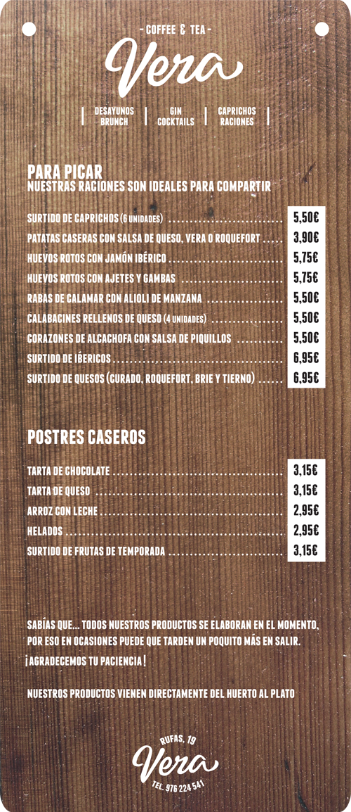
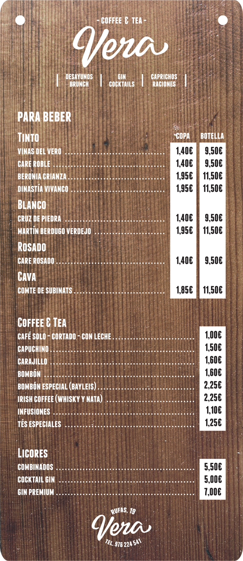
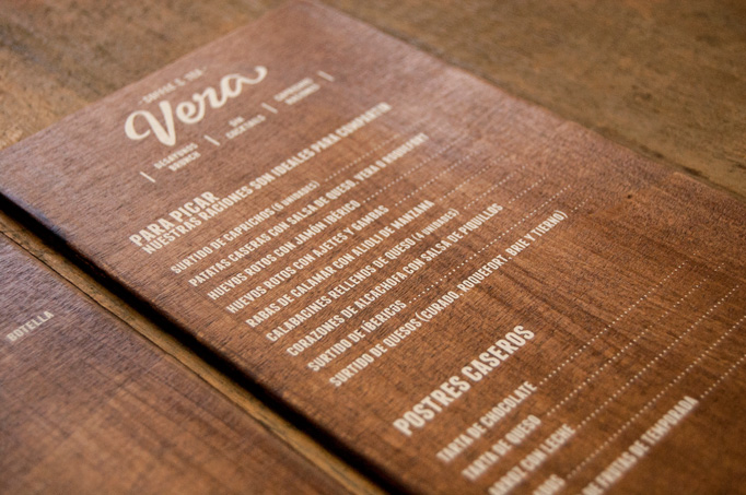
White ink on a thick piece of wood? Yes, please! The stickers for the prices (which I can’t imagine fluctuating too much) detract a little bit from the overall presentation but it’s still one grabbable menu.
No. 11
Design
Thoughts
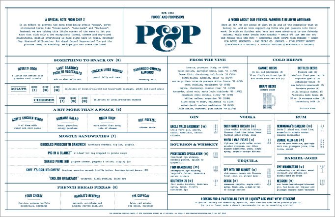
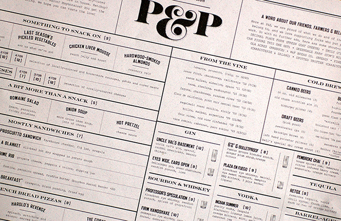
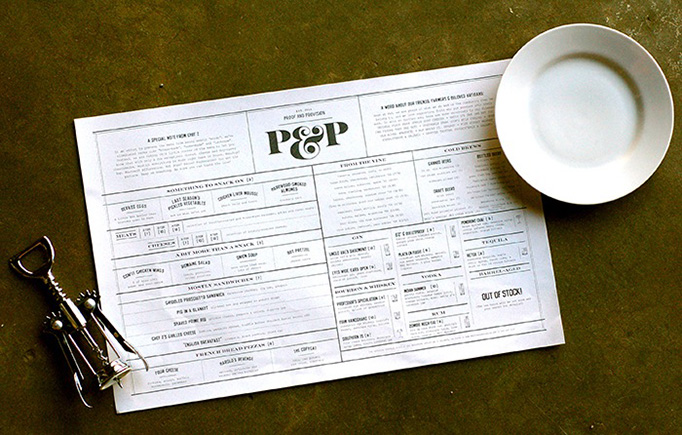
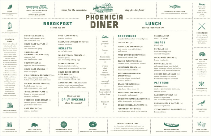
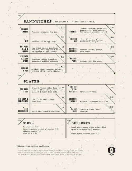
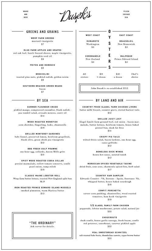
The filled-to-the-brim-with-typography approach is common in menu design but this one stands out with a tight grid and nice combo of wide serif and condensed sans.
No. 10
Design
Thoughts
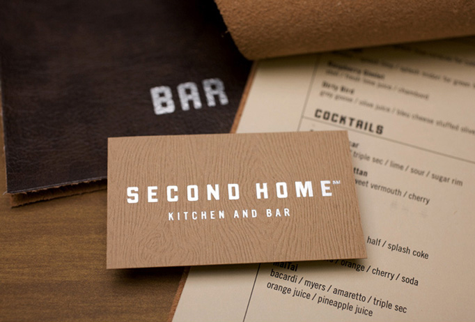
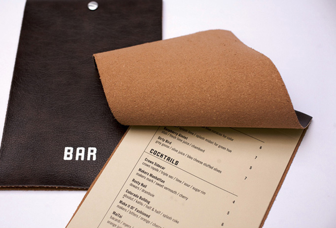
Tell me you don’t want to rub your cheeck against the inside of that felty-looking piece of leather covering up the menu? And the word “BAR” has never looked that good on leather either.
No. 9
Design
Thoughts
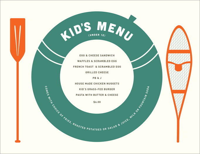
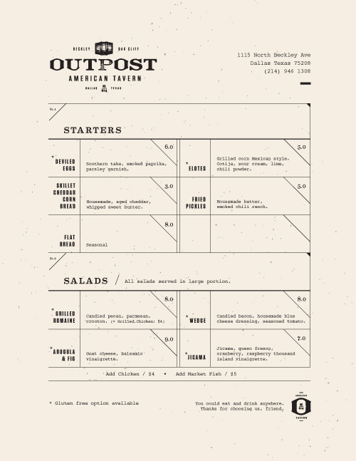
Perfectly typeset and charmingly illustrated this is a no-frills menu that does its job right on a single sheet of paper.
No. 8
Design
Thoughts
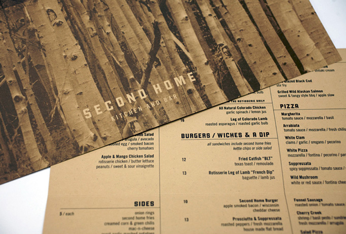
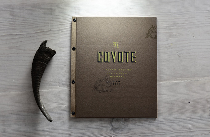
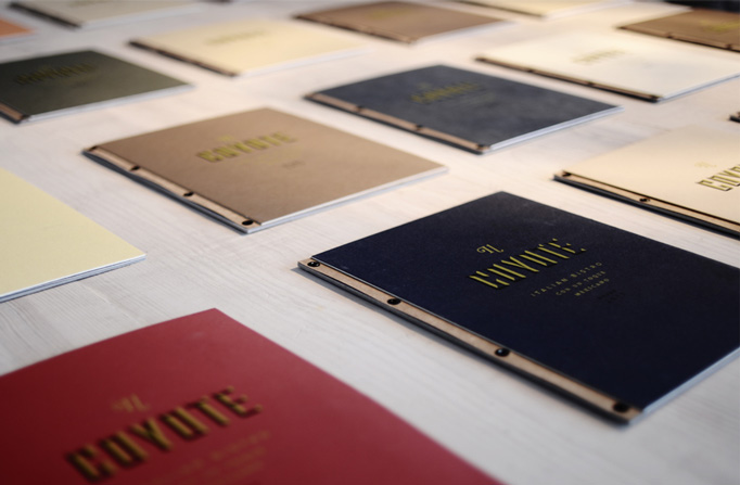
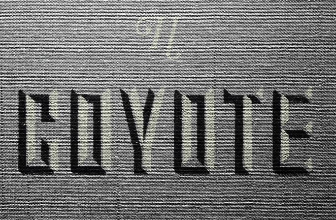
A great color palette on scrumptuosly textured covers with chiseled typography make for a great menu delivery.
No. 7
Design
Thoughts
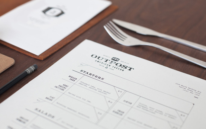
Strong typography and layout that looks like a ledger straight out of the Old West.
No. 6
Design
Thoughts
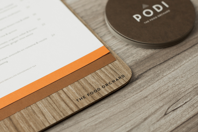
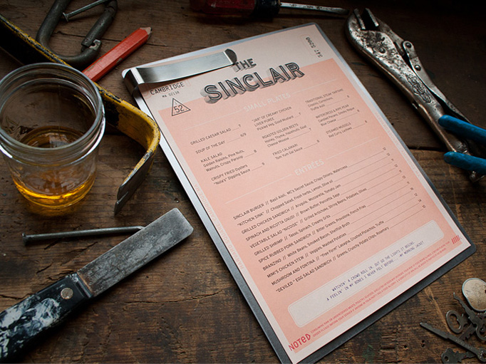
On its own, the binder-clipped menu on a piece of wood is fulfilling great but as part of this warm-hued identity it’s a full, hearty meal.
No. 5
Design
Thoughts
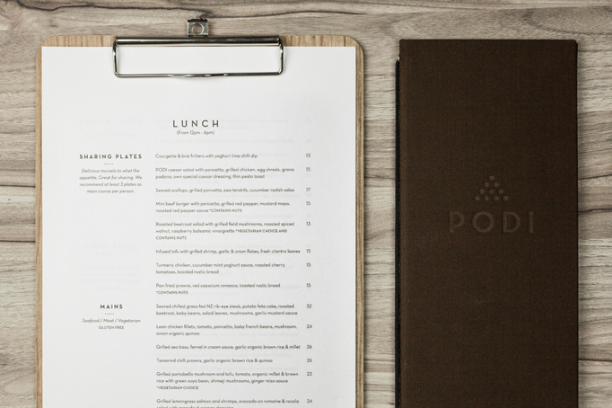
Slightly oversized and beautifully typeset to offset the relatively ornamental script logo.
No. 4
Design
Thoughts
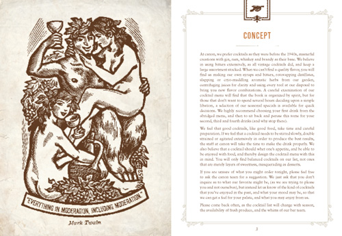
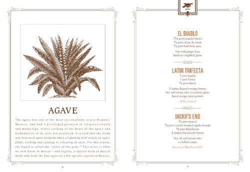
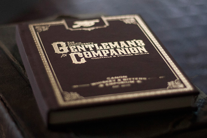
This menu-slash-cocktail recipe book is delightfully packaged in a foil stamped brown cloth cover that sets the tone for dozens of vintage illustrations.
No. 3
Design
Thoughts
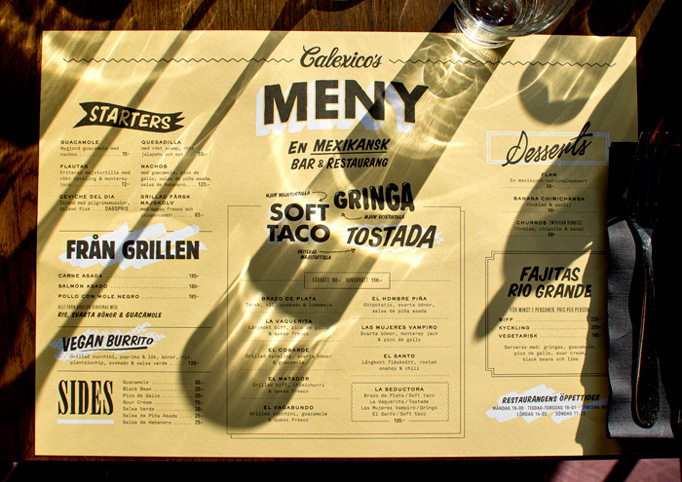
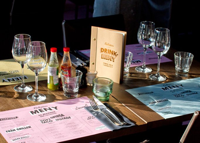
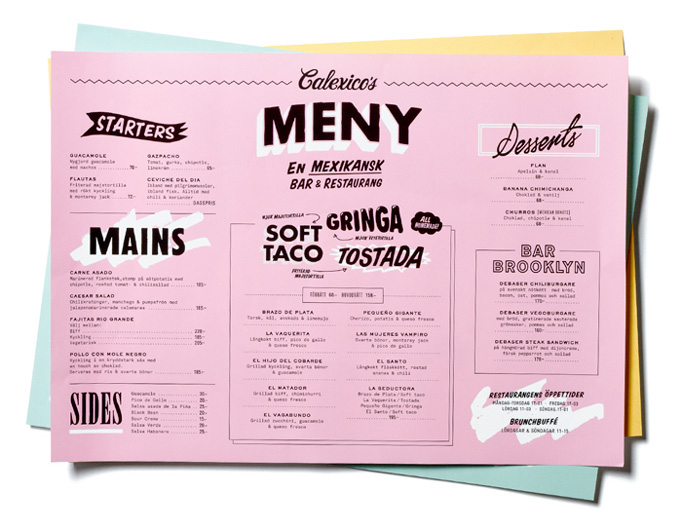
Leave it to a bunch of Swedes to properly interpret the Mexican vernacular into a lo-fi menu that is all Mex and no Tex.
No. 2
Design
Thoughts
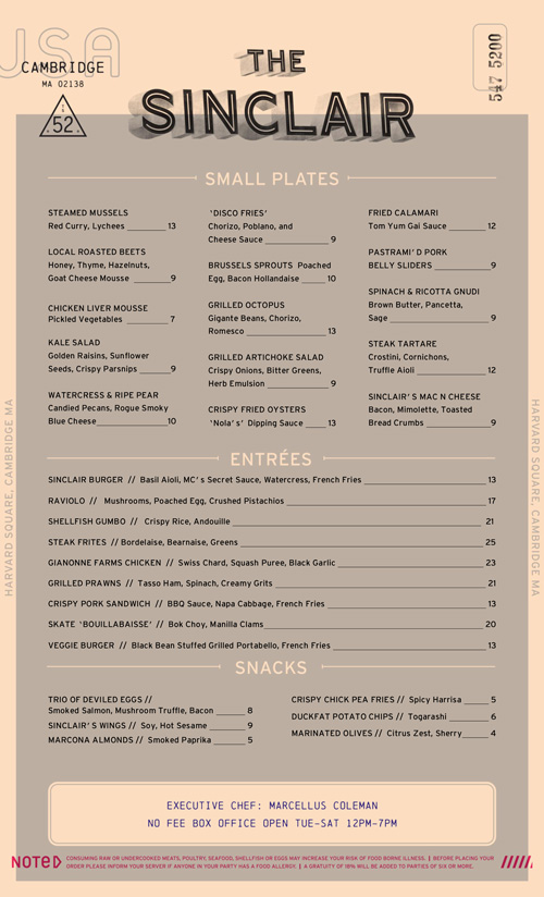
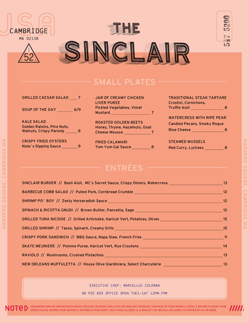
This menu looks almost like a prop from Blade Runner, that kind of rundown sexy ugly futuristic look. With typography that is inventive and attractive.
No. 1
Design
Thoughts
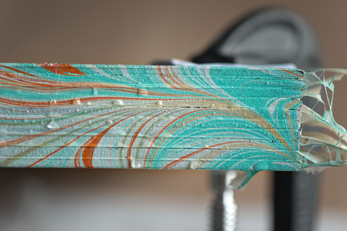
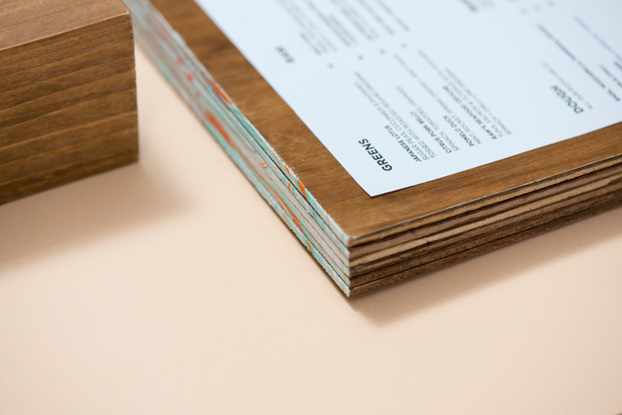
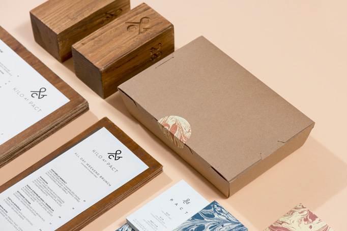
ACRE have taken the trend of using wood as a base for menus to a new high by exploiting the thickness of the wood and adding, by hand, a marbling edge that looks decidedly delicious.
About
Art of the Menu, is a division of UnderConsideration, cataloguing the underrated creativity of menus from around the world.
Art of the Menu uses Typekit to render Proxima Nova by Mark Simonson and Adelle by Type Together.
Art of the Menu is run with Six Apart’s MovableType 6.8.8
All comments, ideas and thoughts on Art of the Menu are property of their authors; reproduction without the author’s or Art of the Menu’s permission is strictly prohibited
Twitter @ucllc
Thanks to our advertisers
About UnderConsideration
UnderConsideration is a graphic design firm generating its own projects, initiatives, and content while taking on limited client work. Run by Bryony Gomez-Palacio and Armin Vit in Bloomington, IN. More…
blogs we publish
Brand New / Displaying opinions and focusing solely on corporate and brand identity work.
Art of the Menu / Cataloguing the underrated creativity of menus from around the world.
Quipsologies / Chronicling the most curious, creative, and notable projects, stories, and events of the graphic design industry on a daily basis.
products we sell
Flaunt: Designing effective, compelling and memorable portfolios of creative work.
Brand New Conference videos / Individual, downloadable videos of every presentation since 2010.
Prints / A variety of posters, the majority from our AIforGA series.
Other / Various one-off products.
events we organize
Brand New Conference / A two-day event on corporate and brand identity with some of today's most active and influential practitioners from around the world.
Brand Nieuwe Conference / Ditto but in Amsterdam.
Austin Initiative for Graphic Awesomeness / A speaker series in Austin, TX, featuring some of the graphic design industry's most awesome people.
also
Favorite Things we've Made / In our capacity as graphic designers.
Projects we've Concluded / Long- and short-lived efforts.
UCllc News / Updates on what's going at the corporate level of UnderConsideration.


