You’re looking at one of the…
A graphic design firm generating its own projects, initiatives, and content while taking on limited client work. Run by Bryony Gomez-Palacio and Armin Vit in Bloomington, IN.
Join our Mailing List
Colophon
Headlines and wordmark
Druk Condensed XX Super by Berton Hasebe for Commercial Type.
Body
Neue Haas Unica by Toshi Omagari for Monotype. Served via fonts.com.
UCLLC logo
Custom lettering by Mark Caneso.
Cardinal Stage Identity
Established in 2006, Cardinal Stage is a professional theater company in Bloomington, IN. A non-profit organization with strong ties to the community, Cardinal Stage’s programming covers many genres, including musicals, dramas, classics, and, since 2010, kid-friendly and family-oriented productions. Its holiday show — whether it’s Peter Pan, Mary Poppins, or A Christmas Carol — is a highlight of Bloomington’s end of year events. After 12 years, the theater’s founder and artistic director relocated with this family and opened the door for Cardinal Stage to move into a new era, effectively referred to internally as “Cardinal 2.0”. One half of UnderConsideration (Armin) was invited to join the board of directors at the start of the 2017 – 18 season and soon after we began working with the staff (including the new artistic director) on redesigning their identity to signal the evolution of Cardinal Stage. First previewed at their annual gala event in March, the new identity launched this May along with their 2018 – 19 season announcement. The project — including the logo redesign, new identity, and full range of season materials — was done pro-bono.
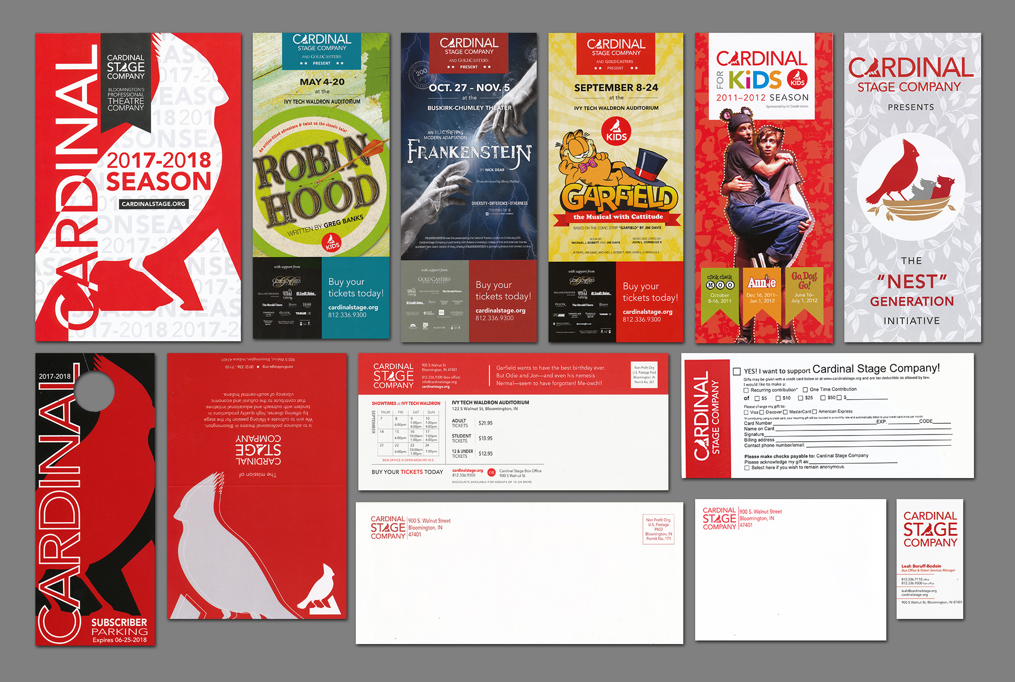
The previous identity was fairly good and it served the theater well for almost ten years. Its main drawback was a lack of consistency in how they used their logo — of which they had three different versions (that would sometimes be used side by side) — and that their materials were sometimes too literal (i.e., an initiative called “Nest Generation” showed an overly cute bird’s nest even though the initiative was geared toward 20- to 35-year-olds). One thing that has impressed us about the theater is how they are able to give their own interpretation, on the production side (through fantastic sets), to existing plays and we felt that that was missing in how they presented themselves, by being less literal and also having an element of joy and surprise.
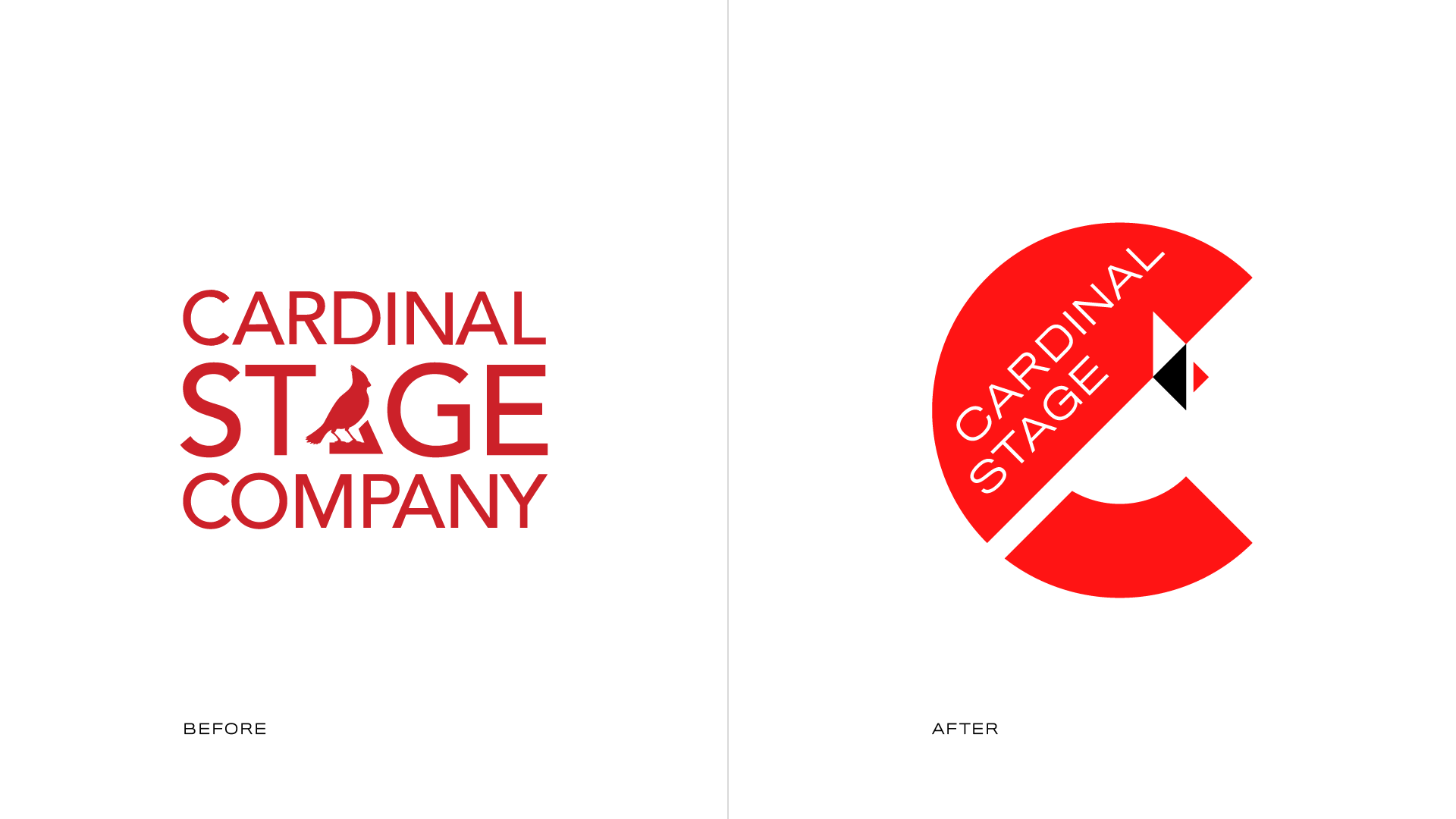
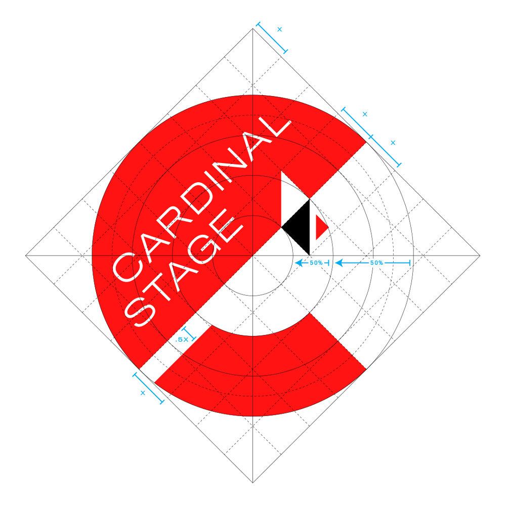
We knew we had to keep the cardinal bird in some form — after all, it was not only part of the name but they had built enough equity into a cardinal icon that it would not have been appropriate to completely ditch it. Also, the cardinal is the official state bird of Indiana so there are a lot of cardinal-themed and cardinal-named businesses here and we wanted to make sure that theirs stood out. In analyzing the cardinal, we found a few key physical features that make it iconic:
Based on those observations, we abstracted the cardinal using only circles and triangles and then worked it out so that we could embed it in the negative space of a “C” (for “Cardinal”) as an element of surprise that, as we’ve found, brings a moment of joy to those who didn’t see it at first glance.

The name of the organization fit nicely in the wide space over the bird and yielded some pleasant alignments (like the two “A”s and “D” and “E”). Having an icon and wordmark contained as a badge, allows the logo to be flexible and effective in its use and placement.

We worked with StudioTBT to create a couple of animations that the theater could use on social media videos as well as in PPT presentations. The first is more about the geometry of the logo, revealing through a sweeping motion and the second is about highlighting the different stories that unfold on their stage.
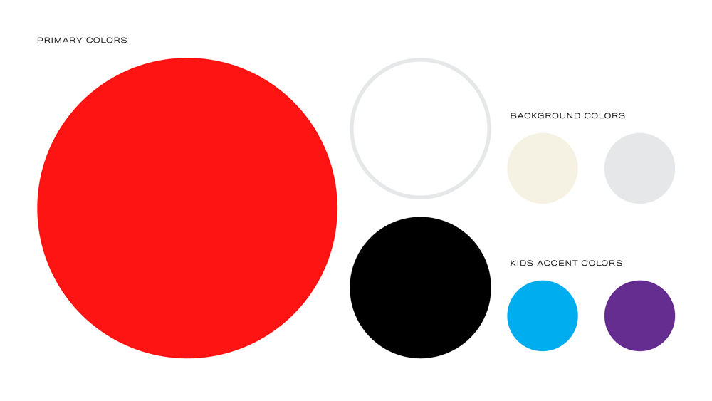
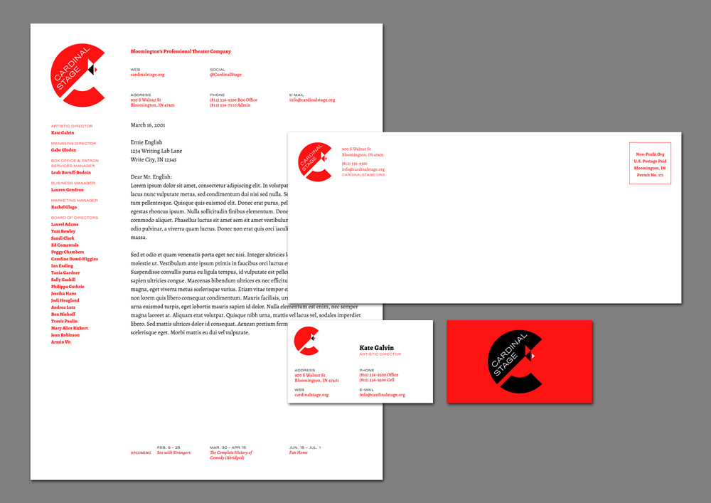
A simple color palette of red, black, and white drives the identity and logo applications.
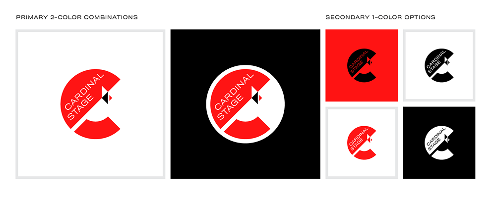
The badge configuration of the logo is best used in large sizes so that the name maintains its readability. For situations where the logo needs to appear smaller, a secondary version that separates the wordmark from the icon can be used in much smaller dimensions.
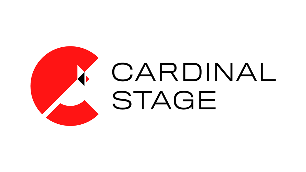
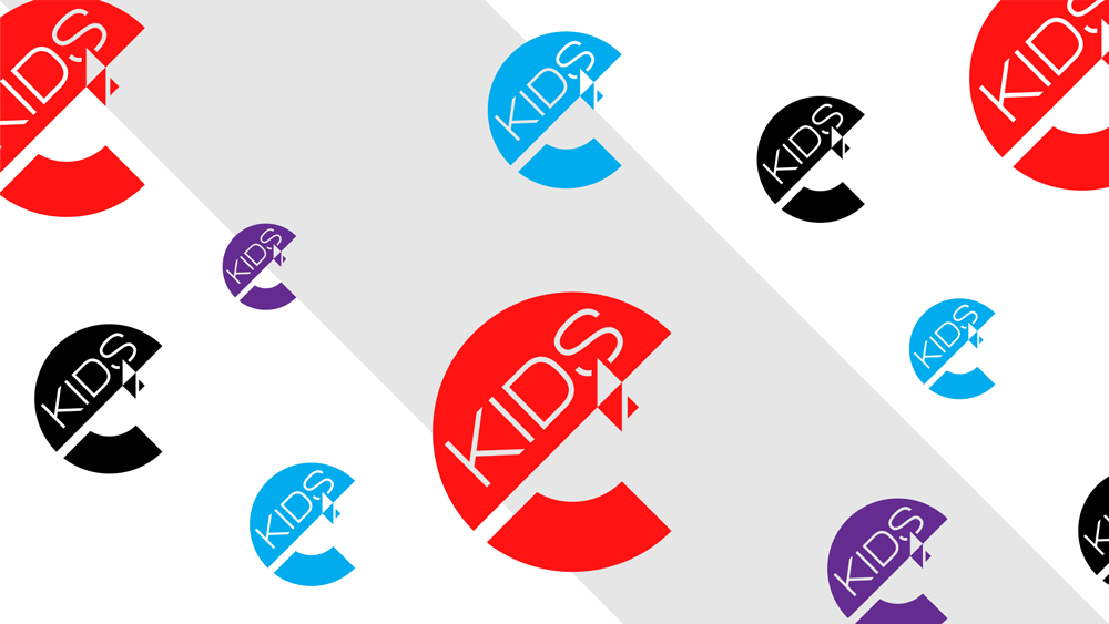
The logo has flexibility to accommodate some initiatives and sub-brands and its geometry allows for some colorful interpretations and, when appropriate, it can house imagery inside.
Aside from red, black, and white, the color palette is limited to include a couple of light background colors and some accents for kids-related materials. More color is infused into the identity through the show graphics (further below).
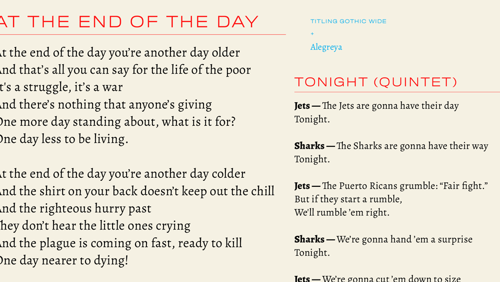
The identity uses Titling Gothic Wide (in Thin and Light weights only) for headlines and Alegreya, a free serif family from Google Fonts that not only satisfies the limited budget of the organization but also has a robust and literary aesthetic, for body copy.
Institutional materials are being developed as needed but the premise is fairly simple: keep the logo prominent and make the information accessible.
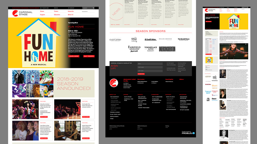
We designed a website with large images, a simple and responsive layout, and made an effort to establish a more sophisticated online presence. (Here is a screenshot of the previous home page.)
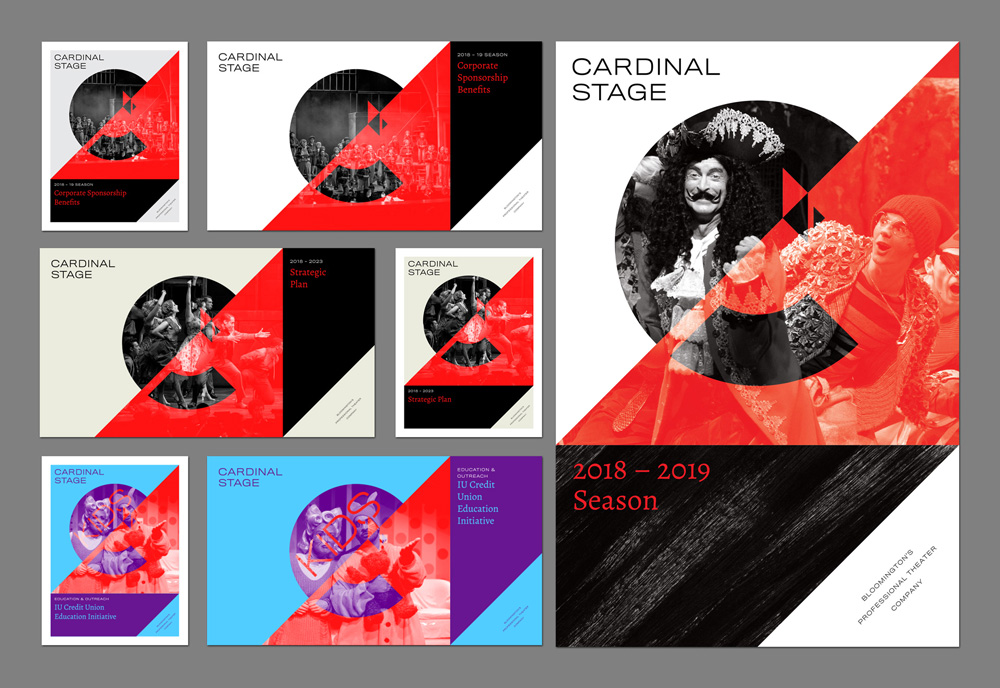
In an effort to give the logo more prominence and help it become more recognizable in the community we arrived at a solution for the print and digital materials that are distributed to sponsors, partners, vendors, and audience, that puts the logo front and center and serves as a device to showcase the production photos in a way that is consistent but also flexible, while also establishing the 45-degree angle and the use of red as key elements of the identity that the various constituents will keep seeing again and again in different but related variations.
One of the things that we were most concerned about were the graphics for each show where, for the past 5 or 7 years, every show looked completely different and there was no cohesiveness between any of them, making it really difficult for the graphics to help tell the audience that this was a Cardinal Stage show and not one of their competitor’s. In the past they had relied on everything from licensed logos and imagery to customized versions of things found online to some original concepts. The problem, of course, is finding an approach that is appropriate across different genres for different audiences and one that doesn’t feel overly repetitive or constrictive.
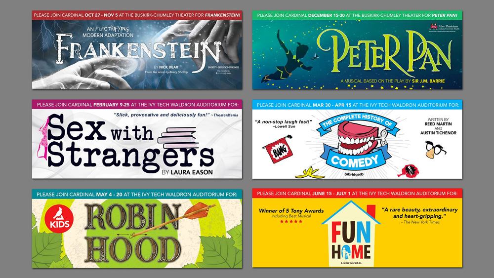
Although our system-implementing inclinations wanted to standardize the type treatments and make them more “design-y”, our Cardinal Stage clients were clear (and correct) in that that wasn’t going to work and that the title treatments needed to be quickly evocative of the genre so that as many people as possible would instantly get what type of play they were going to see. We did establish a standard where the type treatments can only be in black and white and from there we let loose with some fun title treatments. As much as possible, we selected free Google Fonts or affordable choices from Creative Market in order to minimize font licensing costs.
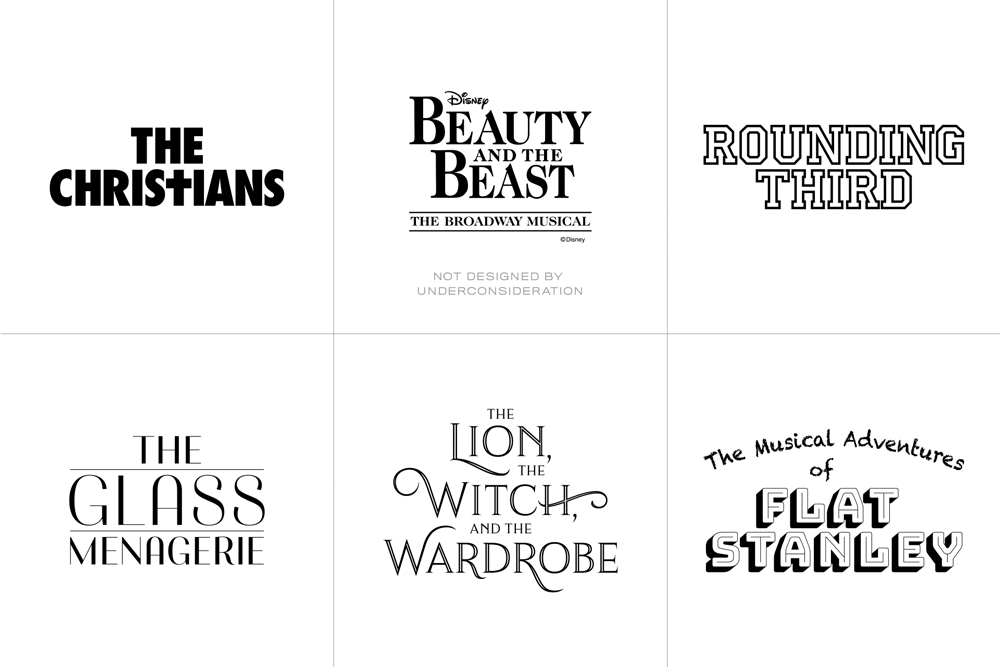
Disney’s Beauty and the Beast is presented through special arrangement with Music Theatre International (MTI). All authorized performance materials are also supplied by MTI.
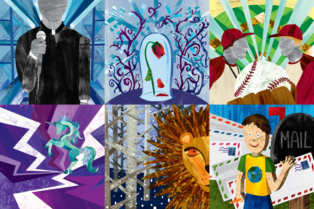
All the illustrations were done in-house and while, also initially, we tried to think far too hard about what the illustrations should be of, guidance from Cardinal Stage was to keep things simple and to the one or two elements that would quickly hint at what each play was about. The backgrounds of each illustrations have strong diagonal elements to evoke the 45-degree angle of the logo while the texturing helped unify the six shows of the season.
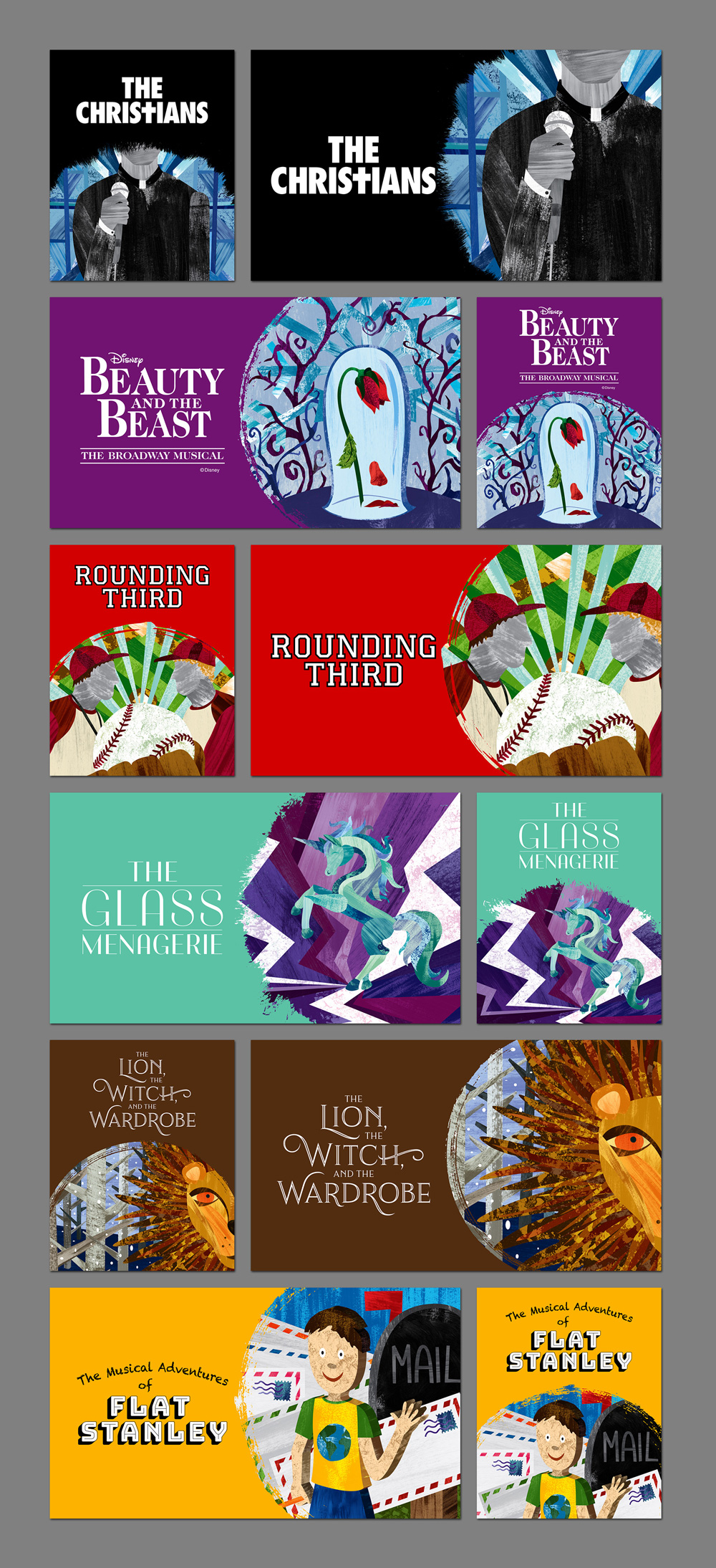
While we still have to adapt the title treatments and illustrations to layouts with sponsors, show information, and a myriad different sizes, we have so far established a system that allows the two elements to exist vertically and horizontally, from which we can then build out different applications. The illustrations are masked inside circle shapes to, again, evoke the shape of the logo.
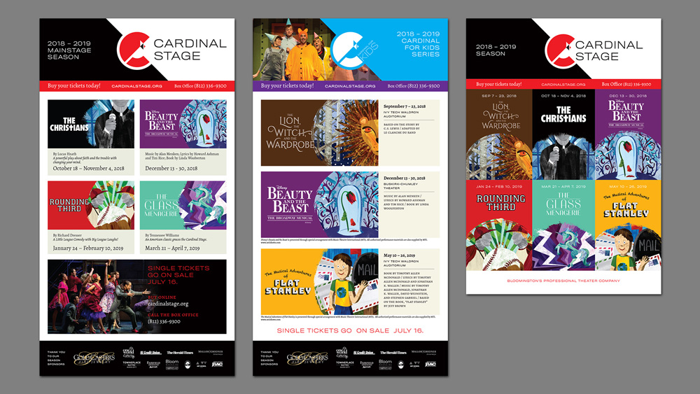
Once we start preparing for the first show of the 2018 – 19 season we will be developing further layouts for the illustrations to exist in. So far we have been focused on how to present all of the shows together, which were announced in March. It was the first time in the theater’s history that the final, matching artwork for all the season’s shows was presented upfront.
We’ve done a few promotional items so far, including t-shirts, mugs, and lapel pins (that were given out at the annual gala event when the logo was first previewed to a rousing drum roll — literally!).
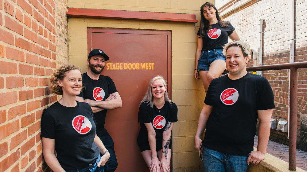
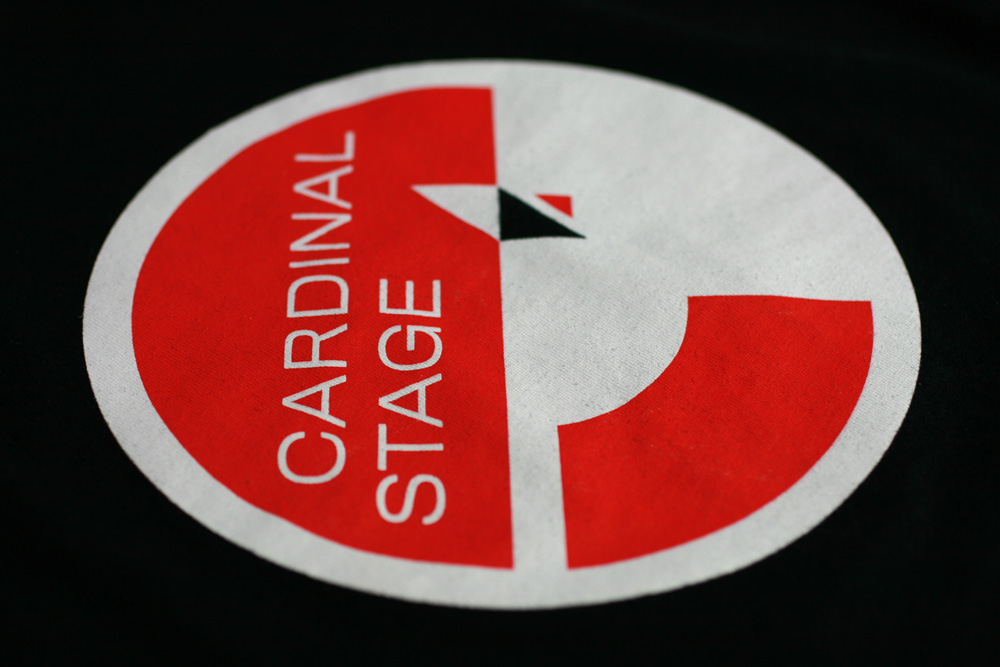
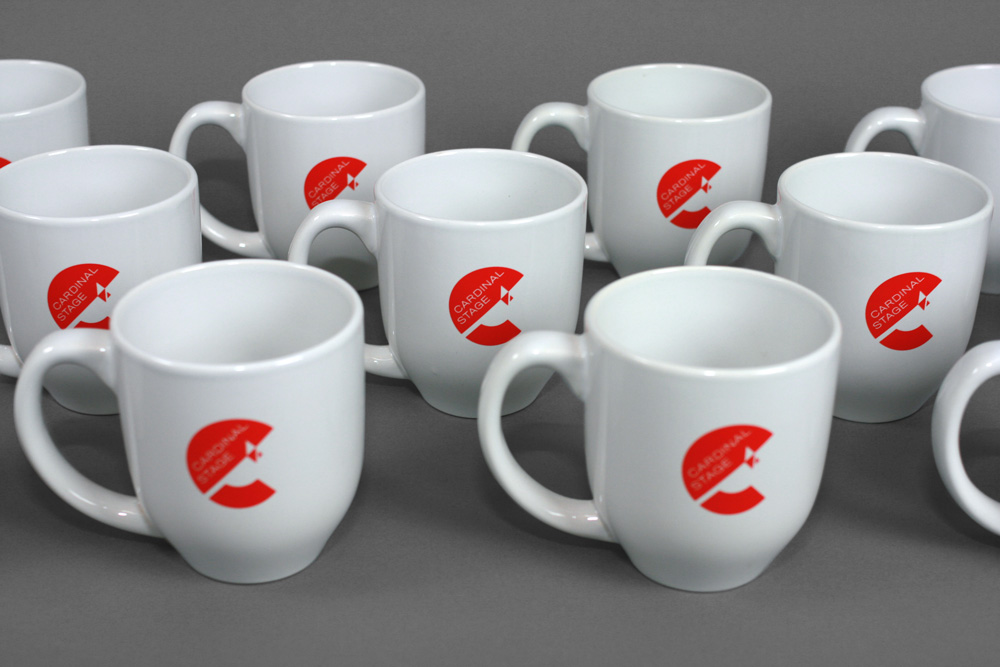
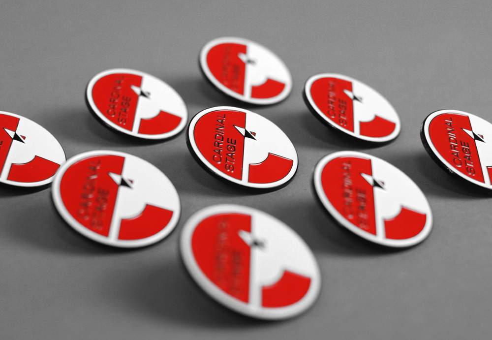
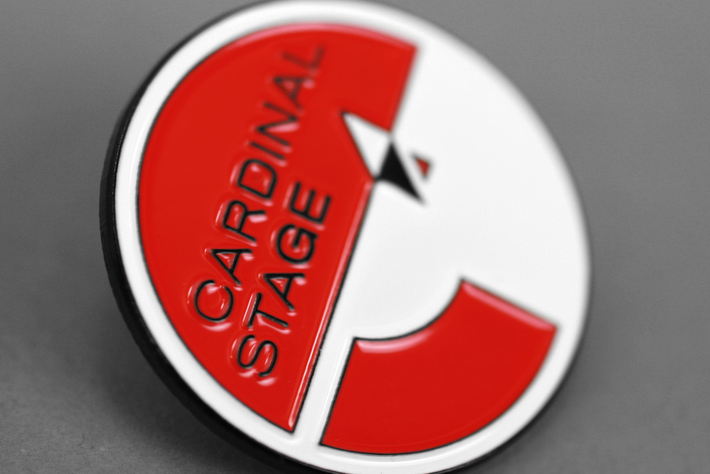
There is a long list of materials to design and produce over the next 3 to 6 months and we will keep updating this page as new items are available. This project has been a real treat for us, as Cardinal Stage staff has been wonderful to work and collaborate with. We hope this identity lasts them for many years until the inevitable “Cardinal 3.0” comes around.