You’re looking at one of the…
A graphic design firm generating its own projects, initiatives, and content while taking on limited client work. Run by Bryony Gomez-Palacio and Armin Vit in Bloomington, IN.
Join our Mailing List
Colophon
Headlines and wordmark
Druk Condensed XX Super by Berton Hasebe for Commercial Type.
Body
Neue Haas Unica by Toshi Omagari for Monotype. Served via fonts.com.
UCLLC logo
Custom lettering by Mark Caneso.
2016 Brand New Conference Identity
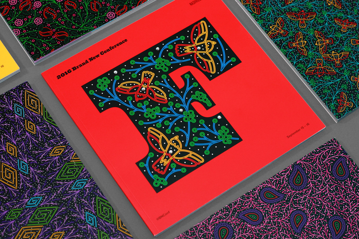
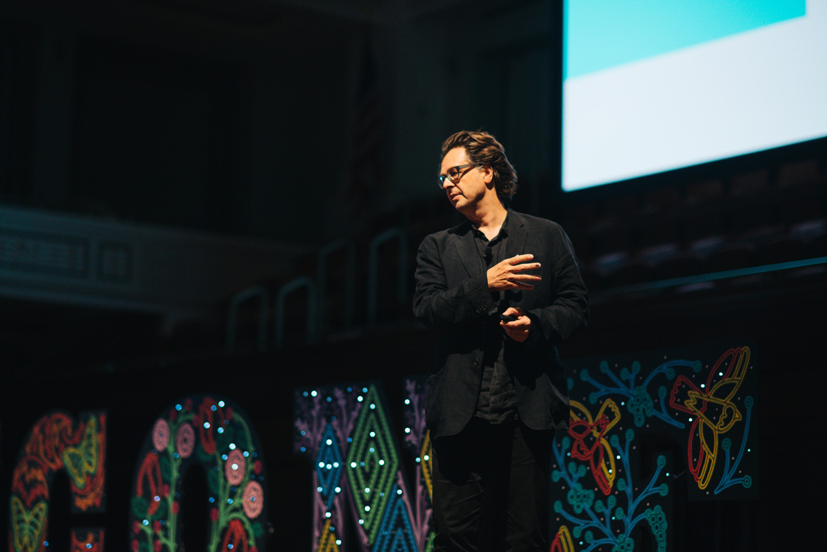
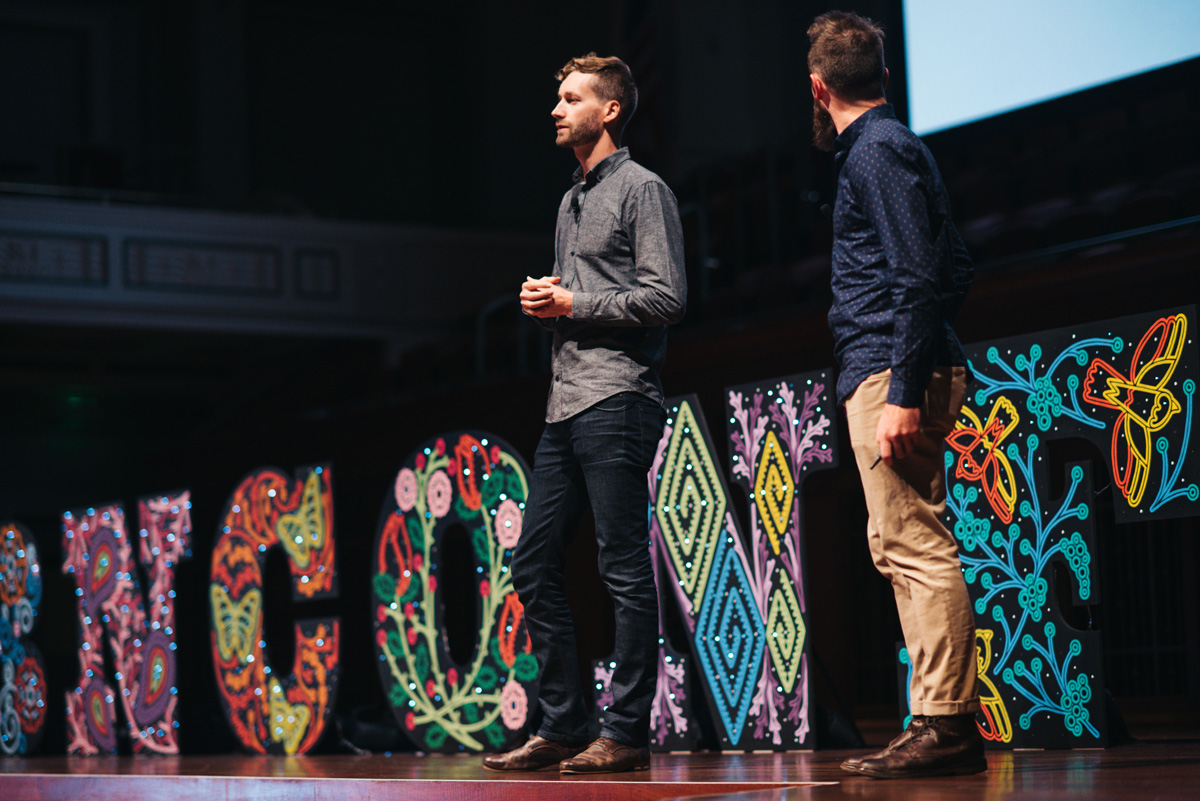
In September of 2016 we celebrated our eighth (8!) Brand New Conference in Nashville, TN, a town oozing with inspiration and material to draw from, which we unapologetically did. Despite having done this eight times, it never gets easier in terms of the materials we produce and the many tactical and logistic challenges that arise every single year, but we enjoy the challenge of designing for designers and hopefully this year’s identity gives y’all some joy.
(Full set of photos of the materials here; believe it or not, the ones shown here are a limited selection.)
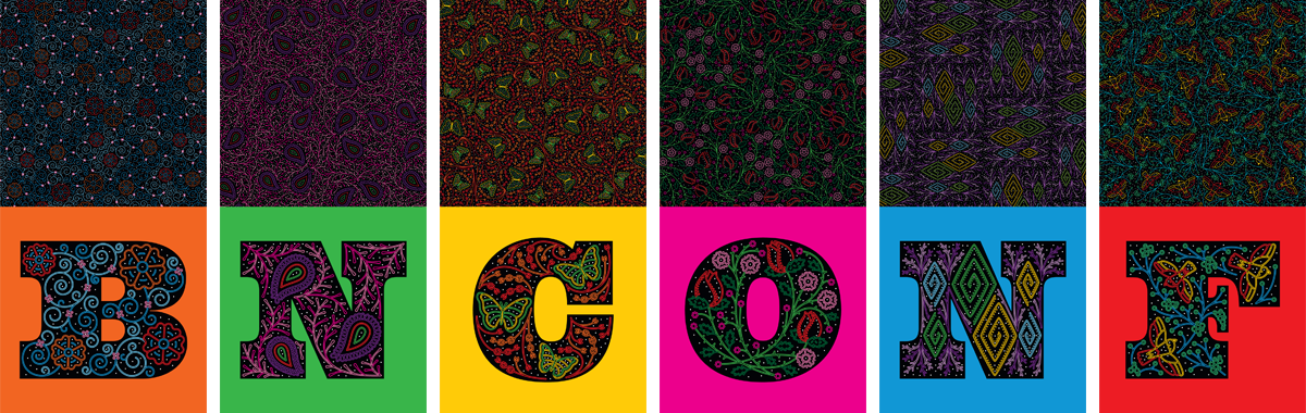
Logo
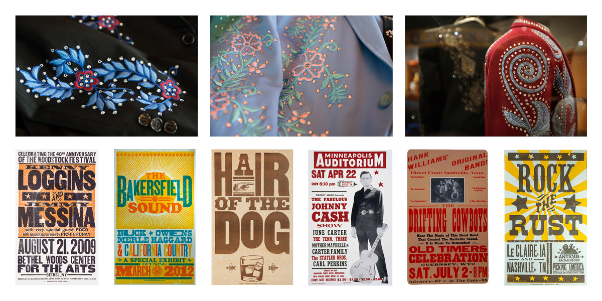
The logo is explained in more detail here so this is a quick reminder of where the logo came from — rhinestone suits and woodtype — and to show the variations that we used throughout the applications.
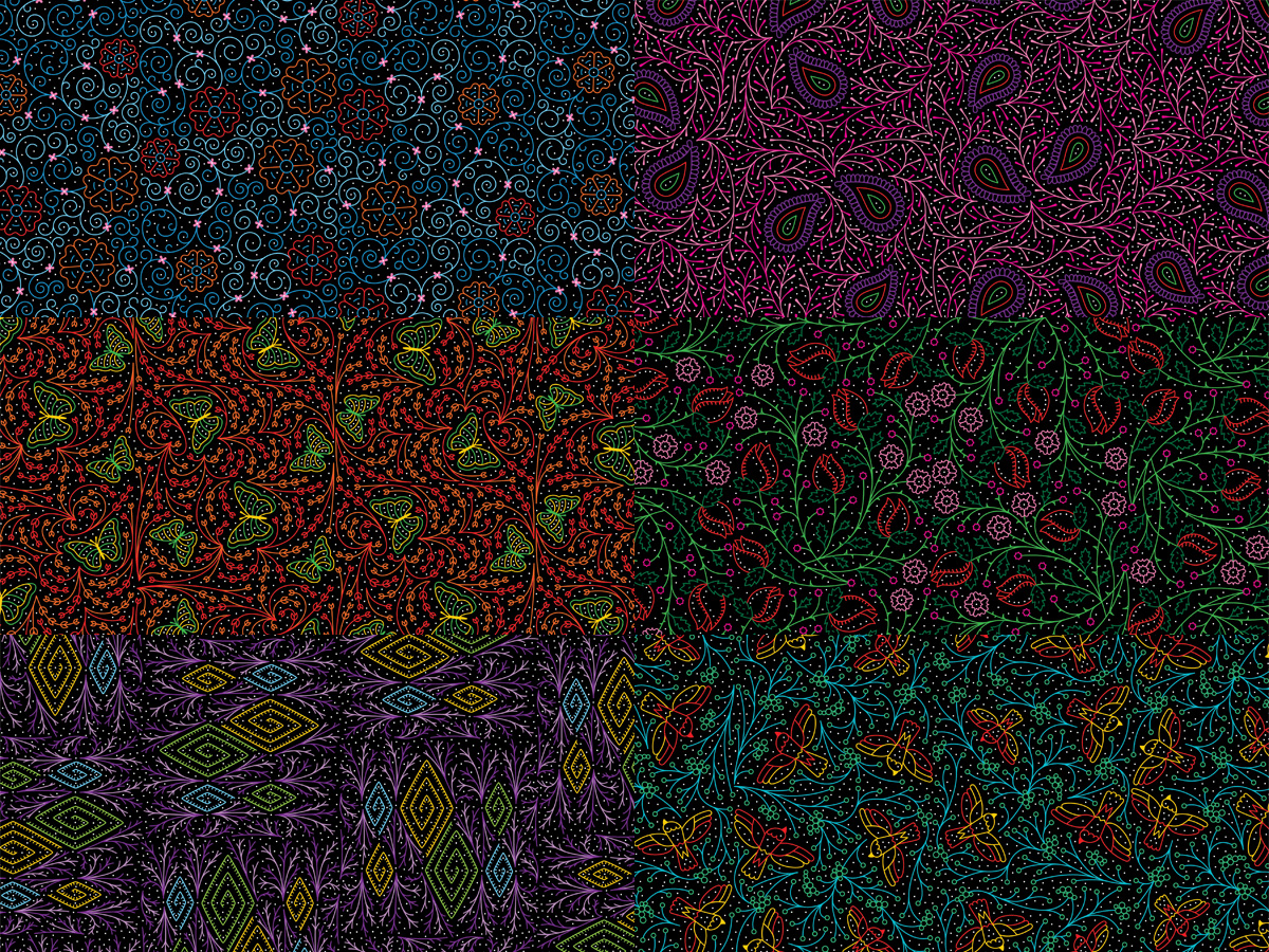
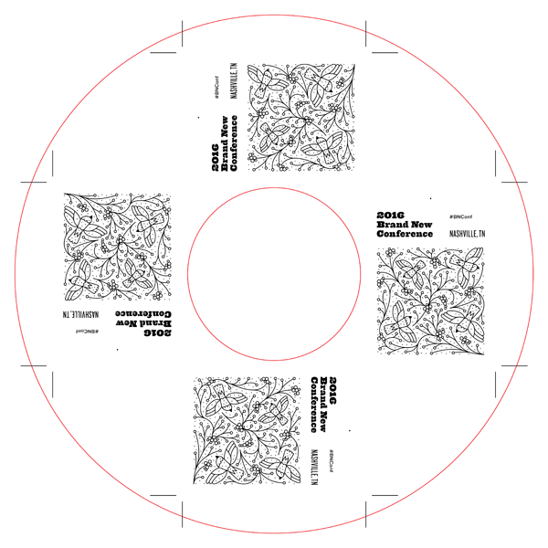
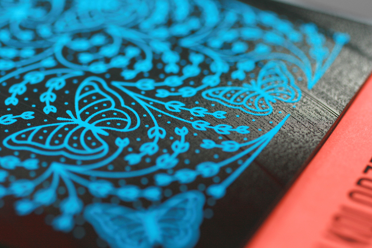
Patterns
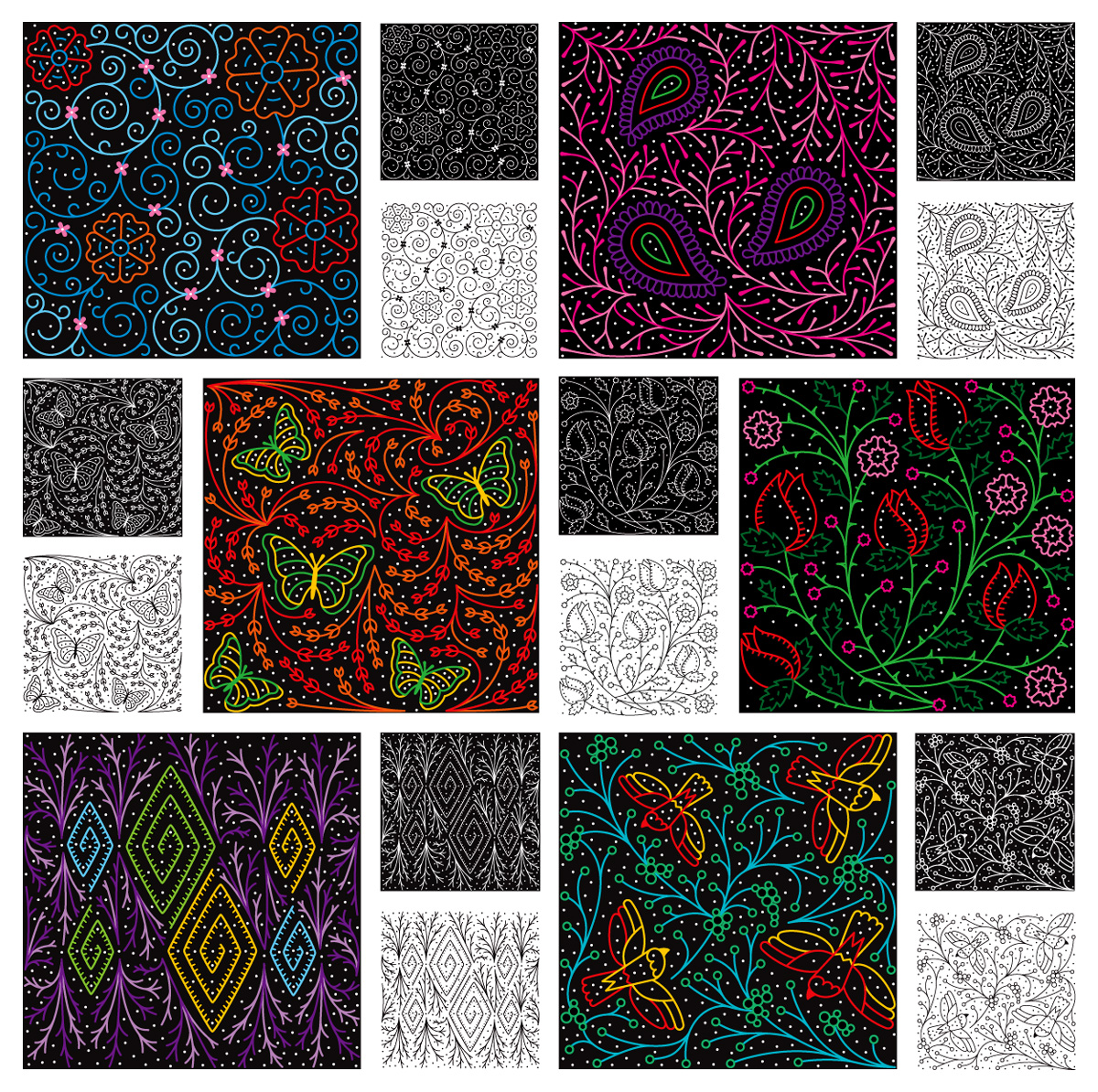
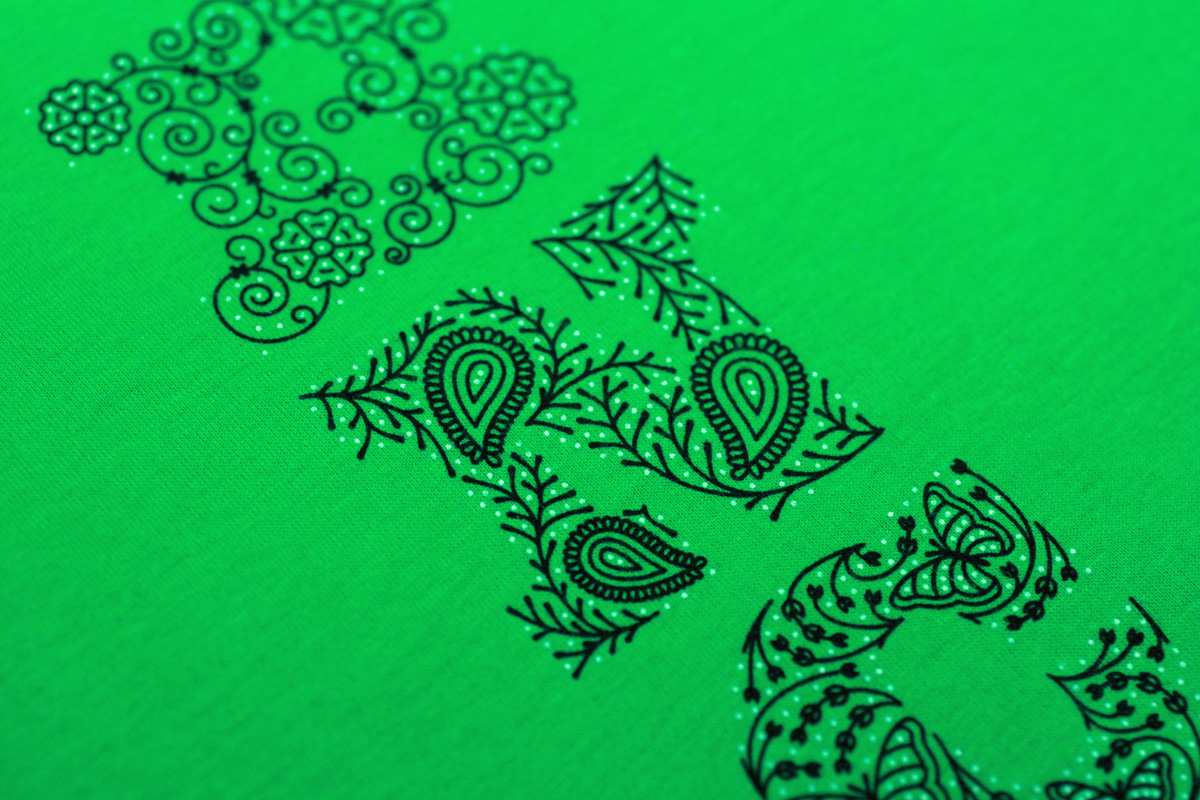
We developed the illustration from each letter into a square tile so that we could then use it as a step-and-repeat pattern. This was almost as hard as the original illustrations since now we had to fill in a full square and customize where all the different vectors landed.
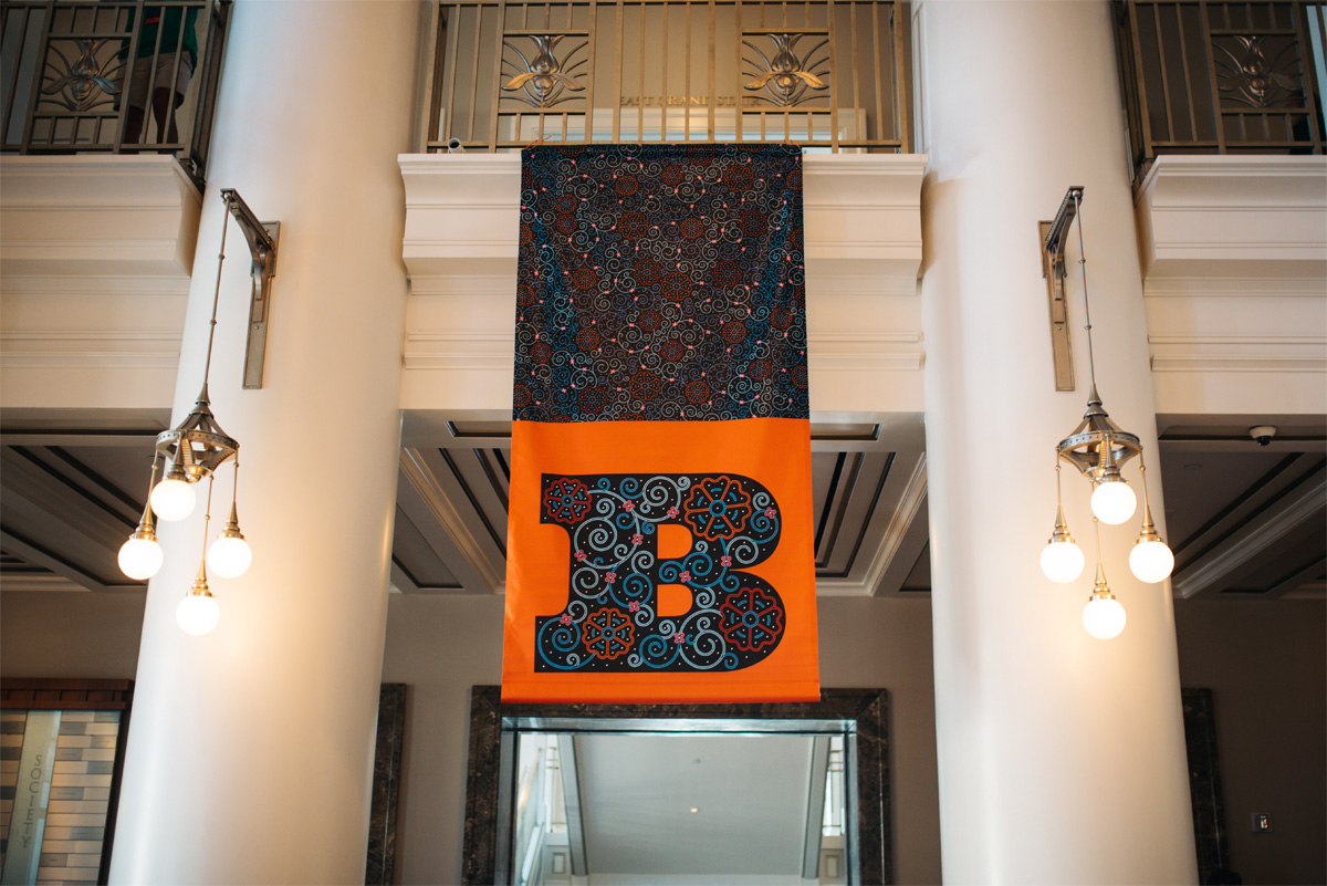
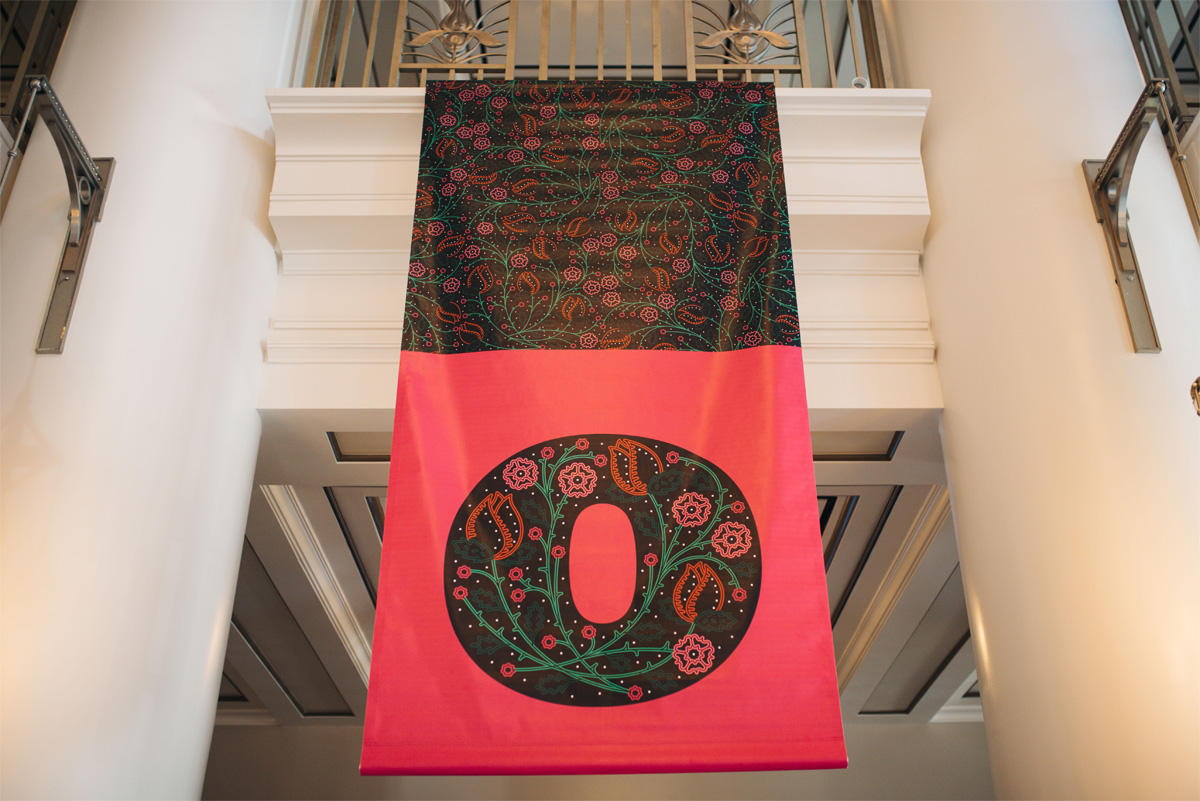
Program
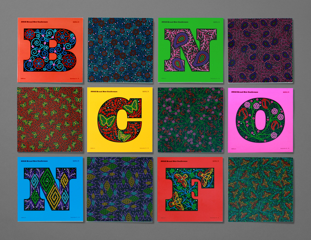
We didn’t expect that putting each letter of the logo in a colorful square would drive so much of the applications where everything stemmed from an initial square shape but it became a simple and effective guiding principle. One of the first things we developed was the program, that was designed at 9 by 9 inches and the print run divided in six, with each letter taking over the whole cover and paired with its pattern in the back cover.
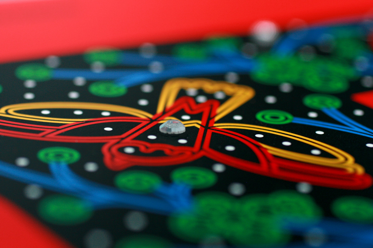
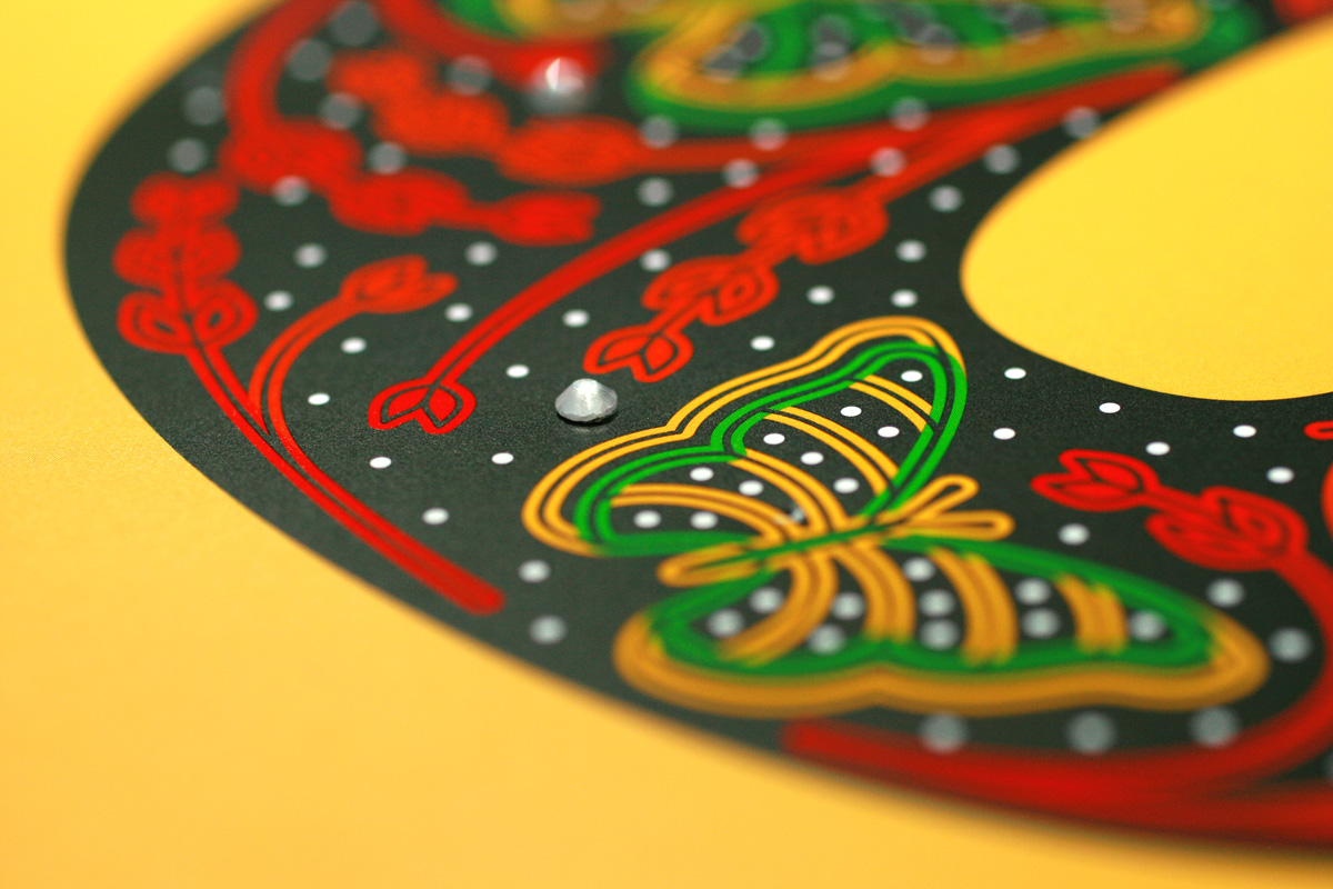
Each of the covers had seven hand-placed rhinestones that were painstakingly but bravely done by our volunteers on the day before the event. Pro tip: 7 rhinestones times 1,000 covers equals an inordinate amount of man- and woman-hours. When we originally planned it we figured it would take 3-4 hours, instead of the nearly 8 with almost all hands on deck. But, in the end, the programs had literal bling.
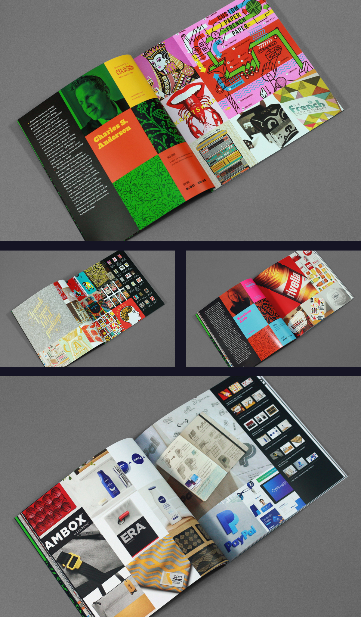
For the body of the program, we established a simple 3-by-3-inch grid and left absolutely zero white space. The idea was to have a program full of rich, tightly-cropped graphics. Small thumbnails at the end of each speaker showed the full image.
Badges
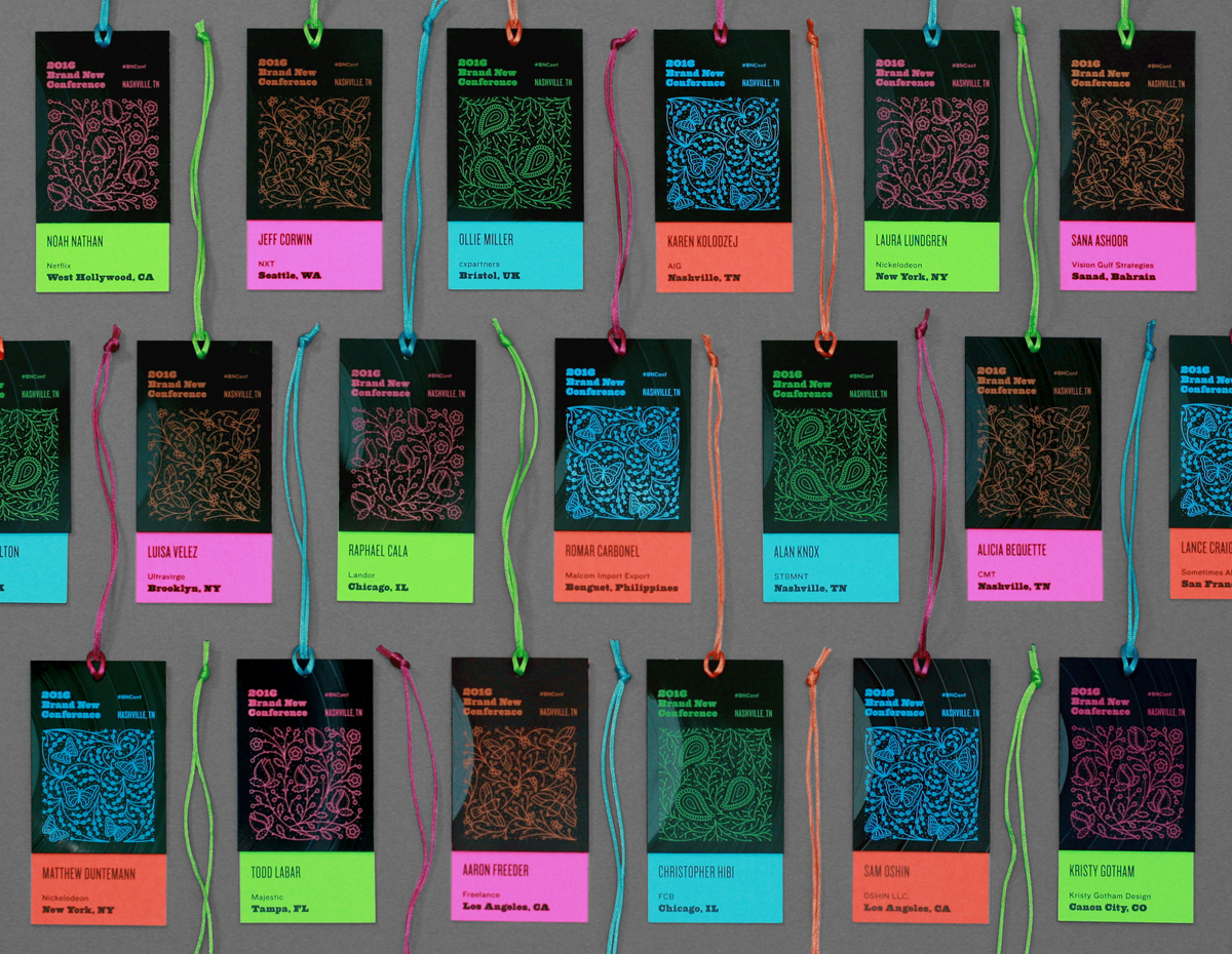
Since the conference was in Nashville, we thought music could play another role beyond the country singer suits by having name badges built using old vinyl records, which sounded great in theory but was remarkably difficult in practice. The hardest part was figuring out how to cut out the badge pieces from the record. After trying numerous approaches — from a “hot knife” to a table saw — we found that the crispest way was to score the record with an X-acto blade then snapping it by hand.
Once we figured out the math, the artwork was silkscreened on the record, with big, fat crop marks so that we could then score, snap, and drill the hole for the lanyard. Here is a little medley of that process.
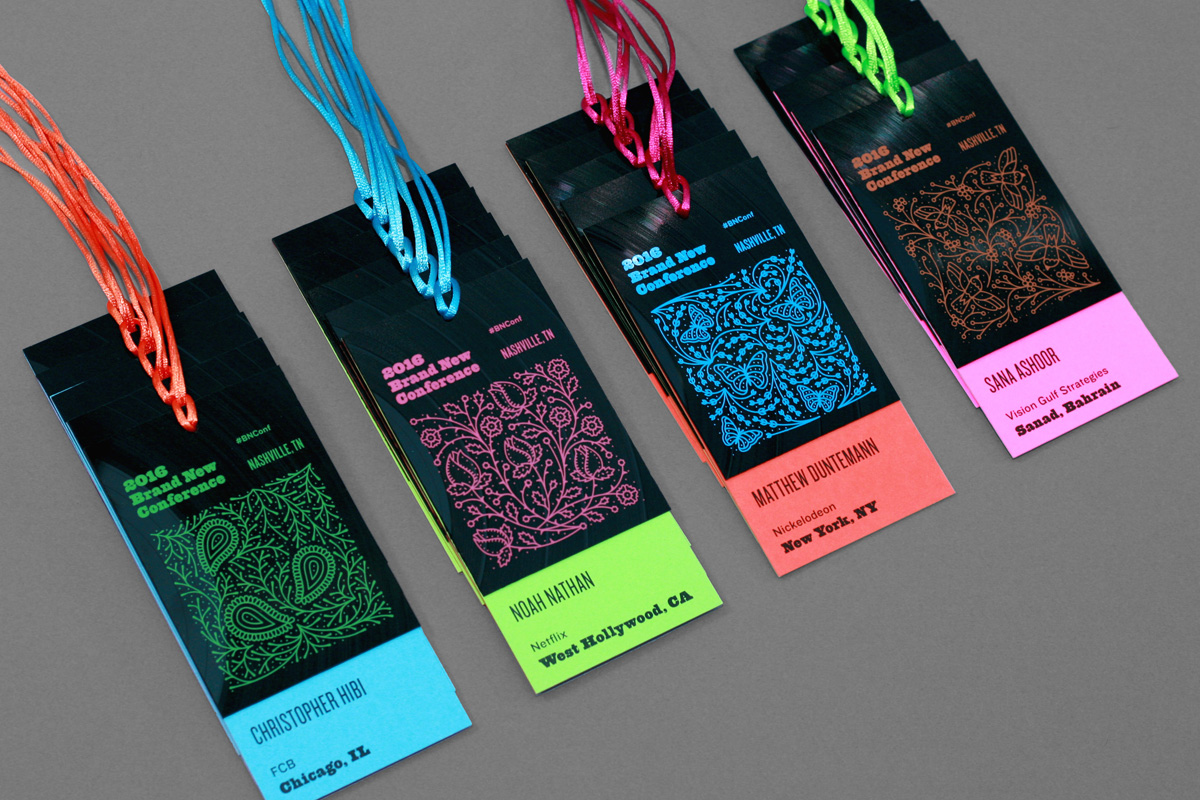
The badges were finished with a duplex piece of paper that was taped to the back and held in place with the lanyard. We were not aiming to replicate the bright multi-color mix-and-match approach of the 2015 Brand New Conference but it kind of ended up that way once we did each tile in different colors and didn’t want them to be too monochromatic. The finished badges had a great, rigid structure and a very off-beat texture from the ridges of the records.
Stage Letters
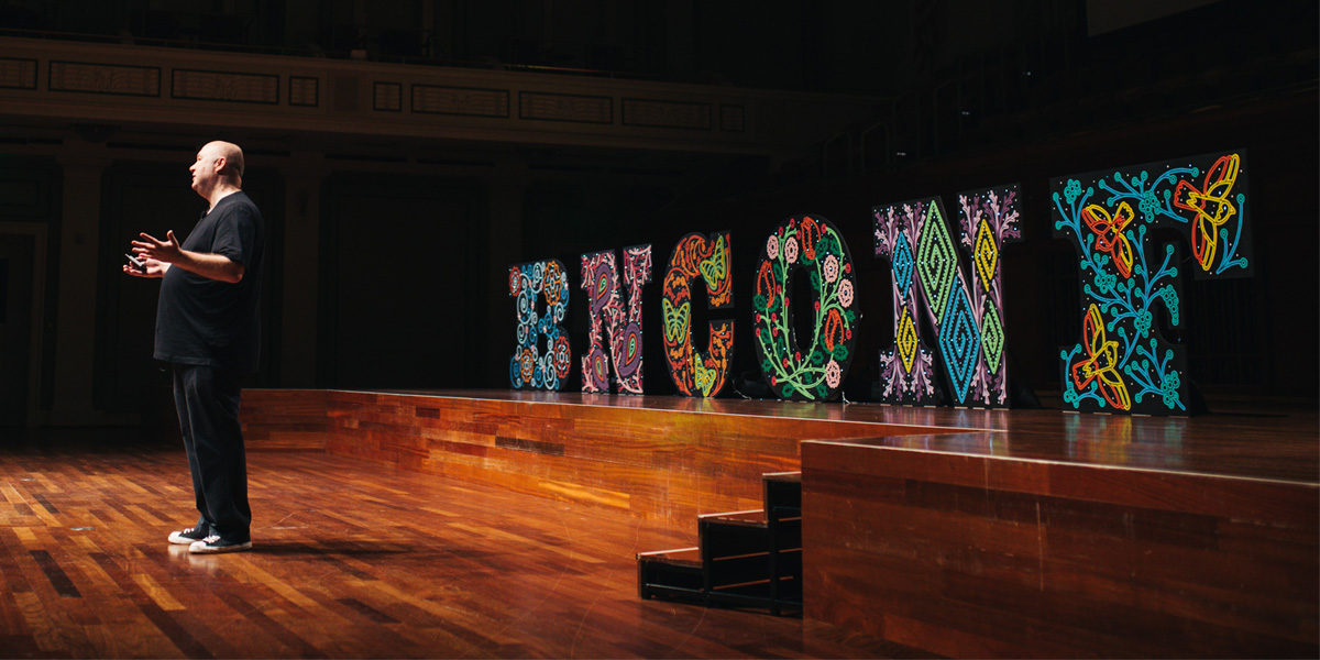
The stage at the venue was quite big so we wanted, nay needed, to fill it with something big. Going back to the idea of woodtype we thought it would be cool to make our type, you know, out of wood. We CNC-routered 4-foot-high letters out of birch, painted them black, transferred the designs to the letters using chalk, and hand-painted each one. We could have easily printed out the designs as large banners, trimmed them, and glued them to the letters but that’s the easy way out and whether what we do is great design or not one thing we never skimp on is effort.
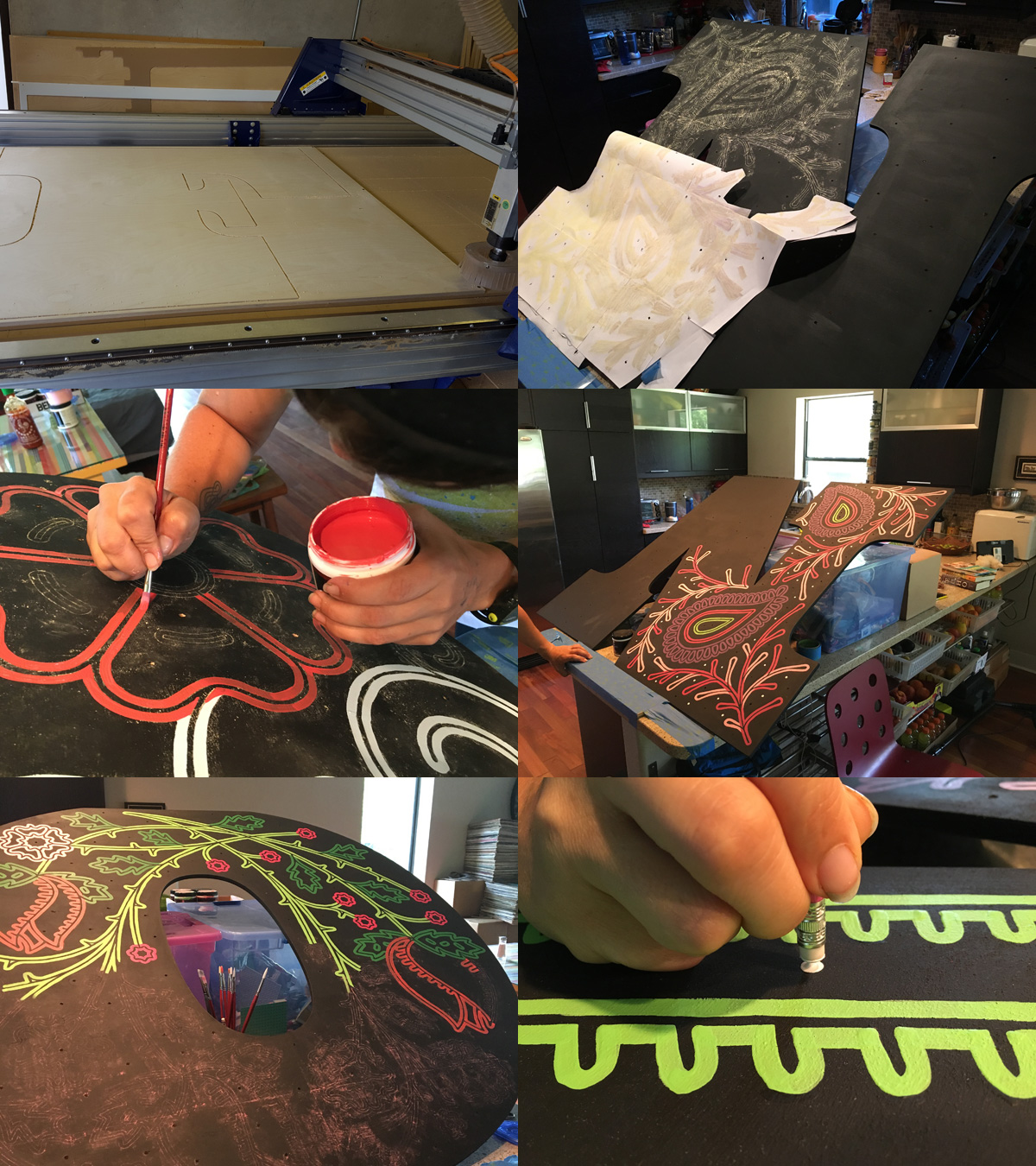
In terms of rhinestones so far, we had used white dots in the logo and a few actual rhinestones for the program so for the stage letters we wanted to convey the glittery goodness of rhinestones, as if a singer were stepping unto a dark stage. We drilled some holes in the letters — 90 per letter to be exact — and placed white christmas lights in them that were set to “pulse” so they had a very subtle fade-in, fade-out effect on the stage and they were all on different timers so it came out nicely random.
Despite the insane amount of effort these letters took — including driving them from Austin to Nashville (13 hours) — we completely forgot to properly document them once they were finished and on the stage. We could have documented them afterwards but we gave all six letters away to some stage-rushing attendees. The “O”, for example, is in Birmingham, AL. So they will live only in our memory as they performed their duty.
Banners
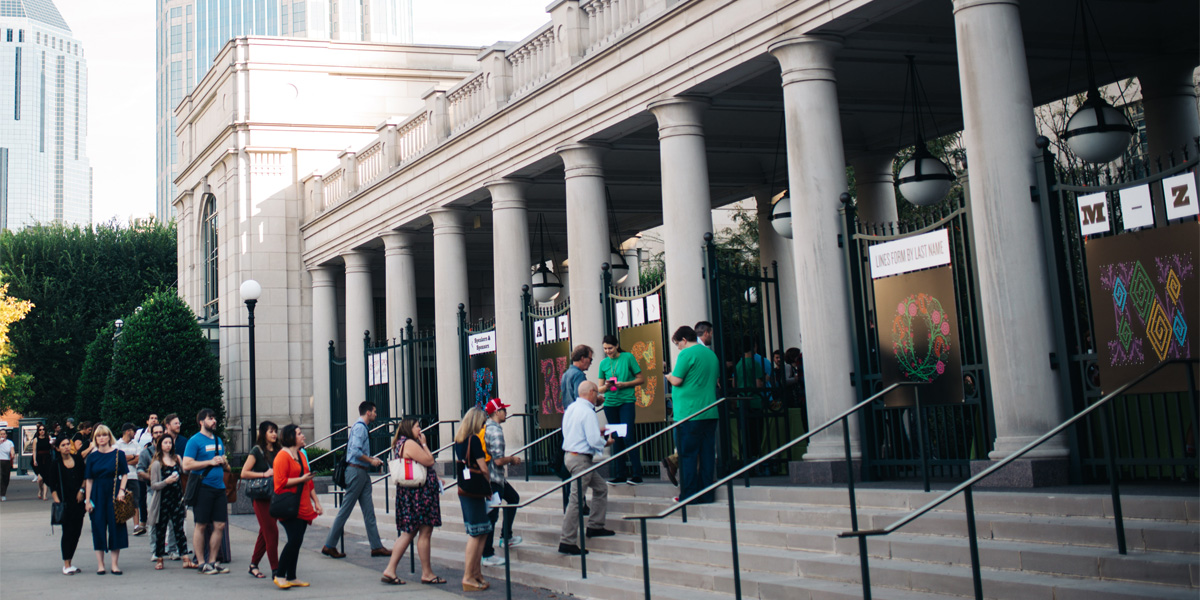
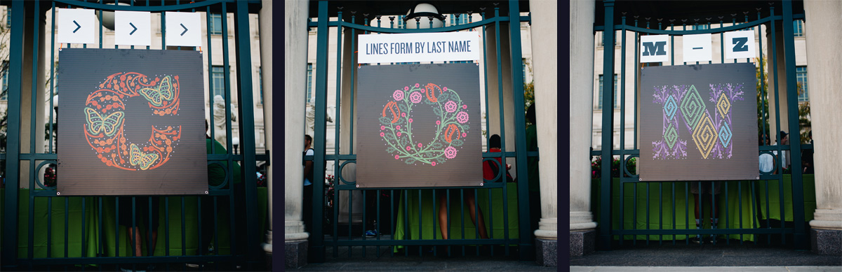
The venue was pretty classy and column-esque so we had to a little bit of the identity in the form of some banners — 4-by-8-feet, which were perfect for splitting into two squares — and some square placards out front with the letters on black.
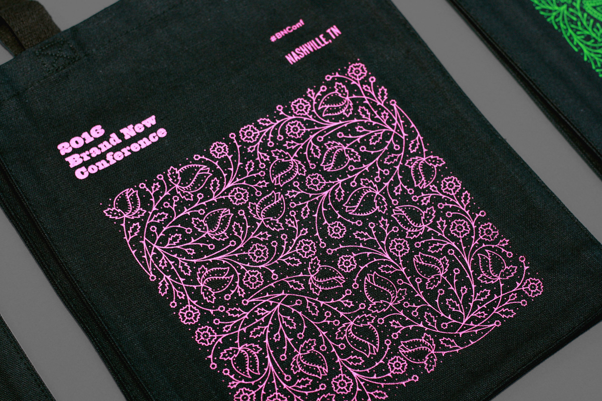
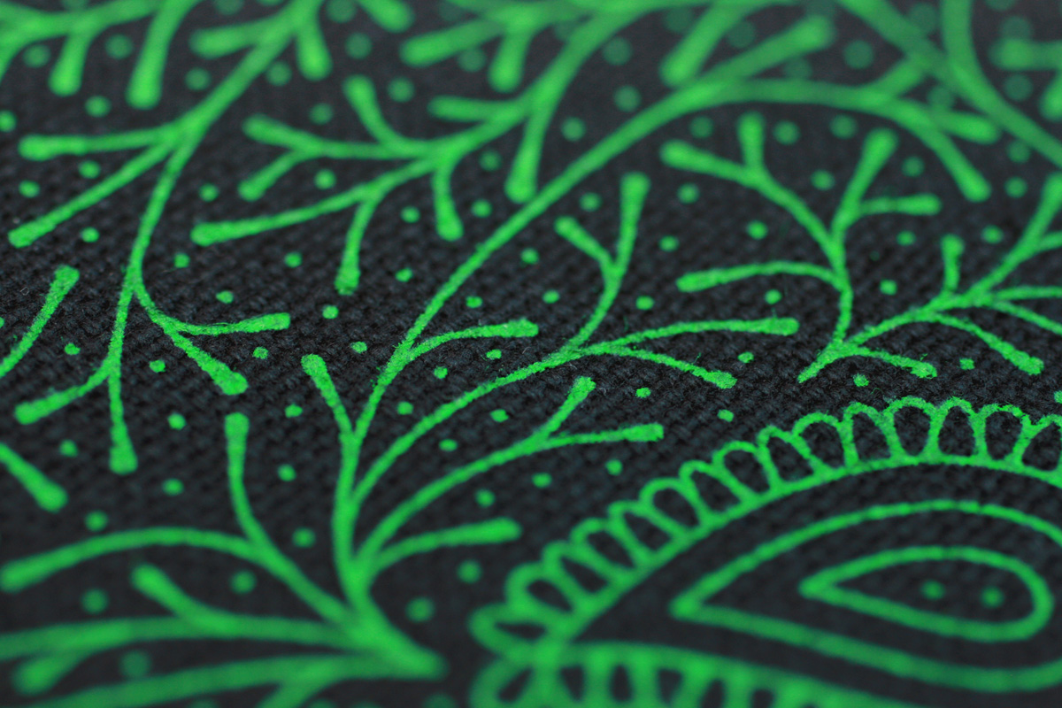
Tote Bags
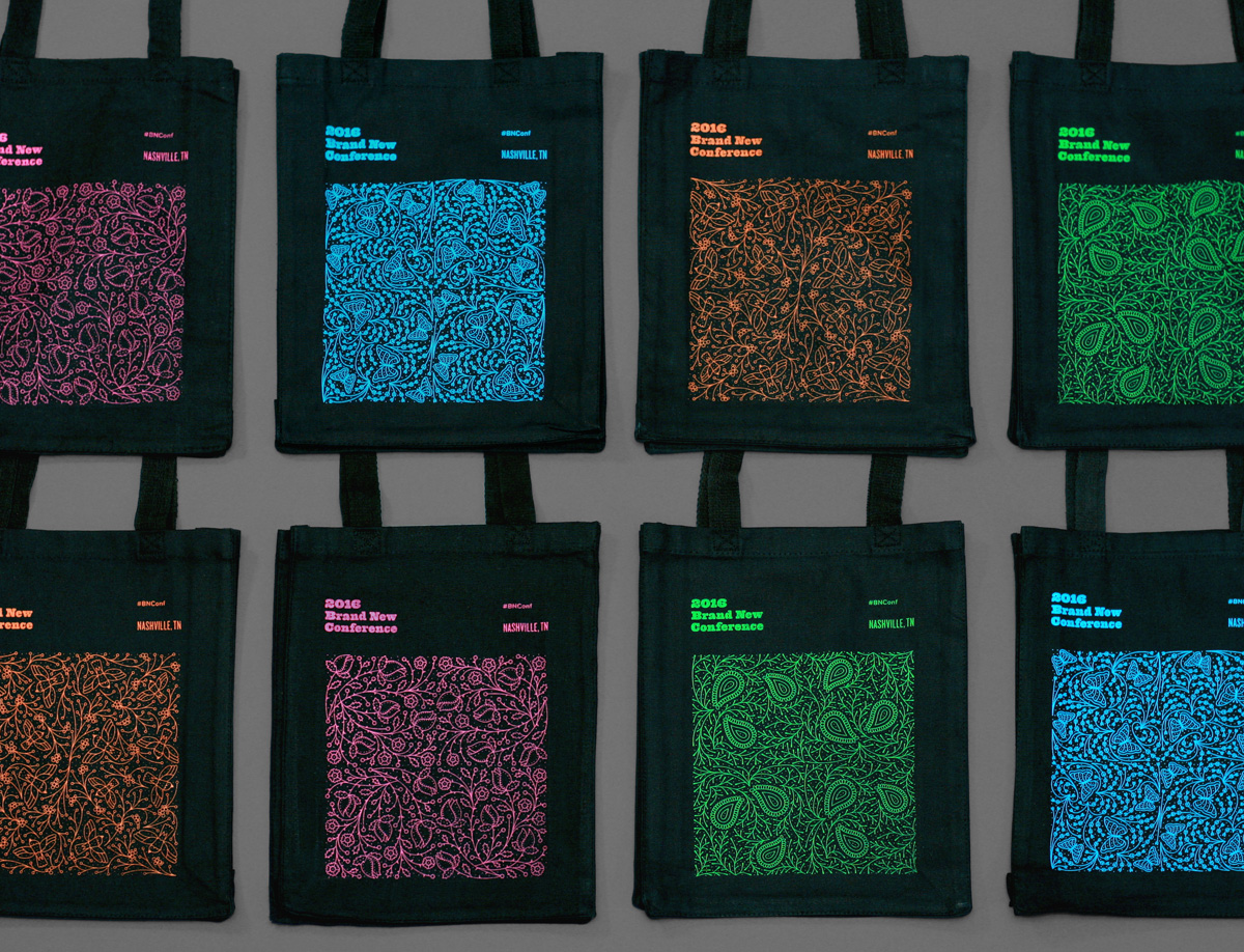
Nothing too heady here, just the same four tiles used in the badges now repeated four times for a nice, small pattern.
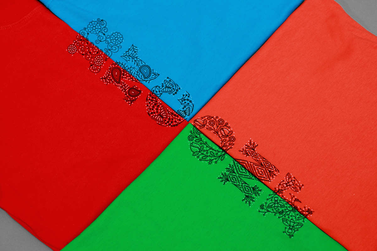
T-shirt
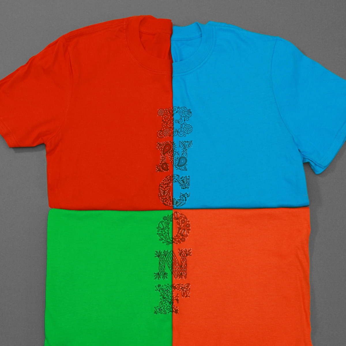
This was probably the only place where we used the letters like this; without the letter shape and on a light background. They are pretty festive.
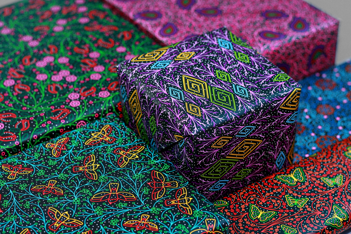
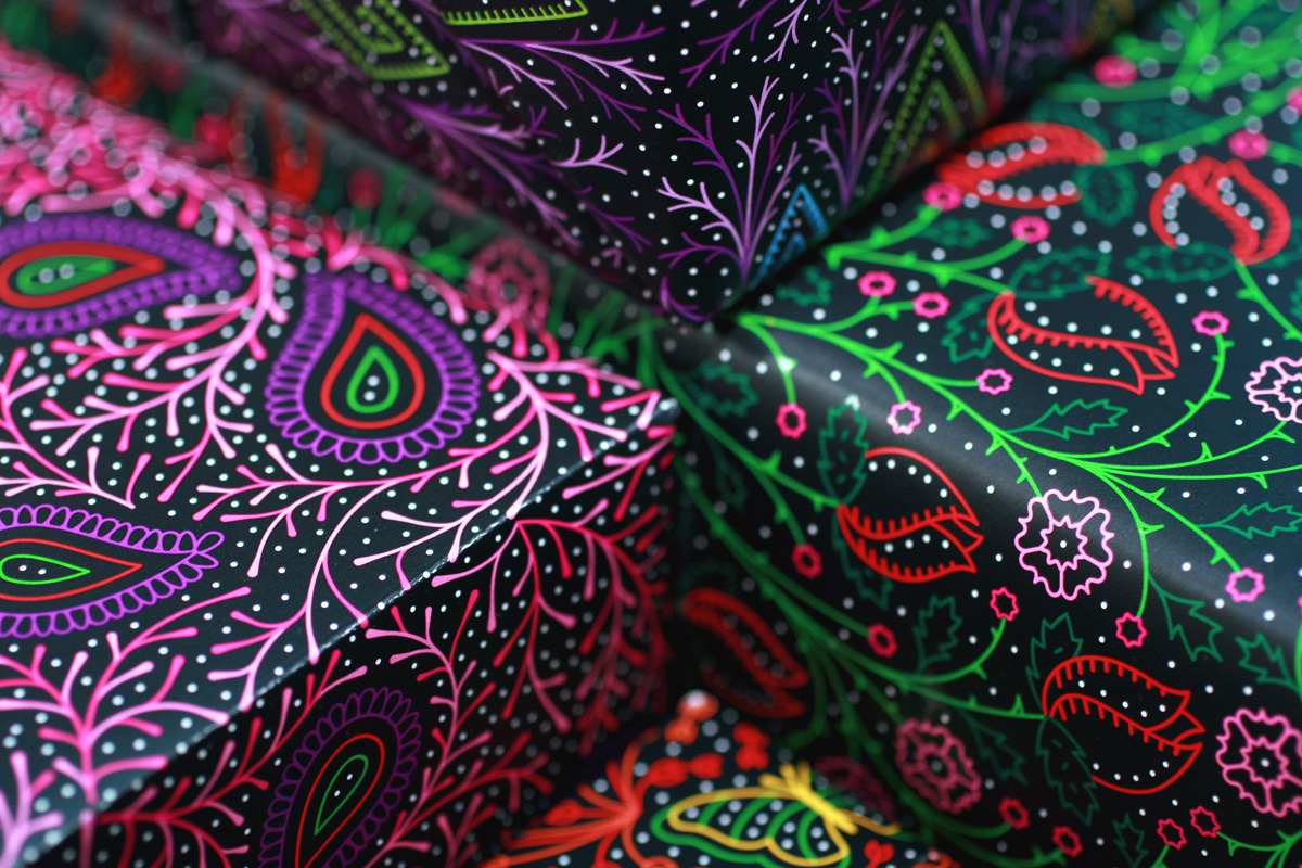
Wrapping Paper
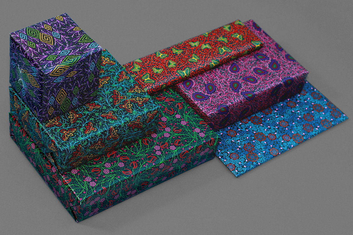
There was zero need to produce wrapping paper but we had the patterns already done and both Classic Color, who printed the programs, and Sappi, who provided the paper (and both of who were sponsors) were on board for going the extra mile to print these and they turned out super extra pretty. All attendees got a set of six sheets.
In Closing
Hopefully when you see all this stuff you can empathize with why sometimes we are unable to write content for the blogs, as it’s an all-consuming affair that culminates in two days and then disappears. Every year we question why we spend so much time, energy, and emotional investment in the conference and its materials but the appreciation of it during those two days makes it worth it and continues to help us distinguish our conference from others — it’s not perfect, or it might not be the best, or the most attended, but you can bet it’s made with tender loving care and lots of sweat and a healthy dose of tears. Thanks to all who attended, streamed, or bought the videos… and hopefully we’ll see you in New York in 2017 so that you can see in which way we will drive ourselves crazy next.