Speak UpA Former Division of UnderConsideration
The Archives, August 2002 – April 2009
advertise @ underconsideration
---Click here for full archive list or browse below
  
The Visual Perils of Graphic Design History

Like any other history I’m sure, chronicling graphic design history is tricky business. There is the written part, relying on correct facts and authoritative sources. But then there is the visual part, upon which graphic design’s history relies heavily to tell its evolution. And just as important as fact-checking we’ve realized that image-checking is just as crucial. This may be a bit of a “well, duh…” but if we’ve come to rely on the most authoritative resources to gain visual knowledge of our history, well, at least one influential example has been wrongly represented.

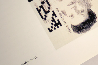
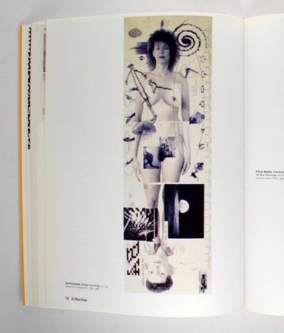
As Bryony has been ferociously laying out pages for Graphic Design Referenced (and, I, ferociously writing the last bunch of words) she noticed discrepancies in three design books of the orientation of April Greiman’s 1986 design of issue No. 133 of the Walker Art Center’s Design Quarterly magazine. For quick reference: Greiman was invited by the Walker to design the issue featuring her work and instead of just styling their publication she transformed it into a two-by-six-foot poster, that showed her, naked, in actual size, overlayed with smaller images, a timeline, questions, and quotes — even a second portrait added at the last minute showing her new hairdo. When folded, the poster takes the form of the portrait-shaped publication so that it unfolds horizontally. Since most books are also portrait-shaped, running the unfolded poster horizontally renders a much too small image where the detail of the piece gets lost. The solution: Display it vertically. In the bigger picture this isn’t the end of the world, after all, the purpose is well intended, to best showcase the piece. But just like getting a year wrong misinforms, in graphic design history, so does a rotated image.
Visual Perils

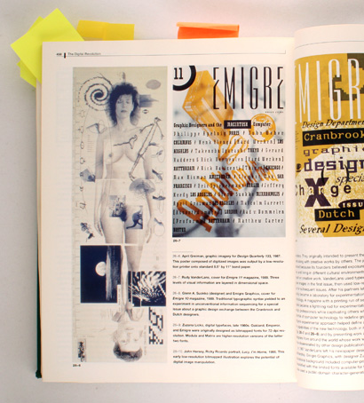
A History of Graphic Design by Philip B. Meggs.

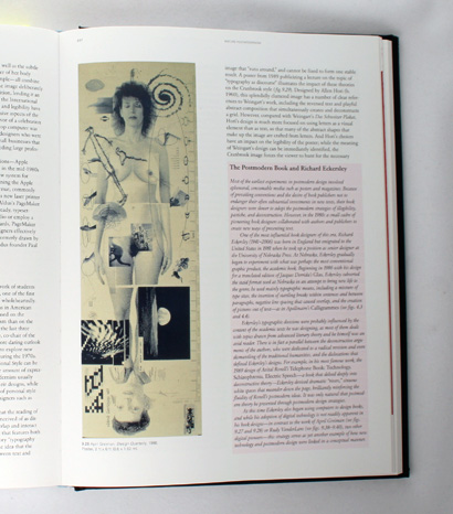
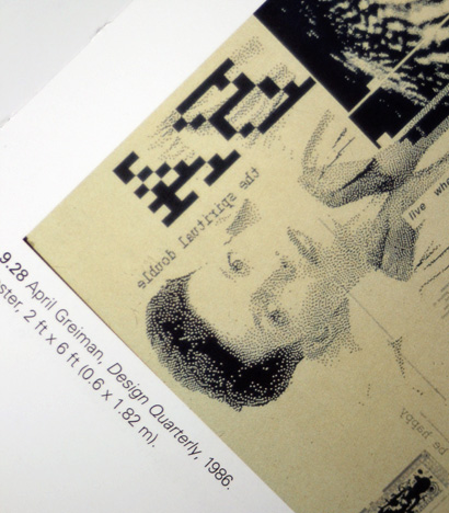
A History of Graphic Design by Philip B. Meggs shows the piece vertically (this, at least, in the second edition we own). Graphic Design: A New History by Stephen J. Eskilson and No More Rules: Graphic Design and Postmodernism by Rick Poynor, also show it vertically and flipped. You have to put the book up to your nose to notice that the typography can only be read by holding the books in front of a mirror.
Visual Perils

Visual Perils

Graphic Design: A New History by Stephen J. Eskilson.
Visual Perils

Visual Perils

No More Rules: Graphic Design and Postmodernism by Rick Poynor.

We bring this up not to cause ridicule, but to commiserate with the very likely possibility of failing to portray graphic design history with 100% accuracy. This is perhaps one of the most glaring examples, and it might be hard to print a flipped poster with bigger typography, but representing the history of graphic design visually is torturous: The colors, size relationships, textures and real-life impact are impossible to convey in either generous full-bleed images or postage-size thumbnails.

I guess the lesson is to absorb graphic design as much as you can right now, when it comes fresh off the oven. Because twenty, thirty, fifty or a hundred years from now it might not look even remotely as you remember it.

Maintained through our ADV @ UnderConsideration Program
ENTRY DETAILS
ARCHIVE ID 5595 FILED UNDER Discussion
PUBLISHED ON Dec.19.2008 BY Armin
WITH COMMENTS
Comments
JonSel’s comment is:

So, assuming you are including this piece in your book, are you running it horizontally or vertically?

On Dec.19.2008 at 09:54 AM
Armin’s comment is:

Juicily horizontally across the spread!

On Dec.19.2008 at 10:08 AM
David Ramos’s comment is:

← this end up

On Dec.19.2008 at 10:58 AM
Doug Bartow’s comment is:

.em ot enif skooL

On Dec.19.2008 at 12:08 PM
Jason Tselentis’s comment is:

You should do a fold-out of this piece, horizontally.

On Dec.19.2008 at 12:54 PM
Bruce’s comment is:

I wonder how many people have viewed incorrectly hung works of modern or abstract art? Do Frank Stella's works have a "This end up" with an arrow on the backs?

On Dec.19.2008 at 01:03 PM
Michael Dooley’s comment is:

Just because the poster is horizontal when folded, that doesn't mean it must necessarily be the same format when unfolded. And this one actually unfolds from both directions.

Unquestionably, the reverse side is meant to be horizontal: that's simply how the text and photos are laid out.

But on the side with April's image, most of the words and images are vertical, including the dominant portrait and the timeline on the "left" edge.

Obviously, April would have final say in the matter. Lacking that, I do have a video of her discussing and displaying this work. As she unfolds it she turns it vertically and holds it next to her, rather than lying it horizontally on the long table in front of her. An the end of the clip, she flips the poster upside-down to show her new hair-do.

To view all the information right side up would require rotating the poster all four ways. I believe that's part of her cosmic message: in space, there is no up or down. So it's possible that printing it either horizontally or vertically would be "correct." Of course, the Eskilson and Poynor flops are unforgivable.

As a Design History instructor, I share your concern for accuracy in such matters. For me, a much better – that is to say, worse – example of an image error can be found on page 388 of the most recent (fourth, 2005) edition of Meggs. The photo of Dugald Stermer's Ramparts cover with the burning draft cards includes a fragment of a caption underneath. In other words, we're viewing a poorly cropped scan of a book or magazine reproduction of the cover. I need to explain to my students that the actual cover doesn't include
[The government went after Ramparts for this co

I'll be looking forward to your new book, folks. And thanks!

~ mike D

On Dec.21.2008 at 12:17 PM
Michael Dooley’s comment is:

I checked April's website.

There, her Design Quarterly poster is posted horizontally....

with her "short hair" head on the left!

And...

she's flopped it, in the manner of Eskilson's and Poynor's books!

Incidentally, the poster does contain "live where you can" text that reads correctly when flopped... You can see a bit of it in the above Eskilson close-up photo.

You know, all this archaeologizing of the piece somehow... makes sense.

~ mike D

On Dec.21.2008 at 05:59 PM
Joe Moran’s comment is:

Flipped, or Flopped… H or V… "If 6 was 9…" April was/is/will be HOT!!!

VR/

On Dec.21.2008 at 08:05 PM
Nikki - Logo Design Guru’s comment is:

Thanks for pointing this out. Graphic design really does have an interesting history and I don't think most people realize that. I will have to check out those editions.

On Dec.22.2008 at 11:59 AM
Gunnar Swanson’s comment is:

As is often the case, Michael Dooley is way ahead of me. I would, however, question his assumption that April's presentation of her work is a necessarily the ultimate reliable source. Many years ago, I complained to Sean Adams (who was then working for April) that the design of a book she had put our obscured the nature of the work being shown, leaving the reader unclear what is the design being shown and what is the design of the book showing the previous design. Sean replied that the book wasn't an archive and that they didn't care about that.

Jennifer Sterling's AIGA 365 #21 distressed many people about what Sterling's presentation did to the historical record but many graphic designers (David Carson's come to mind also) are not always particularly good sources for visual depiction of their own work.

This problem also manifests itself in the written record. Much of what designers write or say about themselves is marketing hype and some of the rest is just plain misremembered. No history is simply "facts" and "truth" but ours has more than its share of errors, many based on relying on "the source."

On Dec.23.2008 at 01:43 PM
Gunnar Swanson’s comment is:

I would, however, question his assumption that April's presentation of her work is a necessarily the ultimate reliable source.

Please make that It is good to question the assumption that April's presentation of her work is a necessarily the ultimate reliable source.

If I'm going to nitpick Michael's writing, I should probably stick to complaining about things he actually wrote. Sorry.

On Dec.23.2008 at 01:46 PM
Michael Dooley’s comment is:

Thanks, Gunnar. Indeed, the version on April's site doesn't really help bring the issue down to earth at all. In fact, it just increases the vertigo.

Small wonder that a catalog of April's works is titled It's Not What You Think It Is... and that she designed the back cover as an alternate front cover, upside-down.

On Dec.24.2008 at 02:18 PM
Michael Dooley’s comment is:

For what it's worth, page 60 of April's Hybrid Imagery shows a screen shot of the poster as she designed it in MacDraw, horizontal, unflopped, and with her long hair on the left... which brings us back to Armin's original premise. We hope you've enjoyed your trip.

On Dec.24.2008 at 02:28 PM
Michael Dooley’s comment is:

Oh, yeah: and this MacDraw image is also part of the original poster, in the bottom left corner... uh, I mean, the end right corner.

On Dec.24.2008 at 02:33 PM
Derrick Schultz’s comment is:

But in Archie Boston's interview with her here she unfolds it vertically! Oh, the confusion! Even by April herself!

And much to reiterate Gunnar's post and to — uh oh! — reference some literary theory, but why should we assume the author's vision is anymore correct than the user's or next author's?

On Dec.25.2008 at 04:25 PM
Michael Dooley’s comment is:

Incidentally, Archie's video of April is the same one I mentioned in my first post. Thank you, Derrick, for posting the link.

On Dec.27.2008 at 04:46 PM
Shawn Wolfe’s comment is:

I remember going to see her speak in Dayton back in the '80s when this was new and I seem to recall her projecting a slide of this oriented vertically.

On Jan.10.2009 at 01:31 PM