Back in May, with the first near-90-degree day of the year and sequestered in a huge loft without air conditioning on the west end of midtown Manhattan for close to ten hours, I was one of the judges of the Adobe Design Achievement Awards (ADAA), celebrating and honoring (with cold, hard cash) the work of higher education students from all over the world. Judging a print design competition is a grueling process: You stand for hours on end, with your neck bent down, your eyes rollercoastering to make focus of big and tiny type, both of your arms eternally at 90-degree angles at the elbow, and your fingers pulpy from all the pieces that must be flipped through. Every time I judge a big show, I swear it is my last time. But despite the physical challenges, I find that the process is addictive. There is something fabulous about a room full of tables, with layer upon layer of work that more often than not reveals a great piece of design that clamors, “I wish I had thought of that.” And, in this case, being all student submissions, all the work carried a contagiously insatiable sense of discovery from its designers that, even though I once again considered this being my last judging, it provided enough curiosity to pick up the next project, and the next, and the next, until the clock hit 6:00.
The ADAA is divided into twelve categories that fall under three main groups (Interactive Media, Video and Motion, and Traditional Media), with four judges for each group to collectively go over the 2,738 entries received this year. I was assigned to the Traditional Media submissions, which encompassed Photography, Illustration, Packaging and Print Communications. While the former three contained some excellent work, I was greatly impressed by the quality of work in the Print Communications entries, and the subject of this post. Midway through the process we realized that we had an equal number of favorite pieces that were either posters or books (or some multi-page format), and upon the challenge of awarding a book over a poster or vice versa we made the case that these had to be two separate categories as each of these type of projects need to be judged differently — for the gracious folks at Adobe, who award $3,000 to each category winner and $1,000 to two finalists, plus a trip to New York for all, this meant adding $5,000 plus New York accommodations. I thought this was a great decision, and assured that the best work had an opportunity to be celebrated. At the end of the day, we selected our winner, finalists and honorable mentions for both categories.
Shown below are the finalists and honorable mentions — the lucky winners will be announced on August 14th in New York (and everyone is invited), with a gallery showcase and ceremony, that typically attracts the full local design industry in honoring these young students. In some cases I have made comments and annotations. And for everyone that didn’t make it into this final round, please know that it was a very competitive context and that it takes really exceptional pieces to be selected.
As usual, the images here barely begin to make justice of the work. Some images come from ADAA, others come from the designer’s web site. Enjoy, I sure did.

Stefan Ruetz
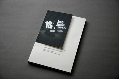
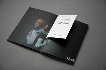
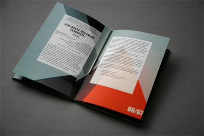
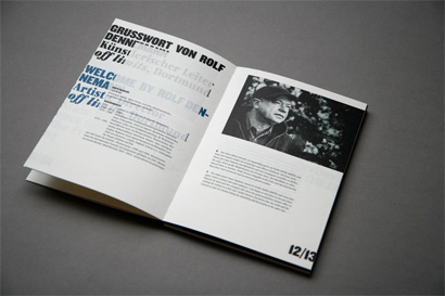
Corporate Design / EURO SCENE LEIPZIG
University of Applied Sciences in Mainz
Charlotte Schröner, Instructor
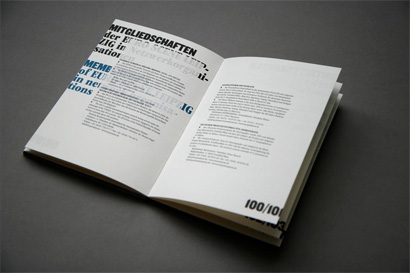
This was one of my favorite typeset pieces, it had the right balance of classic, irreverent and dynamic that it stood out for me from the rest of the entries. The book-within-a-book trope was well played too. You can see the full project at Stefan’s here.

Jakyoung Min
Spending Time
School of the Art Institute of Chicago
Stephen Farrell and Ann Tyler, Instructors
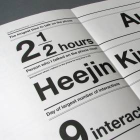
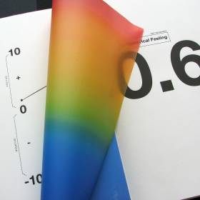
For this one I unfortunately don’t have all the images; the first one is the one that resembles the feel of the whole project. It was some sort of information translation, but all I remember was some sweet Helvetica, carefully arranged, and lots of yellow and black.

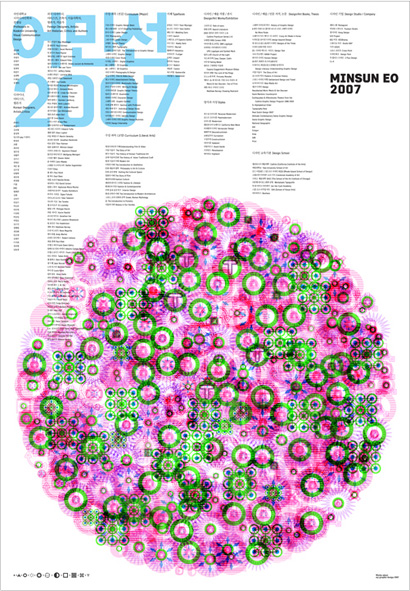
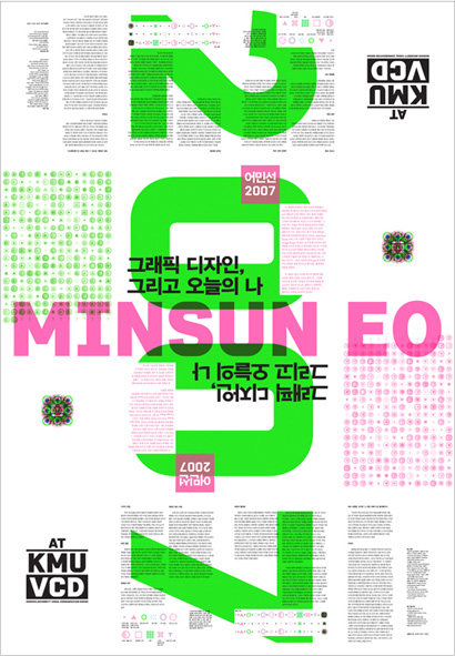
Minsun Eo
Minsun Eo 2007
Kookmin University
Jae-Hyouk Sung, Instructor
It was hard to make heads or tails out of this poster, but they sure were some hypnotic and awesome heads and tails to be confused about. Front and back shown.

Yangseop Joo
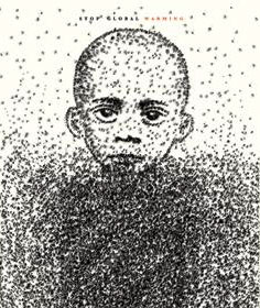
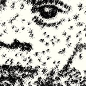
Children are not guilty
Kookmin University
Prof. Hoseop Yoon, Instructor
It wasn’t until the end that we all finally looked at this poster that had been quietly hanging on a wall. Despite a complex illustration, the poster never jumped out, but we could all agree that in its simplicity and starkness it spoke volumes. I was a little bummed that just a few days earlier I had seen these ads, using a very similar concept, so I had a hard time separating this from the others.


Gretchen Nash
Dear Gretchen
California Institute of the Arts
Gail Swanlund, Instructor
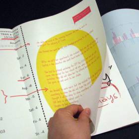
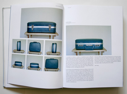
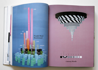
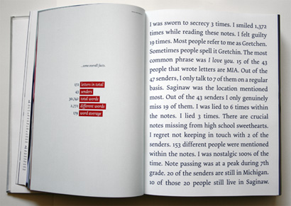
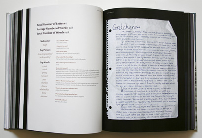
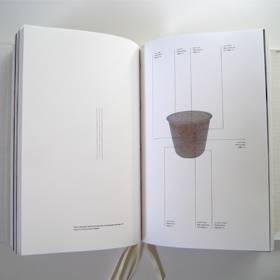
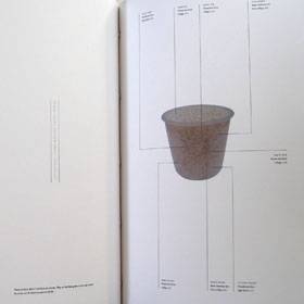
This was a 400-page book, or more. It was all about the life of Gretchen and the hundreds of things that her life revolves around. I am typically turned off by introspective projects where the designer unveils all there is to know about them in some sort of clever book form. Yet Dear Gretchen was fabulously paced and put together. My favorite ten or so spreads from the whole show was a chapter in which Gretchen made charts with paper and photographed (you can see some of those below) — they were the most clever and original interpretation of a common design element.

Paul Grabowski
TDC NY on the DRUPA 2008
University of Applied Sciences Wuerzburg-Schweinfurt
Prof. Christoph Barth, Instructor
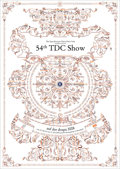
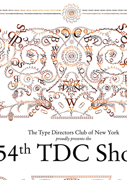
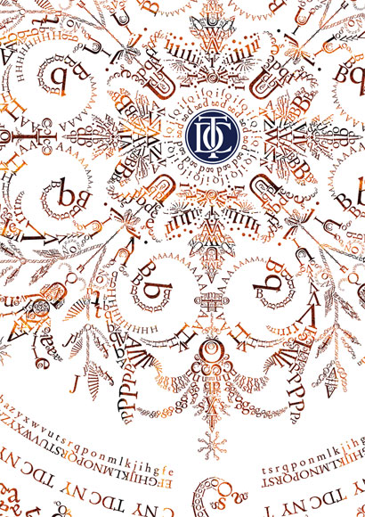
One of the first posters that drew immediate attention was this luscious announcement of the TDC show coming to Düsseldorf. From afar it looks like feathers and richly ornamented, but it is all made with letters. Painfully placed, rotated and scaled letters. Pretty amazing. The images below, including the details underneat the full poster, can be clicked to see bigger.

Stefan Bräutigam
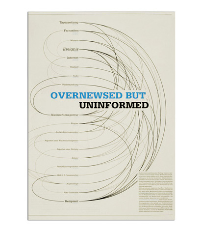
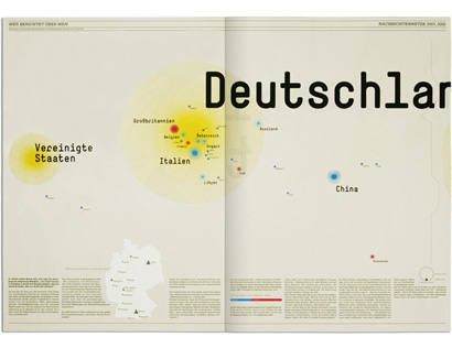
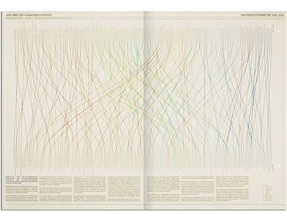
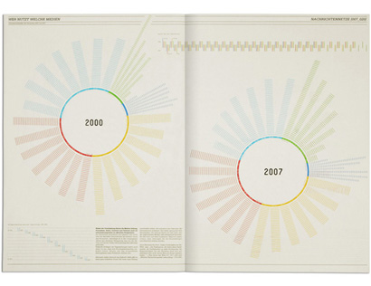
Overnewsed but uninformed
University of Applied Sciences in Mainz
Prof. Philipp Pape, Instructor
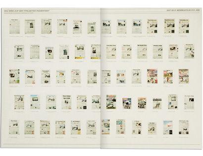
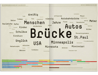
Like many designers I know, I’m a sucker for information graphics. They just look damn cool. And Stefan’s oversized newsprint piece delivered all the infoporn necessary to service the heat. Perfectly and imaginatively typeset and laid out, with a dash of white ink silkscreen to add to the effect, this piece was a crowd favorite. You can see the full project here.


Ken Meier & David Yun
No Independent Thought
Yale University
Sheila Levrant de Bretteville, Instructor
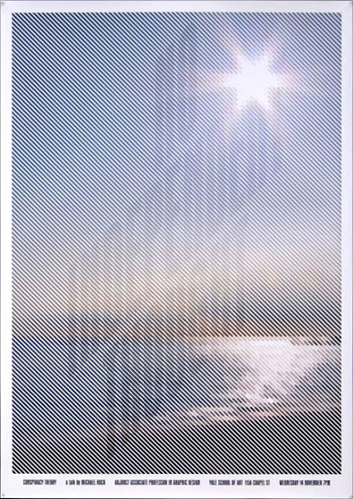
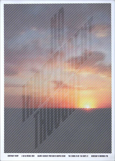
On screen these posters look pretty under whelming, but at real size and playing optical tricks with your eyes, they proved to be irresistible.

Annie Chen
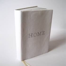
Home
California College of the Arts
Prof. Michael Vanderbyl, Instructor
I hate to admit it, but I can’t remember seeing this piece. Sorry. It’s not that I didn’t like it or it didn’t make an impression, I just, literally can’t remember ever holding it in my hands.

Kyong Eun Kim
KMUVCD Graduation Show 2007
Kookmin University
Jae-Hyouk Sung, Instructor
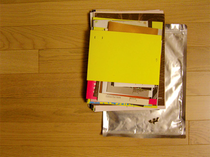
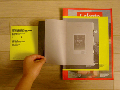
At first I wasn’t too thrilled about this piece, it just felt like someone had unloaded a box of flyers and bound them with a rod. Rebeca Mendez made me appreciate it. As a graduation show brochure, Kyong asked fellow graduates to design a page of the brochure at different sizes and then bound all of them together, allowing the reader to take it apart and see it as a whole or in pieces and then put it back together as desired; it had nice interactivity.

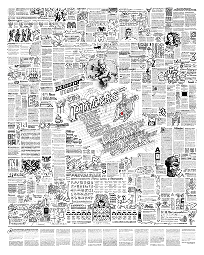
John Passafiume
(Process)
Indiana University Bloomington
Not listed, Instructor
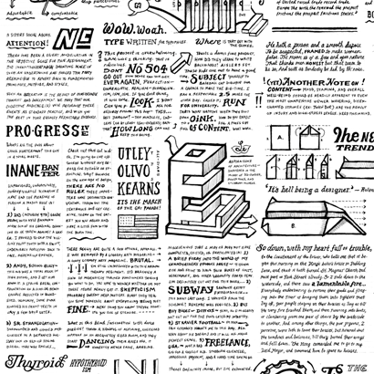
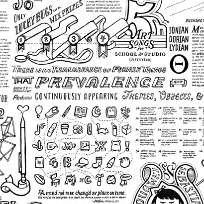
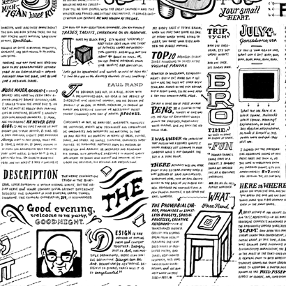
This poster, no one could keep their eyes off of it. It was entirely set by hand, and every square inch had something new to discover. The combination of the hand-drawn with the strict grid makes for a grand texture. It’s one of those posters that works when you see it from afar, then as you get closer and, like few posters, it also works when your nose is pressed sorely against it as you try to see every detail.
Click on the images below for bigger views.

Many thanks to Daniela Birch for all her help in getting a lot of these images ready, as well as for managing the balmy judging day and all the work that came before and after it.


Wow - I have to say this is among the best student work I've ever seen. The Typography and Process posters blew me away.
On Jul.29.2008 at 10:49 AM