Speak UpA Former Division of UnderConsideration
The Archives, August 2002 – April 2009
advertise @ underconsideration
---Click here for full archive list or browse below
  
Hancock: A Poster Critique

Two weekends ago, the one with fireworks and grilling, Will Smith clinched its fifth Fourth of July with a number-one movie as Hancock raked in $66 million at the box office. A few months ago, with neither fireworks or grilling, I was contacted by one of the editors of Radar magazine, who were looking to run a critique of Big Willy’s latest poster. Of course, I obliged. The very neatly edited final piece is currently running in the July/August issue on newsstands now — which also happens to sport a new design, full of Cooper Black and primary colors, designed by Pentagram’s Luke Hayman. Here, so that the cut words don’t gather too much digital dust, is the full critique of Hancock’s poster, designed by BLT & Associates.
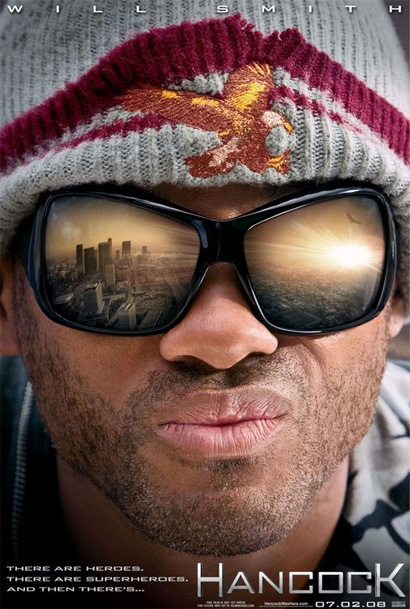
Hancock Poster

On the possible American Eagle Outfitters logo on his wool cap
It does look like the American Eagle Outfitters logo, although theirs is facing the other way and doesn’t look as if it just slid on a banana peel and fell on its eagle ass. If it is indeed a wool cap from AE, I would let the cynic in me believe that it is pretty smart product placement. But beyond the eagle’s origins, it does come to represent strength and resilience as the eagle patch is holding together the crumbling wool cap.

On the eagle reflected in the sunglasses
It’s probably a poetic way of representing Hancock facing and meeting his destiny. The strong, soaring free eagle represents what he can be, as opposed to the ragged eagle he is, represented by the one on his forehead. I also can’t help but see the eagle as a patriotic statement — the movie is opening on July 4th after all, how much more American can you get?

On Smith’s eyes being totally covered by his sunglasses
I actually think it works better this way. With such a tight close-up of Smith’s face, his eyes would probably be too creepy. It also helps turn the poster into an imagination, rather than a realistic depiction of how a pair of sunglasses would photograph.

Plus, if Hancock can do what Men in Black did for Ray-Bans, these elephantine sunglasses will be the next hot thing — and this is the perfect product shot.

On the scruffiness
It conveys the plot perfectly, specially when paired with the tagline. It quickly lets the viewer know that Hancock is way less than perfect, that he has many faults and, most importantly, that he is the antithesis to Superman’s metrosexual ideal of a perfectly groomed superhero.

On first impressions
The first thing I noticed were the pursed lips. I really don’t get it. They also look heavily Photoshop’d, a shade lighter than the rest of the face. It makes it look like he is sitting in the toilet after eating too many bran muffins, if you know what I mean.

On the pursed lips, more
I would think they were trying to convey a sense of ambivalence, defiance and general the-fuck-do-I-care attitude. It’s also a way of deprettyfying (sorry, made up word) Will Smith. The pursed lips remind me, at best, of Zoolander’s “Blue Steel.” It’s hard to detach yourself from the brand that Will Smith has become: Smiling, charismatic, friendly. So this “look” feels, as we say, off brand; it’s forced, unnatural and, well, wrinkly.

On the earring mark
The way Hollywood images are manicured, I doubt this was an oversight. But even if it was, it helps in maintaining the story that Hancock is a weathered man, he has been through many things, and his past is a mystery — maybe he even was a young TV star with a million dollar smile that then made it big but, in the end, his luck turned sour.

On the typeface
The font choice is completely wrong. It’s a very geometric and square font, very “techie”, suggesting that it was computer generated. On first impression, I would think that Hancock was a government experiment gone wrong and that his superpowers were the result of bionic limbs and superchips instead of gray matter. The font is also similar to the one used in another Will Smith movie, Enemy of the State, in which technology plays an important role, and the font swiftly conveys that. However, if you want to get geeky, the font looks to be a modified version of Bank Gothic, designed in 1930 by Morris Fuller Benton, who was one of the great American typeface designers — so maybe, this is a very (VERY) subtle way of extending the patriotic bent of the poster.

Spot on?
It works. It’s Will Smith. It’s big. It’s a Summer movie. It has two eagles. What else could you ask for?

Maintained through our ADV @ UnderConsideration Program
ENTRY DETAILS
ARCHIVE ID 5023 FILED UNDER Critique
PUBLISHED ON Jul.15.2008 BY Armin
WITH COMMENTS
Comments
Tom’s comment is:

It works?

No it doesn't. And after reading your critique I don't understand how you got to that conclusion either?

On Jul.15.2008 at 09:06 AM
Andrew J Klein’s comment is:

I can't decide without seeing the movie if it works, but I am happy that movie posters are getting better (see Dark Night posters) - Glad we are starting to move past the floating-heads of cast-members era.

On Jul.15.2008 at 09:17 AM
Kevin Hopp’s comment is:

This is an example of "better"?

I wouldn't cast a vote on all movie posters because of a few designers sick with Nickelodeon tendencies.

On Jul.15.2008 at 09:53 AM
Armin’s comment is:

Tom, as I said, it works because: It's Will Smith. It's big. It's a Summer movie. It has two eagles.

Sarcasm aside, it's not a Fall or Winter movie with Oscar aspirations that has to try hard at looking smart. This is a movie with the only bankable movie star left. His face is big and ugly on the poster. The movie — despite, or not, of the poster — killed. So, yes, it works. Not everything that works has to be "good" design. It's about context.

On Jul.15.2008 at 10:07 AM
Haik Avanian’s comment is:

I think this would've been yet another acceptable home for our friend Comic Sans.

On Jul.15.2008 at 10:42 AM
Doug Bartow’s comment is:

Armin, I also like the central image, but I think you were too light on the criticism w/r/t the typography. It's awful in so many ways -- a complete afterthought. BLT & Associates have an obvious fondness for Bank Gothic, as they use it as the primary nav on their site.

But when I see it squashed and stretched (as it is on the Hancock poster), it reminds me of the Fresh Prince theme song:

"Yo Holmes, smell ya later..."

On Jul.15.2008 at 11:01 AM
Peter Whitley’s comment is:


It's a Will Smith vehicle, fer sher. I can't abide the awful airbrushed reflection in the sunglasses. Shouldn't they be scratched like the Salvation Army veteran that Smith looks like? "I may be scruffy but I can still afford these indestructible shades. I'm saving up for the matching hat."

The pursed lips didn't bother me. They invoke (or is it evoke) a juvenile insolence that I suspect is fitting for the character (from what I've seen in the trailers).

The unforgivable crime is the ultra-corny eagle in the reflection in his glasses. That's the tell-tale evidence of some brand manager who doesn't know how to leave well enough alone. "No, one eagle isn't enough...it needs TWO or you're fired!" I can't imagine the designer thinking that another goddamn bird would be a "cute touch." But, whatever.

And yeah, the type sucks. Wrong face. Wrong drop shadow. Wrong sizes. Wrong gradient. Wrong position. Wrong alignment.

On balance I am quite fond of it. The whole is greater than the sum of its parts.

On Jul.15.2008 at 11:44 AM
Pat Broderick’s comment is:

My reaction upon seeing this poster for the first time was that it was a parody of the various Spider-Man movie posters (Spider-Man 1's first teaser poster had to be recalled because the World Trade Center was reflected in his lenses, then re-recalled because the Empire State Building was visible in the background and the building's owners wanted a royalty paid. Spider-Man 2's one-sheet featured the villain reflected in his lenses). The squarish "metal" typography is also not dissimilar to that used for Spider-Man.

On Jul.15.2008 at 12:14 PM
Hex’s comment is:

For a movie pushing itself in the superhero genre, it is woefully lacking in comic book vernacular.

Something that hinted at its roots would have been welcome, particularly in the typography (and I'm not talking about kitsch execution).

On Jul.15.2008 at 02:51 PM
Tom’s comment is:

Armin, I can't see Will Smith. I can hardly see the Eagles let alone discern their significance (which BTW if were supposed to be symbolic then why two? isn't one enough?). The typeface is misleading.

I won't be paying to see it. Therefore, for me, it doesn't work.

On Jul.15.2008 at 04:32 PM
Charles Chaplin’s comment is:

One wonders why this was critiqued at all. Didn't we just see yet another image reflected in sunglasses a few posts ago in the "Almost Famous" poster? If the close cropped squinty face of Will Smith in yet another star vehicle has any redeeming value it might be that the product placement cap is right there in-your-face. (if only he was drinking Pepsi and munching a McDonald's burger we'd have the perfect synthesis of advertising in entertainment.)

The new crop of movie posters all seem to be done by the same kind of cokeheads who are too full of their own profound genius to ever move off the same square.

On Jul.15.2008 at 05:16 PM
Art’s comment is:

I think this is yet another horrible Hollywood poster. I didn't even know it was Will Smith the first time I saw it. I thought it was George Michael. The type is slapped on; there's no relationship to the image of Will. Did they stretch Bank Gothic in the lower left? The poster gives zero indication as to the voice and tone of the movie. Is it a comedy? A drama? The dreaded dramedy?

It's just another movie star face on a poster with zero creativity or originality.

On Jul.15.2008 at 06:20 PM
Peter Whitley’s comment is:

Hex: "For a movie pushing itself in the superhero genre, it is woefully lacking in comic book vernacular."

I disagree with you here, Hex. The poster seems very character-driven to me. The anti-hero qualities are apparent. Sure, it could be a movie about a guy battling cancer while being homeless. That's the hook. "This is the superhero!?" The irony of him being a superhero is captured in the poster. That's good because, as I understand it, that's what this movie is about. Maybe I'm projecting what I know of the movie into the image but I still think it works...I mean, in terms of the overarching message. The tight crop suggests we are going to participate in an intimate character exploration...and it's not going to be about Hancock vs. Godzilla or whatever.

No superhero is complete without some vulnerability (Superman). Maybe it's their secret identity, maybe it's their sensitivity (Peter Parker). Maybe it's their intense principles (Batman). Maybe it's their alcoholism (Tony Stark). The Hancock poster illustrates that the character has vulnerabilities...and the promise is that we get to see how he reconciles them.

But, yeah, that double-eagle thing is really awful.

On Jul.16.2008 at 10:47 AM
Davi’s comment is:

Each lens in the pair of sunglasses would reflect the same image rather than one large overall image. Try it.

On Jul.16.2008 at 01:56 PM
Pesky’s comment is:

Davi, it's the magic of Photoshop...

On Jul.16.2008 at 06:18 PM
dream.’s comment is:

I couldn't agree with you any more on the typeface, it's not like the conventional "superhero" typefaces I am use to. But honestly, after awhile and a few uncontested positions on the typeface, it does begin to look more native to the nature of the movie. The reflection in the sunglasses makes the movie look more relative to Will's last patriotic movie, Independence Day.

On Jul.17.2008 at 02:40 AM
Bruno’s comment is:

I saw it on the street and it does work, even if I find I dislike pretty much all the elements.

I don't know if they are doing the same for every market, but here in Spain what shows on the reflection is the Sagrada Familia church in Barcelona. That has zilch to do with the movie, I am told.

On Jul.18.2008 at 07:22 AM
Gavin’s comment is:

Armin

Your critique is generous and gracious but this is just semiotics gone crazy.

Almost nobody will notice or care for this level of detail, and your thoughts about the design simply show how stifled and muddled these posters become when they are so obviously one-man shows.

It's just another Will Smith movie.

I don't understand why you felt the need to be so overly sympathetic to this, when just the very last line of your post would have said all you needed to say.

Gavin

On Jul.18.2008 at 10:23 AM
Eric’s comment is:

Armin,

The things you seem to like about this poster are more marketing related, and have not so much to do with design.

I think all of the designers here realize that the typography is terrible and no design effort was put into it at all. Under the assumption that typography on a poster is a large part of the "design" a different conclusion could be reached.

When you said above, "Not everything that works has to be "good" design. It's about context," I don't understand your meaning. As far as design is concerned, just because a movie is a block-buster hollywood movie doesn't mean the poster has to say that, that gets back to marketing again.

Here are a few thoughts on design context by us, at corndog brothers.

Insight -
Designers work from their culture's collective visual language. They can be innovative in relation to it, but they are tied to it by nature. Designer's are not creators in the sense that they can make something new completely from nothing. They can reconfigure, switch the context, and make you look differently at what you already have some familiarity with. This is no small achievement, providing insight. It creates a new perspective and realization upon something familiar and it adds value and interest to our environment.

Synthesis -
Design does not exist in a vacuum, hung in the white-isolation of the gallery space. It forms one dimension of daily experience, in a window, in a book, at home, on the train. This is where it gets context. Context is enough to make or break a design because context creates meaning. 20 years from now printed posters may just be fetish objects which carry a constant association of 'the age of print'. So designers must design for all the factors which determine how their design is seen and used (and it's usually best to focus on
the here and now). If one these contextual factors changes, the meaning of their work may shift. This is why simplification is so effective, because it
attaches itself easily to various points of view. The alignment of all the collective factors of context is the act of synthesis.

On Jul.18.2008 at 01:59 PM
angie’s comment is:

I'd have to agree that I'm not very fond of the font, but overall I like the image. And my 2ยข, I thought the pursed lips were from him squinting at the very bright sun we see reflecting in his sunglasses...

On Jul.18.2008 at 04:41 PM
Armin’s comment is:

> I don't understand why you felt the need to be so overly sympathetic to this

Because it was for a pop culture magazine and audience. Not a design blog.

Again, context.

On Jul.18.2008 at 06:28 PM
Michael Dooley’s comment is:

Herbert Matter concept...
http://www.moma.org/images/collection/FullSizes/00193070.jpg

+ Almost Famous composition...
http://www.underconsideration.com/speakup/archives/25top_Almost_Famous.jpg

+ George Michael stubble...
http://www.poster.net/michael-george/michael-george-photo-george-michael-6234338.jpg

= Hancock image.

~ mike D

On Jul.18.2008 at 09:36 PM
Arthur’s comment is:

How's this:
The originator of that look for african-americans, and still holding on to it (just check latest gossip columns via Madonna etc.etc.) is Lenny Kravitz.

So what the poster shows is Smith in-your-face, with just a fashionably chic fatigued look of Kravitz (Kravitz meets Olsen twins). Fashion house bag-lady boho etc... all antiseptic for the family audience.

All the other detail is unimportant, as no one sees it on first quick glance driving by a billboard, or sitting on a subway or bus, or just walking on the street.

They see this (for white mainstream audience) exchangeable figure: Will Smith, star african-american "popular actor", who is stylistically rockin the street-cred look of: Lenny Kravitz, star african-american "popular rocker".

On Jul.19.2008 at 12:13 PM
Joe G.’s comment is:

I recently saw a huge version of this poster at an intersection in downtown Toronto. I found the imagery to be quite striking... the detail in the photograph was amazing, and really popped against an otherwise grey cityscape. I think the image itself is interesting - you get to see Will Smiths face, as well as his own dramatic POV via the sunglass reflection. In regards to the pursed lips, isn't he flying?. I don't think a corny smile would be as appropriate. Who cares about typography on a poster like this? The image is the design.

On Jul.23.2008 at 02:16 PM
Joe G.’s comment is:

ps. you refer to Will Smith as "it"! Hehe, is this a typo or are you suggesting he is not really a person but rather a Hollywood machine?

On Jul.23.2008 at 02:19 PM
Daniel’s comment is:

If it truly reflected the movie, it'd be a good poster until about half the way down, at which point it would start to suck. A lot.

On Aug.10.2008 at 08:52 PM
NaldzGraphics’s comment is:

as what i see on the poster its very simple and no lots of effect.Movie Poster is another factor where people judge the quality of the movie.

On Aug.12.2008 at 07:28 AM
Sage’s comment is:

WOW!! all i have to say is that maybe before you guys go "critiquing" A movie poster, watch the movie! the eagle thing is a big symbol throughout the rest of the movie, and the font thing, who really cares!! If your that worried bout it, you really have an OCD problem! Its a freakin poster, that is advertising a movie, letting the public kno of it! Now if it had some distinguishing problem, like you could see his nose all jacked up, or the photoshoped picture was the worst cropped in peace of artwork (aka ruff unsmoothed edges, not fit w/in the glasses) then fine go ahead but really!

On Dec.01.2008 at 12:01 AM