For twenty years, Duffy, headed by Joe Duffy, was owned by the advertising agency Fallon Worldwide. While the thought of an ad agency overruling a design agency seems like a scary proposition, Duffy was able to maintain its own identity, and in turn create some of the most memorable brand identities and packaging of the last twenty years. In 2004, Duffy separated from Fallon and was re-established as Duffy & Partners. Joe, and one of his partners, Erick Block who focuses on the business aspect of the firm, talked about establishing a new design firm in the twenty-first century.
One of the recurring themes from this presentation was the need to scale back from the consistent growth of the past twenty years, when Duffy employees numbered in the hundreds through five offices around the world, and Joe mentioned that of those, he usually only knew who 50 of them were and even less were the number of people he knew what they were doing. The new D&P is around 18 people, and they have envisioned a maximum number of 25 people working in the office, allowing Joe to be more hands-on with the work. He mentioned that someone he knows had lost so much control of the design work in his/her office that it was in the taxi ride to see the client that he/she would be seeing the creative work for the first time. Joe and Erik also talked about the new name, and how the “Partners” part is not so much about the people that hold Partner titles at the office but about the clients becoming partners and working together.
They provided some insight into how they are running the company. One key thing is being transparent to employees, removing any mysteries of how the business is doing. Every quarter everyone gathers and they talk about every aspect of the firm. They talked about that pinnacle of running a business, time sheets. They have done away with them, questioning their relevance by asking, “why should I be forced to be creative within a specified period of time?”. Another interesting tidbit they offered, which sounds painfully obvious but just as well so easy to ignore, was that you should do what your clients do: Hire experts to do what you can’t (or shouldn’t) do. And the best measure to hiring someone, like lawyers or accountants, is “to look for those that give you the same treatment and expertise that you give your clients.” Told you, it’s obvious but overlooked.

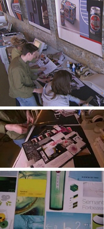
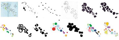
Process charts are always funny to look at, they seem so simple and neat. But in the case of D&P, it feels like the chart reflects the way the work. It’s pretty self-explanatory, so there really is no need to go into it here. One of the more interesting things they mentioned in relation the process was the need to invite clients into the process, but that this is usually something that scares designers — and leaving the clients out of the creative process usually leads to the client being surprised by the design options, and not in a good way. One manner in which they involve clients and avoid these design surprises that appear magically from thin air, are collages of existing imagery that D&P puts together with the client, creating a visual blueprint for the development of the design; like any other benchmark in the process these collages need to be signed-off and represent a commitment to the design evolution. Joe was adamant that these are not “mood boards”, but I think it’s just a case of semantics and a little bit of a cootie complex towards the term advertisers have for these things. Nonetheless, the examples that Joe showed on screen were pretty convincing. The collages were decidedly a jumping platform for the final design, never feeling like a copycat move, but more about drawing from imagery that clients can relate to and agree that that is the visual path they want to take. I tried a mood board once at marchFIRST. It sucked.

Some screengrabs from the D&P web site showing glimpses of the collages.
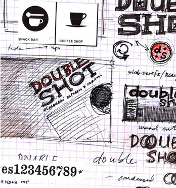
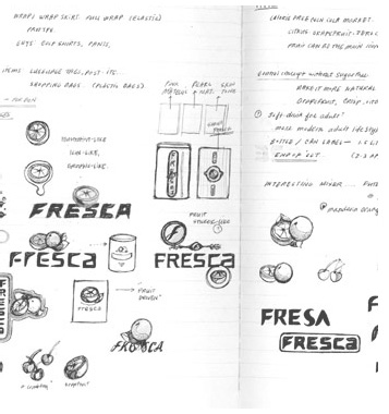
Joe also talked about the need to work on paper first and how everyone must sketch by hand before moving into the computer.


Joe and Erik’s presentation was very engaging, and painted a picture of what it takes to build a sizable design firm and the dynamic of the creative and business aspect onstage was great to experience. But the best comment was made in the discussion panel, and is something that summed up the purpose of this conference. When asked what is one of the biggest mistakes he had done or mistake that designers make, Joe talked about “Creative Optimism,” which is thinking that your creativity, talent and the overall awesomeness of your design will solve any problem: It takes more than just design talent to do good design. Lastly, to leave everyone on a happy note, Joe aslo pointed out another obvious key to running a successful design business, “It’s all about the people. The people you work with as clients, the people who are your employees. They have to keep you excited, so that you wake up everyday and be excited about the work you are doing, and the people you are doing it with.”


Great read, one question that popped up, when you mentioned you did your mood board at marchFIRST, I couldn't decide whether you meant the process sucked or your final board sucked.. could you clarify that for me?
On May.30.2008 at 03:01 PM