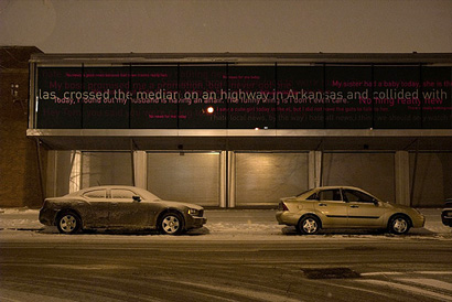
In September of 2007 most of the graphic designers from our MFA program at the University of Illinois at Chicago enrolled in a seminar class called “Drive-by: On Site-specific Art and Urban Screens,” led by professor and artist Daniel Sauter. As an MFA student, seminar classes are mandatory, so it was a matter of selecting the one that sounded the most appealing. That semester, Drive-by’s description was way too tempting to pass by, and most of the students hurried up to make sure we got a spot in the class. The course description: Exploring media projection and technology, recent developments in public art, and had, as a final aim, to produce video works for projection on the new façade of the Hyde Park Art Center (HPAC) — an 80-foot-long, 10-foot-wide glass façade equipped with 10 projectors, designed by Chicago architect Douglas Garofalo.
The final group of students in the seminar included art students, with experience in video and performance art. I could feel us graphic designers were intimidated by the company. The class was divided into groups, and the graphic designers formed two groups of their own — I was disappointed that we did not find a way to “cross-discipline”, but we were comfortable working with familiar faces. Early in the course we took a trip to HPAC in the south side of Chicago to learn about the possibilities of the digital façade. We came out of that meeting inspired by the HPAC’s commitment to the community around it and its mission of promoting and stimulating interest in the visual arts in the neighborhood.
Over a a group lunch, between classes, our group voiced our ideas and that day we found some common ground: We knew we wanted to use type and we wanted the piece to be interactive. Other than Inigo Manglano-Ovalle’s “Random Sky,” most of the works previously projected at the space had been video. We also knew that we were going to face some technological difficulties. In our group of four we had had some experience with Processing, so as naive students we convinced ourselves that we could pull this off.
As the semester progressed our first ideas brought in more questions than answers: Could we have microphones in the gallery so the public’s voice could be seen in the screens? If we gave the public a voice what would they say? What would be the catalyst to get response? Should the public interact only in the gallery or could we build a web-based project? How could we capitalize on the inside/outside proposition of the screens? After a mediocre mid-term presentation and some good questioning by guest professors, we came up with the idea to use some sort of official content as a catalyst, a base layer that people could then react to. From there, news became an obvious choice. Not only because of the format of the screens but because of the ephemeral quality of the news itself.


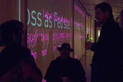
Behind the scenes of the façade testing the project.
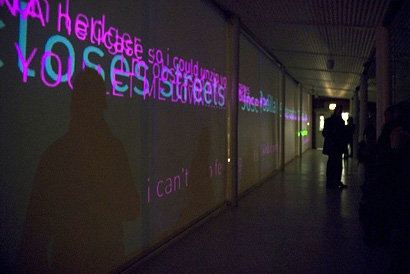
The graphics of the project followed the visual scrolling aesthetic that we are all familiar with from television news shows, stock tickers and Times Square. The scrolling information serves as an unquestioned authority: It is there, eternally rolling by, constantly telling us what we should be interested in at any given moment. But there is also space for personal news, feelings, commentaries and exchange of ideas to happen. So the piece was born from the idea of transforming this official news monologue into a community dialogue. However, we wanted to see what would happen if this commentary was projected on an enormous scale and lived as a member of the Hyde Park community — a digital graffiti wall and message board.
On the day of the final presentation it became obvious that the two design groups would make the cut. And although our group was very happy we were very anxious about the end piece. Up to that point we had experimented with building the application in Processing and switched to Flash. We eventually discovered, after several weeks of Actionscript torment, that we were not technologically capable of realizing this project in time on our own so we asked Eric Mika, a recent graduate of Northwestern University’s Animate Arts program, to collaborate with us — without his knowledge and passion the project would probably have never seen the light of the projectors.

Our project, called “Newsworthy”, involves an RSS feed from the Chicago Tribune that scrolls in the background, while the public can post comments about the news, their lives or anything they wish onto the screen. Anyone can physically visit the HPAC to post their comments at provided computers which are located on the catwalk and by the community classrooms, people can also participate through the website newsworthychicago.com. Comments collect on the screen throughout the day, growing and fading as time passes, creating a texture of the daily conversation.
We don’t know if this is going to be successful project, but we are grateful we will be able to find out and we are also happy that the HPAC was open to have an uncensored piece go up on their screens. Newsworthy launched yesterday and will be on view at HPAC until March 23.
Design team: Renata Graw, Gretchen Schulfer, Sara Bassick, Michael Ruberto
Development: Eric Mika
Renata Graw is a Brazilian designer with an undergrad degree in Product design from the Pontificie Universidade Catolica of Rio de Janeiro. She has worked as a graphic designer in Chicago since 1997 and is currently pursuing her graduate degree in graphic design at the University of Illinois at Chicago.


Drat. I'll miss it by a week.
On Mar.11.2008 at 04:38 PM