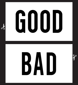
In GOOD magazine, each issue closes with a “GOOD Project”: a provocation of readers, a call to respond, contribute, document or aspire.
Issue 006 of the self-proclaimed magazine for “people who give a damn” was devoted to design. With contributions from the likes of Alissa Walker, Jessica Helfand, Alice Twemlow, Luke Hayman, Brian Collins, Steven Heller and many more, I was most intrigued by this issue’s project, a design project.
GOOD Design Director Scott Stowell of Open contributed Project 006, one that asks readers to identify both good and bad design that they experience and why they feel that way. I asked Scott about his take on this most subjective of endeavors.

RJH In your eyes, what makes a piece of design “good”?
SS For me, a piece of design (or anything) is good when it was made with care and effort and a point of view. If it’s apparent that the person making it was thoughtful about the world and took pride in his or her work, then it feels good to me—whether I agree with all of their decisions or not.
But I think that whether something is “good” or “bad” is subjective—that was the main reason for Good Project no.6. It’s interesting to see what other people care about. Some of the first responses to the project were things I’d never even notice, much less bother to critique.
RJH Is there design that is good and will stay that way or do judgments of good or bad change over time?
SS How tastes change over time is both fascinating and impossible to predict. What looks great today often looks embarrassing in the future.
But it must be possible to look at anything and figure out what we can get out of it, no matter its age. That’s how buildings get landmarked, for instance.
RJH You’re asking users to submit photos through Flickr. Why that choice?
SS That came from the people at GOOD, and I think it was a great idea—they solicit photos that way all the time. So you can see photos (including some of me) from various GOOD events, etc. on Flickr as well. It’s the closest thing we have right now to a worldwide public-domain photo database.
RJH You write, “while most of these things were designed for someone like you to use, you had no say about how they would work or look or feel.” Do you think that everyone having a say in the design they receive or use would make for better design?
SS There’s an old saying that if Henry Ford had held focus groups before introducing the Model T, the number one request of his prospective
customers would have been a faster horse. So I’m not advocating getting approval or seeking design ideas from the world up front.
But I do think that a lot of designers don’t think about the people that will buy or read or use their work. They’re more concerned with what their clients or bosses think, and they’re not always looking out for the end user either. So I think designers can act as advocates for their audience.
RJH So, what’s something in NY, something unexpected, that you’d shoot a “good” sign with?
SS This might not be that unexpected, but I am a big fan of the twentieth-century hand-painted sign lettering that used to be found all over New York City. It’s still there if you look, but it’s slowly dying out, replaced by seemingly cheaper and more efficient solutions (see below)
RJH And bad?
SS The number one purveyor of ugliness in New York City is the vinyl store awning. Once upon a time awnings had a purpose—they were unfurled to protect an establishment from the sun and people from the rain. These vinyl ones cost a few hundred bucks, look like shit, and never go away.
RJH Something closer to home: what’s on your desk right now that’s good?
SS An aluminum 12” PowerBook, several black Uni-Ball micro pens, Eye magazine, a nixie clock, a plastic 1960s turntable from Japan that you can hang on the wall, a package of toothpicks from China, a set of Muji colored pencils, and my latest black hardcover sketchbook.
RJH …and bad?
SS Lots and lots of empty Diet Pepsi cans.
Scott Stowell presents on GOOD October 13, 2007 at NEXT: AIGA National Design Conference.
GOOD is in the running for the Cooper-Hewitt’s People’s Design Award. Cast your vote!


Photos on Flickr manifestly are not in the “public domain.” Even Creative Commons–licensed photos have copyright restrictions; all the others have normal copyright protection. You do not have the right to do what you wish with Flickr photos, or any copyrighted work, as you do with genuine public-domain works. Perhaps he meant “publicly viewable.”
On Oct.13.2007 at 01:30 PM