Convention and convenience. Tradition and ignorance. These invisible forces are both blessing and burden. I like the ease and credibility they lend some of my efforts. But they stifle and impose, keeping me from exploring new territory and keeping design exciting for myself. Every once in a while — though not often enough — someone reminds me that just about everything I know and react to, aforementioned included, is worth questioning. Gareth Pugh is one of those people.


Photo: Wikipedia. Creative Commons ShareAlike 2.5
I first saw Gareth Pugh at “The Creators Series,” the event organized by Tomorrow Unlimited, which focused on multi-disciplinary creativity. While the variety of disciplines ranging from sustainability journalism to interface design were featured in discrete sessions, I have to hand it to the organizers, I’d have never encountered Pugh if it wasn’t for this mash-up event.
Gareth Pugh is a bit of an anomaly in the fashion design world; he has just the right kind of story. At 26, he still has a charming innocence. His controversial, through critically acclaimed designs have been shown three times at London’s Fashion Week, most recently this fall. The art collective !WOWOW!, of which he’s one of the most widely known participants, was the breeding ground for much of his work, and becomes the setting for what would be a peculiar but fascinating look into his past and present.

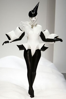
Photo from style.com.
Pugh told his story in what could be most accurately described as MySpace come to life — the format, the aesthetic, the audience…and the unexpected depth found buried in his work. After a typical introduction, he deliberately took a seat near the end of an on-stage table and shyly waved while barely raising his eyes. Sitting closer to center stage, Pugh’s friend and collaborator Matthew Stone set up his computer while mumbling to the audience that he and Pugh would be “doing this really casually.” With curiosity piqued, thus began a few design lessons from Gareth Pugh:
Call On Your Friends
It was obvious that Gareth Pugh isn’t overly social or comfortable in front of room. Rather than be deterred, Matthew Stone joins him as facilitator, essentially interviewing Pugh and illuminating his responses with further questions and concrete examples from their shared experience.
Flaws
It’s no surprise, with our love of vernacular typography and attraction to the subversive, that we enjoy those things with imperfections. In the context of polished presentations, Gareth and Matthew’s exchange felt incredibly human and down-to-earth. There was no pretense of expertise, simply the desire to share experiences.
Contrast
White looks more white against black. Irreverence, party culture, and hard work look both more naughty and more respectable when Pugh uses them to throw the high-fashion world in stark relief. Cultural contrast and visual contrast working in harmony can be a powerful formula.
Ignoring Convention
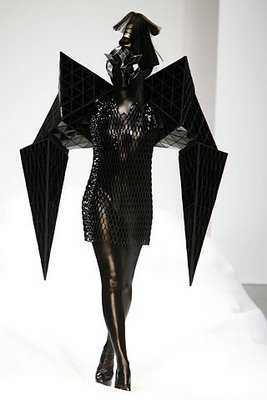
Much like his inflated clothes made of industrial vinyl and theatrical material concoctions, most of what Pugh touches oozes a technology-infused DIY spirit. It’s amazing how a little software, iPhoto to be specific, and a disregard for the conventions of presentations created the perfect backdrop for discussing Pugh’s education at Central Saint Martins and the nature of the !WOWOW! collective.

Photo from style.com.
While the two on stage reminisce, they’re backed by a looping album of blurry point and shoot dance party photos. These are replaced with images of a fellow collective member’s photography and shots of their 4-story building in Peckham, London. These in-turn become a few random images of Pugh working on collections. As they look behind them at a stream of images not unlike your favorite photo-viewer widget, they interrupt themselves in the short attention span way we’ve all grown accustomed to online. They’re reminded of a performance held in the space. Then they reflect on the building.
The Contents Are More Important
When looping photos had run their course, though the active dialogue and enchanted audience could have continued regardless, Stone cued up videos of Gareth’s fashion shows. And by “cued up”, I mean he literally searched for “gareth pugh” on YouTube. It’s the kind of presentation your design school teacher would cringe at, yet no one seemed to care.
Make Due
Pugh describes a post-graduation choice: get a “real job” working somewhere in London’s creative industry, not having time to make his own work because he’d be busy paying rent in what’s still one of the most expensive cities in the world. Or, he could commit to his passion and see where it took him.
With the perspective that their youth afforded them little to lose and much to gain, Pugh and fellow !WOWOW!ers took advantage of London’s rather liberal squatter protection laws. They found an abandoned and not-yet-on-the-market 4-story commercial building and made it their home, studio, gallery, and club.
This was party culture gone productive.
Pugh admits that until only recently, every garment he’s shown — including those at Fashion Week — has been made using a sewing machine his parents received as a wedding gift.
A question from the audience: “How did you get materials when you weren’t making money, and wouldn’t take another job.” Matthew Stone chimes in, “I think they call it dumpster-diving here.”

At a time when brands are stories, programs are stories, and economies are stories, it’s too easy for me to forget that the most interesting of the lot are those of people’s lives. I’ll take them as a novel, in a film, or even in a marketing-injected content-mining social network website. I’ll even take them in a scrappy presentation. And if they leave me questioning and uncertain about my design choices, all the better.
Thanks Gareth.


Gareth Pugh's work seems to represent part of the contemporary avant-garde in fashion design. However, some say that the avant-garde died with the end of modernism.
"The notion of the existence of the avant-garde is considered by some to be a hallmark of modernism, as distinct from postmodernism. Postmodernism posits that the age of the constant pushing of boundaries is no longer with us. Postmodernism posits that avant-garde has less applicability (or no applicability at all) in the age of Postmodern art."
Who, if anyone, is doing avant-garde work in graphic design? Valicenti? Sagmeister?
On Sep.12.2007 at 10:12 PM