Over the years I have learned to master a few typefaces, knowing at what size, with which letterspacing and with how much leading they will look its best. Some are inherently easy to use: Gotham looks great in uppercase, generously letterspaced and slightly big, and then I avoid using it at 9pt. for long stretches of text; Caslon, on the other hand, at 9 over 12pts. with tracking at +10, mamma mia, you could read the whole Bible in one seating; or something quirky like my favored Cooper Black, that somehow manages to look great under any typographic circumstance. But just as well, there are typefaces that I will never be able to make look good, or even convincing: There is Abadi, an odd sans serif that I have had to use that is impossible to equalize as a pleasant viewing experience at any size; unlike thousands, I can’t get a grasp on Helvetica, I set it too tight, too loose, too big, too small, too blah; and something like Bodoni or Didot, proves too fragile for my sometimes blunt approach. Through it all, I have always made time to explore typefaces and see if I can tame them. Dead History, Mrs. Eaves, Serifa, Avance, Akzidenz Grotesk, Matrix Script… I have given all of these, and more, a go with mixed, but always fulfilling, results. Yet there is one typeface — perhaps my typographic Moby Dick — that has taunted me for a long time, unwilling to submit to my will, teasing me with the possibility of greatness: Copperplate Gothic.
Correct. Copperplate Gothic. A typeface now bundled in most Macs and PCs, readily available for PowerPoint presentations, Word documents and, for the more daring and less considerate, as live text for HTML. Equally, it’s not surprising to find it listed — under business, elegant, serious, traditional, etc. — as an option for off-the-rack, template designs for business cards, wedding invitations or restaurant menus that one could order from Kinko’s or makemeaboringdesign.com. It looks its (sarcastically) best when cheaply engraved on creamy linen stock or on gold-colored vinyl on the door of a private dick’s office. Copperplate Gothic’s default ubiquity and, by consequence, broad misuse, has procured it a place among The Designers’ Holy Hatred Font pantheon reigned by Papyrus and Comic Sans — and while there is still no campaign to ban Copperplate Gothic, it does have its detractors. Yet, to this more prevalent Mr. Hyde side of Copperplate Gothic, there is a valiant Dr. Jekyll ready to shine from its own evil cast.
Designed by Frederic Goudy in either 1901 or 1905, depending on which source you choose, Copperplate Gothic occupies a strange niche in the typographic world: It’s wide, it has no proper lowercase (only small caps) and, despite its Gothic (= sans) classification, it features the smallest, peskiest serifs known to humankind. Characteristics that on their own, and in other typefaces, render pleasant forms become an odd Frankenstein in Copperplate Gothic. And when you break down the character set to its individual forms it’s like picking ripe from rotten cherries — some are delicious, others are rather offensive.

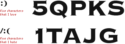

Despite the unflattering words so far, there is a certain point, as seldom as a lunar eclipse, when the characteristics that make Copperplate Gothic such a nuisance can turn it into a strong, sophisticated and enigmatic typographic statement. Set in the right size, with the proper letterspacing, and in the serendipitously fitting context, this typeface can become surprisingly fulfilling, providing a dual sense of gravitas and freshness. For your consideration — and for my personal inspiration in my continued, but still elusive, attempts to master it — I have gathered some instances where Copperplate Gothic’s Dr. Jekyll manages to suppress its icky alter ego.



Rembrandt logo and packaging
The revamped Rembrandt identity pretty much fueled this post and rekindled my hope that Copperplate Gothic could look simply amazing. (To appreciate how remarkable this change is, here is a sample of what the old one looked like). Upon closer inspection you will notice that this is an altered and customized version of Copperplate Gothic, which could lead to arguing about whether this counts as a valid example. I argue yes. The logo takes advantage of the established relationship of the Copperplate Gothic’s upper and lowercase characters and the nicely spaced, wide letters can’t say “whitening” any louder. Much credit has been given to the internal design team at Johnson & Johnson for the design of this packaging project, so let me sway the credit towards the unsung heroines at Little Fury.

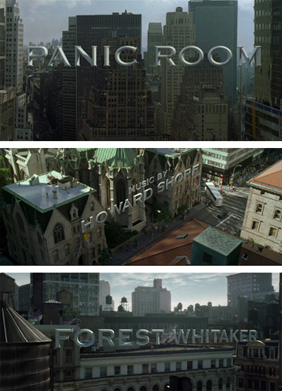
Panic Room opening titles
The Picture Mill’s opening titles for Panic Room presented us with an ominous interpretation of Copperplate Gothic against the still New York landscape. With its ironcast execution, perfectly aligned with the city’s buildings, it’s not hard (nor sad) to imagine a day where we could live in a city flanked by 20-feet-high Copperplate Gothic letters. These titles later spawned some imitators (two car TV commercials I can’t specifically recall at the moment), including the Picture Mill’s own titles for A Night at the Museum.

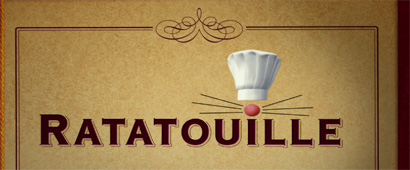
Ratatouille trailer (capture)
Copperplate Gothic has long been the signifier of a French culinary experience in a number of Bistros around the world, excluding France. Ratatouille exploits this connection with a nicely outlined shadow and considered kerning. The addition of the plump, pink nose, whiskers and chef hat give Copperplate Gothic a nice, playful feeling.

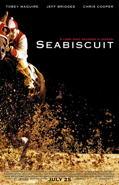
Seabiscuit poster
When I close my eyes the only typeface that comes to mind when I hear “seabiscuit” is Cooper Black, but that’s just me. Luckily, someone else thought Copperplate Gothic would look terrific against a black background and next to the frail couple. What I like about this example is what happens when Copperplate Gothic’s serifs fill in with ink so they disappear ever so slightly leaving only a soft sharpness to the letters’ edges. The names at the top of the poster, small and airy look lovely.

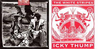
White Stripes’ Icky Thump
This is the only example where I have to claim ignorance. I don’t listen to the White Stripes so I don’t know what’s going on here, other than the faux-regal execution of Copperplate Gothic in this faux-crest looks like rock ‘n’ roll. Bonus points for its implementation of the K, one of my top five.

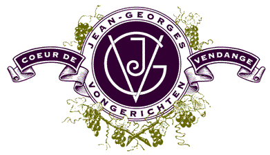
Jean-Georges Vongerichten’ California Grape Seed Oil logo
If Copperplate Gothic is good enough for the typographically gifted Louise Fili then, by golly, it should be good enough for anyone. Small, airy, purple and set on a curve — what else could you ask for?

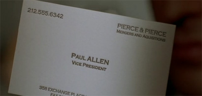
Paul Allen’s business card close-up, American Psycho
“OH MY GOD, it even has a watermark,” American Psycho
In its execution, this is perhaps the worst example of all. It’s too tight and all over the place with its use of upper and lowercase. But as the epitome of what a business card — in the business world of manly men in suits and slicked-back hair — should be, is simply laudable.


Logo for The LaSalle Bank Theatre in Chicago
To finish, a bucketfull-of-freezing-cold-water-in-your-face reminder of how devastating Copperplate Gothic can be in the wrong context, use and execution.


The most beautiful implementations of Copperplate Gothic that i have seen are letterpress. Somehow the glyphic serifs make an optically crisper presentation, especially in smaller point sizes. Anyone out there have any JPGs of this?
On Sep.04.2007 at 10:18 AM