by Yael Miller
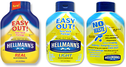
For as long as I can remember, I’ve used only Hellmann’s Real Mayonnaise — a household staple if you will. To state the obvious, but for the sake of this post, it is available in glass jars or upside-down plastic squeeze bottles in vibrant full-color printed shrink labels. The problem with the latter (and the crux of this post), as all of us who have bought it know, is getting out that last sixth of mayonnaise left in the bottle, which is usually enough to complete one more sandwich. No amount of shaking, banging or determination will clear out the bottle completely (or nearly so.) Ever. Enter the new Hellmann’s Easy Out!™ bottle. (Sort of.)

Regular (front only) and light Easy Out!™ bottles
In bold letters, the package states that “shaking, banging and scraping” mayonnaise out of the bottle is a thing of the past. An innovative “coating” in the bottle would now allow the product to flow out almost completely! Progress at last, I thought. I bought a bottle, made enough sandwiches, and waited for a miracle. After all, Hellmann’s was pretty confident that the results would be great… why would they assign 50% of the front of the bottle to a huge arrow and an “EASY OUT!” graphic bigger than the Hellmann’s logo if they weren’t? “NO More Waste”, it said. I felt assured. On a recent sandwich-making session I came to the dreaded last sixth of the bottle. This was it. SHAKE. BANG. SHAKE. SHAKE. SHAKE. BANG. SQUEEZE. SQUEEEEEEZE. CURSE. Maybe a slight improvement? I honestly couldn’t tell. No mayonnaise for my sandwich — and the bottle, as if taunting me, looked deceivingly full with all the mayo stuck to the inside walls of the bottle. And this took one year to develop?
“In an effort to continually delight consumers, we listened to their comments, both in focus groups and also from our consumer hotline, and we began working on a package to make it easier for consumers to get all the mayonnaise out of the bottle,” relates Melanie Huet, associate brand manager for Hellmann’s.
The 24-oz package, used for Real and Light mayonnaise varieties, was in development for one year and owes its nonstick properties to a specially formulated inner bottle surface that provides the required slip properties. While the bottle supplier is confidential, Unilever says the package is a multilayer construction of polypropylene/ethyl vinyl alcohol/PP.
— Press release [scroll down]
Maybe another year of testing would have been in order. Sheesh. I would have been feeling more kindly to the hardworking team at Unilever if they had been more realistic in their marketing copy. Unfortunately, all the development time will most likely go down as a big waste because the marketing copy overstated the claim of improved product flow by using black-or-white, everything-or-nothing language. The result? Elevated consumer expectations deflated by the actual performance of the product. How about a more realistic bit of copy: “LESS Waste”? Of course not, that does not fly off the shelves. But at least, knowing what I’m getting, I could buy the old-fashioned glass jar and scrape the heck out of it with a trusty knife.

Heinz’s “Trap Cap”
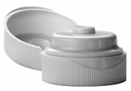
A similar episode happened with Heinz Ketchup several years ago. In 2000, the company introduced a new bottle cap designed to prevent the “watery stuff” — more scientifically known as “syneresis” (the separation of liquid from a gel caused by contraction) — from coming out and ruining your burger buns — one of the most depressing turn of events in the American culinary experience. The Heinz “Keep your buns dry and happy” $20 million ad campaign by Leo Burnett created publicity, but along with it came negative scrutiny when customers quickly realized the cap (also known as the “Trap Cap”) was only slightly effective. Although Heinz claims they did extensive testing before introducing it, the claim was overstated. The massive marketing push made this semi-effective improvement very annoying. Specially when my hamburger bun went wet with that gross watery stuff — fancy caps, $20 million campaign and all. Again, couldn’t we have just had a less inflated pitch? “Not as much watery stuff as before” would have been good enough for me, letting me know that the cure had not yet been found, but that the suffering would be less.
When redesigning a product’s packaging to improve it or address market research findings, the “spin” is maybe as important or more so than the actual design change itself, as this is what faces — or is it “lures”? — consumers on the shelves. Careful choice of words is important, if the innovation is indeed proven in focus groups and lab tests. Why not let consumers discover a pleasant surprise when they use the newly improved product? If they want it, they’ll buy it anyway. Subtlety is an art that mass-market consumer product goods need to learn. You don’t need a megaphone (or a big ad campaign) to convince consumers you were up to something good when you redesigned your product. Can the product speak for itself for a change? Or is the super sales pitch really necessary?
Yael Miller specializes in branding and package design for food and beverage.


You know mayonnaise is super bad for you, right?
On Jul.12.2007 at 04:21 PM