In 2003, the pop auteur Mellowdrone released an album called “A Demonstration of Intellectual Property”. None of the lyrics addressed the notion of intellectual property directly; the album’s name refers to the fact that Mellowdrone initially gave away the album as unrestricted MP3 files on his website, before offering it for sale as a retail CD.
I, personally, had never heard of Mellowdrone before this. But a friend of mine, who had seen him open up for Johnny Mar, directed me to his web site. I downloaded his music, and indeed, it was catchy enough to stay in my rotation (which is more than I can say for most free MP3s found online). As such, Mellowdrone effectively wagered his talent against both his royalty proposition and the music industry’s conventional wisdom.
His bet paid off, at least in my case: I have since bought his full-length album from Amazon. He has apparently been quite successful since then in many ways. One of the songs from “A Demonstration of Intellectual Property” was later used as non-diegetic background music in an episode of Six Feet Under, which could be considered a pop canonization of sorts.
I am interested in the notion of “intellectual property”, in large part because the term itself is rather oxymoronic: How can you own an idea? If I give you my sandwich, I’ll be hungry, but if I give you my idea, I still have the idea. We both win, n’est ce pas? Ideas don’t behave like physical property.
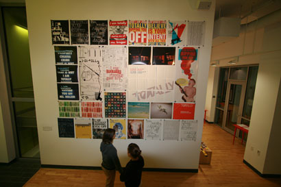
So, I wanted to have my own intellectual property demonstration, to see how the concept might operate in the field of graphic design. I assembled an exhibition of posters at a student gallery here at RISD. The show, called “I AM TOTALLY RIPPING YOU OFF”, consisted completely of from-scratch recreations of notable typographically-oriented examples from graphic design and conceptual art. In each recreated work, I used the words “I AM TOTALLY RIPPING YOU OFF, _______” with the blank substituted by the author or artists’ name. I ripped off a very wide range of practitioners in this fashion, from Wim Crouwel, to John Baldessari, to M/M Paris. I also included two of my ex-girlfriends, both of whom are practicing graphic designers.
In some ways, this approach is the opposite of what Mellowdrone was doing. Instead of giving away the fruits of my hard labor, it could be argued that I was standing on the shoulders of giants in a bid for attention, which is, like, the ultimate currency in graphic design.
Nonetheless, the act of ripping everyone off was a very revealing one, I found. The verb phrase “to rip off” here is important. I was not “precisely emulating” my subjects, nor was I “loosely borrowing”. When you rip someone off, you are adapting their trademark style to your own ends. This is something that we do all the time, as graphic designers. I will freely admit that in the past, I have adapted some idea I saw executed by some far more established practitioner, and passed it off without so much as a footnote. My early website designs, for example, were more or less reassembled components filched from The Designers Republic; for a while after that, I thought I could ride on Mr. Müller-Brockmann’s coattails by making everything I did some sort of geometric abstraction with Akzidenz Grotesk on top.
It was therefore fantastically refreshing to rip everyone off so blatantly and unapologetically. I could devote my time and effort to marshalling the rip-offs towards an emulation of the original technique as much as possible, without having to invest effort in diluting the spirit of the original to make the work seem more “mine”, which is typical in the normal, day-to-day course of ripping someone off.
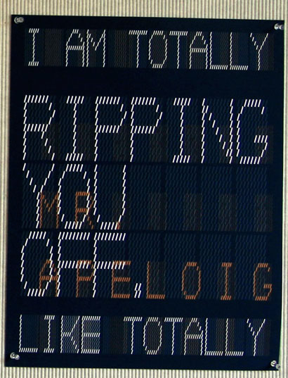

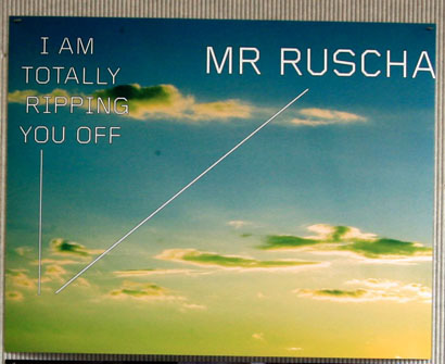
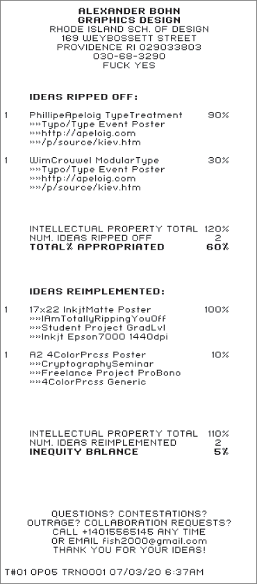
But even still, the results were not perfect, by any measure. I know this definitively, because for the last phase of the project, I sent copies of each rip-off back to the rip-offee. I included, along with each rip-off, a “receipt” for rip-offee’s intellectual property, which consisted of a deliberately nonsensical but precise-looking tabulation of their ideas. This proved to be rather amusing to compile. When I ripped off Phillippe Apeloig, for example, I could not rightly attribute all of the modular typographical ideas in his posters solely to him; clearly, he was basing his character sets on work originally pioneered by Wim Crouwel. I stated this in the receipt.
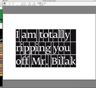
At the moment, I have only received a handful of replies to these thought-crime dispatches, but the few I have received have been quite astounding. Peter Bil’ak wrote me back within five minutes, stating that I had ripped him off incorrectly. To rip him off, I had adapted his type-grid stamp design for the Dutch Royal TPG. I had not been aware of the fact that the stamps’ grid was based directly on Fedra’s metric tables, and as such, the rip-off’s grid included padding between the character and the grid cell boundary that wasn’t present in the original. Mr. Bil’ak even sent me a PDF mockup of the stamp with the phrase “I AM TOTALLY RIPPING YOU OFF MR. BIL’AK” rendered in a manner he deemed more correct.
Fascinatingly, the other replies have been in line with this sentiment. The original authors and artists who have felt compelled to address the project have done so to say, “you haven’t ripped me off well enough!” I thought it especially funny to have received a reply like this from Mieke Gerrizten. I mean, isn’t everyone supposed to be a designer? I supposed that doesn’t make us all equal as designers, but hey.
My reply to this sentiment, incidentally, hinges on the definition of “rip-off” falling somewhat short of “exact emulation”. In each rip-off, I considered the precision of the original designer’s work, and used that as a loose guideline. For example, I am pretty sure I nailed the Wim Crouwell piece, but I did not seek the same sort of rigor when ripping off, say, 178 Aardige Ontwerpers, because I don’t see an analogous kind of punctiliousness in their work.
I had expected at least a smidgen of outrage from those I pilfered from. This kind of reaction is not without precedent: on April 17, 2006, the New York Observer published an article by Simon Doonan, entitled “How Did I become the Typhoid Mary of the Art World?” Mr. Doonan is a designer based in New York, and for decades, he has crafted window displays at retail shops like Barney’s, using found type from junkyards. In his article, he hilariously details an incedent where the Art World luminary Jack Pierson came to town for a show, and saw a high degree of similarity between his art and the work Mr. Doonan had been doing for decades. So similar was the work, in Mr. Pierson’s eye, that the only possible option was for him to sue Mr. Doonan for infringing on his intellectual property.
This was the sort of response I was gearing myself up for. I have seen otherwise reasonable people, in both the wide-open professional realm and the pressure-cooker of graduate school, who try to claim eminent domain over, say, a typeface, or a printing technique, or what have you. “How dare you use Gridnik! That one’s mine!” It sounds ridiculous, but it happens. Since I was explicit as possible about my method and intentions regarding the intellectual property of those I ripped off, it is possible that my victims have been playing along, and don’t actually see the project as a direct threat to their established aesthetics (and therefore their professional identities).
Because this, I fear, is the trap that the notion of “intellectual property” sets up. The unfortunate corollary to the investment of time and effort that one expends to build up a unique style is the ease by which such a style can be adapted by someone else. This, in itself, is not necessarily a bad thing. It becomes bad when your identity as a designer-author is irrevocably bound up in that style. It means your identity can be stolen outright, by anyone with the wherewithal, the tools, and the patience to do so.
Fortunately, we are smarter than that. By experimenting with the more topical aspects of style, we can create an identity that is greater than the sum of the parts of our aesthetics. By resisting the lure of a single aesthetic in favor of a broad-spectrum approach, the bodies of work we craft will inevitably maintain subtle but instrumental common threads, which will add up to a certain je ne sais quoi that observers will no doubt begin to recognize, over time. (In my last article, I described this as having a ™.)
It’s a very tricky proposition, to be sure. Neither my demonstration of intellectual property, nor Mellowdrones’, nor any other object lesson on the subject, in any way implies a blanket, prescriptive approach to dealing with ideas as things*. People should be able to come up with interesting ideas, and use those ideas as the basis for getting paid. That is what copyright law, patent law, and trademark law all seek to address, however disparately (and, some would say, ineffectively). But issues related to “intellectual property” are causing greater and greater convulsions throughout everyday life, from software patent problems to the availability of generic medicines in third-world countries. It’s a bloody mess. But most importantly, it’s an unresolved mess, and as such, we’ll have to continue to experiment until we figure it all out.
It’s more fun this way, anyway. I mean, totally.
* I realize that this statement (and in fact any discussion of intellectual property) implies a gargantuan breadth of issues, well beyond the scope of this pithy document. I would recommend “The Ecstasy of Influence”, an essay by Jonathan Lethem for the February 2007 issue of Harper’s magazine, to those interested in an omnibus analysis of the subject. I would link to it, but harpers.org is now “subscription only”… boo hiss.
[Ed.: Link to Harper’s article added — 05.17.2007]
Alexander “Fish” Bohn is a graphic designer and nacent design writer. Hailing originally from Brooklyn, he is currently a grad student at RISD, where he is researching bullshit patterns in design practice, among other things.


The Ecstacy of Influence looks plenty available to me.
On May.17.2007 at 06:53 PM