Unlike some, I don’t get giddy at the mere mention of the word “design” in mainstream happenstances (Target, Intelligent Design, Fast Company’s Masters of Design, etc.), simply because they are rarely a reflection of what we (or at least I) actually do. So it was with more hesitancy than usual that I tuned in to Bravo’s new Realitontest™, Top Design, with its cadre of stereotypical creative characters: The weird hairdos, the unusual eyeglass frames, the hipper-than-thou fashions and, of course, the bitchiness, cattiness and endless eye-rolling of the interior designers flung at each other, at the judges and at the world at large. Despite this, and especially after this Wednesday’s episode, I was left clamoring for more. Top Design exposes the dynamic, the challenges and the process of being a designer and is the closest parallel graphic design will likely ever experience in terms of exposing to a broader audience how it is we work, how we talk about our work and how our work is perceived by our peers and, ultimately, our clients. Oh, and about this week’s episode… it features the Top Design Putdown ever, but I’ll get to that later.
If you haven’t seen the show — and you should — the premise is simple: Contestants receive instructions of what they need to do, with varying degrees of helpful information; they are prescribed a client who they usually meet late in the process; they are given a budget, timeframe and deadline; they sketch, run, huff and puff; then deploy their creativity on empty, three-walled, no-ceilinged, sheet-rocked rooms; a panel of judges (how cool is Jonathan Adler? “See you later decorator”? Hilarious) scrutinize the work; the client is revealed or a curveball is thrown; and a winner is chosen as having the Top Design and a loser is sent home. Other than the winner/loser set up (unless we are talking about spec, but we ain’t right now) this scenario is scarily familiar. Watching the designers pick fabrics, expensive furniture they can’t really afford, wall colors and other accessories is like looking into a mirror where I am picking typefaces, coated or uncoated paper, printing processes that I can’t afford, PMS colors or CMYK breakdowns and graphic mannerisms. But the true magic happens in the “White Room” where the judges opine and question and where subjectivity and taste become the last word.
The judges, Jonathan Adler, Kelly Wearstler, Margaret Russell and a changing guest judge offer the snappiest versions of both a classroom design critique and a boardroom design presentation. The judges present their opinions on execution, style, appropriateness to the brief and client, inventiveness and above all how they personally feel about the room. I would attempt at paraphrasing, but much of the joy of the remarks comes from the body language, tone and infliction of attitude (with a lovable hint of superiority) from the judges — just one minor i.e., Adler’s “You know clients… They can be fickle” remark with a twinkle in his eye was priceless. The interior designers, in turn, pout and sometimes daringly retort with “Oh, I don’t think so, girlfriend” remarks when their designs are poorly received; and they glow and joyfully sweat when judges shower them with kudos. While, as professional graphic designers who are not followed by cameras and don’t have microphones sticking out of our behinds, we rarely stand in a line-up when receiving design feedback some of these exchanges can be painfully spot on. And unlike its Top Chef counterpart, where things can be objectively undercooked, over-salted or sloppily presented, Top Design relies on, and perpetuates, subjectivity and personal taste as the measuring stick of successful design — yet one more parallel that can be hard to absorb as a viewer.

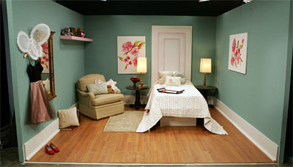
Room design by Michael. Photo: ©2006 NBC Universal, Inc.
But it was this subjectivity that led to one of my favorite reality TV moments ever. In this week’s episode the challenge was to design a room for a kid. They were only told this after the designers had sketched and bought furniture. Oh my Gods and dropped jaws quickly followed. But it was cherub-faced designer, Michael, who took the biggest fall — even if he still managed to stay on the show. After sustaining a critique that described his room as an “assisted living facility” and was labeled as looking “granny” — I’m so stealing that term — the sharpest blow came from judge Kelly. As the judges were deliberating among themselves, talking about Michael’s room, Kelly delivered the most awesome design putdown I have ever heard, one that, in my publicly-admitted snobby ways, delivers the perfect combination of snootiness and disdain for poor design mockery. Kelly, with her legs fashionably crossed, and looking glamorously fabulous finally said “His room looked like it was put together by a state-appointed designer.”
Brutal. Yet so amusingly real.


That was indeed a classic line. I can't say that I am totally in love with the show as of yet. My love for Project Runway and Top Chef was more immediate. It may have to do with the fact there is no one that jumps out me as a favorite. Girl with the glasses is the best of an only mildly interesting or talented bunch. Not tom mention that as nice as Todd Oldham seems, he doesn't really seem like he could care less one way or another. He is no Tim Gunn or Tom Calicio (likely spelled wrong).Hopefully we get some forerunners as I am required to love the show. A friend of mine pitched the show to Bravo and is a consultant on it. Therefore I need to find a way to stay excited.
On Feb.09.2007 at 10:57 AM