Speak UpA Former Division of UnderConsideration
The Archives, August 2002 – April 2009
advertise @ underconsideration
---Click here for full archive list or browse below
  
Game On: The Battle of White and Black

I was born in August of 1977, three months before the Atari 2600 was released and leading into the four years (1978-1981) regarded as the Golden Age of video gaming, allowing the industry to hone its skills and put that red-buttoned, stiff joystick in my capable, chubby hands at an early age.

Video gaming and I grew together: after that first Atari 2600 came the Atari 5200 during Elementary School, the original Nintendo in Junior High, followed by the Sega Genesis in High School segueing into college and ending my run with the original PlayStation as I started my first job in the U.S. until three years ago when lack of time and adult responsibilities forced my surprisingly tireless and dexterous fingers to retire from gaming. A move that both Bryony and my bank account are grateful for as consoles become more expensive and time-consuming, all the while evolving into furious technology, marketing and economic battles between the leading consoles: Sony’s PlayStation and Microsoft’s XBox. A barrage defined by the two giants’ discreetly changing Jekyll and Hyde personalities. Console wars are nothing new but it hasn’t been until now that they have gotten, literally, bloody.

Playstation Ad Detail
Detail of PlayStation 3 ad. [See full ad]

Rivalries between consoles have been ping-ponging since the late 70s: Atari vs. Intellivision, Nintendo Entertainment System (NES) vs. Atari; Sega Master System vs. NES; Super Nintendo vs. Sega Genesis vs. TurboGrafx 16 vs. Atari Jaguar; PlayStation vs. Nintendo 64 vs. Sega Dreamcast; Playstation 2 vs. Nintendo GameCube vs. Microsoft Xbox; and the latest, Playstation 3 vs. Nintendo Wii vs. Xbox 360. Plus a number of console flops and distractions and excluding the portable gaming market. Having cold-turkeyed from my video gaming addiction I am happy that I don’t have to worry about which console I’ll drop hundreds of dollars on or which advertising campaign I’ll be swayed by as both the PlayStation and Xbox market rather aggressively with print and outdoor campaigns, both of which I see regularly in magazines, blogs and TV as well as in the streets (New York’s scaffolding-per-capita puts hundreds of bigger-than-billboard ads at first-floor level) and with the Holiday Season upon us, both companies have gone into advertising overdrive bidding for console supremacy. What’s interesting (to me, at least) is not how fast their processors have become, how much storage capacity they provide, nor how web-connected and wireless they have grown but, rather, how PlayStation and Xbox have Foxtrotted to switch their personalities.

Xbox Ad Detail
Detail of Xbox 360 ad. [See full ad]

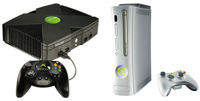
The PlayStation and the Xbox have exchanged a simple premise: Black and White / White and Black. In literal and metaphoric ways. First, the literal. The original PlayStation ruled the late 90s with that light gray clunky box, big power and open buttons and vibrating controllers sitting under TV sets around the world. High Design it was not. Instead, it thrived in its simplicity and calm dominance of the market. Then in 2001, Microsoft, a company with no legacy or history of major hardware or entertainment development launched the Xbox: A scary, X-marks-the-spot, black console with black controllers, radioactive green accents and a logo that would swallow you whole as soon as you turned your back on it. The Xbox was everything the PlayStation was not — except a bestseller . The Black vs. White battle had begun.
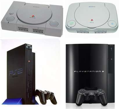
The Evolution of the Playstation
From White to Black: PlayStation, PSOne, PS2 and PlayStation 3.

divider

The Evolution of the Xbox
From Black to White: Xbox and Xbox 360.

Almost at the same time, the PlayStation 2, matching the Xbox in power, was released in an all-black dress code with haunting shades of blue and a futuristically minimal PS2 logo. Sony also released the PSOne, a revised (and cheaper) version of the original PlayStation with a more bubbly design, a white casting and overly friendly logo. The PS2 sold more consoles, but Xbox gained more souls. In 2005, with a strong following, Xbox introduced a sleek, white version of its console now labeled Xbox 360. The shocking black personality was now replaced by a confident, technically advanced simple design. More than a year behind its promised ship date, the PlayStation 3, finally premiered this November with a black, curvaceous design and a Spidermanesque logo. (Damn you Bronzo!). With the physical White and Black / Black and White metamorphosis complete within the span of a decade, the two consoles have also modified their attitude.
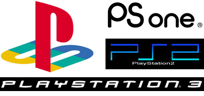
Playstation Logos
PlayStation’s identity moves into the future.

divider

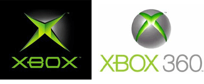
Xbox Logos
Xbox softens its edges.

While the hardware changes are obvious and objective, the Xbox and PlayStation have also played with the metaphor of White and Black — inherent in this is contrast. And in the console wars it has played out as a battle of good vs. evil, friendly vs. aggressive, pleasing vs. shocking. When the Xbox was introduced to the market it relied on shock and awe. The X in the name instantly made it “extreme”. The rumbling from the confines of the earth of the logo animation in TV advertising made it clear that this was a dangerous instrument of mass entertainment. The Xbox shipped with one of the most successful first-person shooters, Halo: Combat Evolved, relying on the success of multi-player violent games like Unreal Tournament played giddily by an army of man-children in offices across the world during the dot-com bubble. As a whole, Xbox was clearly positioned as Black to PlayStation’s White. With a limited number of titles for the Xbox, and a majority of them violent — quick disclosure: I don’t mind violence in video games and I don’t condemn it, I basically adored Mortal Kombat’s fatalities — the Xbox had a hard time competing with PlayStation’s stronghold on the market, but as more developers started porting games to the Xbox, the gap closed and the launch of Xbox Live (allowing users to play online and download additions to existing games) proved that Microsoft belonged in the market and that it had muscled its way in. With plenty of games in common between the PS2 and the Xbox, it was time for the next move. For both consoles.

With the launch of the PlayStation 3, Sony went Black. Its ad campaign, Play B3yond, revolves around a creepy PS3 mysteriously floating in a white room — reminiscent of solitary confinement in a psychiatric facility — that enjoys decapitating chess pieces, flooding rooms in black ooze and hypnotizing lifeless baby dolls. Other ads introducing the campaign featured a very scary depiction of Rock Paper Scissors and extreme versions of monkey bars and swings. Meanwhile, Xbox 360 decided to wear White. Their TV and print ads feature light settings with jolly flying green game boxes and touting the wireless accessories all floating happily around and above the Land of Xbox. A stark contrast to 2001’s launch. Worth noting is that Black has been the positioning of choice for Sony and Microsoft when the stakes were higher (and sharper) for each company. In 2001, Microsoft was betting $4 Billion on the Xbox and knew that it had to make an impact: It chose Black. In 2006, Sony, who was delivering the PS3 late (and also betting the house in its success) and losing market share to the Xbox, realized that it had to make a statement: It chose Black. In contrast, White has been used by both companies, in intervals, to signal confidence and leadership.
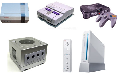
The Evolution of Nintendo
From gray to vanilla Nintendo keeps it in-between: Nintendo Entertainment System, Super Nintendo, Nintendo 64, Nintendo GameCube and Nintendo Wii.

Few industries feature such sharp contrasts in attitudes between competing brands and even more rare is the case where leaders exchange personalities. Apple vs. the PC market may be the most clear battle of cool vs. uncool but the chances of a flip-flop are minimal, specially with such a nebulous enemy for Apple; Pepsi vs. Coke, Nike vs. Reebok, Cingular vs. Verizon vs. Sprint, Paris Hilton vs. Lindsay Lohan, Prada vs. Gucci… All competitive brands operating between safe shades of gray with small and gradual changes in tone and volume. Perhaps it’s the inherent competitiveness, kill-or-be-killed state of mind and non-stop evolution of video gaming that is reflected in both manufacturers and buyers that allows such opposite leaps to be taken. Successfully. Unlike carbonated cola drinkers or Mac geeks where switching is rarely an option, gamers fluctuate to where the action is faster, harder and louder making it a no-brainer to switch to the console of the moment or, heck, play all the consoles of the moment further loosening the market and almost restarting the race with every new game, new mod, new console, new accessory. Watching these two brands morph, adapt and evolve (and fight it out!) is as enthralling as seeing two sticks bounce a ball across the screen for the very first time.

Maintained through our ADV @ UnderConsideration Program
ENTRY DETAILS
ARCHIVE ID 2848 FILED UNDER Discussion
PUBLISHED ON Dec.12.2006 BY Armin
WITH COMMENTS
Comments
Dave Werner’s comment is:

Very interesting analysis.

In contrast, Nintendo has often sold colorful alternative versions of its systems and controllers (and gold cartridges and discs in the case of the Zelda series). The original Gamecube was purple, and sometimes got dismissed as a kid's lunchbox because of it. But the pink handheld systems always sell remarkably well, and early prototypes of the Wii promised multiple ipod-esque colors for future models.

The company's message has always been fun gameplay, and the color options seem to relfect that. With the shift to white for the Wii, coupled with the non-traditional name and simple logo, the design focus seems to be more about innovation and ease of use.

On Dec.12.2006 at 10:08 AM
Su’s comment is:

PlayStation 3, finally premiered this November with a black, curvaceous design and a Spidermanesque logo. (Damn you Bronzo!)

It's based on Mata, actually. As was the original XBox logo. And uh, the Spider Man movies'. Which is an "interesting" branding move, if you ask me.

On Dec.12.2006 at 11:44 AM
Armin’s comment is:

Su, word on the street is that Greg Samata's Mata came after Rick Valicenti's Bronzo – which, until Thirstype became vllg, was apparently their bestselling font – so it all comes back to Bronzo. Maybe pk can corroborate both of these statements?

On Dec.12.2006 at 11:58 AM
Tselentis’s comment is:

Su, right on, and good typographic connection. Last week my wife and I caught the PS3 ad, and at the close they had the Playstation 3 typography, my wife caught it from a distance, and mistook it for the Spider-Man movie ad. Sony's playing a strange game connecting the type like that---it's dissolving the brand, and confusing at least one consumer.

On Dec.12.2006 at 11:59 AM
Kevin Hopp’s comment is:

Is it possible that Mata created it without ever knowing about Bronzo?

I just ask this because recently I saw a typeface Desrocher created which looked similar to Summa, but she swears she's never seen Summa in her life despite a close look and feel.

On Dec.12.2006 at 12:37 PM
Su’s comment is:

Ah. I thought you were citing, not making historical reference. Yeah, Bronzo then Mata. The copies I just looked at(don't ask where I got them) say 1993(also MyFonts) and 1994 respectively(MyFonts says '95 for Mata).

On Dec.12.2006 at 12:58 PM
Matt’s comment is:

I saw Rick Valecenti speak at SACI a couple years ago and he said that the X-Box logo is Bronzo (or a slightly modified version of it).

On Dec.12.2006 at 02:02 PM
James Gibson’s comment is:

Is it me, or am I the only one really turned off by the new PS3 typography? I'm very curious why sony would change so much after investing so much equity in the the old Zekton typeface?

I couldn't agree more with Tselentis, when I saw the PS3 unveiling, I had the exact same reaction, the immediate association with Spider-Man, because Mata has become so associated with the marketing of those films, I can't even begin to imagine where Sony would consider such a face.

One of the biggest problems I have, aside from brand dillution, is the staleness of this face. The face screams early-90's post-modern experimental type. It's pretty obvious by the curves and crossbars in the face, that it's an novelty decorative face. It could be just my dislike of faces like this in particular, but it seems like such a bad choice for a brand that is trying to look "next-gen"

Now look at Xbox's new typography, much larger x-heights, the kerning is a bit tighter, and the typeface is a nice clean medium weight sans. This typeface could be timeless. And they added a nice touch by adding the extention of the "B"'s crossbar, and followed the slash of the "X", just referencing to the old logo a bit, but getting the brand out of the 90's. It's clean, sexy and modern.

Another thing: Sony took a very good cue from it's audience by changing the name of the "Playstation 2" to PS2, because of what the fans were calling the system anyways, and they ran with it. It was a brilliant idea, when they created a brand that was easy, and resonated with their audience. "pee-ess-two" rolls off really nice.

Anyone else agree?

On Dec.12.2006 at 03:03 PM
James Gibson’s comment is:

Another sidenote I just noticed: Sony hasn't ditched the PS rainbow logo, but it's taken a backseat. It's still on all the game boxes and system literature. Just interesting to note, they haven't redesigned that infamous icon. Very interesting.

On Dec.12.2006 at 03:09 PM
Keith McCord’s comment is:

Another thing: Sony took a very good cue from it's audience by changing the name of the "Playstation 2" to PS2, because of what the fans were calling the system anyways, and they ran with it. It was a brilliant idea, when they created a brand that was easy, and resonated with their audience. "pee-ess-two" rolls off really nice.
Anyone else agree?

As a "pee-ess-two" owner I completely agree, so why would they go and plaster "Playstation 3" in the above-mentioned very familiar looking typeface across the sexy new black shell? Just feeding the fire...

On Dec.12.2006 at 03:28 PM
Keith McCord’s comment is:


Tell me that wouldn't have looked cool...

On Dec.12.2006 at 04:09 PM
yi’s comment is:

I've hated the PS3 since its first conceptual introduction. It proved to be nothing but vaporware, doomed from the start. They just kept adding functionality gimmick after gimmick to try to win the hearts and minds of would be PS2 fanboys. Its such a shame, since they're on the verge of bankruptcy with this investment. I belive the word of the day would be "hubris". They missed out on a great opportunity to innovate (Wiimote), or even let the design create the brand culture (XBox Live, XBox 360). And if we're still on the topic of logos, I think Nintendo will forever have that covered, my fav being N64. Actually, you know what we need? A Dreamcast ressurection.

On Dec.12.2006 at 04:15 PM
Kevin Hopp’s comment is:

I'm actually surprised so many designers blogging here also play video games at home.

It helps with hand-eye coordination, right? Riiight!

lol

Speaking of games, Armin, when are you going to get a show on Bravo!!!? Top Graphic Designer? If anyone can do it, it's probably you boyee.

On Dec.12.2006 at 06:04 PM
James’s comment is:

As someone working in the industry, I can tell you that PR has a lot to do with the overall impact of building brands, especially for Microsoft and Sony. Sony has had more than a few missteps in launching the PS3 ($600 price tag, huge production delays, wild arrogance, "the next generation doesn't start until we say it does," the idea that it is forcing Blu-ray down people's throats, etc) and this has hurt its brand even before actual content was produced. Among the industry folk I socialize with, a lot are put off by how "edgy" Sony is trying to be with their campaign - some say it's a reflection of how comfortable sony has been with the immense success of the PS2.

Microsoft, on the other hand, has a huge uphill battle. The xbox was powerful, but was basically known as "the Halo machine." Switching to white and using light as the concept for their branding, as well as strong adverts (01, 02) have softened its image of MICROSOFT AND OUR XBOXXbox 360. PR missteps have been few and far between, and public perception of xbox is growing immensely positive as it throws its considerable weight behind good games and Xbox live. Meanwhile, Sony has taken a "meh" attitude to 3rd party publishers and developers (some still haven't gotten dev kits to, you know, start making games on), causing some to jump ship.

Of course Sony is HUGE in japan, where the 1st week of sales of the PS3 outsold the total number of Xbox 360's over the last year. Whether or not Sony can maintain their dominance over 3 generations remains to be seen, but as a self-professed Microsoft hater I have to admit that they've been doing a lot of things right.

Nintendo's Wii, of course, is a staple in the homes and offices of all game industry folk. I'm sold on the clean white/grey/blue Avenir and the accessibility of it and the sheer joy of p-l-a-y-i-n-g something, not just moving the camera/shooting with 2 analog sticks for 2 generations.

Funnily enough, sony's ad agency responsible for the "white-room" ads and branding is the same that's responsible for Apple's iconic ipod ads (TBWA/Chiat Day). Man are THOSE teams not communicating.

On Dec.12.2006 at 06:06 PM
James’s comment is:

Oh on another side note, the sony "rainbow" logo (officially called the "family" logo) accompanies anything that has to do with Playstation. So Playstation is the umbrella brand for PSOne, PS2, PSP and the PS3.

On Dec.12.2006 at 06:08 PM
James Gibson’s comment is:

Of course Sony is HUGE in japan, where the 1st week of sales of the PS3 outsold the total number of Xbox 360's over the last year.

The Japanese are really fickle though, they seem to be much more brand loyal as consumers than Westerners. I had a friend who lived in Japan for a few years, I remeber him telling me that they throw out their cellphones once a year, and get a new car every five years, because what they have has just become too "Old". It's an interesting cultural phenomenon. And Japanese industrial design hasn't been very sexy in the past few years, especially from Sony. Look at how hard they try to make an mp3 player designed as good as the iPod. Korean companies like Samsung and LG have Japanese companies scared.

Nintendo's Wii, of course, is a staple in the homes and offices of all game industry folk. I'm sold on the clean white/grey/blue Avenir and the accessibility of it and the sheer joy of p-l-a-y-i-n-g something, not just moving the camera/shooting with 2 analog sticks for 2 generations.

Wii is by far the best designed system, in terms of industrial design, branding and advertising. They've done an amazing job. I stood in line for a good 40 minutes to try out a Wii at Nintendoworld in Manhattan. They know how to win the console wars, make games fun, easy, and appeal to everyone. They've taken the iPod route.

On Dec.12.2006 at 08:32 PM
Tan’s comment is:

Interesting analysis Armin. Yes, black and white could be interpreted as good vs evil.

But I actually worked on the new Xbox 360 when I was at Y&R -- and there are other brand considerations with black and white.

It's universally accepted that black stands for "premium" to consumers. Black also stands for exclusivity, and most relevant to the game market -- black stands for "power."

When the original PS2 was introduced, the monolithic shape, all in black, symbolized Sony's power dominance within the market. When Xbox came along, they adopted the black power box, but added a glowing green band bisecting the console -- to symbolize an emanating energy source that was greater than the PS2.

But Apple's iPod changed everything. Apple turned the world on its ear, and with the iPod -- made white the power color, also symbolizing brilliance, simplicity, and freshness.

White had become the new black. And everyone has jumped on board -- including Xbox and Nintendo.

But not Sony. It's still adamantly sticking to the black monolithic form that it invented. Why not? It still works.

These types of flip flops in color personification in product design and branding happen regularly -- in everything from appliances to cars.

Once in a while, you'll get a power yellow or green to mix things up -- but eventually, consumer preference gravitates back to black, white, or silver (a neutral mix version of both).

On Dec.12.2006 at 08:50 PM
Daniel Green’s comment is:

Armin and Tan,

Your comments on the color are interesting. I was just thinking of how Steve Jobs has personally been on the edge of color changes in the electronics industry. The original Apple was off-white. When Steve moved to “next”, he unveiled a black unit. Later, when he was back at a struggling Apple, he introduced candy colors. And now, we’re back (as Tan has pointed out) to a stark white. In the field of electronic consumer products, this guy seems to know how to zig when others zag.

On Dec.13.2006 at 08:35 AM
Mark Notermann’s comment is:

Share what you believe Defining Design on a Changing Planet looks like. Icograda Design Week in Seattle, in conjunction with Team Xbox, is awarding an Xbox 360 to the submission from a registered conference delegate that best captures the conference theme: Defining Design on a Changing Planet.* The winner will also receive a second Xbox 360 to donate to a charity of their choice!

Sorry, folks contest expired. I thought my entry was pretty good, with a bit of a subversive message. Its been withering on my hard drive, and this seemed an appropriate place to show it off. They never did publish the winner....hmmmm

On Dec.13.2006 at 10:19 AM
Hyun’s comment is:

I think Nintendo is getting too much credit for the Wii's design. Their designs were always lackluster (except their portables). IMO they're just getting on the ipod bandwagon with all that sleek and white theme. If the Wii isn't proof enough, just look at their DS Lite.

As for the PS3 logo, my guess would be that they didn't want to repeat what they did with the PS2 since the difference between the two may be hard to distinguish in some cases. I'm sure the execs wanted change and said something like "let's capitalize on Spiderman."

On Dec.13.2006 at 01:36 PM
Keith McCord’s comment is:

I think Nintendo is getting too much credit for the Wii's design.

I think it goes beyond basic console design, its the fact the things like the DS and Wii's many controller options show that Nintendo is taking gaming to a new level. Being a kid growing up in the 80's and 90's I was a child of the NES and SNES, but got away from Nintendo after the N64 and that crazy controller. Now that I'm seeing these innovations, I really want to see if the hype is for real. I think their marketing has been spot on, and playing off what gamers do already (my little brother has always flailed around and swung his arms while playing games and now it actually affects the play control!!!)

On Dec.13.2006 at 01:50 PM
Tan’s comment is:

Another important factor to consider when discussing color and product design in general is user demographics. That's very much the case her with all of these gaming consoles.

Believe it or not, and contrary to stereotype -- 40 percent of gamers are female, in varying age range. And that percentage is growing. This new user base is changing brand positioning for all of the gaming brands, and broadening the development and marketing tactics of third party game software as well.

Xbox softened their logo directly because they wanted to appeal to this broader user base. I'm sure that's the reasoning behind the change in their console color and design. The old black Xbox was heavily male-biased, so bye-bye black.

Now Nintendo is a different story. (I briefly did work for them too -- at least Nintendo North America.) Up until Wii, Nintendo's core market was and is still preteens -- 9 to 13 year olds hooked on Pokemon and Mario Bros.

But Nintendo NA's new president, Reggie Fils-Aime (who formerly turned around VH1) saw limited growth in that market -- and with Wii, have gone beyond Nintendo's base -- reaching into an older user based dominated by PS3 and Xbox. So it's no surprise that the Wii's console design and color has deviated almost completely from everything that Nintendo has done in the past. The iPod and Apple comparisons are appropriate for what they're trying to do. I'm sure it is completely intentional.

On Dec.13.2006 at 03:29 PM
Tan’s comment is:

sorry for the typos -- typing too fast and a little blog rusty...

On Dec.13.2006 at 04:51 PM
Hyun’s comment is:

Keith,
I was simply talking from an aesthetic standpoint. In terms of gameplay, your absolutely right. They have always been innovators in game interaction as with the Wiimote and the DS touchscreen. Heck, even the L and R buttons.

On Dec.13.2006 at 05:29 PM
Diane Witman’s comment is:

Whether it's because black or white appeals more to women sort of confuses me. I began playing on an Atari (black) and went on to play Nintendo, loved Super Mario Bros. (gray) and from there it went to Sega, Sonic the Hedgehog anyone? (black) and then Playstation (gray) and then the Playstation 2, I was obsessed with Kingdom Hearts (black). Does it really have something do with the market being 40% women, or is it because the recent iPod trends proved profitable?

I was always impressed by the game availability and the graphics. The color of the console never influenced my decision on what game sytem to use. Then again, I usually decided on it after using the system at a friends house. So if I were in a store having to decide for myself or for my child, I'm not sure if the color would influence me even at that moment. When you are in a store (for example, Best Buy) the consoles are put into a plastic case and an alluring flat panel is displaying either a demo or you might even be able to play a game. After seeing the new PS3 and the XBox, I would absolutely choose the PS3 with the new Blue-Ray technology. The graphics cannot be beat, it's amazing.

I have to admit that I notice that accent colors more than the console colors. X-Box uses the "alien" green, and Playstation has moved it's accent color from Blue to Red. From what I gathered from the Wii site, the accent color being used there is an aqua or cyan. Does this also have a play in the color choices of the console?

On Dec.14.2006 at 09:30 AM
Tan’s comment is:

Diane

The original black PS2 mimicked a power amplifier, and other typically black-colored hardware units. The original Xbox color and shape was the same -- and had a para-military influence as well. Exposed rib textures, notches, rivets, that sort of thing. Even the original NES console adopted a similar theme - though in black, as well as other varying colors.

Now whether or not white appeals to you personally as a woman is a matter of personal taste. It also sounds like you have a history of gaming -- so you're not new to the market and don't have any preconceived barriers.

But in general, white is usually less intimidating as a color. A white console also deviates from the typical stereo/server/power unit color scheme most commonly used. So yes, white is intended to appeal to an atypical new user -- and in this case, it's primarily women who aren't hardcore gamers.

It's not as overtly sexist as a pink or purple console, but white is definitely meant to create higher appeal to a broader user demographics -- and in this case, a broader female user.

On Dec.14.2006 at 11:45 AM
Diane Witman’s comment is:

Thank you for the info.

I would rather choose White over pink or purple, so thank goodness someone was thinking.

Do you know what the age range is for their femaler gamers? Just curious. I was really surprised at the percentage of women who are in this market. I thought I was a freak!

On Dec.14.2006 at 01:25 PM
keith’s comment is:

Tan said: 40 percent of gamers are female, in varying age range

On Dec.14.2006 at 01:28 PM
Paddy C’s comment is:

The 40 percent number is a little misleading with regard to consoles as the vast majority of this 40 percent are playing games like Everquest on the PC. Very few are in the console market.

So although the 360, by going white, may be trying to broaden its market the games themselves are working against this as the most important titles are all action/sports/FPS titles—titles that do not appeal to any audience other than the traditional 18-30 year old male.

Sony, by sticking with black, looks to me to be placing emphasis on power and (in fogey talk) Hi-Fi. The Spiderman logo may be an attempt to reference film and therefore Blu-ray. On the other hand maybe someone at Sony just thought it was kewl.

On Dec.14.2006 at 02:27 PM
Tan’s comment is:

Now I want to back up a bit and clarify what I've said about gaming console's greater appeal to female gamers.

The goal isn't to directly make consoles and games for female users. The goal of Xbox, Sony, and Nintendo is to broaden the appeal of console gaming as a social activity.

Instead of selling to geek male gamers holed up in their parent's basements -- these companies are trying to turn console gaming into an activity that guys would enjoy with their girlfriends, and vice versa. They're trying to broaden the spectrum of usage and lose the stigma and stereotype of the typical gaming fanatic.

For proof, take another look at a commercial for Nintendo's Wii. It's like a commercial for Pictionary or Cranium. Two college-age couples yucking it up in a semi-upscale/hip living room/apartment.

That's what I mean by a broader appeal to users, including more female users. And Diane -- the age range is approx 15-25, but I'm not certain. It's been a while since I worked on that business -- so don't quote me.

>the vast majority of this 40 percent are playing games like Everquest on the PC. Very few are in the console market.

On what basis do you make this statement? I'm curious. Demographic figures for console gaming versus PC/online gaming are kept quite separate. The industry is too savvy to lump them together in one big group. I wouldn't make such a gross generalization either.

I don't have real numbers to dispute your conjecture -- but my guess is that it's probably the opposite. It's likely that most female users are occasional console gamers in group situations rather than lone gamers on souped-up PCs.

And last I read, World of Warcraft is by far the most universally popular PC/online game -- for male and/or female PC gamers.

Last question -- do you think it's a coincidence that the heroes in Xbox's Halo and Nintendo's Metroid Prime are both actually heroines? Could it be more blatant?

On Dec.15.2006 at 03:31 AM
Stefan’s comment is:

Tan, I appreciate all of your commentary on this subject so far - very enlightening. But I do have a minor bone to pick. Indeed, the heroine of Metroid, Samus, is a woman.

However, the hero of Halo is not a heroine. The hero is Master Chief. He is a bad-ass. He can kick Chuck Norris' ass from here to Pluto and back. His name is John. And he, is in fact, a he. His AI, Cortana, is a woman. She is cool. She does a lot of really nifty stuff in the games. The fan-boys all like her because she's pretty and sassy. But she is not the hero. Master Chief is. One-for-two on your "blatant" gender swipe there.

And yeah, before you can even say it, I'm a geek. You want some?

On Dec.15.2006 at 08:07 PM
Tan’s comment is:

Ooh, you're right Stefan. But as you can tell, I'm not an avid Halo gamer -- so I was probably thinking of Cortana.

Hey, plenty of my friends are geek gamers. I'm not dissin you guys -- cause you'd kick my ass in Azeroth, Outland, or whatever the name of that geekfest virtual continent in World of Warcraft.

On Dec.15.2006 at 08:25 PM
pk’s comment is:

trainspotting, and late to the party. sorry.

Su, word on the street is that Greg Samata's Mata came after Rick Valicenti's Bronzo

correct. bronzo was first. designed by rick and mouli marur based loosely in the eight o'clock coffee typography. mata came later, and is now more prevalent because it was much cheaper and sold by t-26, who were just self-promotional monsters at the time.

On Dec.17.2006 at 08:09 PM