A decade ago Australia-based Barokes developed Vinsafe&trade, a patented process that includes the specifications for the premium wine, can lining and filling requirements. Since 1997, it has been packing 250-ml aluminum cans that can produce a shelf life of up to five years – perhaps not the graceful aging wine enthusiasts clamor for.
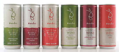
Currently holding patents in Australia, Japan, Singapore, South Africa, New Zealand and Europe (25 European Union member counties), and a complex and secretive process consisting of seven phases that will grant you the Vinsafe License. I am still unclear as to how you can patent a process that includes assessment of a winery, recommendations and marketing, but who am I to judge complex legal processes?
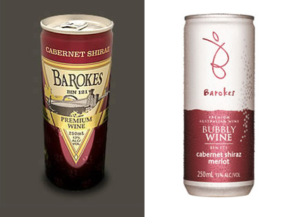
Old and new can designs
What I am – happily – able to judge is the improvement in design. While the information of who is responsible for the giant leap eludes me, I think they have succeeded in making a much better job at targeting the sophisticated 20-30-something woman. Personally, I would not have glanced at the old design while shopping but, the new one, maybe. While It does not necessary reflect great quality wine – considering it’s, after all, in a can – I can see it as a medium-quality, easy-to-transport, practical-for-the-picnic drink.

As the demand for on-the-go products increases, and single-servings become more popular, manufactures are looking for alternative packaging to suit our needs—this has been popular in Europe and Japan for quite some time, and is now just making its way to the U.S. consumer. Many of these handy wines are introduced in the hippest of situations, such as trendy clubs in New York, Los Angeles and Miami; or by putting it in the hands of an appropriately appointed celebrity:

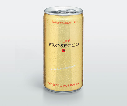
Rich Prosecco created a simple, somewhat sleek can that prompts a double-take about the contents (proseccco?), and its associations (in a can?!). Not your typical wine, but not your typical beach cooler spritzey drink either. With a design stuck in between the elegant and sophisticated, and the bland and generic, they at least stand out from the blasting/splashing/dripping/bursting graphics found in many cans in any given category: wine, soda, tea or energy.
Any celebrity endorsement comes with its own baggage and none is heavier than Miss Hilton’s. Any positive qualities that the design might have helped build are quickly put to the test when the marketing machine gets hold of a camera and starts shooting:

How can it be that while one team (the designers – I assume, and hope, there is a design team) is trying to elevate the idea surrounding wine in a can by producing something with design in mind (I don’t think this is stellar design, but it could be a lot worse), while allowing the other team, that of the advertisers, to throw it all out the window by selecting the cheapest and skankiest spokesperson possible?
It is interesting to note that Prosecco is produced in Italy’s Veneto area (purchased and distributed by an Austrian company), but not sold in Italy due to a nation-wide law that allows wine to be sold only in bottles.

On the other hand, Niebaum-Coppola Winery (owned by film director Francis Ford Coppola) wanted to join the single-serving wagon with its Sofia Blanc de Blancs sparkling wine (named after his daughter Sofia Coppola). Originally wanting to sell it in “splits” (187 ml bottles, think giftey “half bottles”), but unable to find a quality packaging company to work with, they explored alternatives. Not attracted by the airline-style screw caps – another contentious “innovation” among wine fans – they contemplated the can and saw its potential. And rather than target the usual outlet of liquour shops, it has been testing out the sleek pink cans at high-end nightclubs in cities like Miami, Las Vegas and San Francisco.
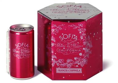
It goes for the “Sex and the City” crowd of sophisticated female city-dwellers who order it by name and can easily hold it while partying or lounging by the pool. It looks chick, sophisticated-girly, elegant and fun. Too bad they did not go the extra mile with the typography by refining the details (especially in the curve) or creating custom typefaces that had the potential of really making a difference – Louise Fili’s work comes quickly to mind.
Having started by word-of-mouth, as they introduce the product nation-wide in the near future they will be using print ads in magazines like Paper and Surface. In the meantime you can visit the official site and get a tasting of the brand by clicking on photos, listening to music and catching extra short videos of Sofia. With her Sofias.

The big issues, of course, remain: Taste, quality, perception.
Does the metal influence the taste at all? They claim it does not, but I am no expert and I have my doubts as anything left in a can long enough does taste metallic. The quality of the wine is the same as when it is bottled, so how do you jump over the oenological faux-pas of wine in a can? How do you attract the new generation of image-conscious, post-college drinkers? How do you maintain your reputation and scoff skepticism from wine connoisseurs? The answer is – or, well, could be – design. Design of the can, design of the message, the image, the advertising, the appeal, the quality, the price and ultimately the design of the image of the individuals the wine must appeal to. Perhaps then, wine in a can will stand the test of time.



Prosecco: That can means "energy drink" by now. I'm always surprised when somebody tries to use it for anything else. (I think Starbucks still does, but given it's coffee, maybe they get a sort of pass.) Other than that, they definitely veered a little too much towards Classy and ended up at generic. Combined with the can, it kinda looks like an energy drink that's uppity yet simultaneously downmarket because nobody knows who the hell they are.
The skank doesn't help. Makes me think of the Red Bull ads with the can causing a...bulge in a pair of underwear. Which is now being blatantly ripped—or one-upped, I guess—by Four, who are peppering the area with branded condoms sporting the URL four-playlonger.com. Image forthcoming.
The Sofia box is trying way too hard and just comes across like a fancy Christmas tin of say, Almond Roca(Welcome home, Roxy Carmichael...) The can makes me think of Tab all growed up.
On Oct.05.2006 at 06:47 PM