Speak UpA Former Division of UnderConsideration
The Archives, August 2002 – April 2009
advertise @ underconsideration
---Click here for full archive list or browse below
  
The Handy Reference Guide to Corporate Identity — Revised.

In 2004, Debbie Millman invited me to give a presentation for the Institute for International Research’s Brand Identity and Packaging conference she co-chairs every year in New York. I know nothing about packaging and having just wrapped up a first year of blogging that included the controversial (at the time) rebrandings of UPS and VH1 I knew one thing about branding: Rebrandings. Which I made the theme of my presentation. As I was developing it I remembered a brilliant piece by Tibor Kalman I had seen in his monograph (I am way too young to have seen the original in I.D. Magazine’s March/April issue back in 1987) titled “The M&Co. Handy Reference Guide to Corporate Identity”. I — either courageously or stupidly — decided to update Tibor’s piece for the presentation, hoping to end up with something that approached at least a small percentage of his critical poignancy and wit. I had forgotten about my chart until this summer’s Payless Shoesource rebranding. With a long weekend at hand I dusted it off, updated it to 2006 — except for the punchline — and I now humbly present it with all the respect and praise that Tibor demands.

divider

“The M&Co. Handy Reference Guide to Corporate Identity”
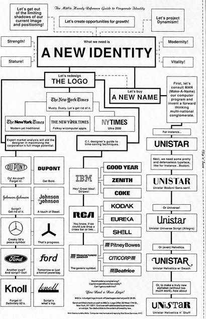
Tibor's Handy Reference Guide

View Big [1,000 pixels wide at 551kb] / View Medium [750 pixels wide at 337Kb]

divider

“The Handy Reference Guide to Corporate Identity — Revised.”
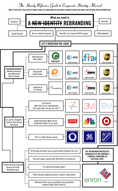
Armin's take on Tibor's Handy Reference Guide

View Big [1,000 pixels wide at 386Kb] / View Medium [750 pixels wide at 247Kb]

Maintained through our ADV @ UnderConsideration Program
ENTRY DETAILS
ARCHIVE ID 2775 FILED UNDER Branding and Identity
PUBLISHED ON Sep.06.2006 BY Armin
WITH COMMENTS
Comments
Jose Nieto’s comment is:

I understand your lack of confidence in presenting this to the world (the original was by Tibor Kalman, after all), but I think it stands on its own. Of course, these days you could add another branch to the Time-Saving Techniques: make it Web 2.0!

On Sep.06.2006 at 10:09 AM
brian’s comment is:

Ironically, I think you just did to Tibor's classic what you accuse other designers of doing to those classic logos.

Also, you should've proofread this before posting it! "Wai until it's all rolled out"?

On Sep.06.2006 at 10:31 AM
oscar’s comment is:

Instead of "Repeat Offender" it might have been better to have a mix-and-match list, or callouts that go to more than one logo.

Still, I laughed - especially at the ultra-chic 7-eleven logo.

On Sep.06.2006 at 11:08 AM
felixxx’s comment is:

Great stuff, Arm. Finally, some self-promotion!

You could do a whole book on this topic. speaking of self promo reenactments, this little jewel of a concept has recently been dusted off by yours truly...

If youve ever worked at an ad agency, you'll love it.

On Sep.06.2006 at 11:25 AM
Kevin M. Scarbrough’s comment is:

Printable logos are so 1997.

On Sep.06.2006 at 03:20 PM
Kosal’s comment is:

You forgot the time-saving technique of setting the first word of a brand in generic sans black and the second in generic sans Ultra Light-- eliminating the need for a space between the two words.

On Sep.06.2006 at 03:39 PM
DesignMaven’s comment is:

Tibor was on the Money with some of his Assessment of Identity Work at the Time.

The Chart may have been his Frustration at not Getting a Larger Piece of the Identity Design Pie.

Tibor was NOT KNOWN for his Identity Design Capability.

I'd be Surprised if anyone can name Five (5) Identities he's Designed other than The Audubon Society and Colors without looking in an Identity Annual.

No Disrespect to Tibor Kalman. I've always loved
the Analogy he was making on the Industry with the Chart.

I don't have the Chart from I.D. Magazine although I've seen it.

I have the Second Incarnation which was Published in an Issue of AIGA Journal 1990s Entire Issue Devoted to Corporate Identity.

Arm, I'm Afraid I'd have to give you an "I" Incomplete for the Chart.

You should've listed every ReDesign except Pentagram's United, Enterprise IG, Bank of America and Sterling Group's Burger King.

Everything else Fail since 1996.

As they say on eBay, Unlimited Revisions until
the Client is Satisfied.

DM

On Sep.08.2006 at 11:46 AM
DesignMaven ’s comment is:

Correction:

Added to my Short List.

Fredy Jaggi's and Gene Grossman's, RockwellCollins Identity is the most Intelligent Identity Design I've seen in years.

Bar None!!!!

On Sep.08.2006 at 12:21 PM
Alexandre’s comment is:

Got here through a local blog.
Fascinating entry, even for an anthropologist without any knowledge of graphic design. It would be nice to provide some analysis of other logos.
And, speaking of logos and corporate identity, you all saw the spoof flags for different websites, right?
(Featuring: Google, Amazon, W3.org, TechCrunch, Yahoo, Adobe, BoingBoing, RIAA, IMDb, Digg)

Cheers!

On Sep.11.2006 at 12:03 AM